Hi there! I have created my own colour pallet which I included onto my PBI report following Sam’s tips.
Now, I have created a Matrix to showcases our period Sales by BU, Zone and Country. Data is displayed just as I would have liked at the highest level (BU), problem comes when drill downing data - see screenshots:
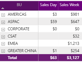
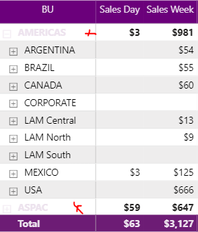
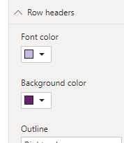
It’s barely impossible to read as shown and if I turn Row headers to be Black then it’s also difficult to read due to the dark purple Background colour. Colours are corporate and as such would need to keep them. I just need to know if there’s any way I can accomplish this.
Thanks a lot
Samuel