I have a problem with displaying accumulated totals at each point in a line graph.
I am trying to calculate the accumulated cash flow over a range of accounting transactions filtered by those account codes that are bank accounts by accounting period.
I have attached the pbix file and the display is on the Cash Flow tab which is driven by the measure Accumulated Cash Flow.
Perversely I have got this logic to work on the Balance Sheet tab which is driven by the measure B/S Total.
Any help, as ever, greatly appreciated…
Best regards
Paul
Accounts.pbix (1.2 MB)
Hi @PaulBoyes,
Yeah don’t think the issue is the measure, let’s take a look.
Accumulated Cash Flow =
CALCULATE(
    SUM(NlTransactionsPosted[Amount]),
        FILTER(ALL(BankAccounts), BankAccounts[BankAccount] <= MAX(BankAccounts[BankAccount])),
        FILTER(ALL(PeriodTable), PeriodTable[PeriodKey] <= MAX(PeriodTable[PeriodKey]))
)
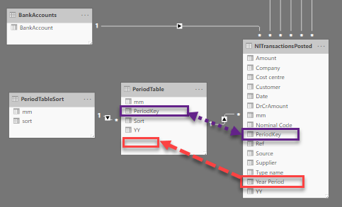
Now this is how your Model is set up. You have a Dimension table called PeriodTable but that doesn’t include your calculated column ‘Year Period’ which you’ve placed on the axis of your visual… so moving that calculated column to your Dimension table and placing it on the axis will sort the issue.
Tip. Hide all Key and other Dimension fields within a fact table in Report view - that way you’ll force yourself (and others) to use the dimension tables instead and can avoid these type of issues.
I hope this is helpful.
Hi Melissa
Thank you very much, and yes of course that was very helpful.
In my defence that configuration was created by another Enterprise DNA responder and it was much earlier in my Power BI Dax learning curve.
Best regards
Paul