A Trick for Conditional Formatting with Transparent Color To Hide Data Below Sample Size

Hello Everyone,

following another post,

I was looking for a solution to set minimum sample size and using the trick Brain provided. I was able to achieve the result. But there is some limitation to it.
In the solution, we used conditional formating with a transparent color card to hide the visual < sample size.
The limitation I run into is when using the overlaying card I lost the ability to have the tooltip and interact with the other visuals.

Sample Size

Is there maybe a way to make this work?

Thank you all in advance.

e DNA Forum – Show Hide Visual Based on Threshold Value Solution.pbix (368.3 KB)

3 Likes

I love your typo of @BrianJ’s name as Brain, seems appropriate really :wink:

1 Like

Very appropriate :joy:

2 Likes

@iasma,

I’m still struggling a bit trying understand the use case here, but wondering whether the following would work?:

Instead of using a card overlay, what about using the conditional formatting of each visual individually to accomplish this? Thus, if the sample size was less than the threshold for display, you would turn all components of each visual to the background color (in this case, white). This would prevent the visuals from displaying, but still make them fully interactive, and you could make the tooltips visible by keeping them in a different color. You could put an overall title on the group of visuals, and change that to something like “Visuals not displayed due to insufficient sample size” via conditional formatting.

What do you think? Does that address the requirement?

– Brian

1 Like

Hi @iasma, did the response provided by @BrianJ help you solve your query? If not, how far did you get and what kind of help you need further? If yes, kindly mark as solution the answer that solved your query. Thanks!

Thank you @BrianJ
I am trying to apply this to this one visual but I don’t have the conditional formating in all the components.
I tried IF statement to each measure and change the error message to something like “Not Enough Data” but my company didn’t like that it showing an error.

`IF(

   VALUE([Sample Size]) >= 30,

    AVERAGEX(
        VALUES(User[User ID]),
        CALCULATE(
            [Average Score])
)
    ERROR("Not Enough Data")
)
`

@iasma,

Sorry if I wasn’t clear in my earlier post – that’s not at all what I was proposing. Let me try to illustrate with a better example. Here’s a simple bar chart. The data bars and the title are controllable by conditional formatting, but the axes are not. So what I’ve done is placed rectangles over the two axes, each controlled by conditional formatting of the background, like the card overlay in our previous discussion.

image

When the sample size equals or exceeds the threshold all the conditional formatting measures get a value of BLANK(), meaning they assume their default color. If the sample size is less than the threshold value, then they all received a value of white, making them indistinguishable from the background but still technically “visible” – thus you can still activate the tooltips by mousing over the visual and also select the visual header options. Similarly the title is conditional on the status of the threshold versus the sample size.

image

image

I hope this is helpful and meets your requirements. I’ve attached the full revised solution file, so you can see how all the different components are configured.

– Brian

e DNA Forum – Show Hide Visual Based on Threshold Value Solution2pbix.pbix (368.8 KB)

1 Like

I appreciate all the help @BrianJ!
This is a great trick but doesn’t work for visual that has more than value.
Cause if it were more than value you can apply the conditional formatting to it.
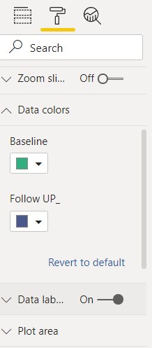
data colors

Otherwise it will work great,

Not sure still how to tickle this sample size.

@iasma,

As long as the data colors have a conditional formatting option, the structure I provided can handle an infinite number of colors/values in the visual. This is because in the IF statement, when it returns a BLANK(), that will keep the existing color(s) intact but if the condition is not met all colors will be changed to the background color.

However, you are correct that there will be a problem if there are multiple data colors on a visual with no conditional formatting option. What type of visual is your screenshot from?

– Brian

Hi @iasma, did the response provided by @BrianJ help you solve your query? If not, how far did you get and what kind of help you need further? If yes, kindly mark as solution the answer that solved your query. Thanks!

Hi @iasma, we’ve noticed that no response has been received from you since the 30th of April. We just want to check if you still need further help with this post? In case there won’t be any activity on it in the next few days, we’ll be tagging this post as Solved.

Hi @iasma, due to inactivity, a response on this post has been tagged as “Solution”. If you have a follow question or concern related to this topic, please remove the Solution tag first by clicking the three dots beside Reply and then untick the check box.

We’ve recently launched the Enterprise DNA Forum User Experience Survey, please feel free to answer it and give your insights on how we can further improve the Support forum. Thanks!