Hi, I am looking for a visual that is suitable to display where “less” is better.
A
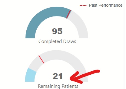
Above are 2 visuals in my report. Currently both KPIs are done with “dial” visual.
1st KPI “Completed Draw” is the # of draws done by phlebotomist. We want this # to be as “high” as possible.
I think in this case, dial visual works.
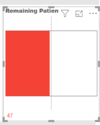
2nd KPI “Remaining Patients” is the # of patients left or still need to get to. We want this # to as “low” as possible. 0 will be the best. In this case, dial visual is not suitable for this KPI.
I can always change this KPI to just a plain “card” visual. I had been looking in MarketPlace and not yet find one that really a good fit. If anyone of you know a custom visual that is a good fit, please let me know. I don’t mind to buy the visual even from a 3rd party vendor.
Hi Brian,
I presented the option, the product manager feels the Brick chart doesn’t go well with the rest of the visuals currently we have on the report. We still have this as a backlog. Recently the client get a senior UI\UX designer to help me with some of the usability flows from tabs to tabs for this report. This backlog is put for him to think of a way to display “less is better” data. Please allow me to update once we have an elegant solution for our report. Do appreciate you checking back.
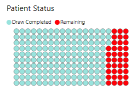
Thanks – that would be terrific. I’ve got a need for this in one of my projects as well. Currently, I’m using the Brick chart as a placeholder, but would love to see what your UI/UX expert comes up with.
Hi Brian:
Just a tot to share… I proposed solutions even though this item is being added to backlog. I want to share with you the following: -
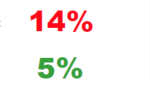
(a) - display the KPI as # (card visual), using color Green Vs Red as a ‘good’ or ‘bad’ indicator.
(b) Display data by using “Data Bar KPI”
I personally like option (a). sometimes “simple is good”
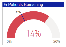
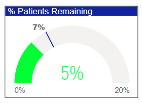
Thanks for sharing. I agree that the simple colored KPI card is pretty effective. The one thing it’s missing though is the target value. To bring this conversation full-circle, since we started this discussion initially, Microsoft has added a lot of conditional formatting options to the dial gauge, where it actually might be an effective option now. See what you think…
Thanks for the update. I like it - clean, clear and simple.
If you’re interested in perhaps adding a small 90 day sparkline to the card to show additional context for the up/down arrow, here’s a really clever way to do so:
 have a wonderful day!