Hello,
Looked around for a solution but I couldn’t find an answer.
Closest I’ve got was Sam’s video https://www.youtube.com/watch?v=LmlK9zC0XZQ&t=263s&ab_channel=EnterpriseDNA but statement does not work for counting.
Unfortunately, I cannot provide the data so I’m creating a scenario.
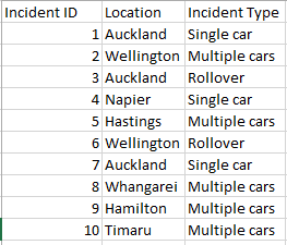
Let’s say, I have a file with Traffic Incidents’ locations in the city. I need to be able to identify the locations with more than 2 incidents one a period of time, and also what were the incidents’ types.
The data is structured as
- Incident ID
- Location
- Incident type
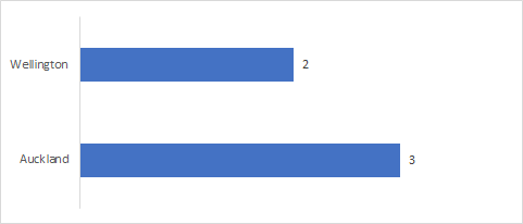
A location bar chart should provide the total volume of Incidents per Location (for the ones that are meeting the criteria - 2 or more) that will interact with the second chart and provide the Type of incident and volume for the selected location on the bar chart.
Hope it makes sense.
Sam’s video would have been helpful if I would have had Volume instead of Incident ID.
Thank you very much!
Hi @AnneCucuetu ,
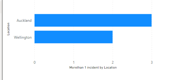
Thanks for posting this question. It is always easy to work on the problem & understand it completely if sample file is attached. However, this seems simple scenario, so I thought it is quite manageable to just throw some sample data and work over it. In below dataset, I have added 2 locations with more than 1 incidents(Auckland and Wellington) and graph only shows those 2 locations.


Morethan 1 incident by Location =
SUMX (
    FILTER (
        SUMMARIZE (
            'Data',
            'Data'[Location],
            "NumberofIncidents", Data[Total Incidents]
        ),
        [NumberofIncidents] >= 2
    ),
    [NumberofIncidents]
)
Incidents PBIX.pbix (17.4 KB)
Incidents.xlsx (8.2 KB)
Please feel free to get back in case something is not clear.
Kind Regards,
Hafiz
1 Like
Thank you very much for the answer!
Actually I’ve got to this point. Different way but I’ve got here.
What it does not work is to add the Incident type into the equation.


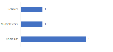
Basically, a second chart should give me the volume of Incidents by Incident Type but JUST for the locations with more than 2 incidents.
And if I select Auckland on the first to get just Single Car - 2 and and Rollover - 1 on the second chart by Type.
As of now the second chart gives me ALL Incidents, and just when I select the location (i.e. Auckland) the second chart reacts (correctly).
Make sense?
I’ll build a small pbi with a sample and calculations to make it simpler.
Thank you!
Anne
Incidents.pbix (20.6 KB)
Car Incidents.xlsx (20.3 KB)
Haven’t used your formula (yet) 
What I need is to show ALL the data (by Ward, Community and Incident type) based on Volume of Locations with 2 or more incidents. Right now, all Incidents are counted and just when Location (address) is selected the info is filtered.
But this way, I cannot compare the wards nor the communities as in “what ward/communities have higher volume of Multiple Incidents”, plus is misleading by displaying total Volume - the report should be called City locations with Multiple Car incidents.
Thank you for spending time on this!
It works!!!
Thank you! Thank you!
Big THANK YOU for taking the time!
Have a wonderful day!
Anne
1 Like
