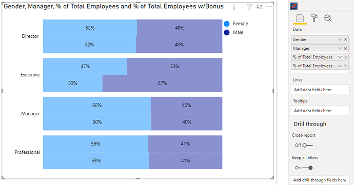
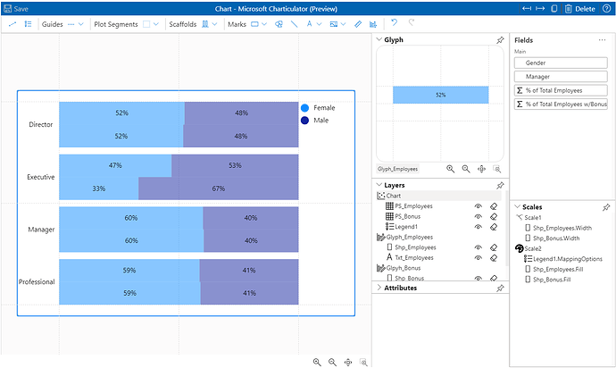
To do it in Charticulator, it’s still quite manual and follows much the same approach that @Greg used for Deneb, e.g.:
I’ve attached a version for you, but here’s my high-level approach:
- Add [Gender] & [Manager] columns, and [% Total Employees] & [% Total Employees w/ Bonus] measures to Charticulator [Data] data role.
- Add [Manager] to axis as desired. In my case I did this as a horizontal bar. If [Manager] is ordinal, you may want to change to vertical bar and use height bindings rather than width bindings.
- Ensure that Plot segment layout is set to Stack X (or Stack Y if using vertical bar).
- Add mark for [% Total Employees] and bind width to measure. Ensure that its height uses 50% of the glyph.
- Bind [Gender] to mark fill.
- Reduce gap between marks (in plot segment) to 0.
- Add text mark and apply measure + formatting.
- Add 2nd glyph and plot segment.
- Repeat steps 2-7, but this time offset the mark to use the other half of the glyph and bind the other measure.
This approach needs 2 glyphs, as the scaling of each measure (if used on a single glyph) will break the scaling of the marks.
You may also want to add marks to illustrate which bar is which measure, as well as hiding the y-axis on the second plot segment to avoid the labels being plotted twice but this should hopefully get you started.
Cheers,
Daniel

