2 100% Stacked Column Chart - Charticulator

Hi,
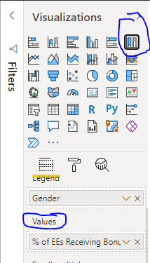
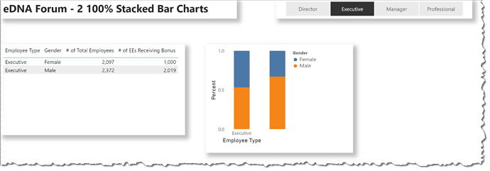
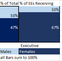
Is it possible to create 2 100% Stacked Chart side by side? I tried to use the default 100% stacked chart but it won’t let me bring the 2nd values. So I am looking for something like this:
image

But in the values I can only have 1 measure.
image

Someone suggested Charticulator but it’s difficult for me to get my mind wrap around that.

Any help is appreciated.

Here is the link for the output that I am looking for:

Thanks,
Ritesh

2 Likes

@rit372002 ,

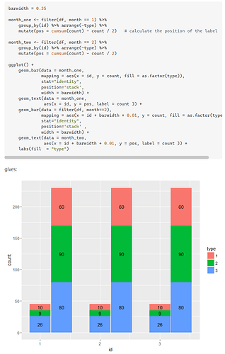
Sorry, I don’t use Charticulator so I can’t answer regarding that, but this is definitely doable as an R/ggplot2 visual within Power BI (see screenshot and reference below). I am also certain that this is doable in Deneb, but I checked the Vega Lite gallery and there’s not an example of this specific configuration there. Looping in @dm-p and @Greg (the Deneb gurus here) to see if they have a Deneb example for you on the grouped stacked 100% chart.

I hope this is helpful.

  • Brian
1 Like

Hi Brian,

Thanks for suggestion and link. I feel like Charticulator is the most viable option due to less learning curve and easy to integrate within Power BI. With R scripting and Gg plot, tbh, I have no idea, where to start or what to make sense of it :slight_smile:

As always, great to see insight from you.

Thanks,
Ritesh

Hi @rit372002. Here’s a rough first try using Deneb using a horizontal concatenation of 2 column charts (actually simple bar charts with “x” and “y” reversed):

Only did a proof-of concept, as you noted that you may end-up using Charticulator, nevertheless, if further Deneb development is desired, you’ll want to address:

  • formatting the Y-axis as a percentage
  • centering the X-axis titles
  • decreasing the spacing between the columns as desired
  • adding a “transform” block to calculate the percentages
  • adding “text” marks for the percentages in the columns

The Deneb code I used is:

{
  "data": {"name": "dataset"},
  "hconcat": [
    {
      "mark": {
        "type": "bar",
        "width": 40,
        "tooltip": true
      },
      "encoding": {
        "x": {
          "field": "Employee Type",
          "type": "nominal",
          "axis": {"labelAngle": 0}
        },
        "y": {
          "aggregate": "sum",
          "field": "Employee Count",
          "title": "Percent",
          "stack": "normalize",
          "axis": {"offset": 25}
        },
        "color": {"field": "Gender"},
        "opacity": {
          "condition": {
            "test": {
              "field": "__selected__",
              "equal": "off"
            },
            "value": 0.3
          },
          "value": 1
        }
      }
    },
    {
      "mark": {
        "type": "bar",
        "width": 40,
        "tooltip": true
      },
      "encoding": {
        "x": {
          "field": "Employee Type",
          "type": "nominal",
          "axis": null
        },
        "y": {
          "aggregate": "sum",
          "field": "Employees Receiving Bonus",
          "stack": "normalize",
          "axis": null
        },
        "color": {"field": "Gender"},
        "opacity": {
          "condition": {
            "test": {
              "field": "__selected__",
              "equal": "off"
            },
            "value": 0.3
          },
          "value": 1
        }
      }
    }
  ]
}

Hope it helps
Greg
eDNA Forum - 2 100% Stacked Bar Charts.pbix (1.3 MB)
4 Likes

@rit372002 ,

Unless you’re already pretty far up the learning curve with Charticulator, I’d strongly recommend going the Deneb route instead. I think it’s more powerful, flexible, performant, greater range of options re: tooltips.

I also think Deneb has some major advantages over gglplot2 - speed, self contained in publishing the report, tooltip and crossfiltering interactivity, ease of installation, etc. However, R does have a lot to recommend it as an adjunct to Power BI. If you’re interested @gjmount has done a terrific introductory R course on the eDNA learning portal, and we will soon be rolling out the second course from him in this series.

As if that wasn’t enough, @PascalKiefer published a brilliant video last week, showing how you can create visualizations in Excel, save them to html, and then make them dynamic via DAX within PBI by using the HTML/CSS Viewer custom visual. That possibly could be an option here as well.

So many different options. I think we are just beginning to enter the Golden Age of PBI visualiization…

  • Brian
1 Like

Thanks @BrianJ I am learning Charticulator with some Youtube videos. Learning curve is not that steep in that but there is still some. For short term, I am going to try it with Charticulator as it seems less scary with no code. :slight_smile:

For longer term, I will check out Deneb route and Vega-lite visuals. Do you have recommendation or courses on Deneb on Enterprise DNA forum? Otherwise I will plough along with this.

@Greg Thanks. I am looking into one of your YouTube videos as well. Thank you!

As always, you guys are the best!

Ritesh

1 Like

@rit372002 ,

We are planning to roll out a Deneb course this spring/early summer. In the meantime, we will be doing some more webinar and YT content on it, and pulling together a bibliography of the best resources currently out there.

  • Brian
1 Like

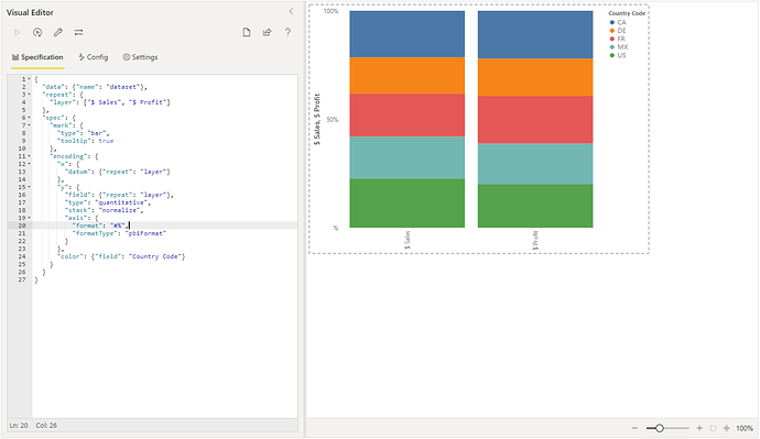
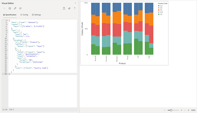
To provide some other Deneb approaches, here’s a very quick version using the repeat operator (done with the sample financials data w/Power BI Desktop) that can let you stack measures as needed:

{
  "data": {"name": "dataset"},
  "repeat": {
    "layer": ["$ Sales", "$ Profit"]
  },
  "spec": {
    "mark": {
      "type": "bar",
      "tooltip": true
    },
    "encoding": {
      "x": {
        "datum": {"repeat": "layer"}
      },
      "y": {
        "field": {"repeat": "layer"},
        "type": "quantitative",
        "stack": "normalize",
        "axis": {
          "format": "#%",
          "formatType": "pbiFormat"
        }
      },
      "color": {"field": "Country Code"}
    }
  }
}

As of Deneb 1.1, you can also use the new Vega-Lite offset encoding channel to add further dimensionality, e.g. we could break out further by product:

{
  "data": {"name": "dataset"},
  "repeat": {
    "layer": ["$ Sales", "$ Profit"]
  },
  "spec": {
    "mark": {
      "type": "bar",
      "tooltip": true
    },
    "encoding": {
      "x": {"field": "Product"},
      "xOffset": {
        "datum": {"repeat": "layer"}
      },
      "y": {
        "field": {"repeat": "layer"},
        "type": "quantitative",
        "stack": "normalize",
        "axis": {
          "format": "#%",
          "formatType": "pbiFormat"
        }
      },
      "color": {"field": "Country Code"}
    }
  }
}

In this case, some additional marks could be used to display which measure is which, but perhaps a couple of further possibilities to try out.

4 Likes

@dm-p and @Greg ,

Great stuff - thanks!

@EnterpriseDNA - When this thread is completed, we should move it into the Deneb Showcase category.

  • Brian
3 Likes

Wow this is amazing and since it involves coding this has piqued my interest, I am starting to learn this from today and hopefully in a month I am able to create some nice visuals.

3 Likes

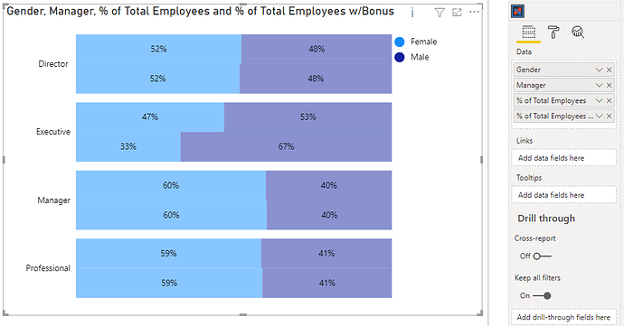
To do it in Charticulator, it’s still quite manual and follows much the same approach that @Greg used for Deneb, e.g.:

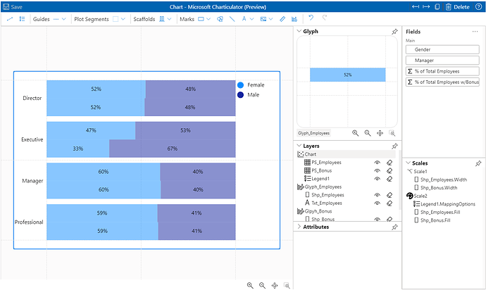
I’ve attached a version for you, but here’s my high-level approach:

  1. Add [Gender] & [Manager] columns, and [% Total Employees] & [% Total Employees w/ Bonus] measures to Charticulator [Data] data role.
  2. Add [Manager] to axis as desired. In my case I did this as a horizontal bar. If [Manager] is ordinal, you may want to change to vertical bar and use height bindings rather than width bindings.
  3. Ensure that Plot segment layout is set to Stack X (or Stack Y if using vertical bar).
  4. Add mark for [% Total Employees] and bind width to measure. Ensure that its height uses 50% of the glyph.
  5. Bind [Gender] to mark fill.
  6. Reduce gap between marks (in plot segment) to 0.
  7. Add text mark and apply measure + formatting.
  8. Add 2nd glyph and plot segment.
  9. Repeat steps 2-7, but this time offset the mark to use the other half of the glyph and bind the other measure.

This approach needs 2 glyphs, as the scaling of each measure (if used on a single glyph) will break the scaling of the marks.

You may also want to add marks to illustrate which bar is which measure, as well as hiding the y-axis on the second plot segment to avoid the labels being plotted twice but this should hopefully get you started.

Cheers,

Daniel

Stacked 100% Bar and Clustered Measures.pbix (2.8 MB)

4 Likes

Hi @rit372002 , did the responses above help you solve your query? If not, how far did you get and what kind of help you need further? If yes, kindly mark as solution the answer that solved your query.

I hope that you are having a great experience using the Support Forum so far. Kindly take time to answer the Enterprise DNA Forum User Experience Survey, we hope you’ll give your insights on how we can further improve the Support forum. Thanks!

Hi @rit372002, due to inactivity, a response on this post has been tagged as “Solution”. If you have any concern related to this topic, you can create a new thread.

@hoosierbi Thanks everyone. I ended up using Charticulator created by @hoosierbi.

Really appreciate all your help.

Thanks,
RK

@rit372002 Please provide link to the solution so that others can also benefit from it later :slight_smile:

1 Like

Absolutely!

Here is the thread.

Thanks,
RK