Hello @rit372002,
Thank You for posting your query onto the Forum.
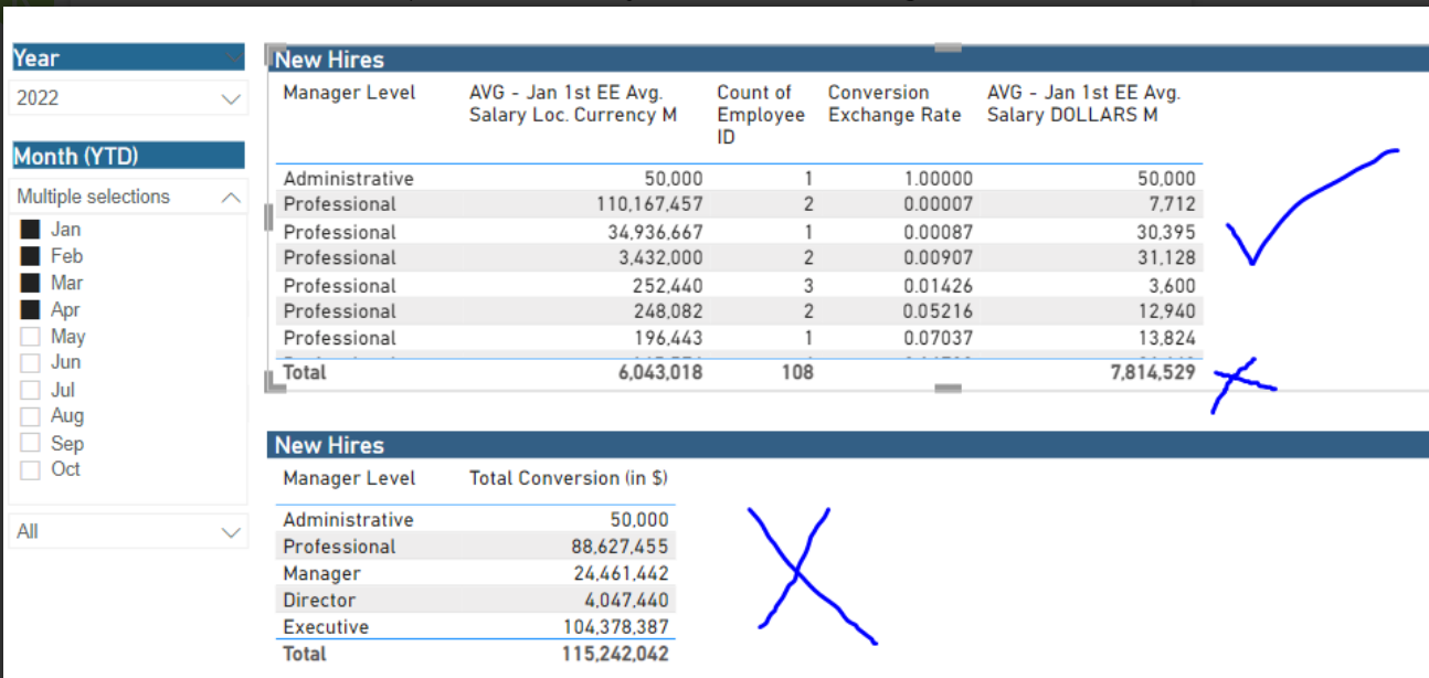
In the PBIX file which you’ve provided, you’re simply considering a naked column of “Employee ID” inside a table visual and converting it into a count. And then multiplying the “Avg. of Local Currency” figures with the “Conversion Rate” in order to evaluate the results of “Avg. Salary in Dollars”. But you’re ignoring the fact that not all the employees will have the same “Avg. of Local Currency”.
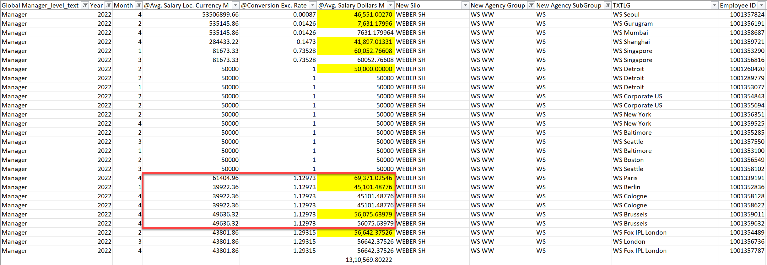
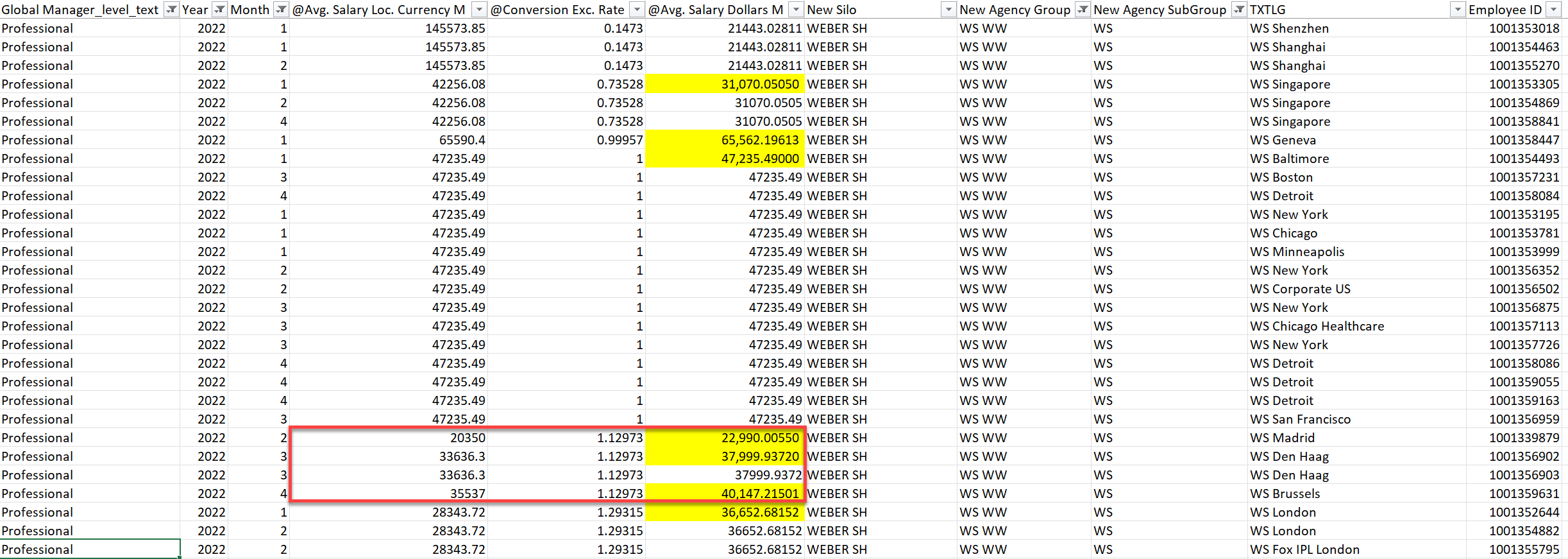
For example, in the case of “Manager” and “Professional”, their “Conversion Rate” is same but their results of “Avg. of Local Currency” is different. And therefore, the results which you’re getting as “17,43,198.00” is incorrect since it’s considering the same “Avg. of Local Currency” figures for all the employees. Rather than that the evaluation of results should be based on actual “Employee ID’s” so that if there’re any changes in the “Avg. of Local Currency” figures, it’ll be considered and not ignored. See the screenshots provided below for the “Manager” and “Professional” category where “Conversion Rate” is same but “Avg. of Local Currency” is still different. Refer the highlighted portion in “Red” box.
If you observe both of the screenshots, you’ll see that although conversion rates are same but avg. of local currency is different for those employees. This is the part which got ignored when you applied a pivot table over the “Currency In Dollars” section because in your case, it considered only conversion rates over the “Count of Employee ID” who are into the same designation over different location whereas ideally it should have applied over the “Employee ID’s” section in order to incorporate this effect.
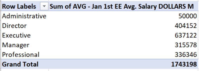
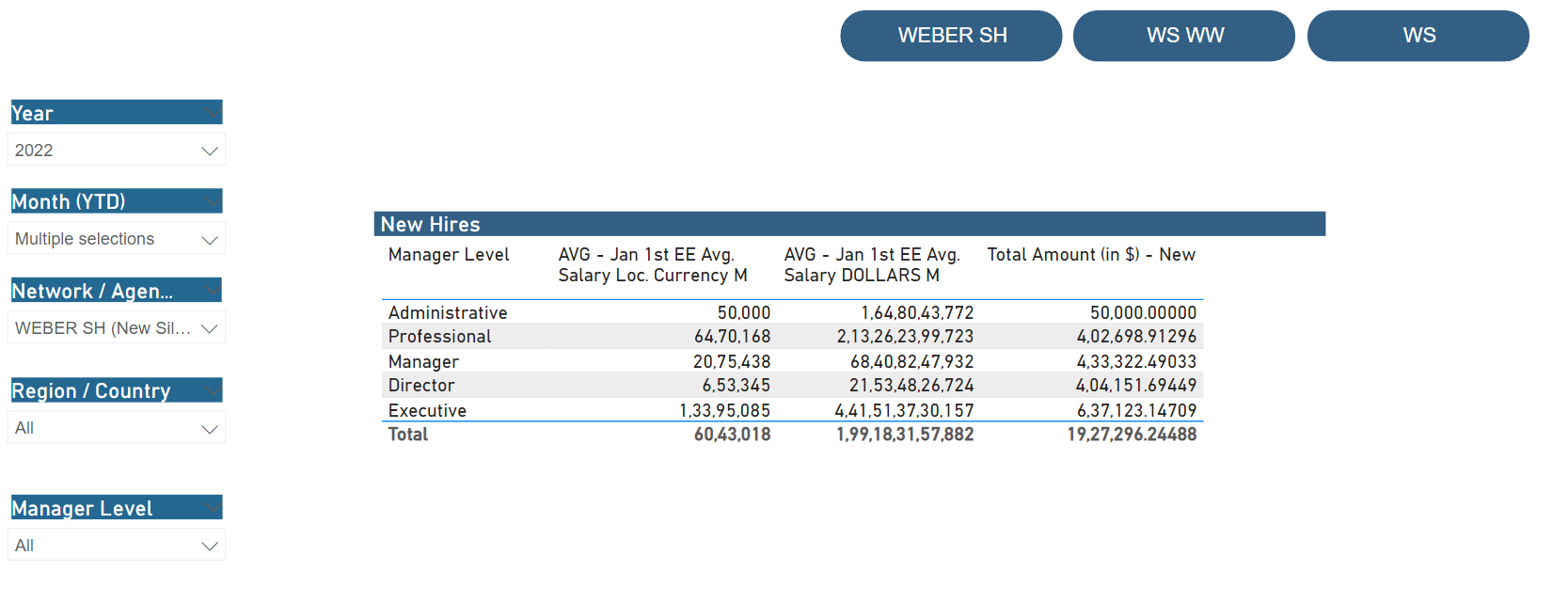
Once that effect is taken into the consideration, the correct figure will be “19,27,296.24488” and not “17,43,198.00”.
So now, based on that entire scenario below is the DAX measure alongwith the screenshot of the final results provided for the reference -
Exc. Rate =
CALCULATE( MIN( HRIS_MD_EXCHANGE_RATES[Conversion Exchange Rate] ) ,
    CROSSFILTER(
        HRIS_MD_EXCHANGE_RATES[DistinctYearmonthCurrency ] ,
        HRIS_TD_COMP_WAGE_DETAIL_NEWOLD[Distinct Year Month Currency] ,
        Both ) )
Total Amount (in $) - New =
VAR _vTable =
SUMMARIZE(
    HRIS_TD_COMP_WAGE_DETAIL_NEWOLD ,
    HRIS_TD_COMP_WAGE_DETAIL_NEWOLD[Global Manager_level_text] ,
    HRIS_TD_COMP_WAGE_DETAIL_NEWOLD[Employee ID] ,
    'Wage Inflation DATE'[Year] ,
    'Wage Inflation DATE'[Month] ,
    HRIS_TD_COMP_WAGE_DETAIL_NEWOLD[New Silo] ,
    HRIS_TD_COMP_WAGE_DETAIL_NEWOLD[New Agency Group] ,
    HRIS_TD_COMP_WAGE_DETAIL_NEWOLD[New Agency SubGroup] ,
    'Business Unit (3)'[TXTLG] )

VAR _vColumns =
ADDCOLUMNS(
    _vTable ,
        "@Avg. Salary Loc. Currency M" , [AVG - Jan 1st EE Avg. Salary Loc. Currency M] ,
        "@Conversion Exc. Rate" , [Exc. Rate] ,
        "@Avg. Salary Dollars M" , [Exc. Rate] * [AVG - Jan 1st EE Avg. Salary Loc. Currency M] )

VAR _Remove_Blanks =
FILTER(
    _vColumns ,
        [@Avg. Salary Dollars M] <> BLANK() )

VAR _Summarized_Table =
SUMMARIZE(
    _Remove_Blanks ,
        HRIS_TD_COMP_WAGE_DETAIL_NEWOLD[Global Manager_level_text] ,
        [@Avg. Salary Dollars M] ,
        'Wage Inflation DATE'[Year] ,
        HRIS_TD_COMP_WAGE_DETAIL_NEWOLD[New Silo] ,
        HRIS_TD_COMP_WAGE_DETAIL_NEWOLD[New Agency SubGroup] )

VAR _Results =
SUMX(
    _Summarized_Table ,
        [@Avg. Salary Dollars M] )

RETURN
_Results
If you see the above screenshot, you’ll observe that figures for “Administrative”, “Director” and “Executive” will match with your pivot table results but not in the case of, “Manager” and “Professional”. That’s because of the explanation/reason provided above.
I’m also attaching the working of my PBIX file as well as an Excel file so that you can cross-verify the results between the two. In the Excel file, I’ve showcased both the scenario’s about how results are generated in either of those cases.
Hoping you find this useful and meets your requirements that you’ve been looking for.
Important Note: In the Excel file under Worksheet No. 3 (Data Based On Employee ID), you can apply filter over the colored portion to cross-verify the results with the PBIX file.
Thanks and Warm Regards,
Harsh
Enterprise - Conversion - Harsh.pbix (9.3 MB)
Conversion of Currencies Results - Harsh.xlsx (1.1 MB)