I have attached sample data for the analysis. In the sample, there is a unique ID, sales opportunity name, Old value for pipeline stage, new value for pipeline stage, and how long it is in each stage of the pipeline funnel.
What I am trying to accomplish is to visually show the various opportunities moving through the sales pipeline funnel. For each period, I want to know how many opportunities moved out of each stage, how many opportunities moved into each stage. I also want to be able to see what specific opportunities moved in and out of each stage.
Hi @msedlak, we aim to consistently improve the topics being posted on the forum to help you in getting a strong solution faster. While waiting for a response, here are some tips so you can get the most out of the forum and other Enterprise DNA resources.
Use the forum search to discover if your query has been asked before by another member.
When posting a topic with formula make sure that it is correctly formatted to preformated text </>.
Use the proper category that best describes your topic
Provide as much context to a question as possible.
Include demo pbix file, images of the entire scenario you are dealing with, screenshot of the data model, details of how you want to visualize a result, and any other supporting links and details.
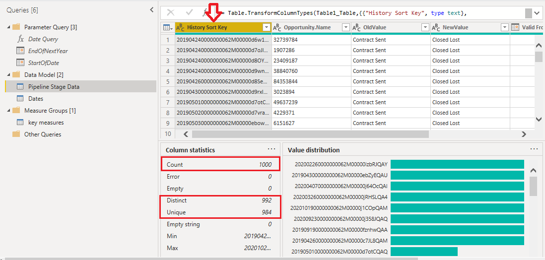
In the description you say that there is a column with unique data, but according to the image below as you can see that column a does not have unique data.
Thank you for your help. After doing further research on EDNA, I realized there was a name for this type of analysis; Events in Progress. I was able to work through it using that logic. I couldn’t figure out how to edit my post. I do appreciate your time on this.
If your data includes a time dimension, you can create time-based analyses. For instance, you could create a time series chart showing the count of opportunities in each stage over time. If your chosen tool supports interactivity, consider implementing filters or drill-downs. This allows you to focus on specific periods, stages, or individual opportunities for more detailed analysis. Once you have created your visualizations, you can share them with your team or stakeholders. Many tools allow for b2b data building, and sharing interactive dashboards or exporting static images for presentations. Use the tool to calculate and display metrics such as the count of opportunities moving into and out of each stage for each period. This might involve creating calculated fields or measures.