Here are some of the hex colors in the brand
New Branding Colors
Saffron - #ffad00
Pencil - #fec661
Daffodil - #ffd793
Banana - #ffe7bf
Cream - #fff3e1
Cast Iron Black - #000000
Charcoal Grey - #545456
Vapor White - #ffffff
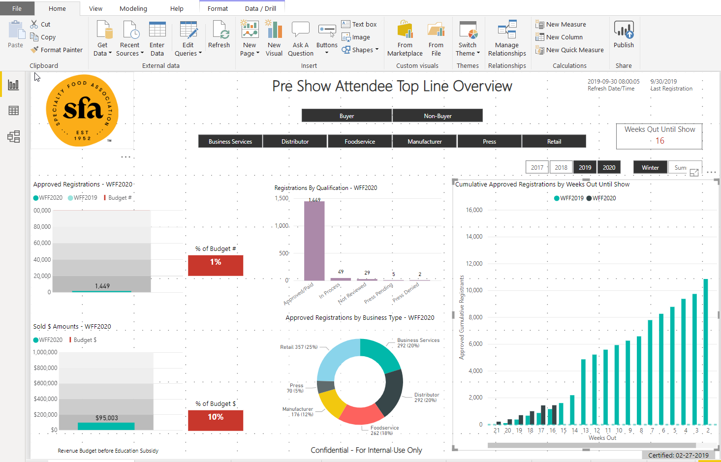
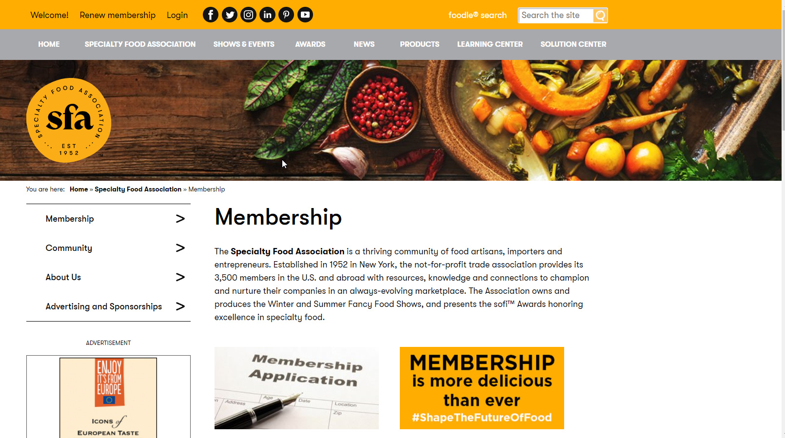
I include a screenshot of the updated website for reference - and quick screen shot of on page of the dashboard (granted I inherited the not so good-looking dashboard) so if you think it looks terrible (I agree and will accept the criticism on my predecessors behalf)
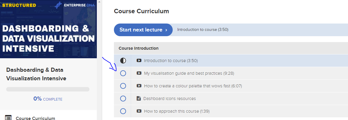
Yes agree, definitely go through the above course Melissa has linked. This is where you will find all my best ideas around how to be more creative with your dashboards.
In addition to the excellent suggestions above, I would highly recommend taking a look at the Makeover Monday site. Every week, they post a pretty “blah” visualization along with the raw data, members of the online community rework it, and the moderators post a gallery of the best submissions. The re-works are often extremely creative, and may help spark some creative thinking in your own reports/visualizations.
Andy Kriebel and Eva Murray, who run the site, also wrote an excellent book on this topic “#MakeoverMonday: Improving How We Visualize and Analyze Data, One Chart at a Time”.
One other recommendation is to check out the work of Edward Tufte, one of the pioneers of data visualization. His books are phenomenal, and he teaches an incredible one day seminar “Presenting Data and Information” that includes all four of his books. If you have the opportunity to attend, I can’t recommend it highly enough.
Thanks Brian for the other suggestion I will look into it the Edward Tufte thing - especially since he is in NYC at the end of October beginning of November.
Kreibel and Murray are Tableau experts, but Makeover Monday is pretty platform agnostic - focused on good design and visualization principles, not the specifics of how to generate them in a particular program.
If Tufte is in your area this Fall, jump at the chance - I’ve taken it twice over the years, and gotten a ton out of it both times.
Pie Charts, Donut Charts, whatever other pastry, are just terrible for anything over 2 categories. They are just hard to read and much better to use bar charts. Just my opinion of course.
I can relate with you. I’m not naturally huge in designs nor colors but I’ve been struggling to like give my designs a professional look far from being copy or patches of others dashboards. Each time I create visuals, I don’t really relate to them and always feel it’s not as powerful as the once I see out there or rather it’s just a pseudo copy. I have the impression it’s because I am always trying to like replicate something I might have seen or struggling to cognitively find my own identity/ authenticity in something alien. I then frame-up this impression in isolation “ a DAX/Power Bi Pro is one with a combination of huge creative designing skills that acts as a front-end signaling mechanism through high-quality visualization/dashboards and powerful Dax capabilities serves as back-end engine to power the latter.”
I nurtured this self-hypothesis for some days and casually decided to embark on a simple PowerPoint designing course since my desire was to ignite something from within and raffle my own creative spirit. I’m barely one weeks in a 10 hours PP designing master course with Udemy. My pace is slow though, but I strongly believe the course is creating this singular creative path I desired, diversifying my creative thoughts and broadening my scope. I can hence acknowledge that designing is an art on its own and PowerBi/Dax PROs are hybrids!
Besides a balanced report layout it’s also important to choose the right visual for the job at sqlbi you can find an overview to help with just that. You can find it here:
As a useful adjunct to that guide, someone created a really nice embedded PBI report that allows you to search for custom visuals by type, publisher, rating, etc.
@BrianJ - Just want to let you know I am registered for a Tufte Course in Brooklyn at the beginning of November so stoked ! Thanks for the recommendation