Hi All:
Here’s my incomplete submission for this challenge. My main challenge (sorry for the pun) in this challenge was lack of time, as being an independent consultant with a September year-end, this is tax time for me (not to mention the demands of my day job and that November is also contract expiration/extension month, so extra negotiations/paperwork). So, I did what I could in the time I allotted myself and thought I’d submit and post my incomplete solution anyway in case others might find some of my ideas useful.
Landing page:

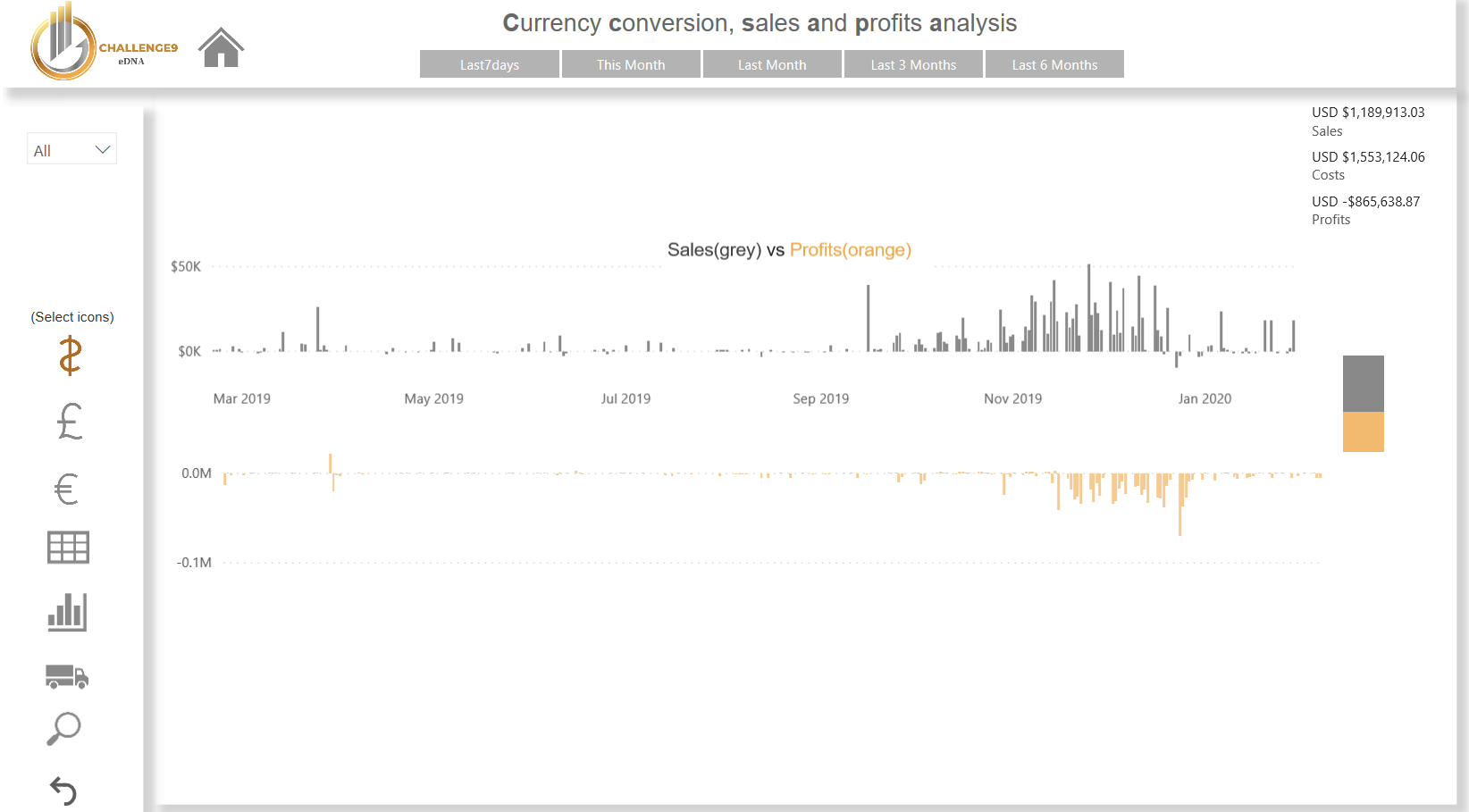
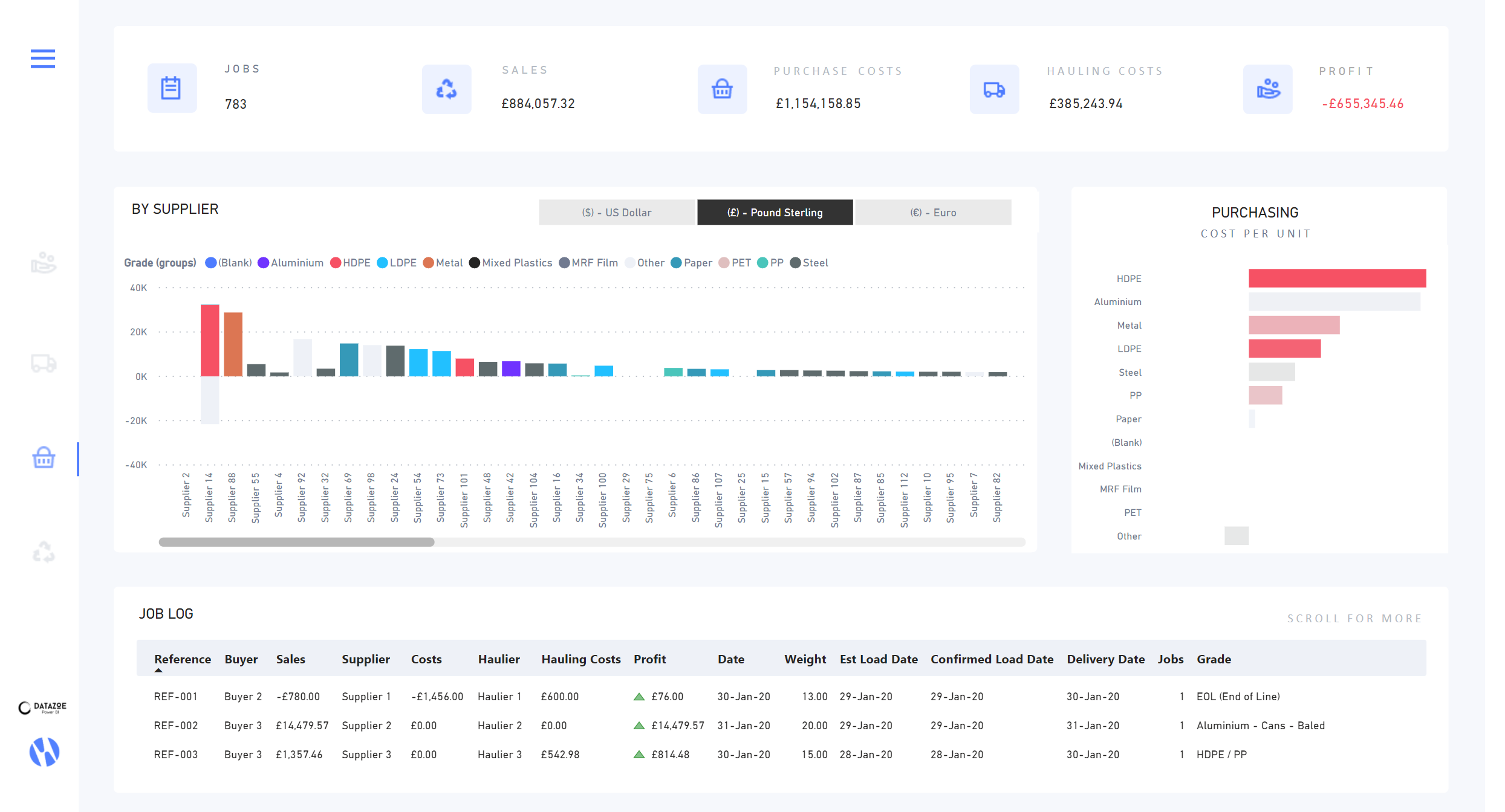
Summary page (unfiltered):
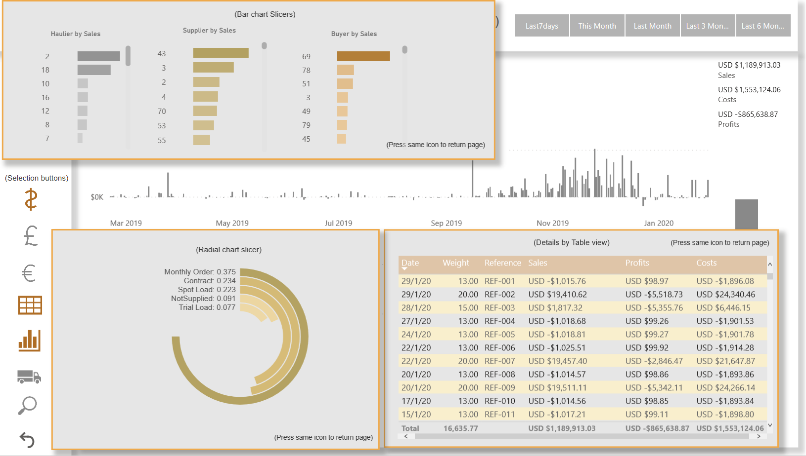
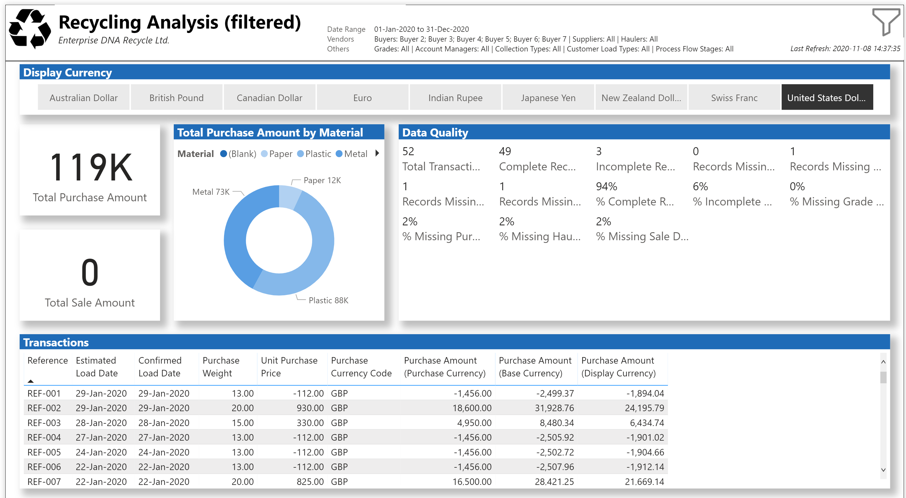
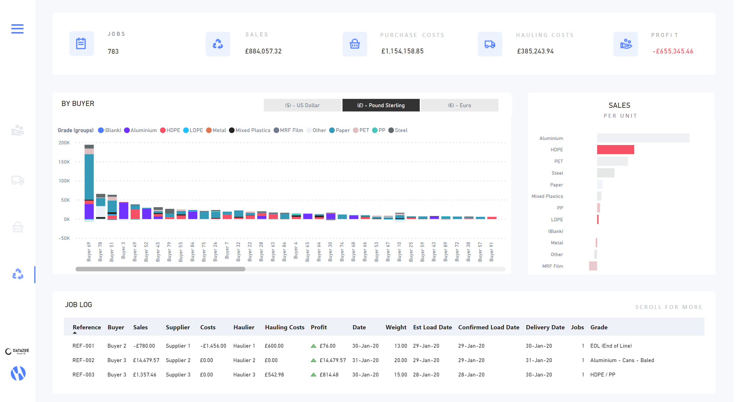
Summary page (filtered:
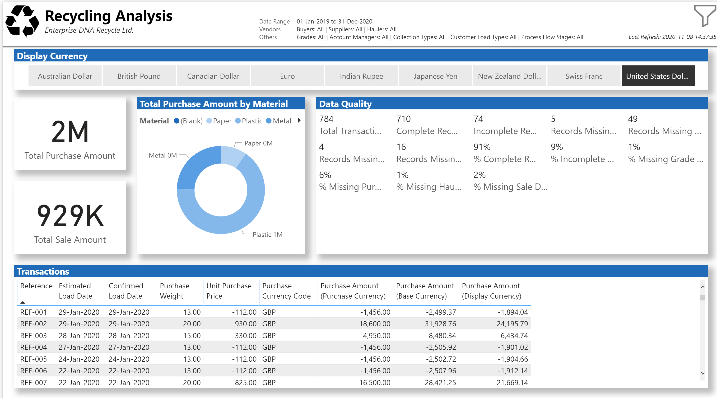
Filter page:

I really liked the simple navigation of simple chevrons I used in my last eDNA challenge submission, and was sorely tempted to use it again (as I think it looks and works great), but attempted to try something new.
So, for what its worth, here are the notes I kept during my (incomplete) development.
(My apologies for the poorly formatted DAX; I wanted to use the “Hide Details” tool to collapse my sections, and once I did so, I could not get the DAX formatter to react properly, so …)
Edit: My mistake … it wasn’t the “Hide Details” syntax that was preventing the built-in DAX formatter from working properly; it was the bullet points, so I entered 3 dashes at the left margin above and below each code block, and voila.
Attributes:
- Icons made by Freepik from www.flaticon.com
What I liked:
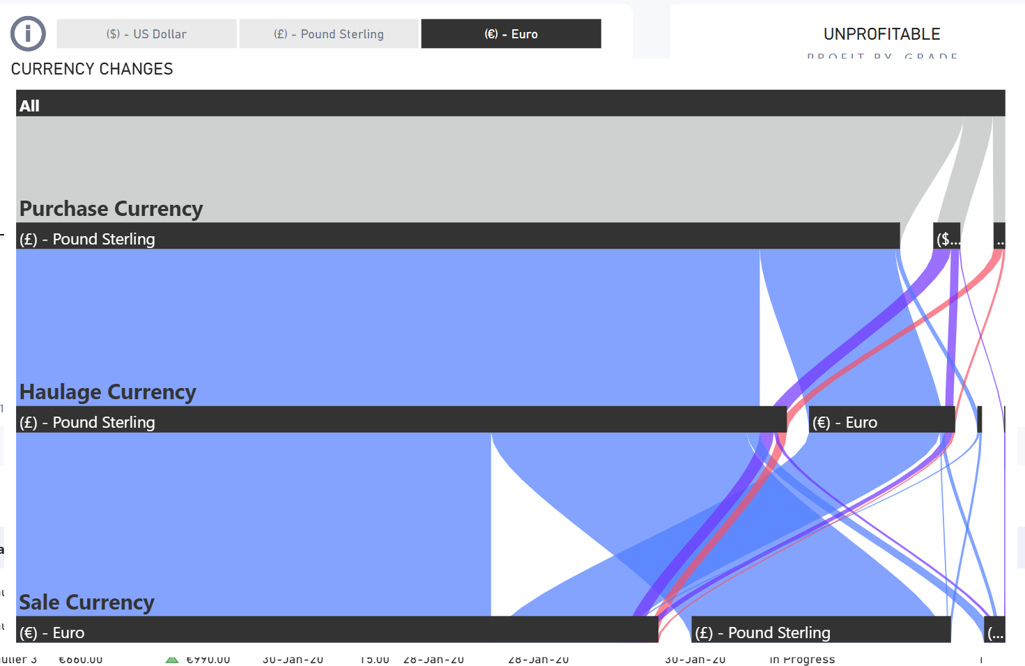
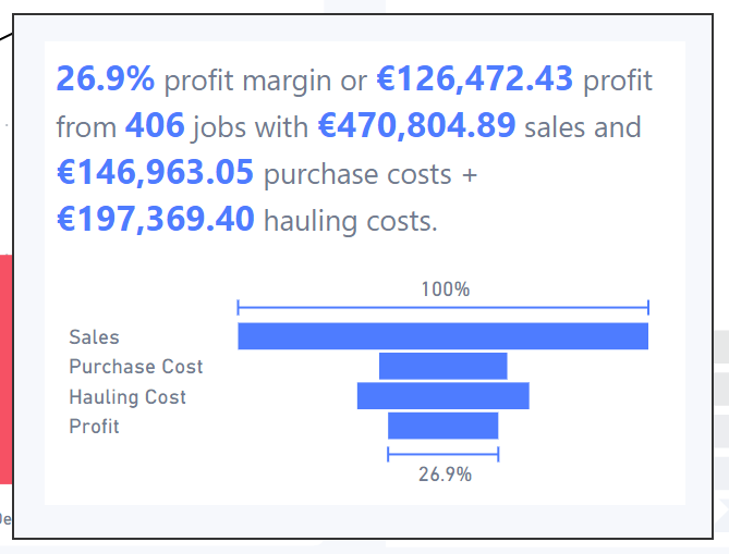
- I’m glad to have taken the opportunity to explore currency conversion; although I didn’t spend much time verifying the results, the basic mechanics of currency conversion are now in my arsenal, and I can explore further when the need arises
- I like that my solution is not dependent at all on choosing a base currency, but rather give the user the option to select whatever display currency they like by doing the conversion twice (once transaction currency to base currency, then once from base currency to display currency)
- I’m happy with the addition of grouping to the [Grades], as instead of 67 separate grades I can now view 4 different “Materials” and hopefully extract more insights
- I like the cleanliness of moving all slicers to a separate [Filter] page, then “echoing” the selected values in a matrix on the Summary page
- I like the cleanliness of simple shadows on all visuals
What I didn't like/what needs more work:
- I’m not happy with not being able to validate the calculations; it seems to me that the amounts are not being presented correctly, but unfortunately, I didn’t have the time to investigate further. (I think this is probably from just going too fast with [and/or insufficient investigation into the] the business rules…)
- I’m disappointed with only being able to spend a limited amount of time on this challenge and did not have the opportunity to explore anything but the most basic visuals
- I didn’t find a way to remove or minimize the blank space at the top of the slicer selection “echo” matrix on the [Summary] page; my original intent was to align this vertically at the top of the page, but couldn’t figure it out in the time I allotted myself for this challenge
Goals:
- to gain experience doing currency conversions (which I had not done before)
- to try to reduce the navigation even further from my eDNA challenge #8 submission, by using a single page only and moving all filters off-page and using simple “funnel” icon to access all filters
Setup:
- used Power BI Desktop November 2020 release (Build 2.87.684.0 64-bit, date published 12-Nov-2020)
- used the Filter Pane visibility “eye” to hide the Filter Pane from report readers
- browsed the Power BI Tips Theme Gallery and chose a selection of blue-based palettes
- extracted the colour HEX codes from these palettes, and put the HEX codes one-at-a-time into the eDNA Colour Fan https://analysthub.enterprisedna.co/apps/colour-generator/colours-fan#18528B until I found one a palette I liked
- using #18528B as the base colour, copied the HEX codes from the colour fan into a text file, then used them to generate a JSON theme file with an 8-colour theme using Power BI Tips Theme Generator https://themes.powerbi.tips/ (#B1D1F2, #85B8EA, #599EE3, #2E85DC, #1F6BB7, #18528B, #103860, #091F34)
- used PowerPoint to create a simple horizontal line background (in theme grey, white 50% darker #808080), exported as PNG, then used as page background to separate the header from the body of the report (used PowerPoint as I could get edge-to-edge line, as the built-in line in Power BI left a gap at both left and right)
Currencies:
- reviewed eDNA YouTube video on How To Download Latest Exchange Rates Into Your Power BI Model (https://www.youtube.com/watch?v=9oPFgHvGyKc)
- chose CAD (Canadian Dollar) as the base currency and sourced daily exchange rates as a CSV file from the Bank of Canada for all available currencies for the date range from 2019-01-01 to 2020-11-06
- loaded the CSV file into Power Query and named as [FX]
- used “Remove Rows” to remove top 33 rows
- used “Used First Row as Headers” to promote first row
- renamed [date] column to [Date], [Attribute] to [Currency Pair], [Value] to [Exchange Rate]
- selected the [Date] column and unpivoted other columns
- used “Column From Examples” and extracted foreign currency from [Currency Pair]; renamed this as [Foreign Currency]
- used “Column From Examples” and extracted CAD from [Currency Pair]; renamed this as [BaseCurrency]
- removed [Currency Pair] column
- filtered [Foreign Currency] column to show only AUD, CHF, EUR, GBP, INR, JPY, NZD, USD
- summarized the foreign currencies and base currency, their codes, and their symbols in Excel and loaded into a new [Currencies] table
- created reference of [Currencies] table as a second currency table [Display Currencies] to use in “Display Currency” slicer
Data Loading/Data Transformations:
-
used eDNA extended date table M code as [Dates] Extended Date Table (Power Query M function)
-
marked [Dates] table as a date table
-
changed all date formats in [Dates] table to dd-mmm-yyyy [by typing “dd-mmm-yyyy” into “Format” box directly]
-
created empty tables for [Key Measures], [Admin Measures], and [Narrative Measures]; opened 2 sessions of Tabular Editor (1 each on my Challenge #8 [C7] PBIX and this file) and copied measures
-
added [Last Refresh] table (used Power Query in both my Challenge #8 PBIX and this file to copy-and-paste)
-
added [fxNow, fxToday, fxStartDate, fxEndDate, fxFirstDataDate, fxLastDataDate] parameters (used Power Query in both C8 PBIX and this file to copy-and-paste)
-
changed [fxFirstDataDate] to use earliest Trades[Estimated Load Date] date; changed [fxLastDataDate] to use latest [Delivery Date]
-
modified [Dates] query to use now-available [fxStartDate] and [fxEndDate] parameters
-
edited error rows in [Challenge 9 Data.xlsx], replacing “#N/A” in “Haulier” column with “Unknown 999” in 2 rows (780 and 781)
-
imported [Challenge 9 Data.xlsx] as staging query [RAW Trades]; disabled load; moved into new group [Staging Queries]
-
created reference of [RAW Transactions] as [Suppliers], chose only [Supplier] column and removed other columns, removed duplicates
- added [Supplier ID] column using “Column From Examples” to extract ID; changed data type to “Whole Number”, then sorted table by [Supplier ID]
-
created reference of [RAW Transactions] as [Buyers], chose only [Buyer] column and removed other columns, removed duplicates
- added [Buyer ID] column using “Column From Examples” to extract ID; changed data type to “Whole Number”, then sorted table by [Buyer ID]
-
created reference of [RAW Transactions] as [Haulers], chose only [Haulier] column, duplicated column and renamed duplicate to [Hauler], removed other columns, removed duplicates
- added [Hauler ID] column using “Column From Examples” to extract ID; changed data type to “Whole Number”, then sorted table by [Hauler ID]
-
created reference of [RAW Transactions] as [Collection Types], chose only [Collection Type] column, removed other columns, removed duplicates, removed nulls, sorted ascending
- added [Collection Type ID] column using “Add Column \ Index Column \ From 1”
-
created reference of [RAW Transactions] as [Account Managers], chose only [Account Manager] column, removed other columns, removed duplicates, sorted ascending
- added [Account Manager Type ID] column using “Add Column \ Index Column \ From 1”
-
created reference of [RAW Transactions] as [Grades], chose only [Grade] column, removed other columns, removed duplicates, removed nulls, sorted ascending
- added [Grade ID] column using “Add Column \ Index Column \ From 1”
-
created reference of [RAW Transactions] as [Process Flow Stages], chose only [Process Flow Stage] column, removed other columns, removed duplicates, removed nulls, sorted ascending
- added [Process Flow Stage ID] column using “Add Column \ Index Column \ From 1”
-
created reference of [RAW Transactions] as [Customer Load Types], chose only [Customer Load Type] column, removed other columns, removed duplicates, removed nulls, sorted ascending
- added [Customer Load Type ID] column using “Add Column \ Index Column \ From 1”
-
[Transactions]:
- created reference of [RAW Transactions] as [Transactions]
- renamed [Est Load Date] to [Estimated Load Date]
- changed all date formats in [Transactions] table to dd-mmm-yyyy [by typing “dd-mmm-yyyy” into “Format” box directly]
- merged [Transactions] table with [Suppliers] table, keeping only [Supplier ID] column and removing [Supplier] column
- merged [Transactions] table with [Buyers] table, keeping only [Buyer ID] column and removing [Buyer] column
- merged [Transactions] table with [Haulers] table, keeping only [Hauler ID] column and removing [Haulier] column
- merged [Transactions] table with [Collection Types] table, keeping only [Collection Type ID] column and removing [Collection Type] column
- merged [Transactions] table with [Grades] table, keeping only [Grade ID] column and removing [Grade] column
- merged [Transactions] table with [Process Flow Stages] table, keeping only [Process Flow Stage ID] column and removing [Process Flow Stage] column
- merged [Transactions] table with [Customer Load Types] table, keeping only [Customer Load Type ID] column and removing [Customer Load Type] column
- duplicated [Purchase Currency] column, then renamed to [Purchase Currency Code]
- replaced values in [Purchase Currency Code]: “(£) - Pound Sterling” with “GBP”, “(€) - Euro” with “EUR”, “($) - US Dollar” with “USD”
- repeated above step for [Sales Currency] and [Haulage Currency] (didn’t use interface; rather, copied M Code for [Purchase Currency Code] value replacements and pasted twice, then adjusted “pastes” for [Sale Currency Code] and [Haulage Currency Code]
- reordered columns in the Data View for [Transactions] table by using “hack” described in eDNA Forum post; bracketed the procedure by taking a screenshot of the data model, deleting all relationships. performing the “hack” (Tip: How to Change Column Order in Data View), then using the data model screenshot to re-create the relationships
- created reference of [RAW Transactions] as [Transactions]
-
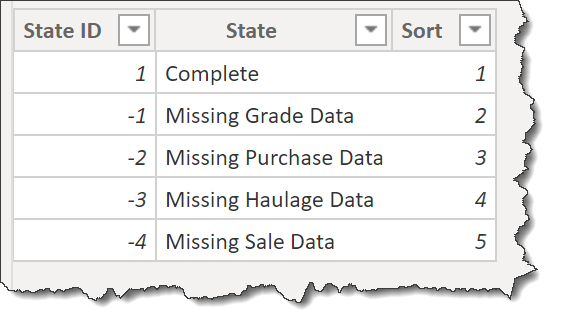
added calculated column for [Transaction State] as follows:
Transaction State ID =
VAR _GradeBlank = IF( ISBLANK( Transactions[Grade ID] ), 1, 0 )
VAR _PurchaseDateBlank = IF( ISBLANK( Transactions[Load Date] ), 1, 0 )
VAR _PurchaseWeightBlank = IF( AND( ISBLANK( Transactions[Total Supplier Weight] ), ISBLANK( Transactions[Est Weight] ) ), 1, 0 )
VAR _PurchasePriceBlank = IF( ISBLANK( Transactions[Unit Purchase Price] ), 1, 0 )
VAR _PurchaseCurrencyBlank = IF( ISBLANK( Transactions[Purchase Currency Code] ), 1, 0 )
VAR _HaulageCostBlank = IF( ISBLANK( Transactions[Haulage Cost] ), 1, 0 )
VAR _HaulageCurrencyBlank = IF( ISBLANK( Transactions[Haulage Currency Code] ), 1, 0 )
VAR _SaleDateBlank = IF( ISBLANK( Transactions[Delivery Date] ), 1, 0 )
VAR _SaleWeightBlank = IF( ISBLANK( Transactions[Total Buyer Weight] ), 1, 0 )
VAR _SalePriceBlank = IF( ISBLANK( Transactions[Unit Sales Price] ), 1, 0 )
VAR _SaleCurrencyBlank = IF( ISBLANK( Transactions[Sale Currency Code] ), 1, 0 )

RETURN
SWITCH( TRUE(),
    _GradeBlank > 0, -1,
    _PurchaseDateBlank + _PurchaseWeightBlank + _PurchasePriceBlank + _PurchaseCurrencyBlank > 0, -2,
    _HaulageCostBlank + _HaulageCurrencyBlank > 0, -3,
    _SaleDateBlank + _SaleWeightBlank + _SalePriceBlank + _SaleCurrencyBlank > 0, -4,
    1
)
[Grades]:
- added [Material] calculated column to [Grades] table to permit categorization into 4 groups: paper, plastic, metal, and other
Material =
SWITCH( TRUE(),
    LEFT( Grades[Grade], 5 ) = "Paper", "Paper",
    LEFT( Grades[Grade], 4 ) = "HDPE" || LEFT( Grades[Grade], 4 ) = "LDPE" || LEFT( Grades[Grade], 14 ) = "Mixed Plastics" || LEFT( Grades[Grade], 3 ) = "PET" || LEFT( Grades[Grade], 2 ) = "PP", "Plastic",
    LEFT( Grades[Grade], 9 ) = "Aluminium" || LEFT( Grades[Grade], 5 ) = "Metal" || LEFT( Grades[Grade], 5 ) = "Steel", "Metal",
    "Other"
)
- used similar formula to create a second calculated column Grades[Material Sort] (instead of “Paper”, 1; “Plastic”, 2; “Metal”, 3; “Other”, 4)
[States]:
- added calculated table for transaction states
- used “Properties” pane in “Model” view to hide all ID fields
- organized all [Admin Measures] into subfolders using Model view as displayed in @JarrettM’s video https://www.youtube.com/watch?v=J_qZ_S-ghoc
Data Model:
- deleted all relationships auto-generated by Power BI
- arranged tables into “waterfall” layout, with lookup tables at top, fact table at bottom, measure tables at top-right, and supporting tables at bottom-left
- created 1-to-many relationships:
- Account Managers[Account Manager ID] → Transactions[Account Manager ID]
- Buyers[Buyer ID] → Transactions[Buyer ID]
- Collection Types[Collection Type ID] → Transactions[Collection Type ID]
- Customer Load Types[Customer Load Type ID] → Transactions[Customer Load Type ID]
- Grades[Grade ID] → Transactions[Grade ID]
- Haulers[Hauler ID] → Transactions[Hauler ID]
- Process Flow Stages[Process Flow Stage ID] → Transactions[Process Flow Stage ID]
- Suppliers[Supplier ID] → Transactions[Supplier ID]
- Dates[Date] → Transactions[Estimated Load Date] (inactive)
- Dates[Date] → Transactions[Confirmed Load Date] (inactive)
- Dates[Date] → Transactions[Delivery Date] (inactive)
- Dates[Date] → FX[Date]
- Currencies[Currency Code] → FX[Base Currency Code] (inactive)
- Currencies[Currency Code] → FX[Foreign Currency Code] (inactive)
- Currencies[Currency Code] → Transactions[Purchase Currency Code] (inactive)
- Currencies[Currency Code] → Transactions[Sale Currency Code] (inactive)
- Currencies[Currency Code] → Transactions[Haulage Currency Code] (inactive)
- States[State ID] → Transactions[Transaction State ID]
DAX Calculations:
- added “Admin” measures for:
- [Is Desktop] using difference between NOW() and UTCNOW() to determine user interface
- [Is Service] using difference between USERNAME() and USERPRINCIPALNAME() to determine user interface
- [… Tooltip] measures to use [Is Desktop] and [Is Service] to display the appropriate tooltip regardless of interface
- formatted all DAX measures using Tabular Editor’s built-in formatter as outlined in YouTube video https://www.youtube.com/watch?v=oF0EbgKfEDY
foreach (var m in Model.AllMeasures) {
    m.Expression = FormatDax(m.Expression);
}
(Saved script as a custom action in Tabular Editor to facilitate reuse in other models.)
- *** IN PROGRESS - INCOMPLETE *** used eDNA DAX Clean Up tool to format all DAX measures and calculated columns https://analysthub.enterprisedna.co/apps/dax
- added the DAX measure expression to the measure description for all measures using Tabular Editor as outlined in eDNA post Sneak Peak of a code inside a measure:
foreach (var m in Model.AllMeasures) {
	m.Description = m.Expression;
}
(Saved script as a custom action in Tabular Editor to facilitate reuse in other models.)
- used measure to calculate the purchase amount in the base currency:
Purchase Amount (Base Currency) =
VAR _TxDate = MAX( Transactions[Load Date] )
VAR _TxCurrencyCode = MAX( Transactions[Purchase Currency Code] )
VAR _TxAmount = MAX( Transactions[Purchase Weight] ) * MAX( Transactions[Unit Purchase Price] )
// get the exchange rate to the base currency for the transaction currency for the transaction date
VAR _ExchangeRate = LOOKUPVALUE( FX[Exchange Rate], FX[Date], _TxDate, FX[Foreign Currency Code], _TxCurrencyCode )
VAR _BaseAmount = _TxAmount * _ExchangeRate

RETURN
_BaseAmount
- used measure to calculate the purchase amount in the display currency:
Purchase Amount (Display Currency) =
VAR _DisplayCurrencyCode = SELECTEDVALUE( 'Display Currencies'[Currency Code] )
VAR _TxDate = MAX( Transactions[Load Date] )
VAR _TxCurrencyCode = MAX( Transactions[Purchase Currency Code] )
VAR _TxAmount = MAX( Transactions[Purchase Weight] ) * MAX( Transactions[Unit Purchase Price] )
// get the exchange rate to the base currency for the transaction currency for the transaction date
VAR _BaseExchangeRate = LOOKUPVALUE( FX[Exchange Rate], FX[Date], _TxDate, FX[Foreign Currency Code], _TxCurrencyCode )
// get the exchange rate to the display currency for the base currency for the transaction date
VAR _DisplayExchangeRate = LOOKUPVALUE( FX[Exchange Rate], FX[Date], _TxDate, FX[Foreign Currency Code], _DisplayCurrencyCode )
VAR _BaseAmount = _TxAmount * _BaseExchangeRate
VAR _DisplayAmount = DIVIDE( _BaseAmount, _DisplayExchangeRate, 0 )

RETURN
IF( _DisplayCurrencyCode = [Base Currency Code], _BaseAmount, _DisplayAmount )
- created similar measures for Sale Amount
- *** IN PROGRESS - INCOMPLETE *** create similar measures for Haulage amount
- created [Is Filtered] measure to check all slicers and return 0 if no slicer selections had been made, 1 if slicer selection had been made (I’m sure there’s a better way to do this, but this was my first thought):
Is Filtered =
VAR _StartAvailableDate = CALCULATE( MIN( Dates[Date] ), ALL( Dates[Date] ) )
VAR _StartSelectedDate = CALCULATE( MIN( Dates[Date] ), ALLSELECTED( Dates[Date] ) )
VAR _EndAvailableDate = CALCULATE( MAX( Dates[Date] ), ALL( Dates[Date] ) )
VAR _EndSelectedDate = CALCULATE( MAX( Dates[Date] ), ALLSELECTED( Dates[Date] ) )
VAR _DatesFiltered = IF( OR( _StartSelectedDate > _StartAvailableDate, _EndSelectedDate < _EndAvailableDate), 1, 0 )
VAR _BuyersAvailableCount = CALCULATE( COUNTROWS( Buyers ), ALL( Buyers ) )
VAR _BuyersSelectedCount = CALCULATE( COUNTROWS( Buyers ), ALLSELECTED( Buyers ) )
VAR _BuyersFiltered = IF( _BuyersSelectedCount < _BuyersAvailableCount, 1, 0 )
VAR _SuppliersAvailableCount = CALCULATE( COUNTROWS( Suppliers ), ALL( Suppliers ) )
VAR _SuppliersSelectedCount = CALCULATE( COUNTROWS( Suppliers ), ALLSELECTED( Suppliers ) )
VAR _SuppliersFiltered = IF( _SuppliersSelectedCount < _SuppliersAvailableCount, 1, 0 )
VAR _HaulersAvailableCount = CALCULATE( COUNTROWS( Haulers ), ALL( Haulers ) )
VAR _HaulersSelectedCount = CALCULATE( COUNTROWS( Haulers ), ALLSELECTED( Haulers ) )
VAR _HaulersFiltered = IF( _HaulersSelectedCount < _HaulersAvailableCount, 1, 0 )
VAR _GradesAvailableCount = CALCULATE( COUNTROWS( Grades ), ALL( Grades ) )
VAR _GradesSelectedCount = CALCULATE( COUNTROWS( Grades ), ALLSELECTED( Grades ) )
VAR _GradesFiltered = IF( _GradesSelectedCount < _GradesAvailableCount, 1, 0 )
VAR _AccountManagersAvailableCount = CALCULATE( COUNTROWS( 'Account Managers' ), ALL( 'Account Managers' ) )
VAR _AccountManagersSelectedCount = CALCULATE( COUNTROWS( 'Account Managers' ), ALLSELECTED( 'Account Managers' ) )
VAR _AccountManagersFiltered = IF( _AccountManagersSelectedCount < _AccountManagersAvailableCount, 1, 0 )
VAR _CollectionTypesAvailableCount = CALCULATE( COUNTROWS( 'Collection Types' ), ALL( 'Collection Types' ) )
VAR _CollectionTypesSelectedCount = CALCULATE( COUNTROWS( 'Collection Types' ), ALLSELECTED( 'Collection Types' ) )
VAR _CollectionTypesFiltered = IF( _CollectionTypesSelectedCount < _CollectionTypesAvailableCount, 1, 0 )
VAR _CustomerLoadTypesAvailableCount = CALCULATE( COUNTROWS( 'Customer Load Types' ), ALL( 'Customer Load Types' ) )
VAR _CustomerLoadTypesSelectedCount = CALCULATE( COUNTROWS( 'Customer Load Types' ), ALLSELECTED( 'Customer Load Types' ) )
VAR _CustomerLoadTypesFiltered = IF( _CustomerLoadTypesSelectedCount < _CustomerLoadTypesAvailableCount, 1, 0 )
VAR _ProcessFlowStagesAvailableCount = CALCULATE( COUNTROWS( 'Process Flow Stages' ), ALL( 'Process Flow Stages' ) )
VAR _ProcessFlowStagesSelectedCount = CALCULATE( COUNTROWS( 'Process Flow Stages' ), ALLSELECTED( 'Process Flow Stages' ) )
VAR _ProcessFlowStagesFiltered = IF( _ProcessFlowStagesSelectedCount < _ProcessFlowStagesAvailableCount, 1, 0 )
VAR _Result = SWITCH( TRUE(),
    _DatesFiltered > 0, 1,
    _BuyersFiltered > 0, 1,
    _SuppliersFiltered > 0, 1,
    _HaulersFiltered > 0, 1,
    _GradesFiltered > 0, 1,
    _AccountManagersFiltered > 0, 1,
    _CollectionTypesFiltered > 0, 1,
    _CustomerLoadTypesFiltered > 0, 1,
    _ProcessFlowStagesFiltered > 0, 1,
    0
)

RETURN
_Result
–
Visualizations:
General:
- chose recycle and filter (funnel) icons from https://www.flaticon.com/;
- added “bounce” to funnel icon by setting transparencies (default = 25%, on hover = 0%)
Landing:
- used custom page size of 640 x 360 to be small and mimic the appearance of a splash page
- smart narrative title using measures for [Report Name], [Company Name], and [Company Acronym]
- recycle image
- full-page button to navigate to summary page (this makes the [Landing] page only accessible on first opening in the Power BI Service
Summary:
- recycle image
- smart narrative title using measures for [Report Name], [Company Name], and [Company Acronym]
- smart narrative title also uses [Is Filtered] measure (see above) to add “(filtered)” suffix if a slicer selection has been made
- “funnel” button to navigate to [Filter] page
- copied all slicers from [Filter] page; set all to sync and hid all
- matrix visual listing slicer selections: date range, vendors (Buyers, Suppliers, Haulers), and others (Grades, Account Managers, Collection Types, Customer Load Types, Process Flow Stages), with “Filter \ Values \ Show on rows” enabled
- last refresh smart narrative textbox using [Last Refresh] measure in bottom-right corner of page
Filter:
- “Back to Summary” button to navigate back to the Summary page (icon left, text right)
- “Reset Filters” button and bookmark to restore slicers to their default state (icon right, text left)
- added “bounce” to “Back to Summary” and “Reset Filters” buttons (default - icon weight = 2, text font = Segoe UI, transparent background; on hover - icon weight = 4, text font = Segoe (Bold), fill 0% transparency, theme 3 blue background)
- standard date slicer complete with slider
- standard slicer drop downs for all dimensions (buyers, suppliers, … etc.)
- standard matrix visual listing all slicer selections, with “Filter \ Values \ Show on rows” enabled


 .
.