Power BI Challenge 8 - Jira IT Service Desk Analysis

@Hideo,

Wow! This is a fascinating report. The design is beautiful, and I’m totally intrigued by the way in which you structured the navigation, which is incredibly creative and unique. It really draws the user in in a very interactive way and allows them to explore the data and questions most important to them. Terrific use of drill through all throughout the report. I spent a long time playing around with this, just exploring different paths through the data. Outstanding!

  • Brian
3 Likes

@BrianJ,

Thank you so much Brian. When looking at my own other reports, I need some time to understand what I have created by the multiple visuals I created also I am confused myself which one I should look at first.

So it is easier for me if there are some indications to lead myself towards the right directions and I noticed that this way is more comprehensive for me and overall is quicker to understand. Thank you for spending some time with the report.

Throughout the challenge your advice and feedback always helps me for my improvement and motivations.

P.S. “Custom tiebreakers for Rankx” video is fantastic video. Creating your own Rand() by using median value is something beyond I have never ever possibly thought. This is the moment human won against technology, really cool.
I always want to be creative like you are.

Regards,

Hideo

4 Likes

Would you be interesting in creating a course walking through how you did each part of this. Could be like an interview style with me. We can discuss this for the future maybe

5 Likes

@sam.mckay 100% yes. If it wasn’t for Enterprise DNA, I would still be creating dashboards in excel.
This is a big achievement that the efforts are being recognized by the Experts. Meanwhile, I will try to document as much as I can for everybody to learn.
You can let me know when you want to do this.

Thanks for the recognition :+1:

7 Likes

@sam.mckay and @MudassirAli,

Great idea! Already looking forward to this…

6DEDC8A8-AB47-44E2-9878-E7640630775B

  • Brian
5 Likes

Hi everybody,
Thanks again @EnterpriseDNA for hosting this challenge!

Here is my submission for the 8th challenge:

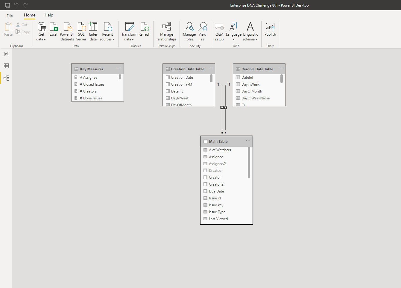
The first Image shows my data model. Since I didn’t have enough time, I decided to keep it simple and just created two distinct Date Table for “Creation Date” & “Resolution Date” columns in the main table. For other categorical columns like “Status”, “Type”, Assignee", etc. also I didn’t create separate lookup tables, and just used their columns in the main table.
If there is any problem with my data model, technically or conceptually, I would appreciate it if you help me to correct it. Any comments would be appreciated.

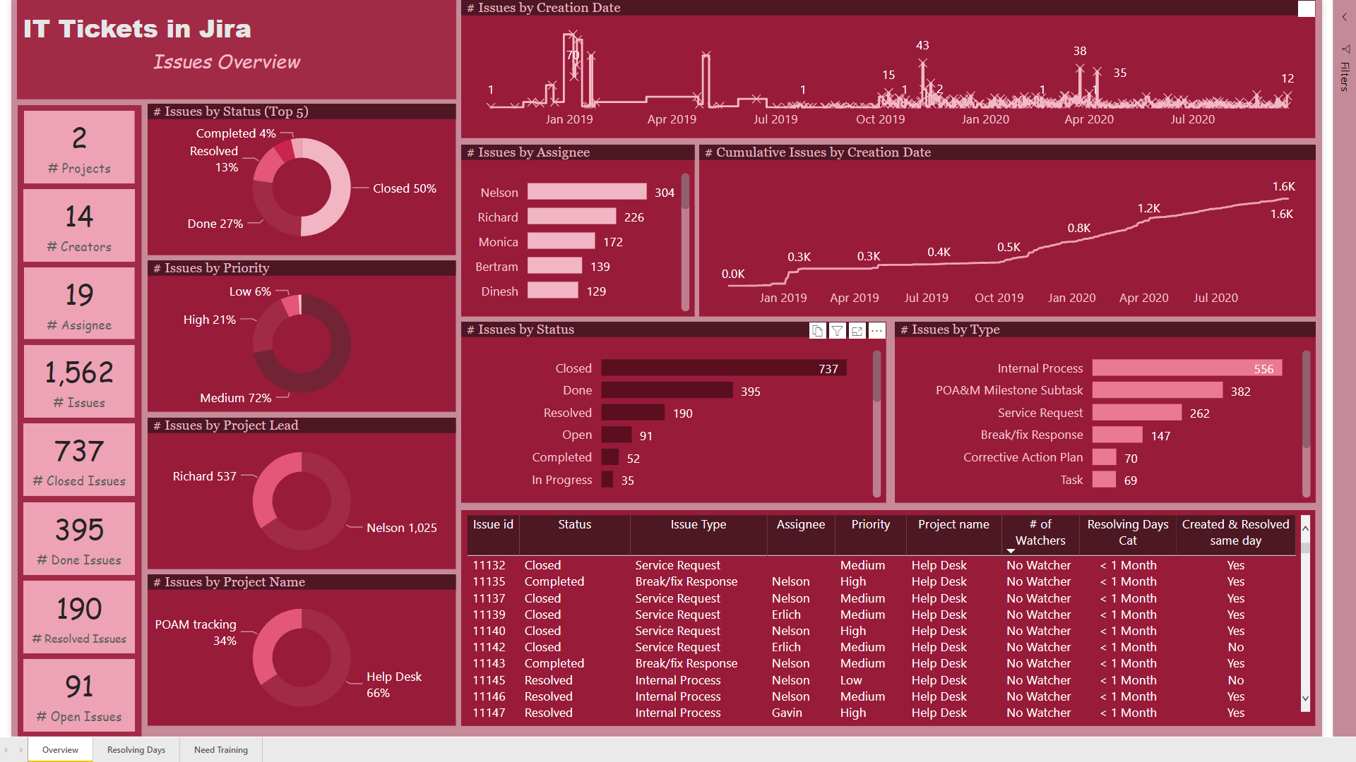
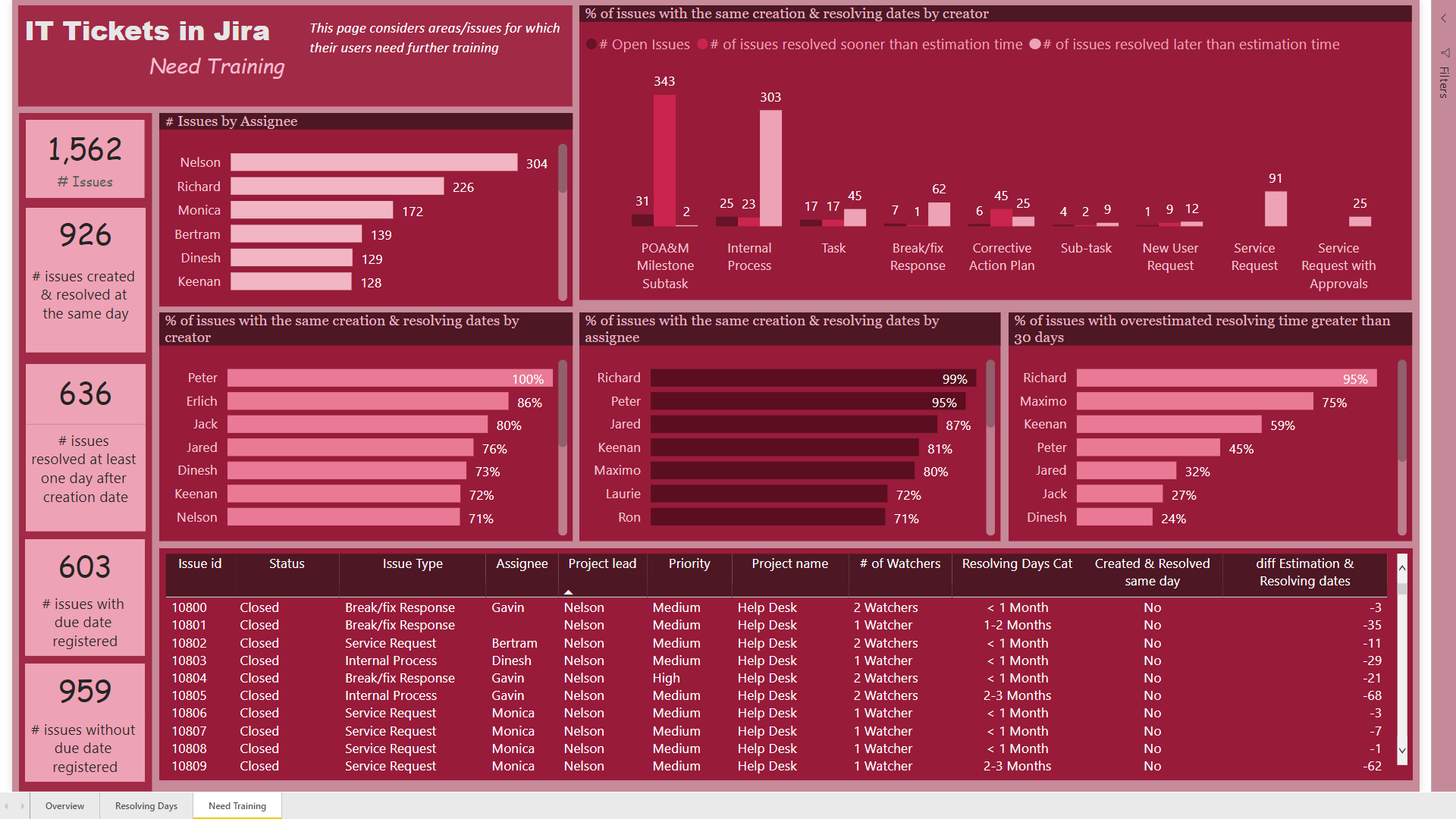
On the first page, “Overview” I just wanted to show some important and basic information about the whole process. Since the amounts of assignee column were emails, I decided to use “Assignee Names” instead of emails using query editor.
Using DAX I created “# of watchers”, “Resolving Days Cat”, and “Created & Resolved same day” measures using measure branching as follows:

# issues created & resolved same day = COUNTROWS(FILTER(‘Main Table’,DATEDIFF(‘Main Table’[Created],‘Main Table’[Resolved],DAY)=0))

Created & Resolved same day = IF( [# issues created & resolved same day]=1, “Yes”,“No”)

Resolving Days Cat =
IF ( [Resolving Days] <= 30, “< 1 Month”,
IF ( [Resolving Days] > 30 && [Resolving Days] <= 60, “1-2 Months”,
IF ( [Resolving Days] > 60 && [Resolving Days] <= 90, “2-3 Months”,
“> 3 Months” )))

# of Watchers =
IF ( ‘Main Table’[Watchers] = BLANK (), “No Watcher”,
IF ( ‘Main Table’[Watchers] <> BLANK () && ‘Main Table’[Watchers_4] = BLANK (), “1 Watcher”,
IF ( ‘Main Table’[Watchers_4] <> BLANK () && ‘Main Table’[Watchers_5] = BLANK (), “2 Watchers”,
IF ( ‘Main Table’[Watchers_5] <> BLANK () && ‘Main Table’[Watchers_6] = BLANK (), “3 Watchers”,
IF ( ‘Main Table’[Watchers_6] <> BLANK () && ‘Main Table’[Watchers_7] = BLANK (), “4 Watchers”,
IF ( ‘Main Table’[Watchers_7] <> BLANK (), “5 Watchers”, BLANK () ))))))


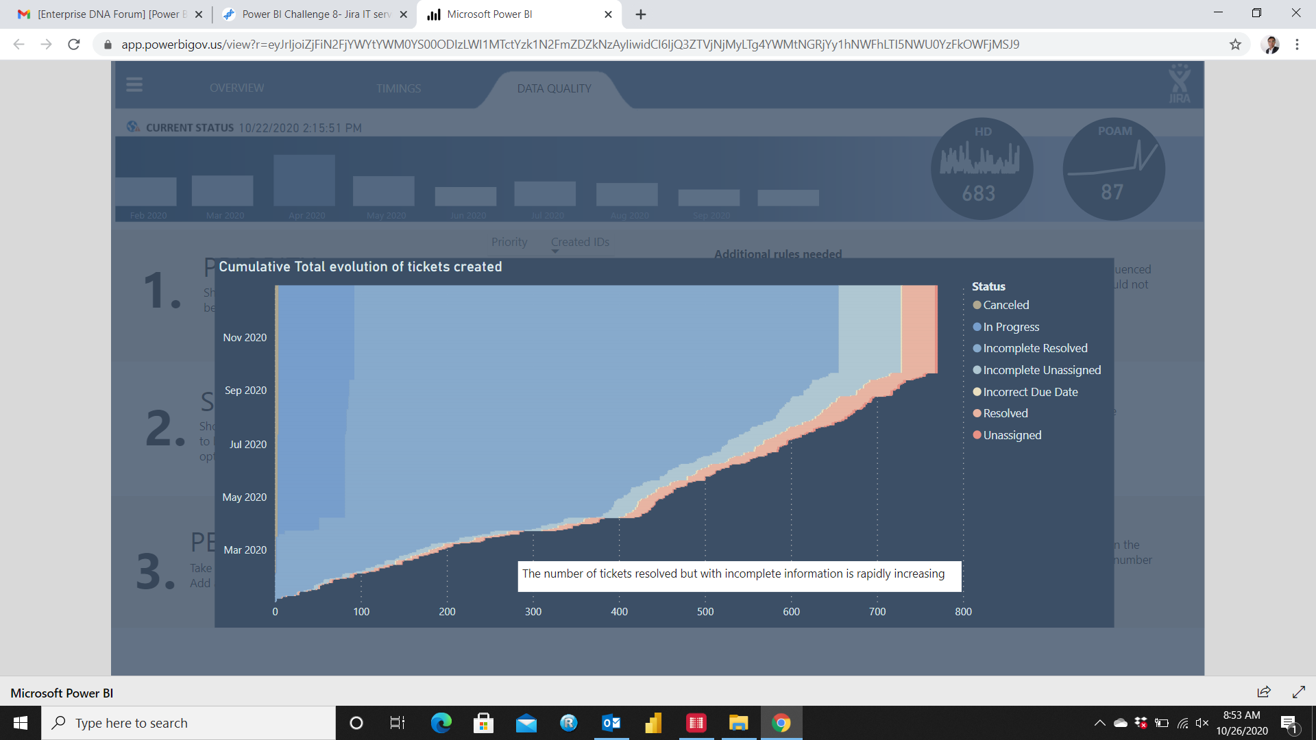
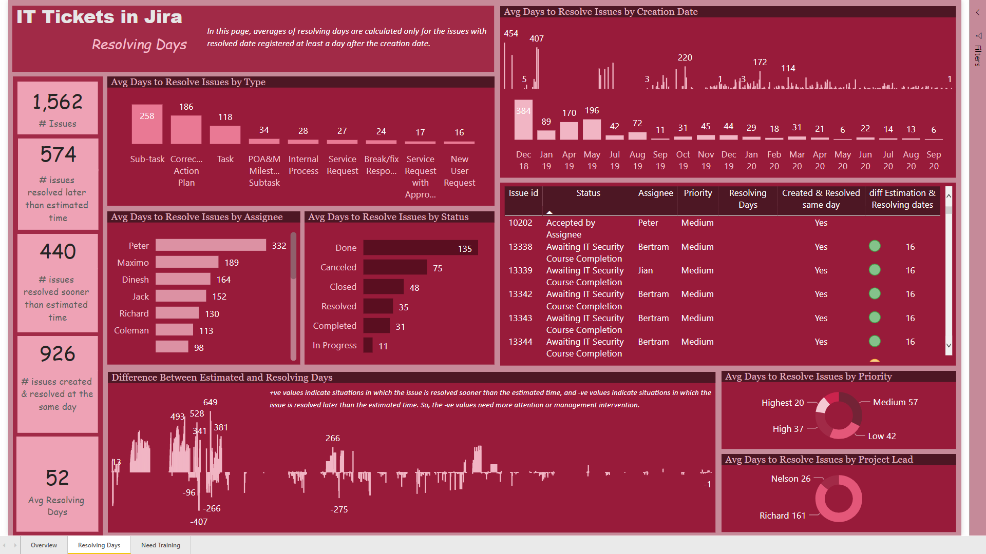
On this page, the graph showing the “Difference between Estimated and Resolution Dates” was so important to me, because I thought that maybe it can help the managers to find the problems with estimating the time an issue needed. I also used color circles in the table to categorize this measure into 3 different categories. If the estimated time was between (-30, +30), the color would be green, if it was greater than 30, the color would be yellow, and if it was less than -30, the color would be red.


Any feedback would be appreciated.
Best wishes
Hossein

Enterprise DNA Challenge 8th.pbix (288.4 KB)

9 Likes

Amazing report @MudassirAli ! And I am not talking only about the visuals/ colours/ navigation! The analytical side is impressive as well! Great job! Now I’m starting to be interested about using custom visuals/Charticulator as well :smiley:

4 Likes

@Hideo, I am a real fan of your reports ! Your reports are unique and I am starting to see your signature in this unique navigation you build. Very creative and intelligent. And it helps indicate the order of the steps an end user should follow.
Great for storytelling with data! :clap: :clap:

2 Likes

@datazoe, the design of this report is impressive! Especially the Slicer Panel, it is very inspirational! The navigation is fluide and intuitive, the visuals are so well integrated! The attention to details is also impressive! Discovering the data through your report was a pure pleasure! Great job !

3 Likes

@alexbadiu,

Thank you for your warm feedback. It took some time for me to understand this Jira IT data set as they are not consistent. I recalled myself your Challenge7 analysis “Refocus on the essential” trying not to lose the destination I should reach. It is important for me what and how the constant high performer like you are feeling to build excellent report consistently. Nice to hear from you who I believe has the most talent of creativity and diligence.

Regards,

Hideo

3 Likes

WOW WOW WOW!!!

Incredible work from everyone! Some of the techniques used and analysis generated are truly mind blowing.

A massive well done to everyone on your incredible reports.

I am looking forward to picking a winner :worried: .

Our community continues to blossom and with each passing challenge we are hitting some incredible heights.

The creativity on display is immense and real testament to the work you are all putting into the challenges.

#BestPowerBICommunityByFar

If you haven’t submitted yet there is still time, so please do so as soon as you can.

Once again awesome work , speak to you all soon on the wrap up.

Thanks,
Haroon

3 Likes

@Gifted I like the way you categorized by situation, project name and duration. This immediately highlights which project has the highest issues and take longer days to be resolved. One thing I would advise is to make the slicer as dropdown and use that space to include one more visualization for your analysis.

Good Work!!

3 Likes

@Neba Great Report and nice looking Key Findings Page. I guess White & Blue color really stands out. I have seen some videos about Calculation Groups in Tabular editor but haven’t really dived into that yet and you have made really good use of the editor.

P.S. This made me laugh really hard :smile:

1 Like

@bradsmith
Wow that’s one way to look at data. Really amazed how you came up with Average Age calculation. However, my only concern is that the report was expected in English Language :smile:

2 Likes

@MudassirAli , Thank you for your kind words. This is the first time I used calculation Groups and they are awesome. Especially for Time related calculations using the same measure like Sales LY , LM , LQ etc… .

BTW I was watching some YouTube videos about Charticulators after I saw the discussions about them in the Forum. Interesting stuff.

P.S. I can’t wait for your interview with Sam on your work.

Nebiyu

2 Likes

Really, really love the report @datazoe . The EDNA Challenges are really fantastic inspiration. Really love how the Challenges take you through from the basic data all the way through to a final report, the write ups are absolute gold dust. I’ll hopefully set aside some proper time to complete the next challenge.

3 Likes

@alexbadiu
Your reports always have one thing constant and that’s Elegance , combined with great analysis, navigation, interactivity and last but not least the ability to narrow down the scope to focus on the root cause has always been the highlight.
Really good use of the colors in this one and love how you placed the charts inside the circle shape. The one that says HD, actually looks like HD (High Definition) :smile:
This one is Special:

If I am not wrong, this is the Area Chart right?

2 Likes

For the topic modelling? Oh I just chose English because that’s my native language haha plus, then I could use the same module in Python for the k-means clustering, topic modelling, and anomaly detection.

I hadn’t thought about it before but… I could probably have it detect the language the program is using, return that as the corpus language, and perform the same calculations… but I’d only be confident in being able to validate the findings if the language was either English, French, Italian, Spanish, or Mandarin as those are the only ones I am comfortable speaking and thus building a quality corpus. I have some experience with Russian and Arabic, but not enough to be able to validate my findings or tune the model. If I had a native speaker of whichever language though I could replicate this process for any language. Technically though, the script is using unsupervised learning… so as long as I had a corpus for whichever language then I could do the same for any language…

Sorry, that was just me thinking out loud haha I really like that idea so I was trying to think out how to do it. Essentially I could make it compatible with any language.

3 Likes

@bradsmith LOL Good ONE!
The terms and the types of analysis you have used are new to most of us. We will have to dig in deep to understand what you have done and how you have done. Waiting for your write-up though :+1: :+1:

1 Like

Thank you for your feedack @MudassirAli!
The graph you pointed out is actually a simple stacked bar chart using Cumulative Totals of tickets created and status on legend.

2 Likes