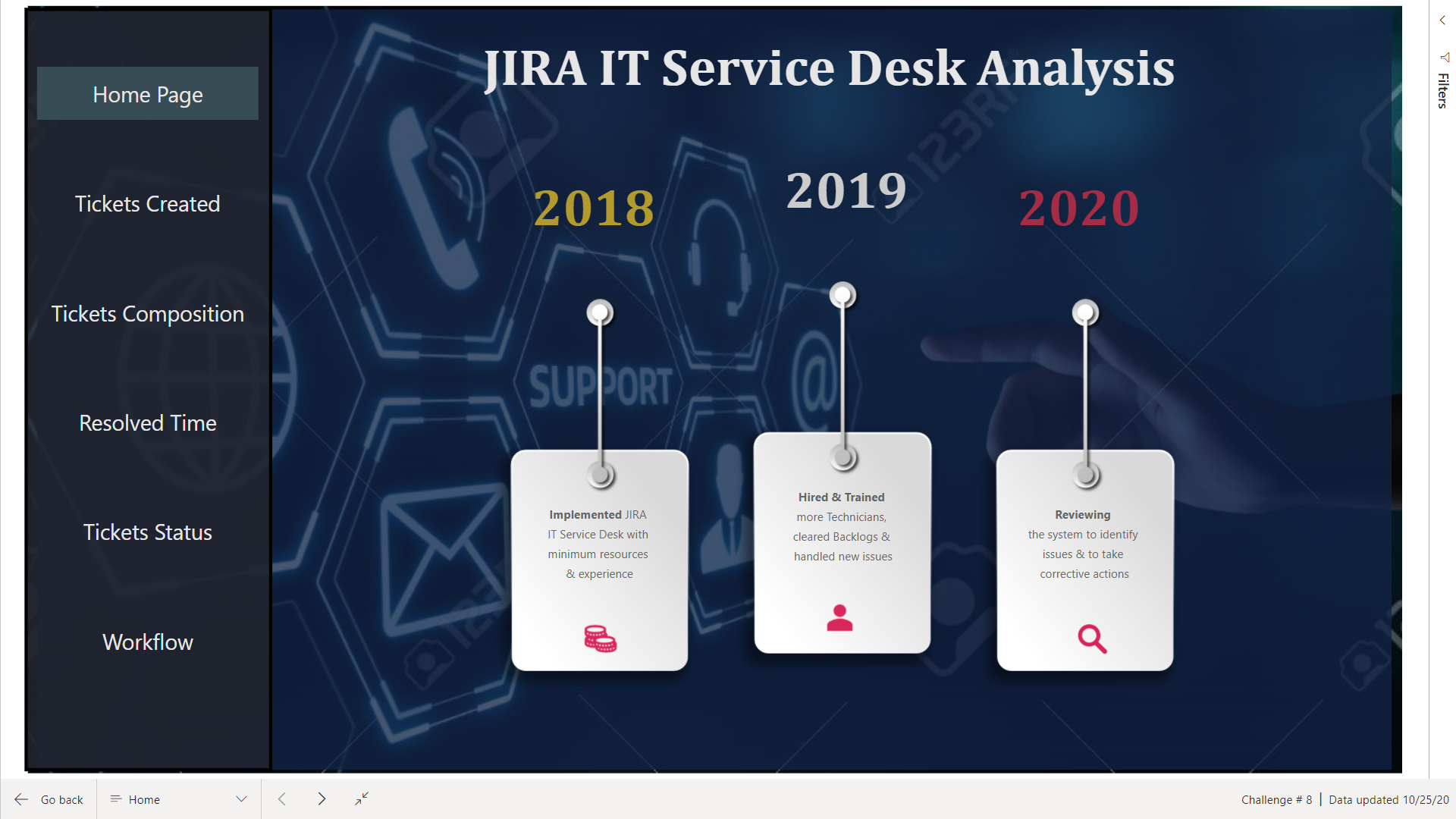
Welcome to the World Of Charticulators
Here is my submission for Challenge # 8
Finally managed to complete the report. Some visuals took days to complete and it was really a Rollercoaster ride.
Using The Report
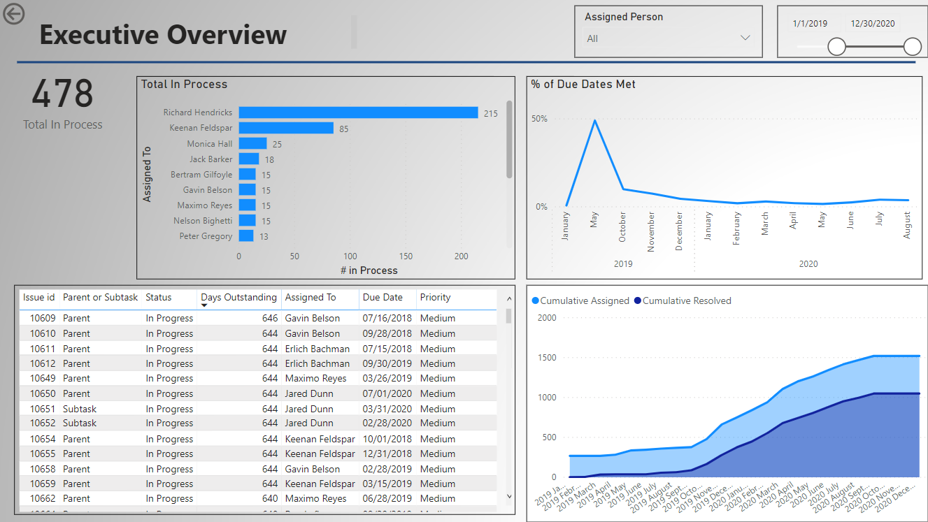
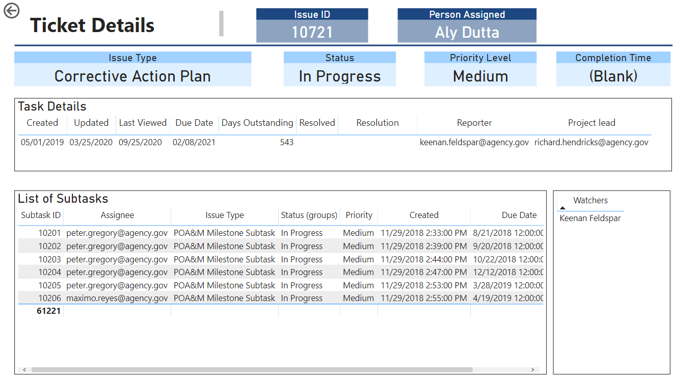
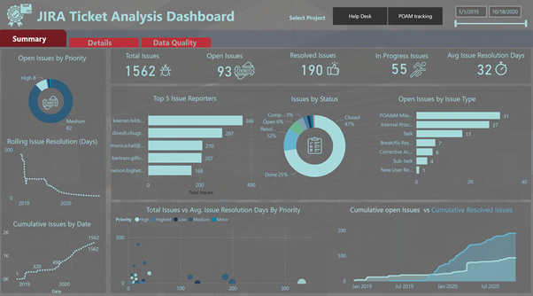
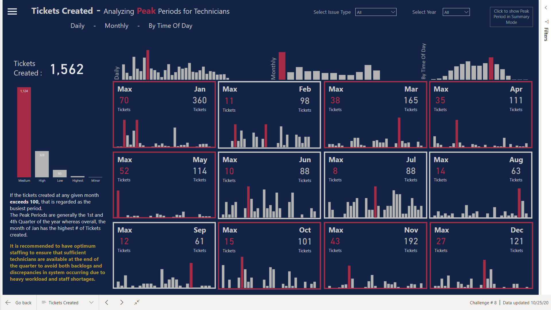
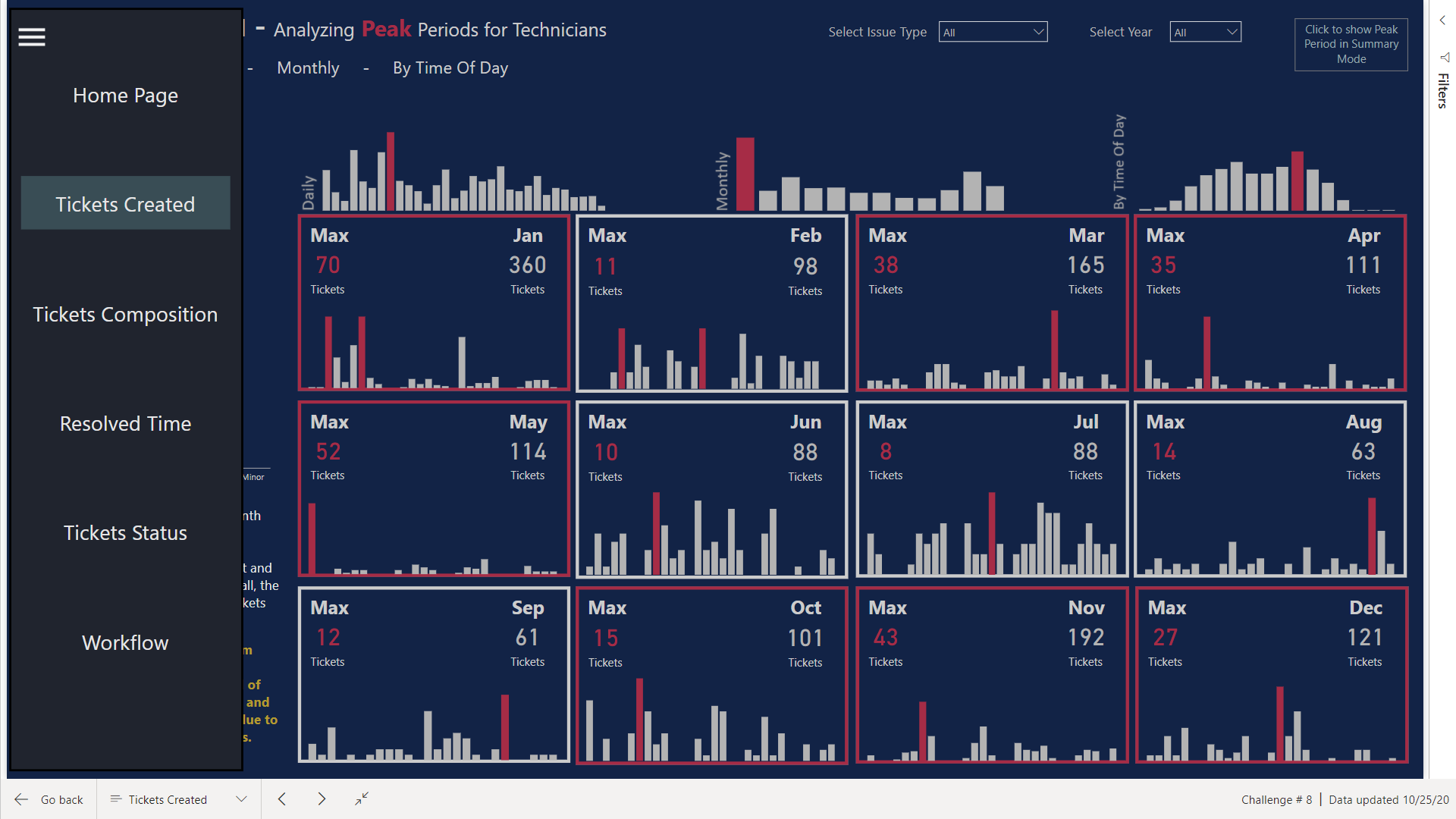
Tickets Created
I tried to build the flow of the chart by first analyzing what Peak Periods are. I tried to show the Peak Periods by Time of Day also so management has the idea as to what time of the day are the busiest for Technicians. You can see that Borders of the Calendar looking visual are Red for some but Grey for others. I made an assumption that the # of issues more than 100 in a month will be considered as a busy period. Therefore, the Borders will turn Red Dynamically whenever the # of issues are more.
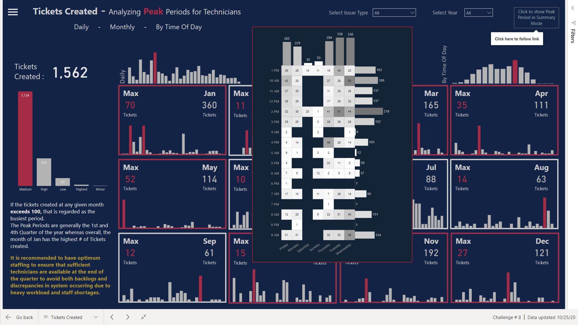
Moreover, If you click on the top right corner, heatmap looking table will pop up giving the summary of Peak Times & Days.
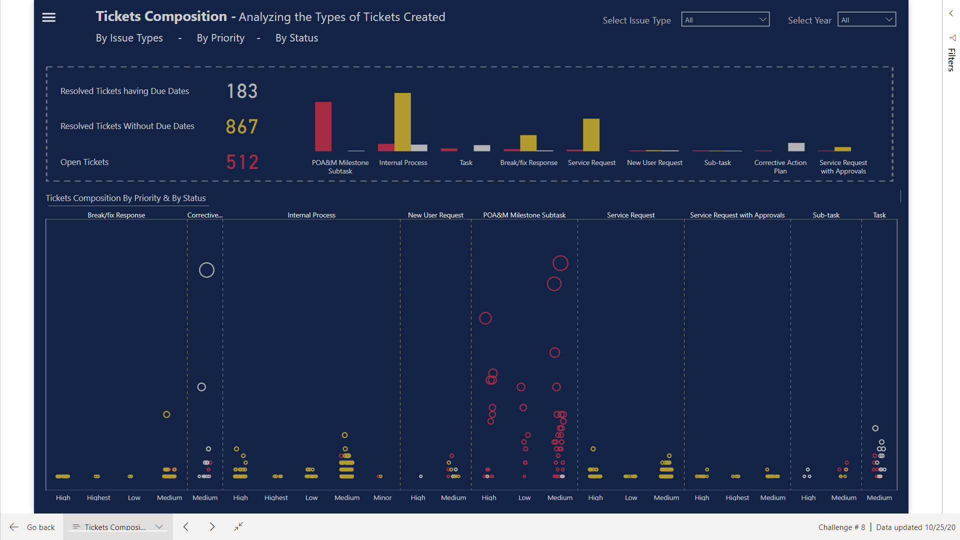
Tickets Composition
Here I have used the Dot Plot Visual to show the # of Tickets Created, segregated by Priority and highlighted by the Status of the Tickets.
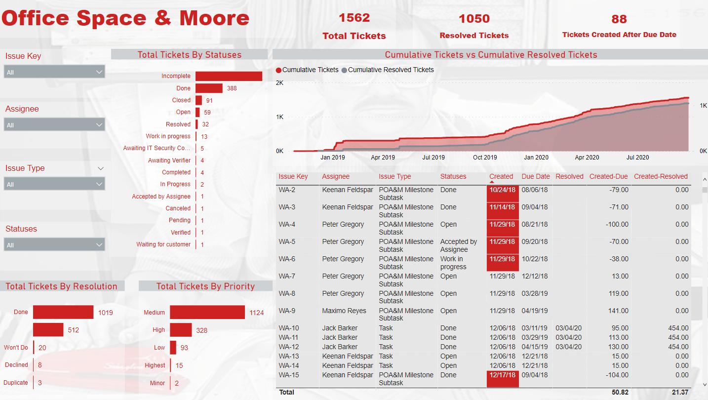
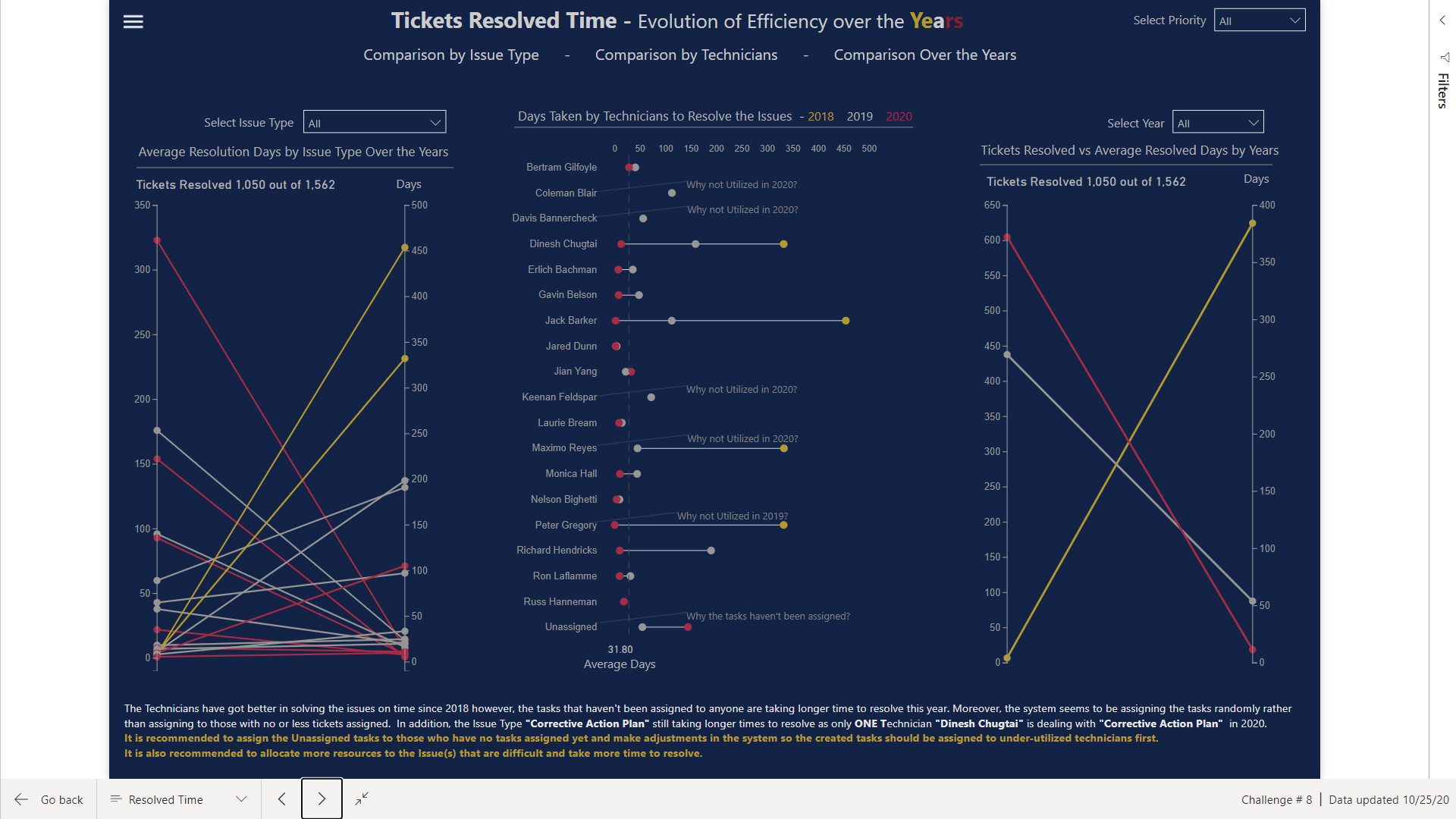
Tickets Resolved Time
The # of days taken to resolve the issues are highlighted here divided into years. The visual itself conveys a lot of information but I have also marked some items for management to analyze.
There were some items whose Created Dates were higher than Due Dates so here I assumed that Created Date column was valid as we already are facing issues with recording of Due Dates in the system
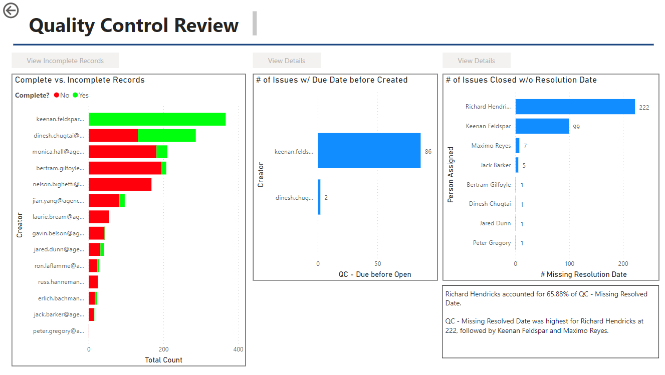
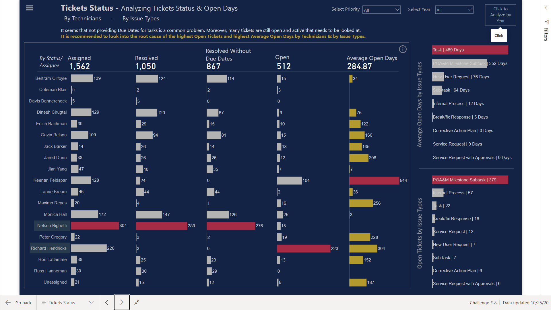
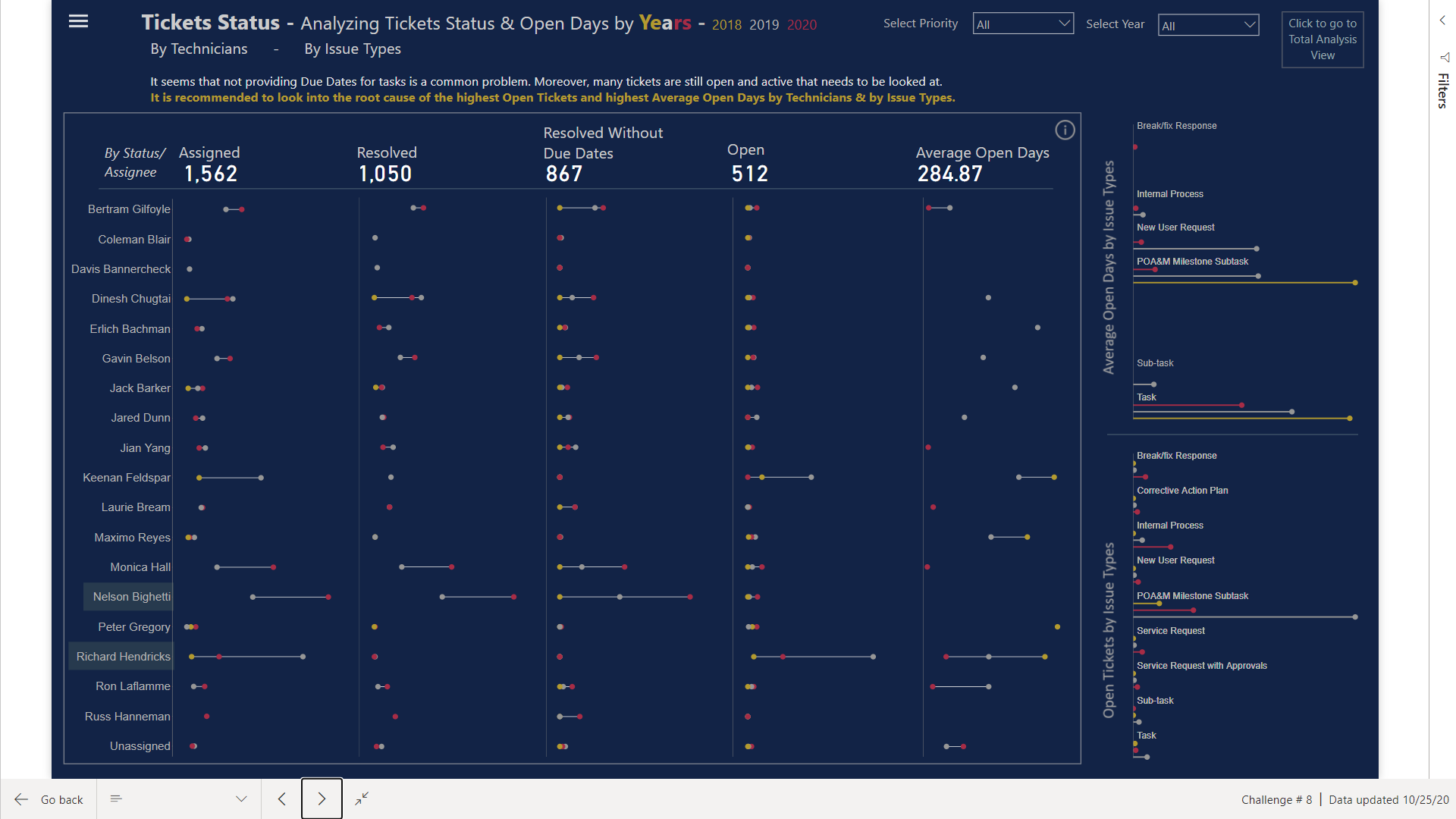
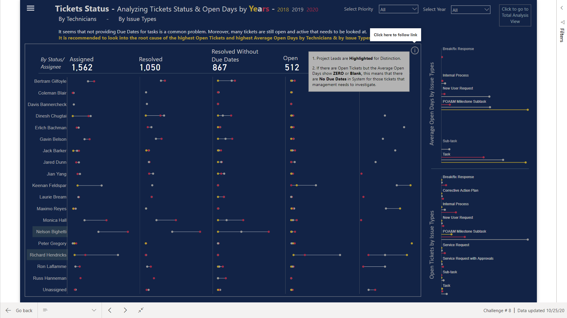
Tickets Status
Here I have converted the table into Bar Chart looking Table that can easily highlight the issues. I have used OPEN DAYS ** term that actually means Active Tickets & Active Tickets Days.
If you click on the top right side, analyzing the Status Trend over the Years will be much more easier with the use of Dumbbell & Lollipop Charts
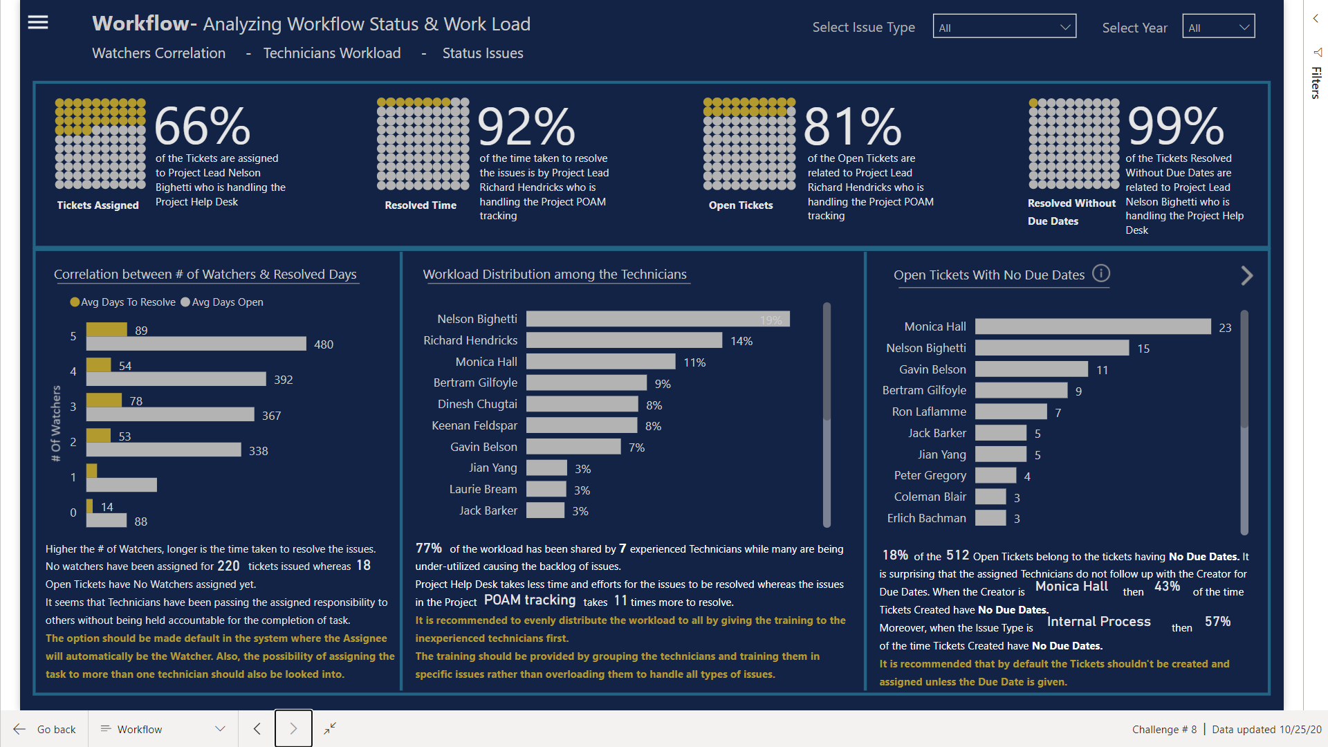
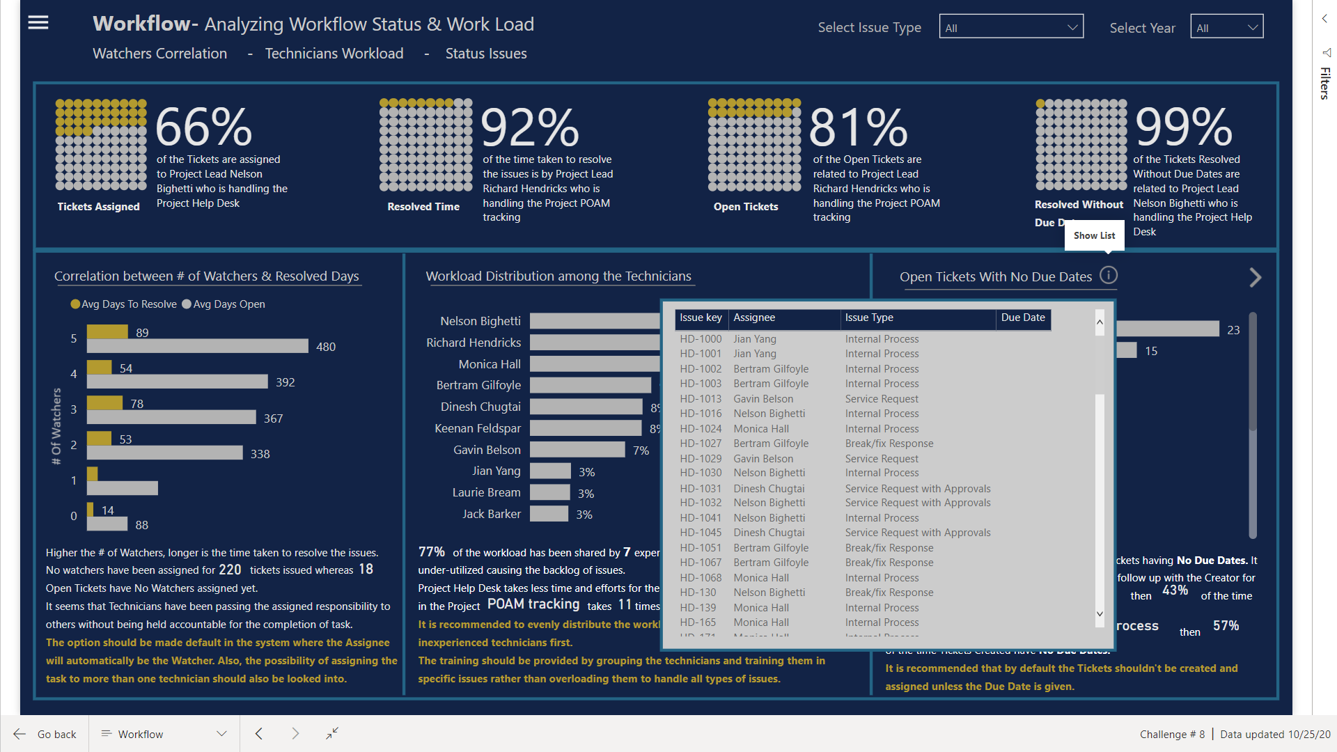
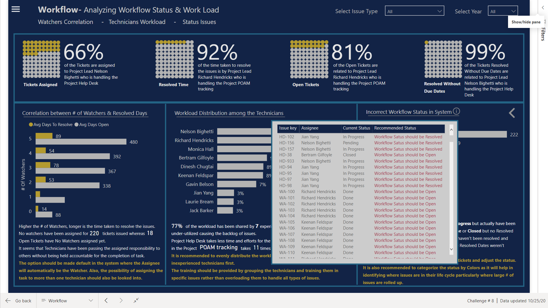
Workflow
At the end the system issues and allocation of resources are highlighted.
Here I have used Waffle Charts instead of Card visual as Waffle charts are perfect for comparison between 2 categories.
Visuals Used
Native Bar Charts
Native Column Charts
Dot Plot by MAQ Software
Enlighten Waffle Chart by MAQ Software
Dumbbell Charts designed in Charticulator
Bar Charts designed in Charticulator
Lollipop Charts designed in Charticulator
HeatMap designed in Charticulator
Slope Charts designed in Charticulator
I know I haven’t explained much as I am exhausted and have to get prepared for the grinding starting tomorrow. I haven’t worked so hard before in completing the project but now I feel satisfied as we can have Tableau looking visuals in Power Bi too 
This past 2 weeks have been a great learning experience, diving into R scripts, Statistics and Charticulators.
Thanks @BrianJ & @AntrikshSharma for your help along the way.
Thanks @haroonali1000 for coming up with the right dataset at the right time 
P.S. Charticulator is not easy when you are trying to design visuals and to make it work with the report design but custom visuals communicate way too much information than native PBI visuals.
With the help of @BrianJ, here is the link to the report