Hey @datazoe , Thank you for your kind words. I saw your beautiful report too. Great choice of colors.
![]() I am trying to break the curse too. I am inspired now. Note to self :- don’t be afraid of colors.
I am trying to break the curse too. I am inspired now. Note to self :- don’t be afraid of colors. ![]()
@Greg This is such a good looking report, and I love those ring charts (and was super sad they didn’t work on the publish to web version). I may have to try and create them in https://charticulator.com/. The way the data is presented is clear and clean, and I love the arrow through the report in the top left.
Hi @Brian … thanks for your kind words. I’m honoured by the your comments and those of others. Thanks for your questions; here’s some more on your questions:
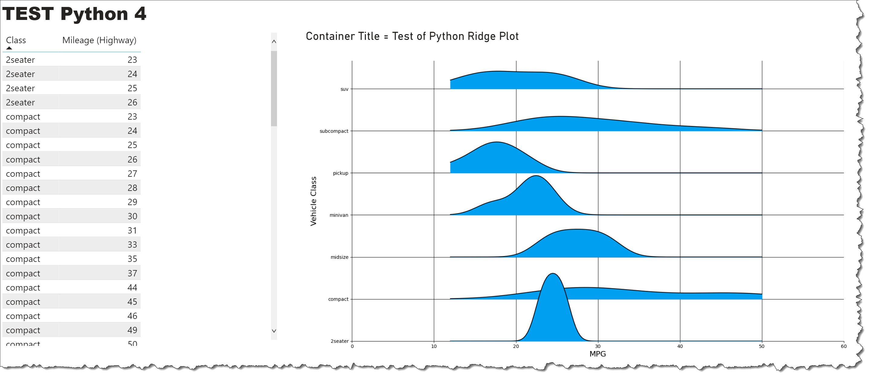
(My plan is to keep working on this on my own time, as I’ve invested a lot in trying to understand and implement it, and think and hope I’m close to being able to show [from the C8 dataset] date on the x-axis, total issues on the y-axis, and project on the “z”-axis (i.e., one “ridge” per project)
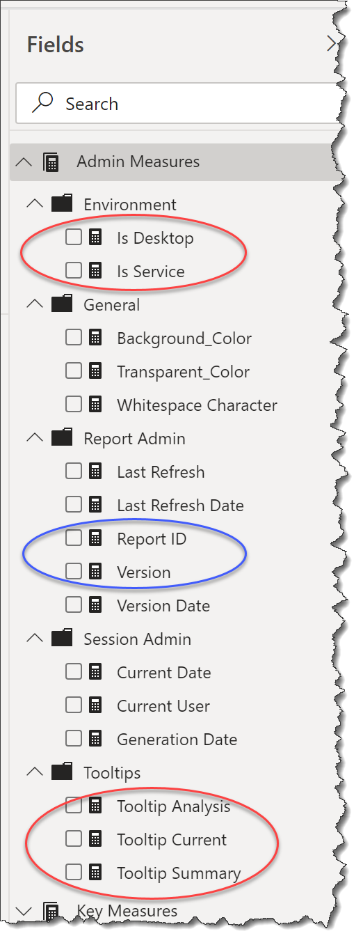
I used the following two measures to give me a TRUE if the report was being accessed in the stated environment:
Is Desktop =
IF( NOW() <> UTCNOW(), TRUE(), FALSE() )

Is Service =
IF( USERNAME() = USERPRINCIPALNAME(), TRUE(), FALSE() )
(My understanding is that the best practice is to always use the USERNAME() to USERPRINCIPALNAME() check to determine environment, but this check doesn’t seem to work properly on my local, hence the “hack” with checking a difference between the local time and UTC time [I know this falls down if you’re located in the time zone where local time = UTC, but was a quick-and-dirty way forward].)
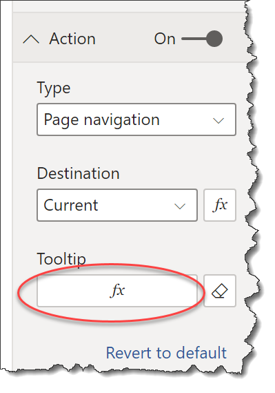
I can then branch from these measures into my tooltip text, like:
Tooltip Current =
SWITCH( TRUE(),
    [Is Desktop] = TRUE(), "CRTL+click to go to the CURRENT page...", -- tooltip for Power BI Desktop
    [Is Service] = TRUE(), "Click to go to the CURRENT page...", -- tooltip for Power BI Service
    BLANK()
)
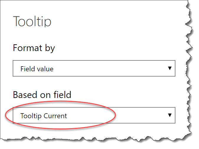
and then use the measure as the “field value” in the tooltip
Report ID = "SD007"
Version = "V1.2"
These two measures were then used in a narrow multi-row card and placed in the bottom-left of all report pages. (I used them on the report Info Tooltip page as well.)
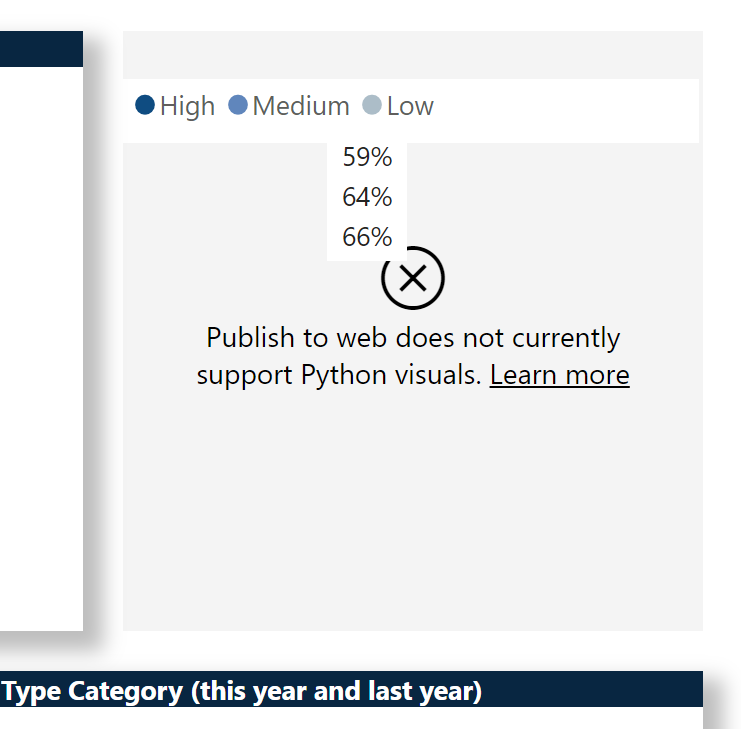
Thanks so much for your kind words @datazoe. I’m a bit puzzled by the ring chart not displaying properly for you … all my screenshots were taken from the service and the ring chart works there for me in the service, there’s just a lag of a number of seconds (about 6 seconds for me) while Power BI exports the data and redraws the Python visual (not ideal, and I’m sure there’s an admin setting to improve this, but I’m still in the infancy of my learning).
Perhaps Python needs to be installed on the workstation viewing the report? (Although this seems unlikely as Microsoft has usually handled something like this.)
Thanks again,
Greg
So wonderful and also all the text to the model and submission. Thanks.
Dear all
Here comes my submission.
Link PBIX fil: Challenge 8 - Data From Jira IT service Desk Analysis.pbix (367.1 KB)
The Challenge was delivered in one Excel sheet.
Started to orientate me in all the columns and what it means. BrianJ shared a link from Jira, what the difference columns means. https://innovalog.atlassian.net/wiki/spaces/JMWEC/pages/108200050/Standard+JIRA+fields
The task was given in the Brief.
I had two goals.
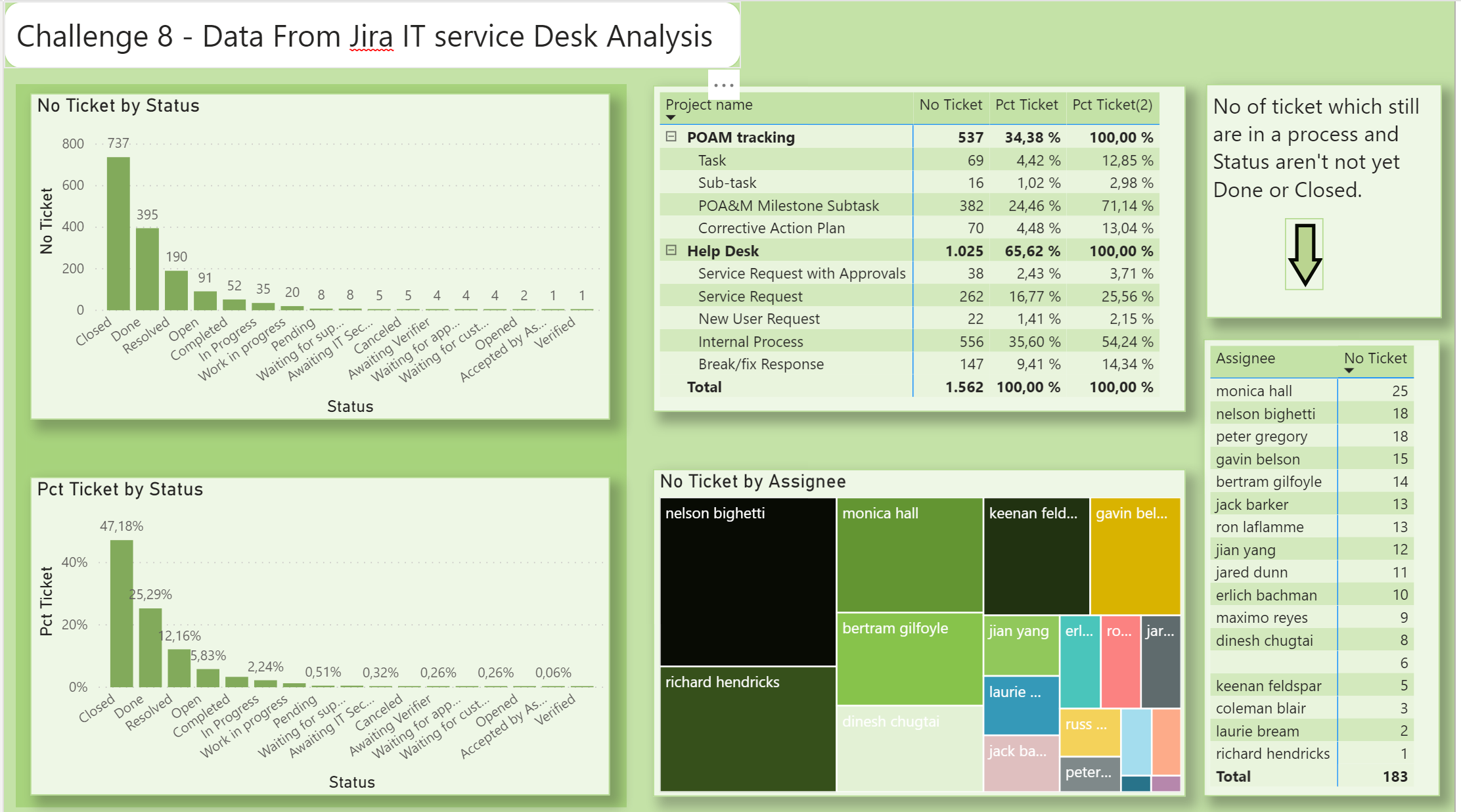
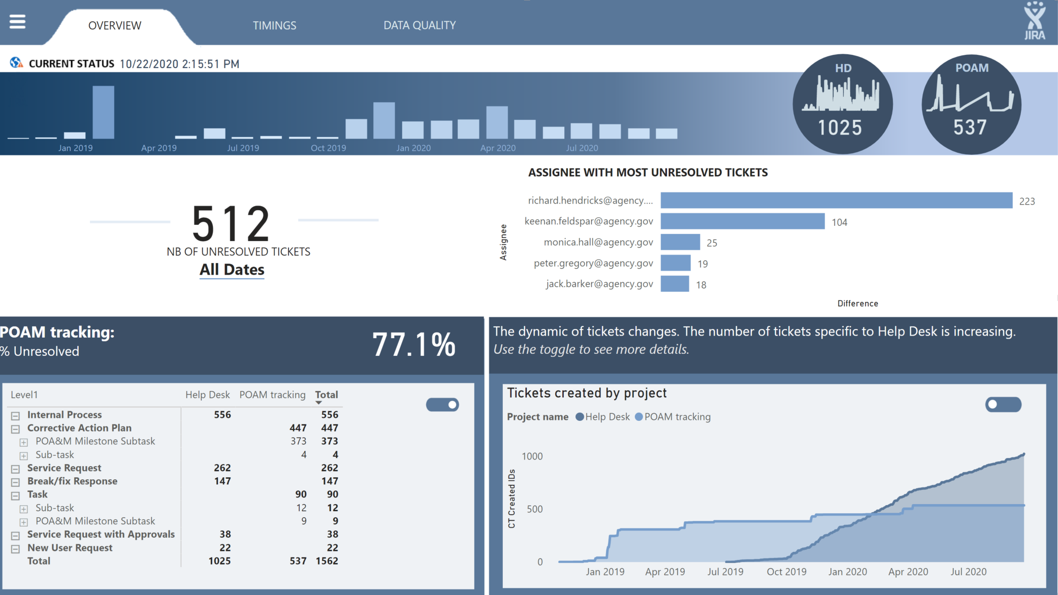
First goal - page one.
Give an overview of the tickets and shows the status grouped from closed ticket and ticket in a progress. Show on which type of task the tickets regards. Tickets which isn’t closed yet and on whom supported the open tickets are allocated to.
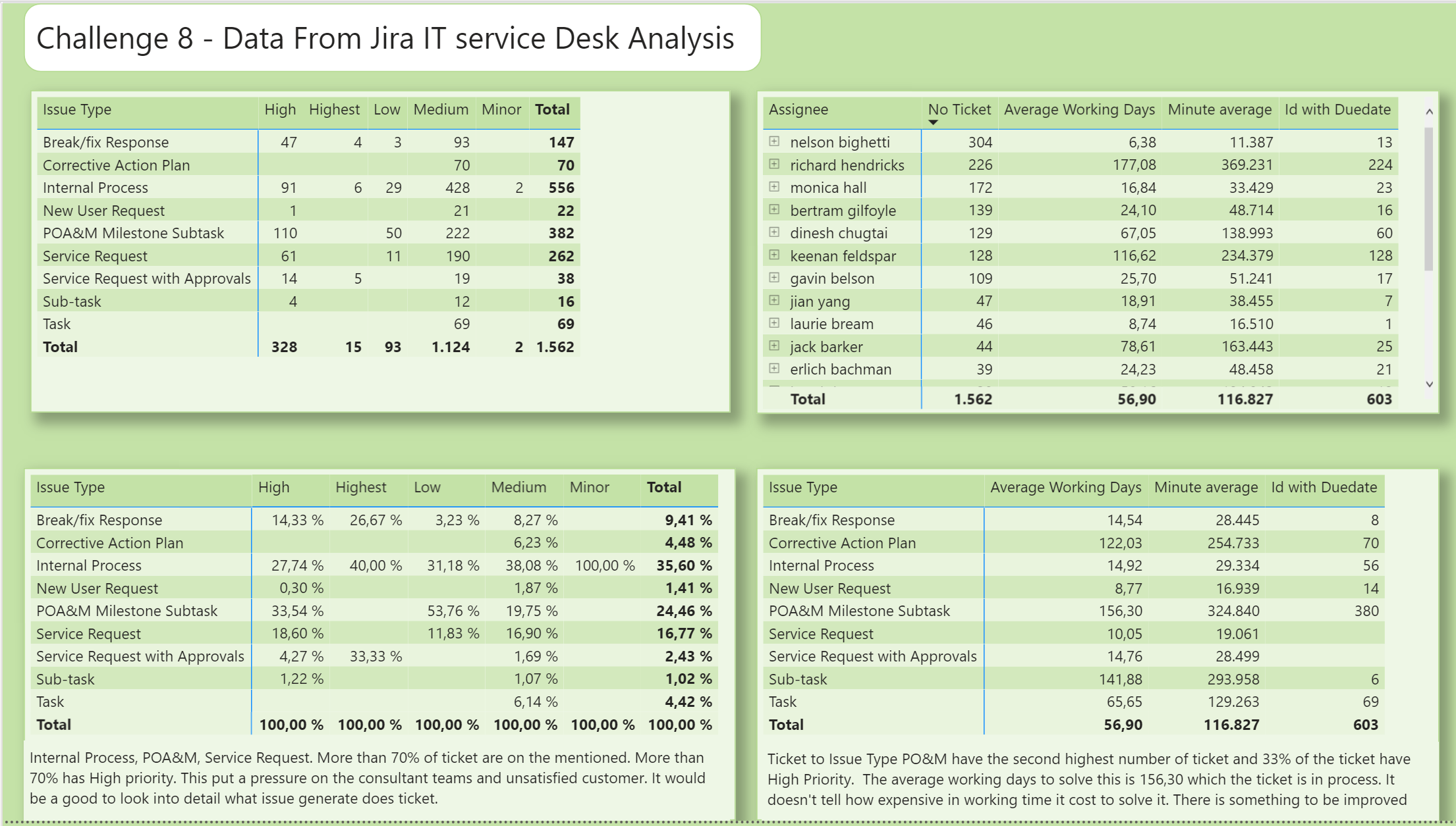
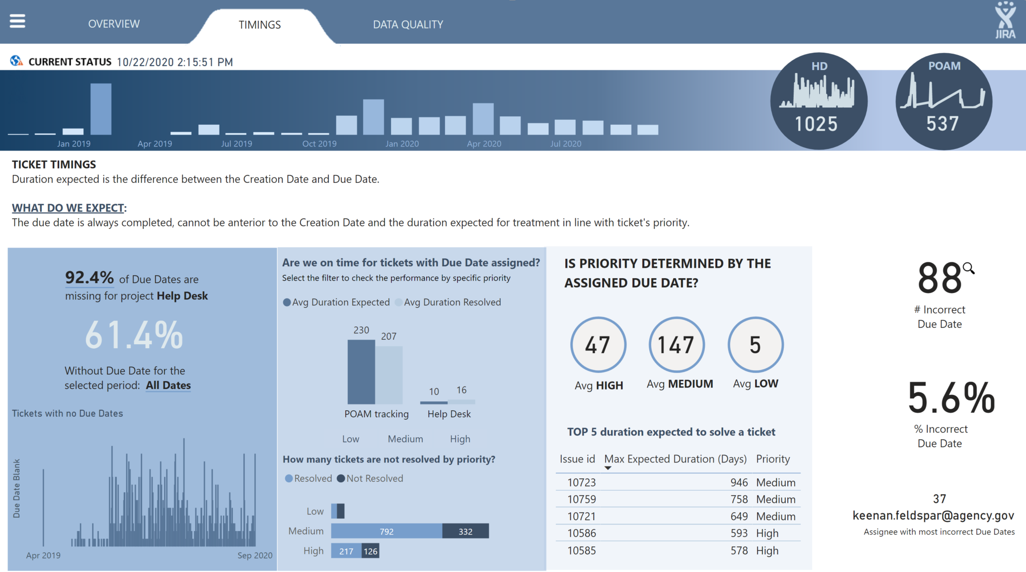
Secund goal – page two.
How are the tickets type divided from high to minor priority both in number of tickets and in percentage.
Then also to show how much time is used on each tickets. It doesn’t tell how much time there has been used effective on the tickets but tell how much time has gone from case opened to the case is solved/closed.
The purpose for this page - Analyze – so the management can see where the support team use their time and on which type of cases. In that way the management have information to dig deeper and see what there can be done to reduced the number og tickets.
Measures:
Number of tickets
Divide the type of #tickets in the two project names Help Desk and POAM tracking:
Pct Ticket(2) =
VAR _AllCountTicketIssueType =
CALCULATE (
[No Ticket];
REMOVEFILTERS ( Jira[Issue Type] ) //Remove the filter on “Issue Type” to get 100% of the subtotal “Project Name”
)
RETURN
DIVIDE (
[No Ticket];
_AllCountTicketIssueType;
0
)
Average working days, from the ticket was opned and it solved and closed.
#tickets solved after Duedate. Not all tickets have been opened with a duedate
Average minutes has gone from opened the tickets and closed.
Powe Query:
Only done some minor change. Column name and removed the “@” on the supporter name.
Hello everyone!
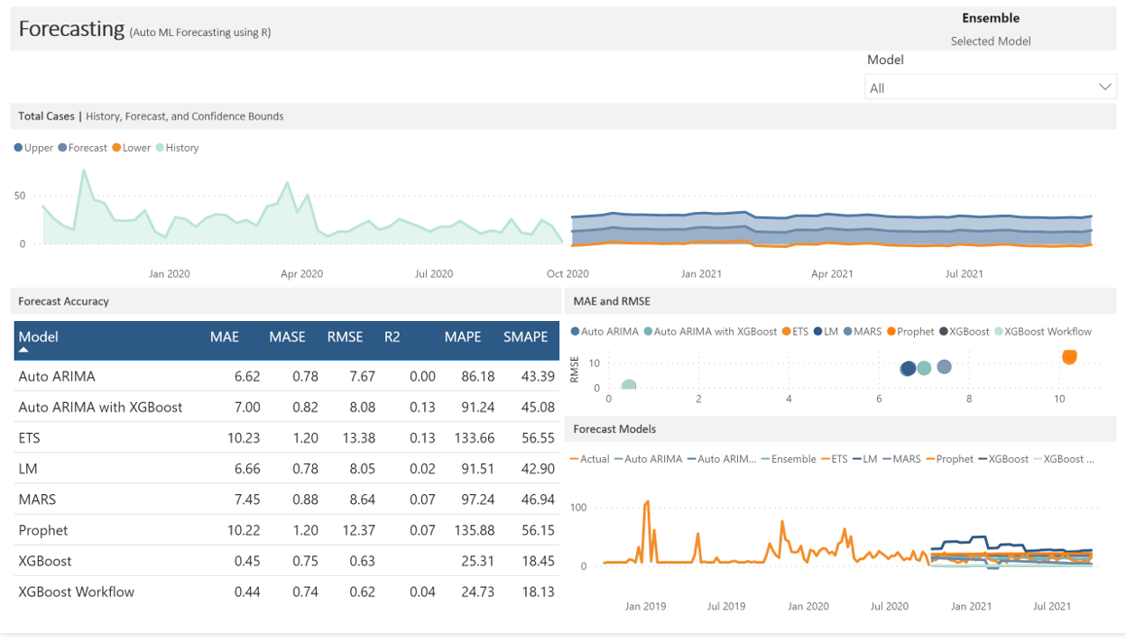
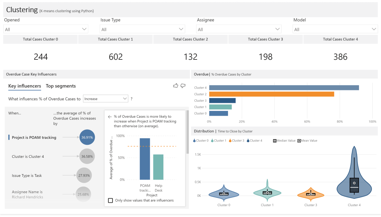
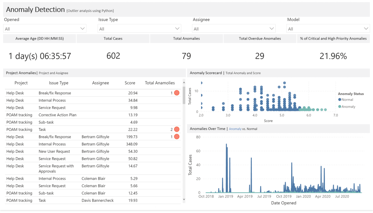
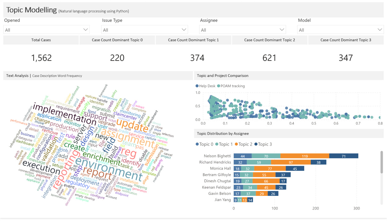
For my submission I added an additional “Description” field which is common in Jira tickets, but primarily limited the use of this field to the topic modelling report. There’s several machine learning algorithms in this report:
If R or Python visuals had the same interactivity/reactivity and all the features that they do using Shiny or just in standard R visuals then I’d have had these done live, but so that I could fully take advantage of Power BI’s visuals and suite of features I had Power Query run the scripts.
This is just the second draft of the dash and I’d want to go through another round of development before presenting it to a client/project lead, but I think it came out pretty good. I’d want to at least add some navigation features, tune the ML algorithms, and optimize the performance, but I’d need to understand more from the client/project lead before I could do that.
@Neba - love the report, the layout and the color scheme. The switchboard has a nice user interface. Great job!
-Tim
Hello all,
Challenge number 8 was very interesting . I never worked with JIRA data before but I think it is an awesome use case.
The most challenging part for me was to find a way to communicate a lot of information/analysis in an interactive, simple and comprehensive way (and in the right order). I explored and tested different ways of presenting this data in the last 2 weeks.
In the end, I decided to use some simple visualizations and bring value with the use of interactions. Doing so, I tried to avoid pushing too much information to the user and lose his/her concentration. I m trying to let the user discover the data, the messages, at their own pace. For this I am trying to build a framework where there is a lot of flexibility for user analysis.
In my quest to simplification, I used for this report only 1 page and used bookmarks
Please find below my submission for challenge number 8.
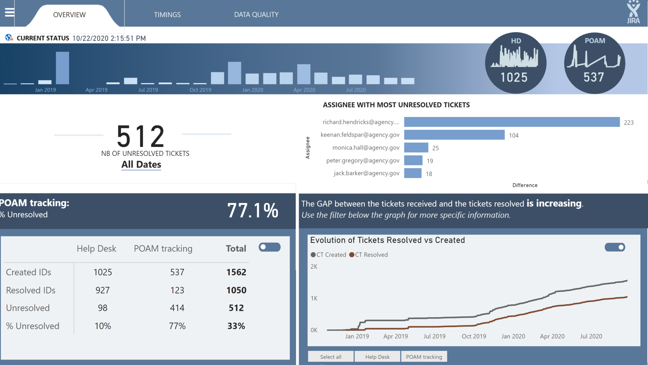
Toggle Activated below left
Toggle Activated below right
Page 2 - Timings
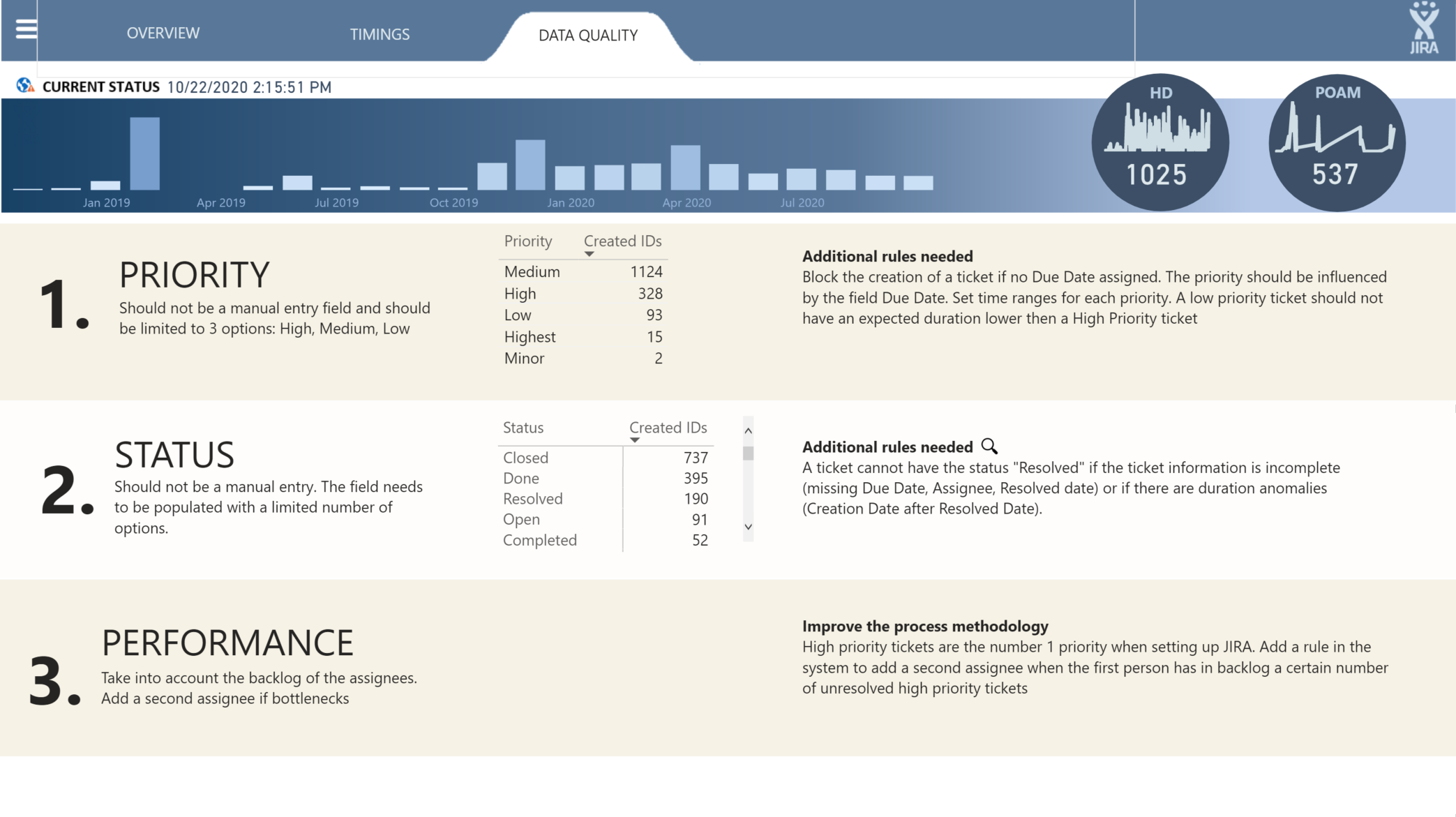
Page 3 - Data Quality and Recommandation
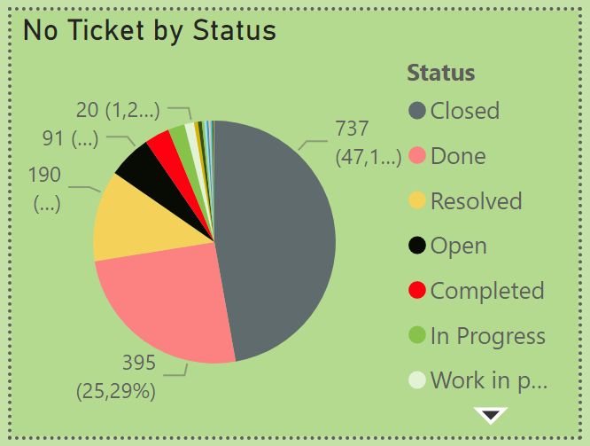
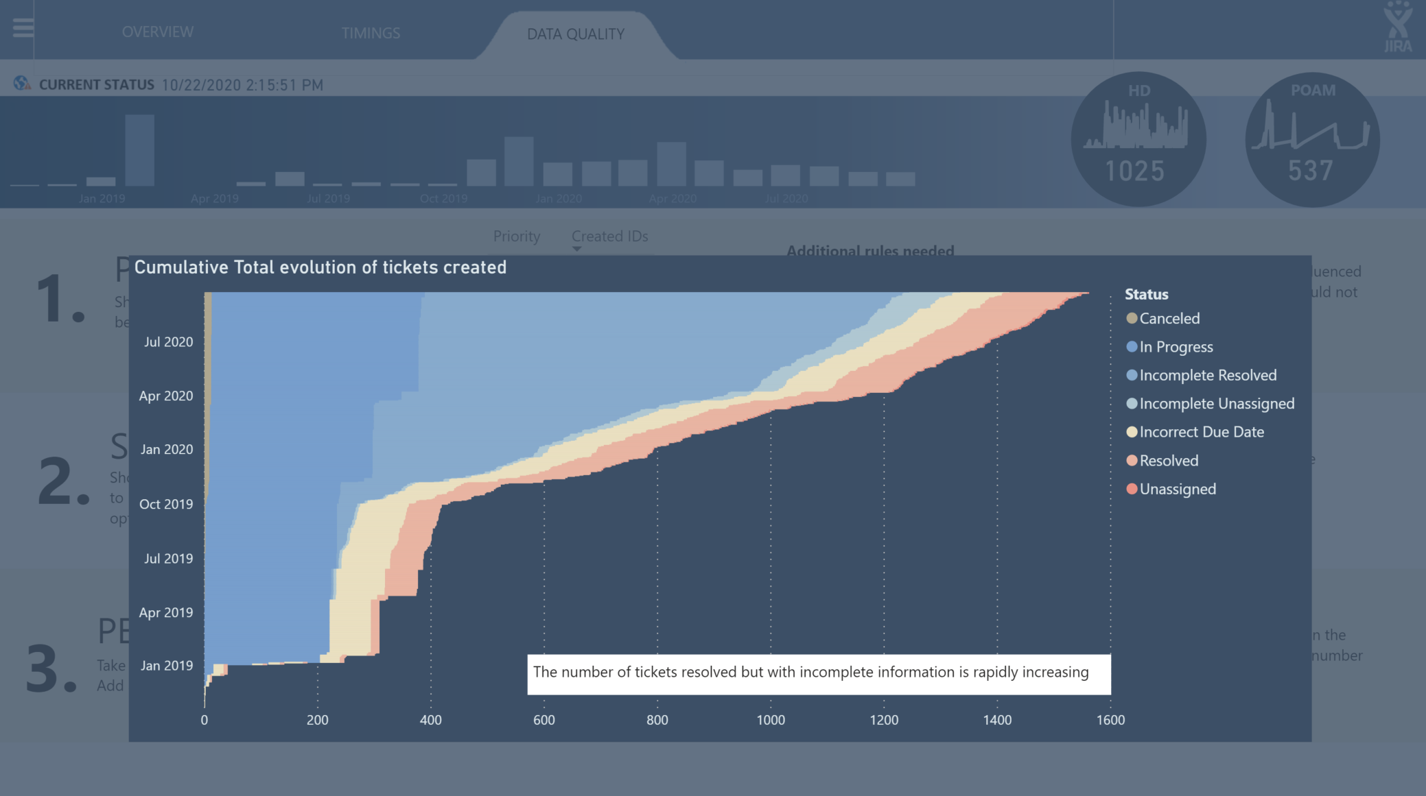
Zoom on Status
Wow, this is amazing! Looks fantastic, and a lot of techniques I’ve never seen used in Power BI before. Can’'t wait to see your full writeup to better understand how you did some of this.
BTW - spot on re: the Description field. I anonymized this data and there was simply too much PII in that field, so I had to remove it.
Phenomenal stuff. 
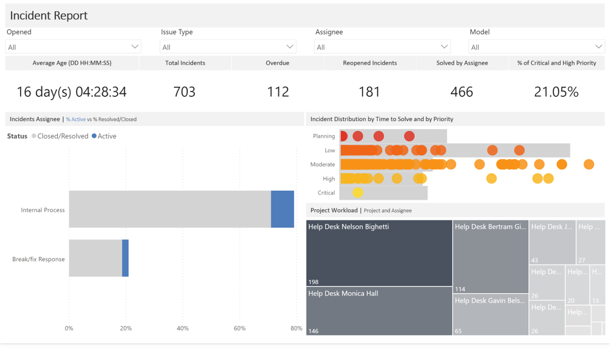
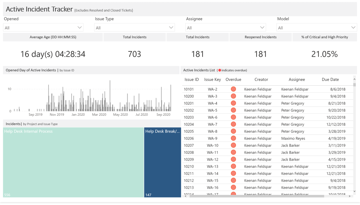
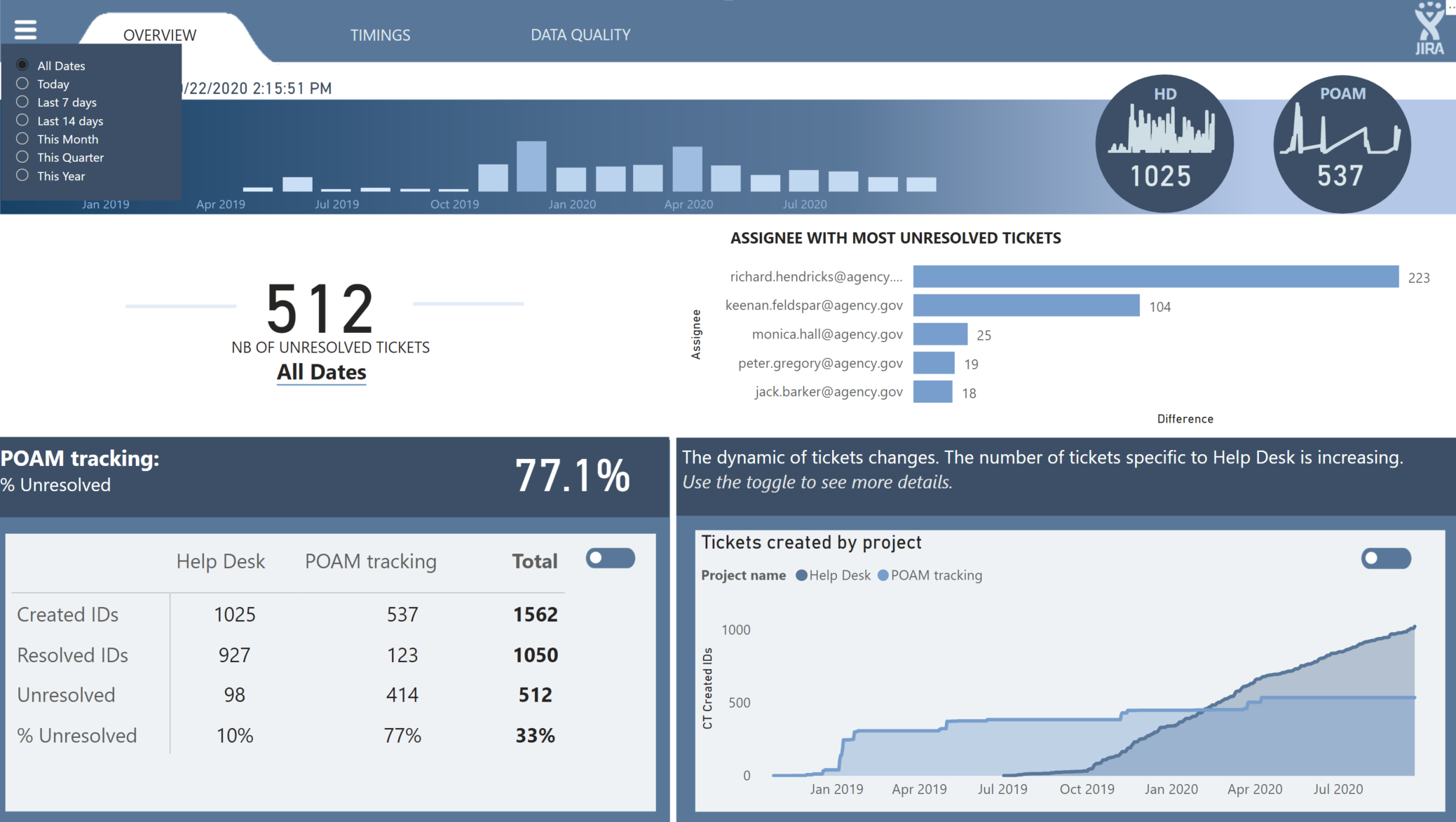
@bradsmith Wow so many cool visuals you used there! I love the layout too! How did you do the Average Age like that?
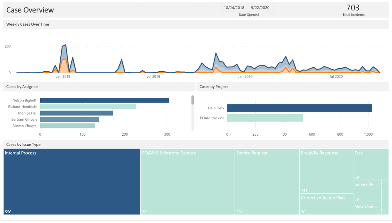
@alexbadiu such a cool design, love the tabs and the gradient bar with the circle kpis, the toggles, so many cool features!
I actually was surprise I was able to get that to work haha I could have done it with one measure, but I ended up using two: Time to Close (seconds) and Average Age (DD HH:MM:SS). That way I could use the Time to Close measure in other measures.
Time to Close (seconds) =
// Calculates the difference in seconds between opening and closing.
CALCULATE(
AVERAGEX(JIRA, DATEDIFF([Created], [Resolved], SECOND)),
FILTER(JIRA, [Resolved] > [Created])
)
Average Age (DD:HH:MM:SS) =
// Transforms time in seconds into DD HH:MM:SS format.
// Formats time in seconds into days
FORMAT(
ROUNDDOWN(
CALCULATE(
AVERAGEX(JIRA, [Time to Close (seconds)]) / 86400
),
0
),
“d”
) & " day(s) " &
// Formats time in seconds into hours, minutes, and seconds
FORMAT(
CALCULATE(
AVERAGEX(JIRA, [Time to Close (seconds)]) / 86400
),
“hh:mm:ss”
)
@Greg this is a machine I just reset a couple days ago so I don’t have python installed yet, so here is what I see:
I installed Anaconda and then took another look, and still see the same. So then I clicked the link on it, which went to https://docs.microsoft.com/en-us/power-bi/create-reports/desktop-r-visuals
So I installed R ![]() And it still doesn’t work for me.
And it still doesn’t work for me.
Hi Everyone - attached is my submission for the challenge.
(Unfortunately I have a work account so am unable to publish this to web. If there is way to publish this, I would love to as it’s impossible to see the buttons in action)
Features I tried this time:
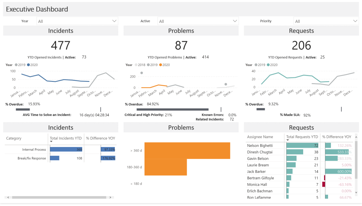
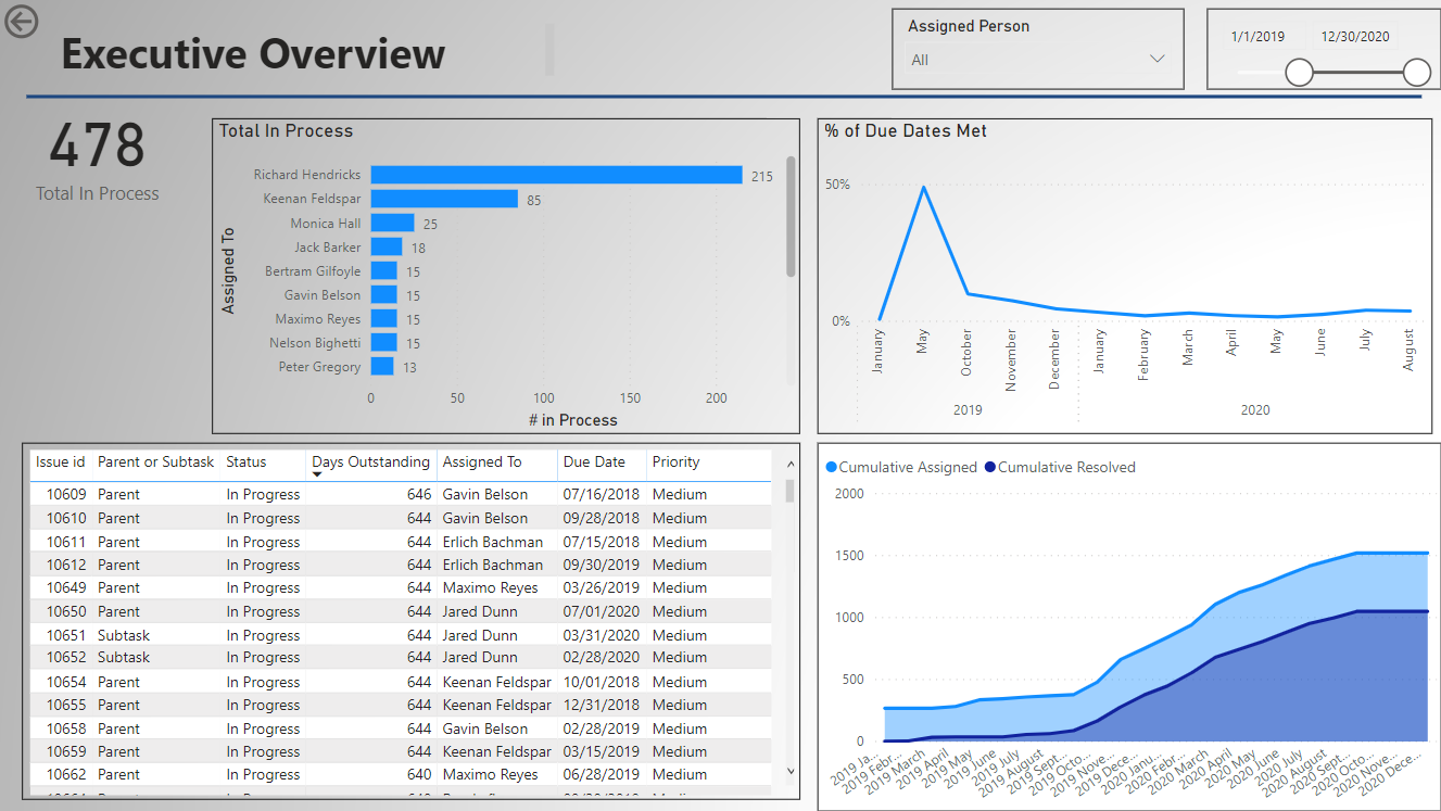
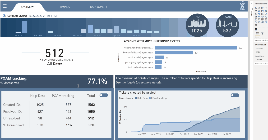
Executive Dashboard – a quick overview
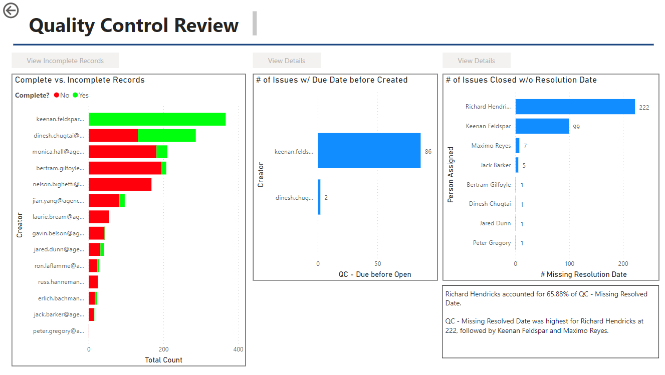
Quality Control Dashboard – to provide quick information on three key areas
1.Incomplete records (no due date)
2.Tickets with a due date before a creation date
3.Tickets closed without a close date
(The green text boxes indicate the # of records in this area and will update if an individual user is selected)
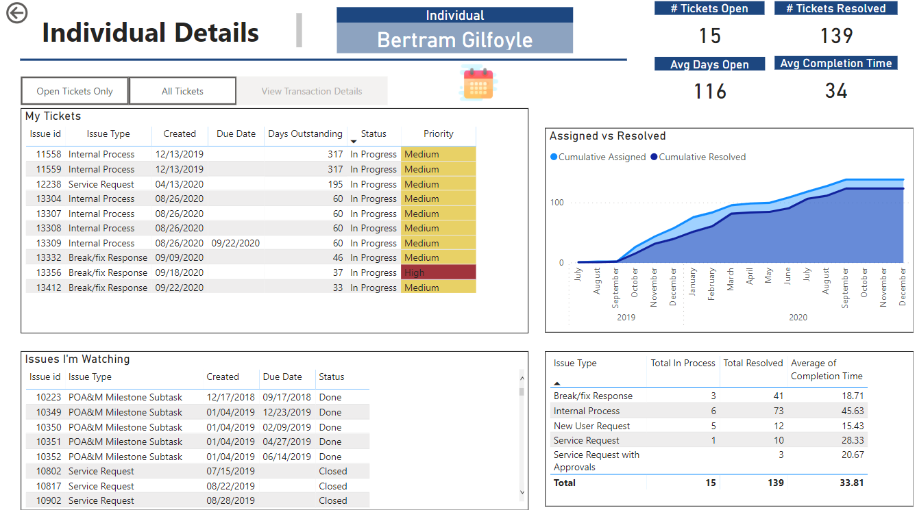
Page for Person Specific Details. (For this – I have a button to show the list of names to select from. Selecting a name will then active the button to view the details.)
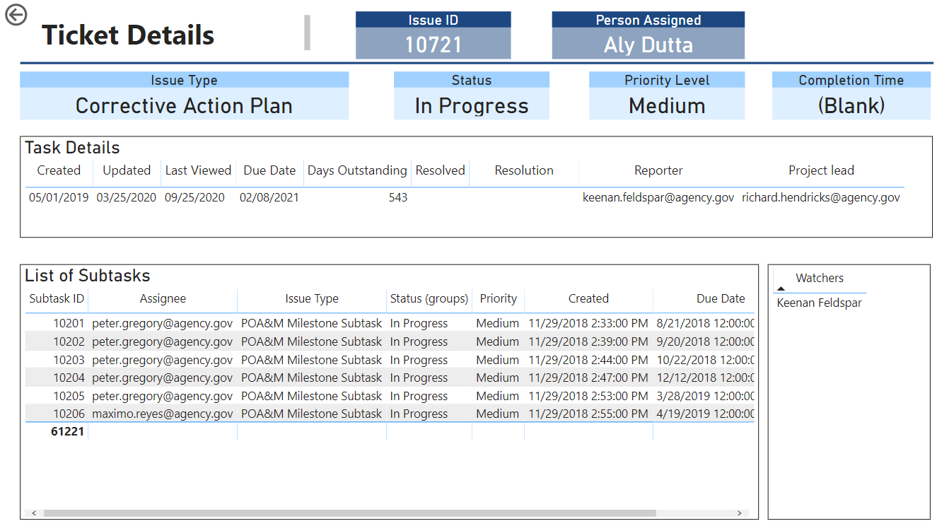
Page for Ticket Details (Similar to the person, there is an option to search for a ticket and then see the specific details)
@bradsmith - your use of Python and R was great and something I want to get more into.
Things I wish I would have done (and plan to approach for the next one):
Spend more time upfront studying the dataset rather than just jumping in and playing around with visuals;
Related to above more time planning out the layouts on paper/whiteboard and the overall strategy. While I did whiteboard ideas - I have the bad habit of jumping into the solution instead of spending more time on the overall design.
Improving on the overall color schemes and design, etc. Seeing all these submissions really provides excellent ideas.
Icons on the switchboard made by Freepik from www.flaticon.com</a>
All,
I am absolutely blown away by the quality and creativity of every one of entries submitted (there also seems to be an emerging consensus that blue-and-white designs just look good…)
Given that all the interactive features being used “show” better in the service, I’d like to offer to anyone that if you don’t have publish to web capabilities but want your entry published, just let me know in this thread and I will direct message you to arrange to get your PBIX file published to web and send you the link.
I’d be interested in doing this as well!
Sigh … apparently both R and Python visuals aren’t supported by PTW… who know?