Power BI Challenge 8 - Jira IT Service Desk Analysis Entry from Kiran

Here’s Kiran’s entry for Power BI Challenge 8. @kirank.gh, feel free to add other details of your work.

image

image

image

Here is the link to the report:

And here’s how Kiran described it:

Following is brief writeup for the submission
• Data loading and transformation

  1. Excel loaded into Power BI
  2. Used Enterprise DNA extended date table M code as [Dates] Extended Date Table (Power Query M function)

• Data modelling

  1. Created following dimensions
    a. Issue Type
    b. Project
    c. Priority
    d. Project Type
    e. Resolution
    f. Creator
    g. Issue Status
    h. Reporter

  2. Fact Table
    a. Jira
    Created many to one relationship between Facts and dimensions

  • DAX calculations
    Created following DAX calculations

  • Reports and visualizations

    • Created a background image based on EDNA Visualization course
    • Developed color template using color generator (coolers) and imported the theme
    • Downloaded icons from flaticon
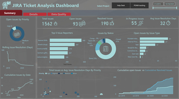
  1. Created Summary Report

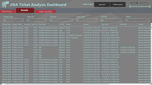
  2. Created Details Report

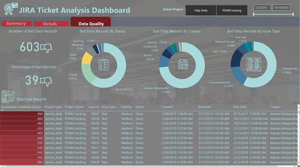
  3. Created Data Quality

Inspiration:

  1. Navigation was inspired by @DianaB entry in Challenge 3 HR Data Insights
  2. Most of the Visualization were inspired from EDNA Courses

To learn about the real-life scenario presented for the challenge, be sure to click on the image below.

power-bi-chal-1

1 Like

This post is part of the Enterprise DNA platform improvements, through the PBI Data Challenge our members can now share how they built their dashboard and what their inspiration is in building it. We hope all members can utilize it efficiently.

Congrats on a great submission.

I really like the where you’ve broken up your report into grids using rectangle shapes. This is something I like to do a lot and I think really makes your analysis stand out and makes it also easier on the consumer to navigate around your report.

Also really like how you’ve gone with the tab approach. So that the user can click through just like they would on a web browser. I think you can always take design inspiration from other technologies out there and why not when creating power BI reports just copy what has probably been tested billions of times by some of the largest companies in the world. So I’m not sure if you got inspiration from there but if you did well done for applying it quite effectively here.

Only simple improvement I would make here is just consistent color theme. I think it really breaks down when you have your donut chart series with a lot of variations. You have too many colors to fill in. So you want to try and find visuals where overall your color palette can still be simple and easy on the eye.

Nice one.

Sam