Power BI Challenge 7 - Purchases, Inventory And Sales Entry from Brian J

Here’s Brian’s entry for Power BI Challenge 7. @BrianJ, feel free to add other details of your work.

Here is the link to the report:

And here’s how Brian described it:

Of the seven challenges so far, this one was definitely my favorite. After a subpar performance in Challenge #6, I hit on a great inspiration for this one. My favorite non-Power BI YouTube deep dive is music mashups, where someone takes two (or more) artists with completely contrasting styles and combines them into a single song, that when done right creates something new and cool. So I wanted to try to do that with my entry this time, shouting out many of the great ideas I’ve seen implemented throughout the challenges and mash them up into a one-page report that fully answers the charge from @haroonali1000. So here’s the roster of tips and tricks that I mashed up:

@jarrettm - building color theme from a logo, conditional formatting via DAX SWITCH() returning hex values
Paul Ross - bar chart tooltip
@mudassirali - clickable info pop-ups on visuals, also incorporating parameter entry box into report
@michaelsampsonidis and @alvi - overall look influenced by their visual styles, which I really like
@alexbadiu - placing slicers in header to conserve space
@datazoe - incorporating notes about the data and analysis into the tooltip
@greg - dynamic narrative summary using Envision Data Story (I thought about switching this over to the new Smart Narrative feature, but decided to keep it a straight up shoutout to @greg’s reports that have a craftsman quality to them that I think is awesome)
@sam.mckay - inspiration from the 30 for 30 series on creative use of tooltips (I think I used every type of tooltip available in this report)
@melissa - the backbone of this report is a powerful data model I built entirely through techniques I learned from Melissa’s incredible forum posts and her Power Query YouTube video series (plus some basic assumptions I made about business practices regarding when a purchase order is considered completed):

image

This challenge was unique in the sense that prepping the data in Power Query and building a robust data model to support the required analytics was 90% of the battle. Everything went together quite easily after that.

One of the problems I ran into in Challenge #6 was reaching far beyond the scope of the brief. This time I tried to stay tightly within scope. Thus, per the charge, the left side of the report addresses in multiple ways only the elapsed time between ordered and received, and received and billed, while the right side analyzes billings.

The top narrative is dynamic based on the Purchase Order (PO) slicer, and uses the Envision Data Story custom visual. The second visual is a standard bar chart that uses the new September 2020 feature to show bar totals. I couldn’t decide whether to use total days or business days, so I figured why not both? To show the latter, I added a report tooltip with a single stacked horizontal bar chart, again using the bar total feature.

image

The next visual is my favorite in the report. It’s a really flexible timeline visual called Queryon Timeline. The problem is it is almost completely undocumented – no usable documentation on the company site, no YouTube videos, no postings on the Microsoft Community. Thus, it took me a while to figure out how to make it work, and then I combined it with the custom icon image hosting technique I stumbled onto in my Challenge #5 entry.

This timeline provides a spatial/visual representation of the elapsed times between the ordered date, the received date(s) and the billing date(s).

image

You can filter it down by material using the bar chart above:

Or go into focus mode to see the entire date history:

image

Or click on the visual tooltip header to see a table of the dates conditionally formatted by the icon color:

I modified Mudassir’s really innovative clickable “information dot” approach to show a graphic key explaining the icons.

image

Okay, onto billings. Seeing that for most POs the total ordered quantity, received quantity and billed quantity differed by varying degrees, I created a “Tolerance %” what-if parameter to indicate within that percentage is close enough to call the compared quantities (ordered vs received, received vs billed) equal. If the two quantities are equal within the set tolerance, the icon returns an on target arrow, whereas if the second item is less than the first outside of the tolerance it returns the down arrow, and an up arrow if the reverse outside the tolerance.

Finally, I think the four-quadrant scatterchart provides an enormous amount of information in a single chart: margin, margin %, customer, purchase order, total PO duration and number of materials. This allows us to visualize a number of key elements regarding the billings across a range of dimensions:

  • this is a low-margin business
  • the longest durations tend to be associated with the orders involving a large number of materials
  • customer U113 is associated with both the greatest variability in margin, and also generally long durations
  • no other customers have a discernible pattern with regard to duration, margin or margin %

Thanks to those who made it through this long-winded writeup, to Haroon, Sam and the entire Enterprise DNA Team for a phenomenal challenge, and most of all to my fellow challenge participants – thanks for all you’ve taught me, all I’ve borrowed here from you, and best of luck on your entries. Can’t wait to see them!

To learn about the real-life scenario presented for the challenge, be sure to click on the image below.

power-bi-chal-1

3 Likes

@EnterpriseDNA,

Pardon the length of this post. I took a somewhat unusual approach to the data modeling component of this challenge, and have gotten a number of questions about it, and the same is true for the timeline visual I included in my report. Thus, for those interested I have laid out the approach I used for each in detail, with a lot of screenshots to help explain the methodologies.

DATA MODEL

In looking at the data initially, all the tables had a many-to-many relationship to each other. However, I knew from previous financial projects I’ve worked on that if I could build a single transactions fact table that captured ordered, received and billed end-to-end with granularity at both the purchase order and materials levels, that would be an extremely powerful data modeling outcome that I could then use to create a pivoted version that would allow further powerful analysis. So, the objective became to create three tables, each using a concatenation of PO and material as the key to uniquely define records within each table. So, to see how feasible this might be, I started with the Purchased table:

REDUCING THE PURCHASED TABLE:

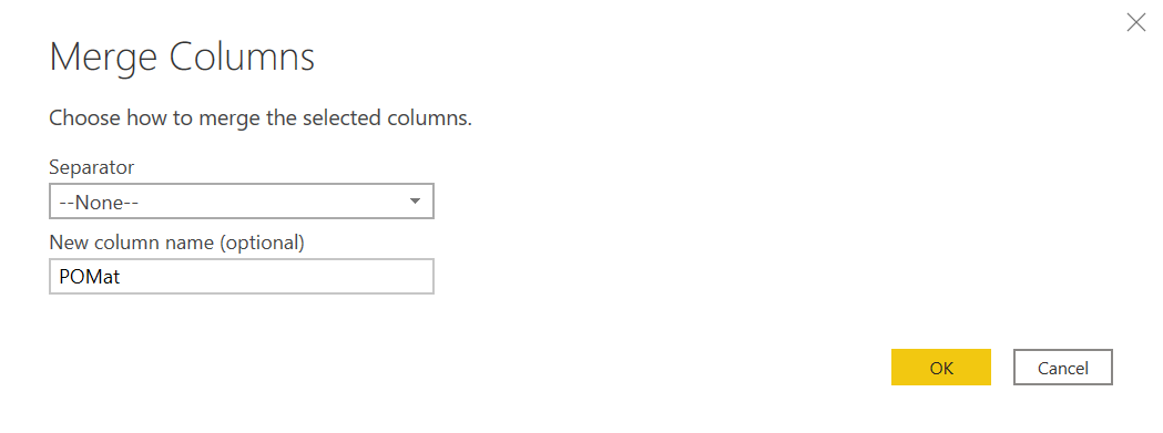
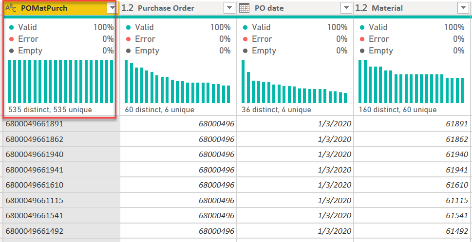
The first thing I did was create a merged key field based on PO and material:

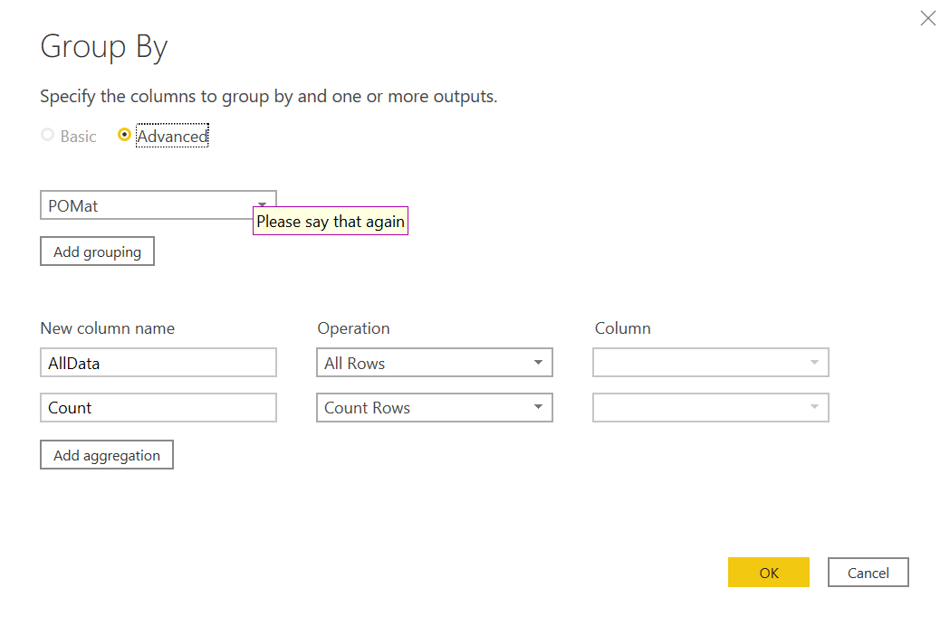
then I grouped based on this field and added a counter field to see how many records had more than one instance of the (hopefully) unique key:

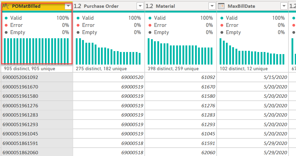
After expanding on all rows, the answer was 39 records with a count of two or more. However, in looking carefully at these records it became clear that each multiple instance still had the same PO date,

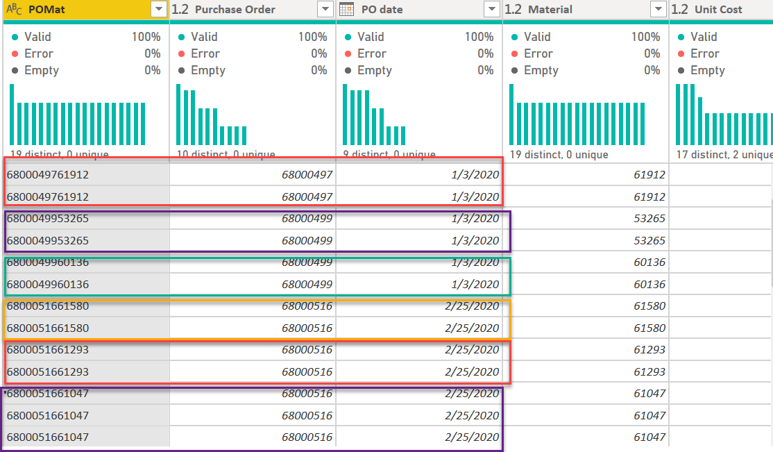
which meant that we could aggregate the amounts by our key field and recompute the average price based on the combined line and not lose any relevant information.

with the end result being a table of 535 records uniquely identified by our concatenated PO-materials key:

So, one down, two to go….

REDUCING THE RECEIVED TABLE:

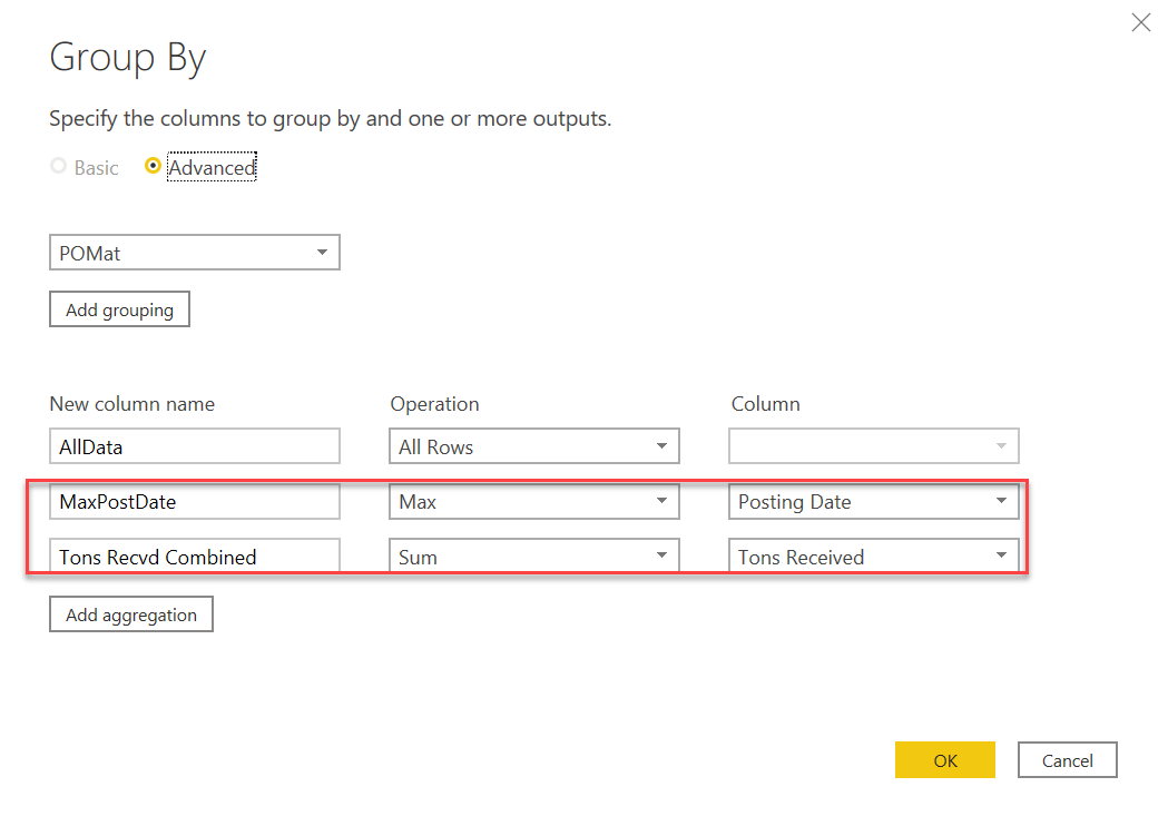
So, I ran the same analysis initially on the Received table, but this time the data were not quite as well-behaved. In this case some of the key field combinations had different received dates, and thus we couldn’t collapse the sums into a single existing date. It was at this point that I made an assumption about business rules that allowed for the creation of a one record per key table.

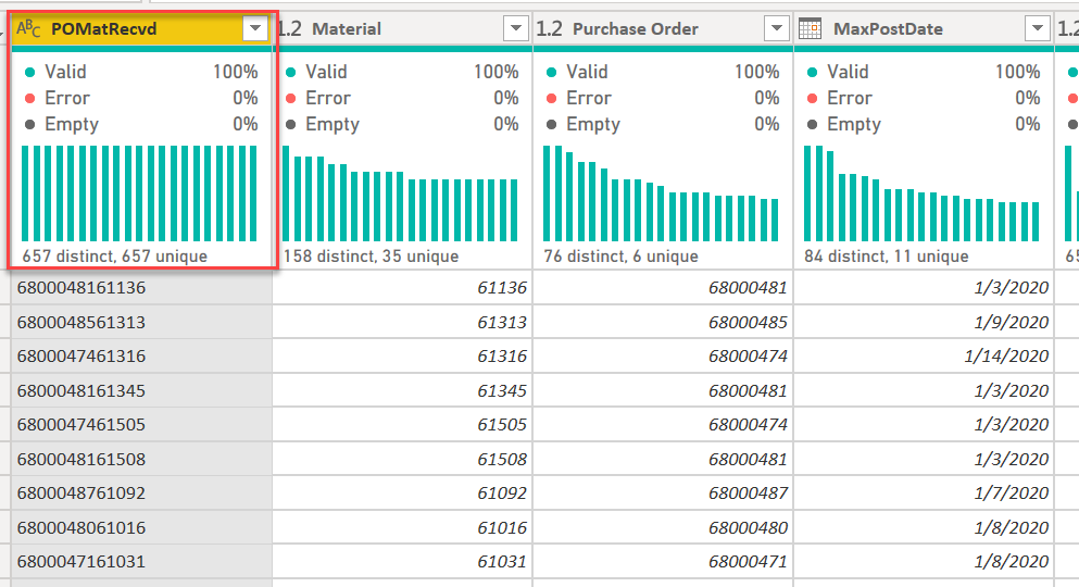
A word about assumptions. I feel that economists get unfairly bagged on about making assumptions (evidence that “assume a can opener” has its own Wikipedia entry). I would say two things about this: 1) making these assumptions is useful because it lets you do the thought experiment of what the minimum assumption needed to achieve the desired result is, and then evaluate whether that assumption is reasonable and what the implications of making it are; and 2) if the analytical power of the analysis is dramatically increased by making the assumption, in some cases you may actually be able to convince decision-makers to change the business process itself in a way that makes that assumption a fact. In this case, I think the assumption that the “received” date for a set of materials within a given purchase order is the maximum date on which the last material ordered was received is eminently reasonable. When you order from Amazon, and they split your purchase across multiple days of delivery, the order isn’t considered fulfilled until the last item is delivered. By making this assumption, we can now reduce the Received table down to one in which the concatenated key uniquely defines a record:

Note: in a real-world situation, I would certainly talk to the client before making this type of assumption about their business rule. In this case, where that wasn’t possible I just “assumed an agreeable client”. :blush:

two down, one to go…

REDUCING THE BILLING TABLE

the exact same strategy used to reduce the Received table was applied to the Billing table. The business rule assumption that materials weren’t considered “billed” until the max date was made here as well.

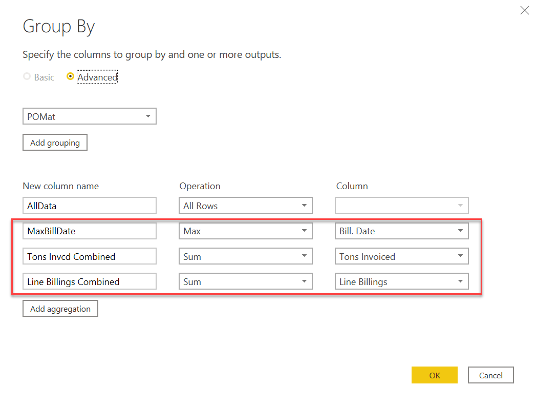
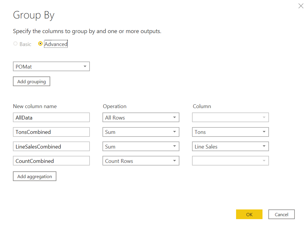
Once the aggregations and Max bill date were computed, I added a new custom column to recalculate average unit price based on the sum totals.

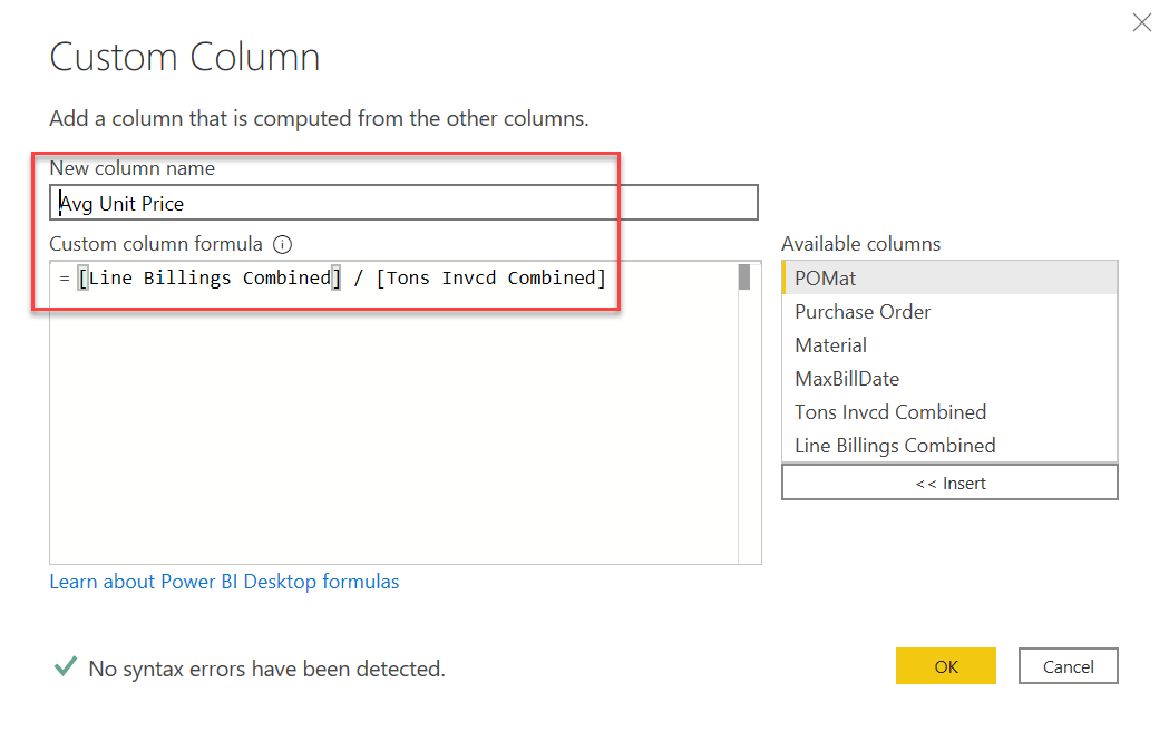
And we are again left with a table in which the composite key uniquely defines a record

The final step, now that we had three tables for which the composite key (concatenated PO and material) uniquely defined a record was to merge these three tables into a single Transactions table

the two merges to create the transactions table were simple left outer joins, merged on the composite key created in each of the three table reductions described above

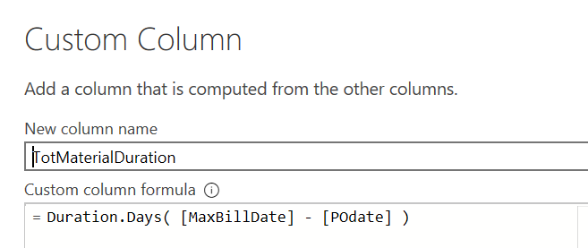
Now we created two more max fields – this time at the PO level, rather than the material level. This represents the second-order condition assumption that a purchase order is considered “received” when the last material ordered is received, and the same assumption is made about billing. Note: for those examining my methodology, the convention is that Max refers to maximums at the material level, and MaxMax refers to maximums at the PO level.

Once this master transactions table was created, it became a trivial matter to compute the days between different pairs of dates.

image

Now once the Transactions table was created, I duplicated it and created an unpivoted version that was necessary for the timeline visual.

Here’s how it all looks in the final data model:

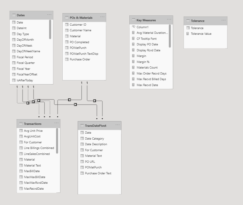
Ultimately, a pretty simple but very powerful, flexible data model, but a lot of prep work needed to get to this point. Doing so was totally worth it though IMO because it dramatically simplified the rest of the analysis and the DAX I had to write (and the DAX I didn’t have to write…).

With the data model completed, most of the rest of the report was pretty standard stuff. The two elements worth some additional explanation are the timeline visual and the tolerance/custom icon interaction.

TIMELINE VISUAL

As I mentioned when I posted my entry initially, the timeline was a custom visual called Queryon Timeline. You can really create some amazing visual timelines with this, but it is almost completely undocumented – no useful documentation on the company website, no videos on YouTube and no posts on the Microsoft Community. Because of how customizable the timelines are, there are a ton of configuration options and thus it took a lot of trial and error to figure out how to use this visual.

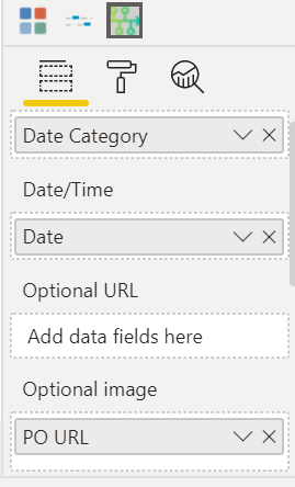
Here’s the choice of fields that ultimately produced the timeline I wanted. Date Category is from my unpivoted transactions table, and just captures whether the date is ordered, received or billed. Date is the single date column from my unpivoted transactions table (NOT the date from my date table, which was an initial mistake I made) and PO URL, which was a column I created that contained the image URL corresponding to the custom icon for each unique entry in the Date Category column (see section below for discussion of web hosting of custom icons).

image

After this initial set up, it was just a matter of playing with all the formatting and configuration options available in the custom visual.

I think I will try to do a video demonstrating the options and configurations available via this visual, since nothing like that currently exists elsewhere and this visual fills a role that I’ve never seen done as well by any other visual.

TOLERANCE % AND CUSTOM ICON HOSTING

Seeing that for most POs the total ordered quantity, received quantity and billed quantity differed by varying degrees, I created a “Tolerance %” what-if parameter to indicate within that percentage is close enough to call the compared quantities (ordered vs received, received vs billed) equal. If the two quantities are equal within the set tolerance, the icon returns an on target arrow, whereas if the second item is less than the first outside of the tolerance it returns the down arrow, and an up arrow if the reverse outside the tolerance.

In Challenge #5, I stumbled upon the best way I’ve found so far to manage custom icons. Here’s the process I used:

  • find the icons you want on flaticon.com (great site with millions of searchable icons in multiple styles)

  • using the flaticon editor, alter the colors of the chosen icons to match your color theme. A big help in managing hex codes is a free program I found called Just Color Picker. I have a video coming out this week on the Enterprise DNA TV YouTube channel on different ways to use Just Color Picker to save you a lot of time in the development and application of color themes.

  • Download the customize icons from flaticon.com and then upload them to imgbb.com – an excellent free image hosting website. Imgbb provides the direct URLs for each icon file.

  • You can then write your measure or calculated column to return these URL values as the result of IF or SWITCH statements, such as this:

    PO URL =

      SWITCH (
          TransDatePivot[Date Category],
          "Ordered", "https://i.ibb.co/QMfQ3tv/order-orange.png",
          "Max Received", "https://i.ibb.co/FbpjhRX/received-medium-blue.png",
          "Received", "https://i.ibb.co/FbpjhRX/received-medium-blue.png",
          "Max Billed", "https://i.ibb.co/5G8NYyv/invoice-dark-blue.png",
          "Billed", "https://i.ibb.co/5G8NYyv/invoice-dark-blue.png",
          BLANK ()
      )
    

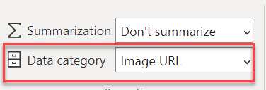
The only thing you need to be sure to do after that is to define the data category for your measure or column as Image URL

image

Other than that, everything else in the report is pretty standard stuff. Because of all the advance Power Query prep, I ended up writing significantly less DAX than usual and the measures I did write by and large were pretty simple.

I hope you found this helpful. Thanks for sticking with it to the end.

• Brian

12 Likes

@BrianJ This is awesome! Sometimes doing the heavy lifting in power query saves you the DAX heavy lifting was a great point to make.

@datazoe,

It’s funny – a while back I started forcing myself to do as much in Power Query as possible, just because I felt my PQ/M skills were lagging way behind my DAX knowledge/comfort level. Thanks to @Melissa’s awesome PQ videos and forum posts, and her “learn by Googling” philosophy towards M, my mindset about PQ /M has totally changed from treating it like the vegetables I had to eat to get to dessert (DAX) to something I now enjoy at least as much as the DAX component. In getting to this point (still an absolute ton I need to learn in PQ/M…), I’ve really realized the benefit of doing things as far “upstream” as possible (as @AntrikshSharma succinctly puts it - SQL > PQ > DAX), in terms of better data modeling, and easier and faster DAX.

BTW - great writeup. I really enjoyed reading through that.

  • Brian
5 Likes

@BrianJ everything here is gold :slight_smile: I will need to check out @Melissa’s stuff! the SQL > PQ > DAX is a great way to put it. PQ is such a powerful tool overall.

And thank you for the compliments on my write up! I’ve been working on my markdown skills a bit. (Which, btw, you can use in the new smart narrative visual apparently.)

2 Likes

@BrianJ It’s a treat to see such types of techniques being used to create a report. I just love the way you did all the mashing of data in PQ. It just makes life really really easy especially in complex scenarios. I will transform the data as you described to get a good understanding of the techniques you used.

Lastly, really appreciate that you took out the time to impart your invaluable knowledge.

2 Likes

@BrianJ you are a magician! We all have so much to learn from you! I am very greatful we have a week before a new challenge starts. It is the minimum amount of time needed to look more in detail and be inspired by the ideas of other participants and learn even more. When I go to your Wrap up section, I feel the need to take out a pen and a paper. The ideas we can take out from here can make chapters. I think that after couple of months of these challenges you can have enough information to write a book!

1 Like

Unbelievable submission this time round Brian.

So much for everyone in the community to learn from. I can see you have also mentioned others that you’ve learned a lot from as well so really appreciate the collaborative nature of your reports creation and descriptions here.

But for me and I’m sure others there’s a lot to be inspired from your work here as well. There’s on the face of it a one page report but you can tell sitting beneath it all is some incredible work around your data model your query editor work and also the logic built into your DAX formulas. And then to top it off you have visualized it in such unique ways that a consumer is going to be incredibly engaged in reviewing this on a consistent basis.

The timeline visualization! Seriously this is epic. So wish I could even have dreamt of creating this and figured out how to implement it as well as you have done that here. That is such a good idea and such a unique way to visualize this random data that we had during this challenge.

Please do a follow up video on this timeline visual for the Enterprise DNA TV channel. The whole world deserves to understand how you did this.

Also really like the dynamic text in the top left hand side of the report page. This is straight out of Greg’s playbook, which I love and I think that it’s something that I’m definitely going to try and implement on a future challenge. Maybe I’ll test out the smart narrative feature to see if it is or works as well as the way that you have done things in your report.

Colors all work really well, and I also really like the consultancy name that you’ve used for your report, Strategic Route. Very creative.

Tooltips are also used really effective especially in your total days elapsed visualization and in the timeline visual. Wow, so good.

Definitely some of your best work I’ve seen I feel. Maybe you think the same. Appreciate the extensive writeup as usual. I’ve learned a lot from reading through it.

Appreciate the amazing work this challenge.

Sam

1 Like

@sam.mckay,

Thanks so much for the encouraging and inspiring feedback. I’m still amazed at the detailed, individual reviews you provide to every participant on every challenge, and I always experience a thrill when I see your response to my entry pop-up as a new post.

To hear that you and others learn from my submissions still seems surreal to me, since I still so vividly recall being the confused noob who used to stick CALCULATE() statements around every arithmetic operation because… well, I wanted them to do a calculation.

Per your request, I will definitely do a video about the timeline visual over the next few days. It’s inexplicable to me that a visual this good is almost totally undocumented. I nearly gave up on it twice trying to get it to work properly, so will share what I learned with the community and hopefully give back something cool for others to borrow in the future.

Thanks again.

– Brian

3 Likes

Awesome report. It would be great to be able to download the model and go through the techniques, dax structures used.

@stevens,

Thanks very much. I anticipate the @EnterpriseDNA team will have all the files for Challenge #7 posted in the section below soon.

  • Brian

Hi @BrianJ

I clicked on the link to download the PBIX file and have a ganders but i

receive the following error. Any ideas why this would be?

Thanks

image

@Hitman,

I’m not sure, but as soon as I get to my desktop this morning, I’ll DM you the file.

  • Brian

Thanks Brian - Strange only i get that message…

Just tested it and it works fine at my end

@BrianJ have you got a video on how you built everything from scratch?

@ambepat,

Your best best is to download his PBIX file from the link that Sam mentioned right before your post. @BrianJ spent numerous hours putting this together.

Thanks
Jarrett

1 Like

@JarrettM thanks for your reply. But I think it will be valuable for us members to see how the process was done from beginning to end so we can understand Brian J thinking process around it. I saw a speed video on the showcase example in the membership portal for the other challenges but it is too fast to follow. I can see the pbix file but I think it will be even more awesome if a video accompany this file then we can really see the details and thinking behind the build up and finishing.

1 Like

@ambepat,

There is not one single video that walks through this entire entry end-to-end, but there are a number of resources I and others have put together that will explain how to replicate the nonstandard elements of this entry.

The Data Model
I took a unique approach to modeling the data for this challenge, partially because it was a technique I’d used in a work project that provided a lot of analytical power and flexibility, and partially because it was the necessary structure needed to implement the timeline visual. I have a step-by-step writeup of my data modeling approach here:

Power BI Challenge 7 - Purchases, Inventory And Sales Entry from Brian J - #2 by BrianJ

The Timeline Visual and Custom Icons as Dynamic Indicators
The timeline visual is kind of crazy, since it uses a really cool custom visual for which almost no documentation exists. To explain how to implement that visual, I created the video below. Another aspect of this entry is using custom icons as dynamic indicators (upper right portion of the report). While I don’t have a specific video addressing that, the process that I used to manipulate custom icons for the timeline visual is very similar to what I did for the indicators portion, and is discussed in the video below as well.

Also, re: the custom icons as indicators technique, you can refer to my writeup Challenge #5, where I discuss how that approach came out of an original failed attempt to incorporate the icons directly into the local file:

The Info Pop-Up for the Timeline Visual
This was a blatant steal of a technique I first saw used by @MudassirAli @sam.mckay did an excellent video dedicated to explaining this technique after Mudassir’s use of it in Data Challenge #4:

The Dynamic Text Narrative
This was another steal, this time from @Greg. Again, @sam.mckay did an excellent video on this approach. @Greg does absolutely epic writeups of his challenge entries, and has covered this one as well in a couple of his writeups. Here’s the link to Sam’s video on this technique

I think that should pretty much cover it. The rest of the techniques used in the report are fairly plain vanilla Power BI.

I hope this is helpful, and if after going through the resources above you still have any questions, just give me a shout. Thanks for your interest in this entry - I really had a lot of fun putting it together, so I hope you enjoy deconstructing and rebuilding it.

  • Brian
4 Likes