Couldn’t complete fully, submitting what I did so far under Newcomer category.
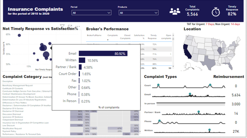
Insurance Compliants
8 Likes
@BrianJ Ah, that makes sense, I knew there was something I was missing there. Thanks! Though not sure I follow what you mean by mirror image top and bottom chart axes? Your entries are always really awesome!
@sam.mckay This Power BI Challenge idea is really awesome. When I mentor people with Power BI I hear often that they want some data to play with, and/or wait for a specific project to come up in work. This I think caters to both. There are many data sets available but they are always there so no real hurry. Whereas this data set is given with a deadline and objective like a project at work. And you get to see what others are doing with it at the same time, which makes it even cooler than an work project in my opinion!
3 Likes
@datazoe Yes I agree and the only difference with work projects is that you are given specific requirements and you don’t go all out with creativity or analysis. Sometimes people don’t realize that analytical dashboards are not created at the flip of a button and it takes hours and hours of efforts and concentration.
1 Like
Hi MudassirAli
Excellent work in the visual and organizational part. A very good history telling.
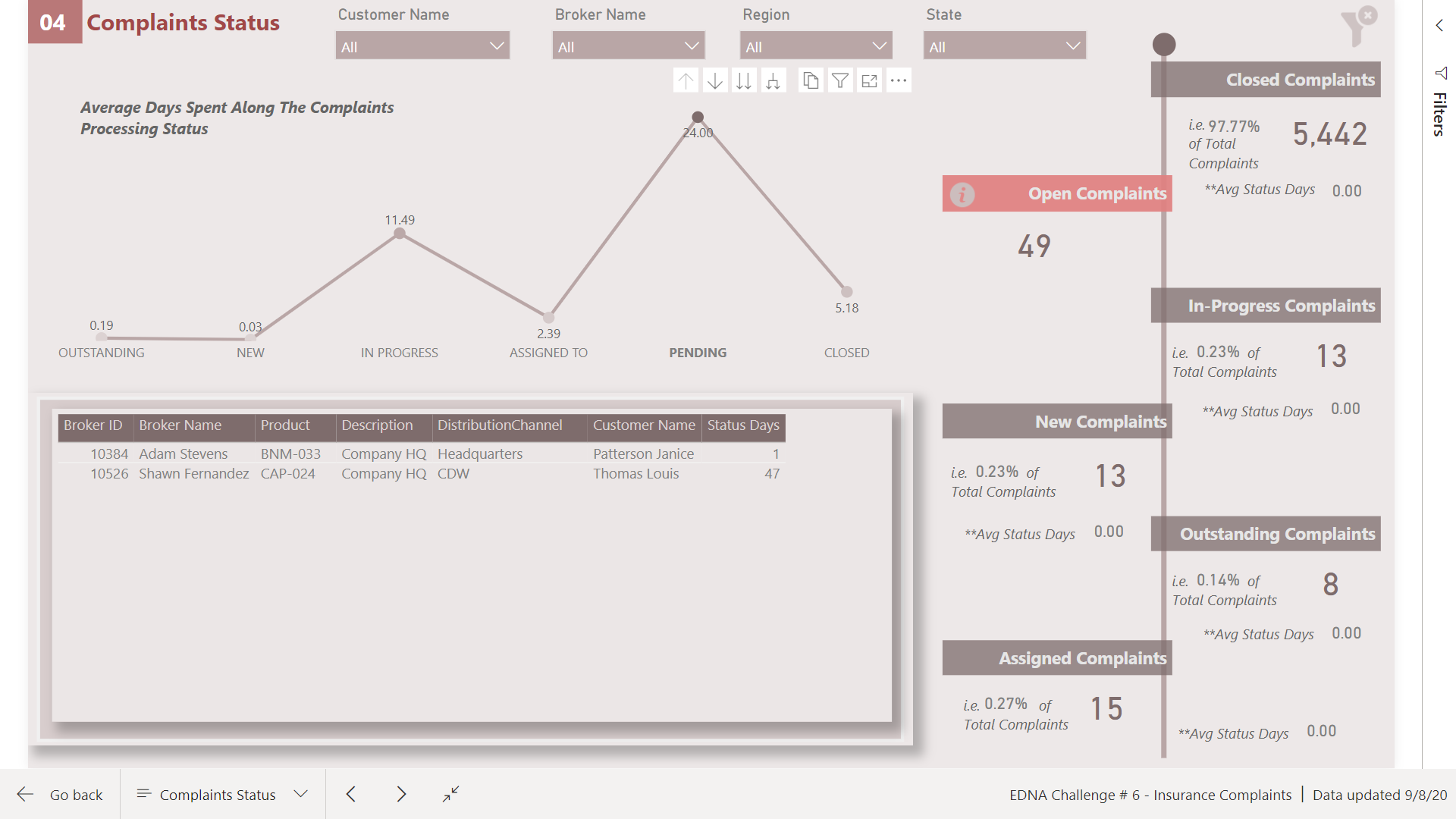
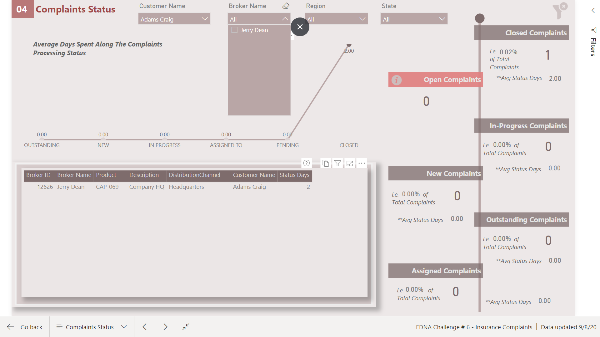
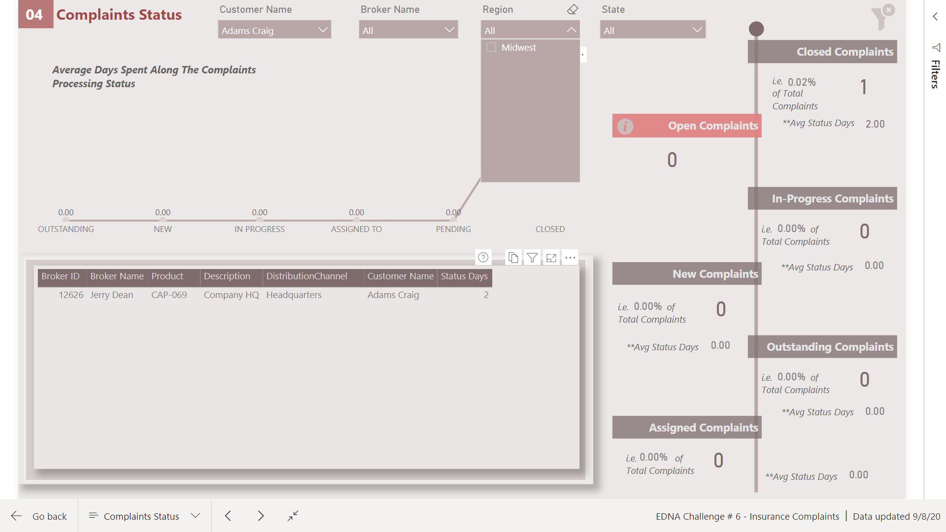
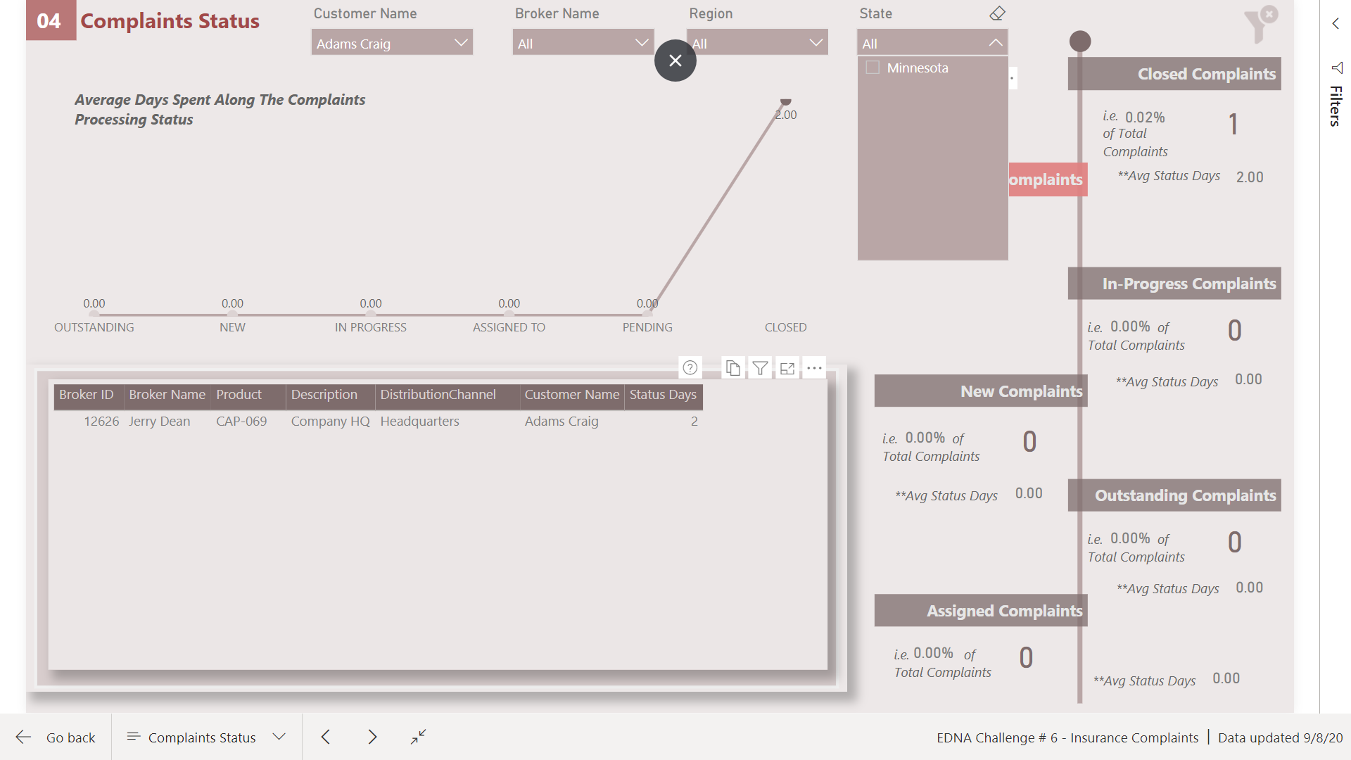
But the segmenters of chapter 4 (Complaints Status), I do not notice synchronization between them and the results of the table below.
If I choose a region and a State corresponding to that region, the other segmenters should only contain the brokers and customers for the selected regions, and I think it does not.
If I’m wrong, please excuse me.
Cordial greeting
1 Like
Jejeje
Yes, I joined today.
1 Like
Hi @alejos1971 Welcome to EDNA Power Bi Community and really appreciate your comments. You are correct that slicers were not synchronized. I made use of the filter pane but forgot to update the Clear Filter bookmark so what happened was all the changes were undone when I cleared the filter. Now everything is filtering everything. Thanks for pointing this out.
2 Likes
Hi all,
Hope you are doing great.
This is one of the best challenges yet from Enterprise DNA Team. I am so excited and I am learning a lot. Many Thanks.
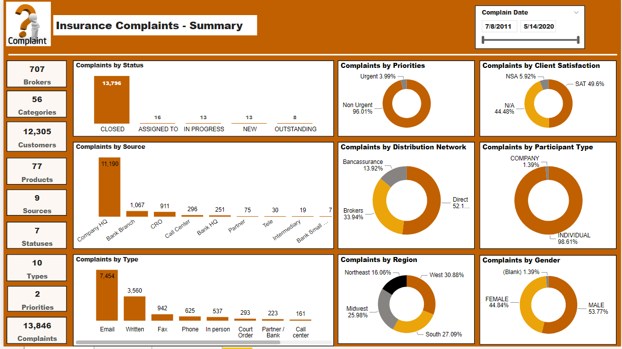
For this report I created five pages containing insights such as:
- Yearly Overview
- Some Details
- Complaints Status
- Open Complaints
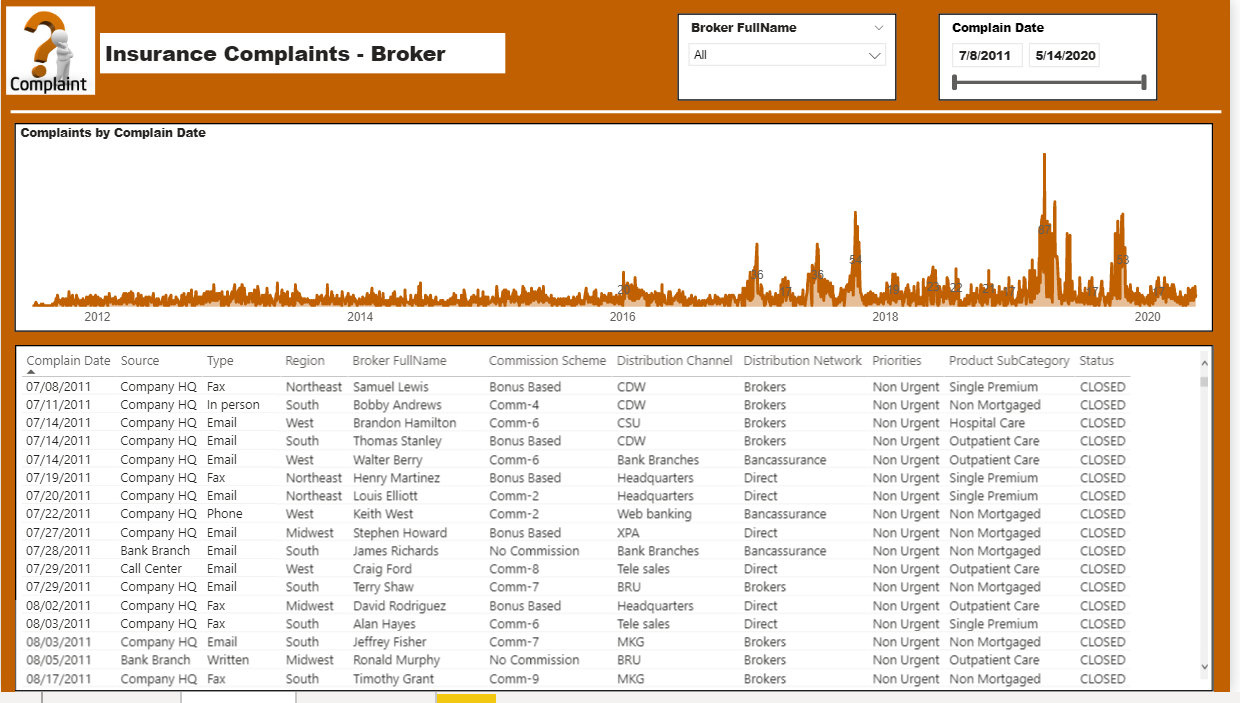
- Brokers
Any feedback is welcome

This is the Power BI file I’ve prepared.
Power BI Challenge #6.pbix (1.3 MB)
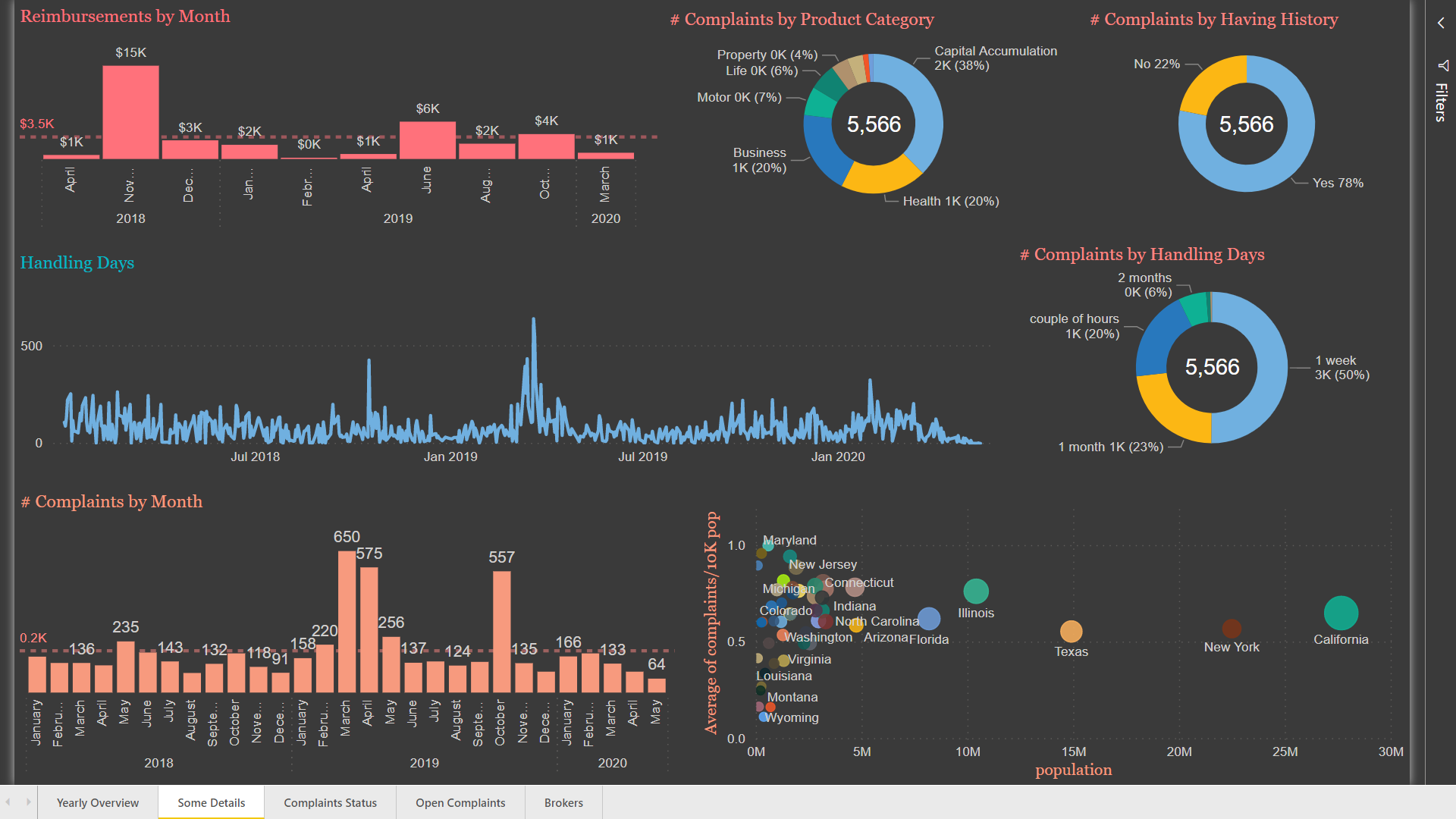
Here are some details about what I’ve done in this report:
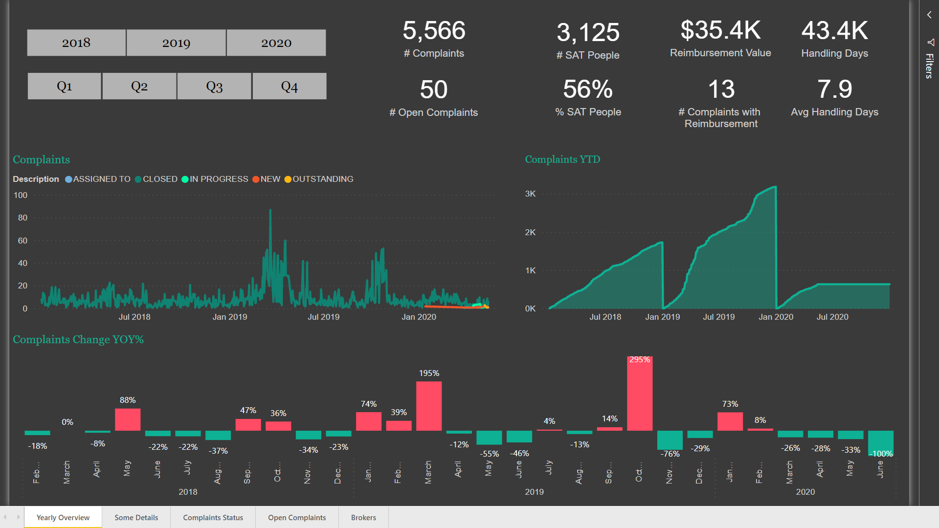
I used a dark theme because I thought it is so attractive.
In the “Yearly Overview” Page, I placed some general information about the data, as well as “Number of Complaints Year to Date” using Time Intelligence function in Power BI.
I’ve also used Year over Year function to monthly show the percentage of changes in the number of complaints.
In the “Some Details” Page, I used a typical line chart for the number of handling days, but since it has a lot of details, I thought that maybe a categorical column named “handling duration” can practically explain the subject. So, I created a pie chart to summarize the line chart based on “handling duration”.
Since the population in each region is different, I decided to standardize the number of complaints in each region based on the population. Therefore, I created a column named “complaints in each region” and based on that created another column named “Complaint/10k Population” using the following formulas:
Complaints In each Region = CALCULATE(SUM(Customers_L[# Complaints for each Customer]),FILTER(Customers_L,Customers_L[RegionID]=Regions_L[Region ID]))
complaints/10K pop = DIVIDE(Regions_L[Complaints In each Region],Regions_L[population])*10000
and finally created the scatter plot in this page.
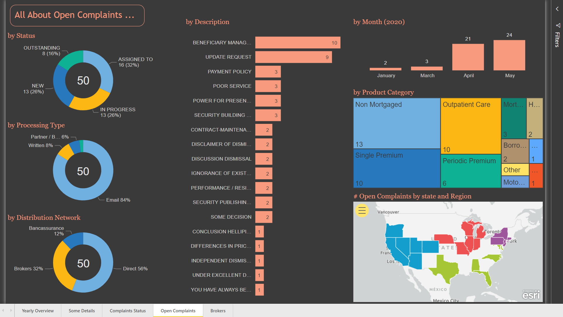
In the “Complaints Status” Page, I prepared two different tables for complaints details and complaints status history. By clicking on any row in the complaints details tables you can see the history details on the other table. I’ve also created a scatter plot showing the number of complaints per 10k population and used the number of replicates for each complaint for “Size” section. By placing satisfaction status in the “Legend” section, I is so easy to see satisfaction in each region.
I’ve also used drill-through option in this page so that from every other page you can drill through this page and find details.
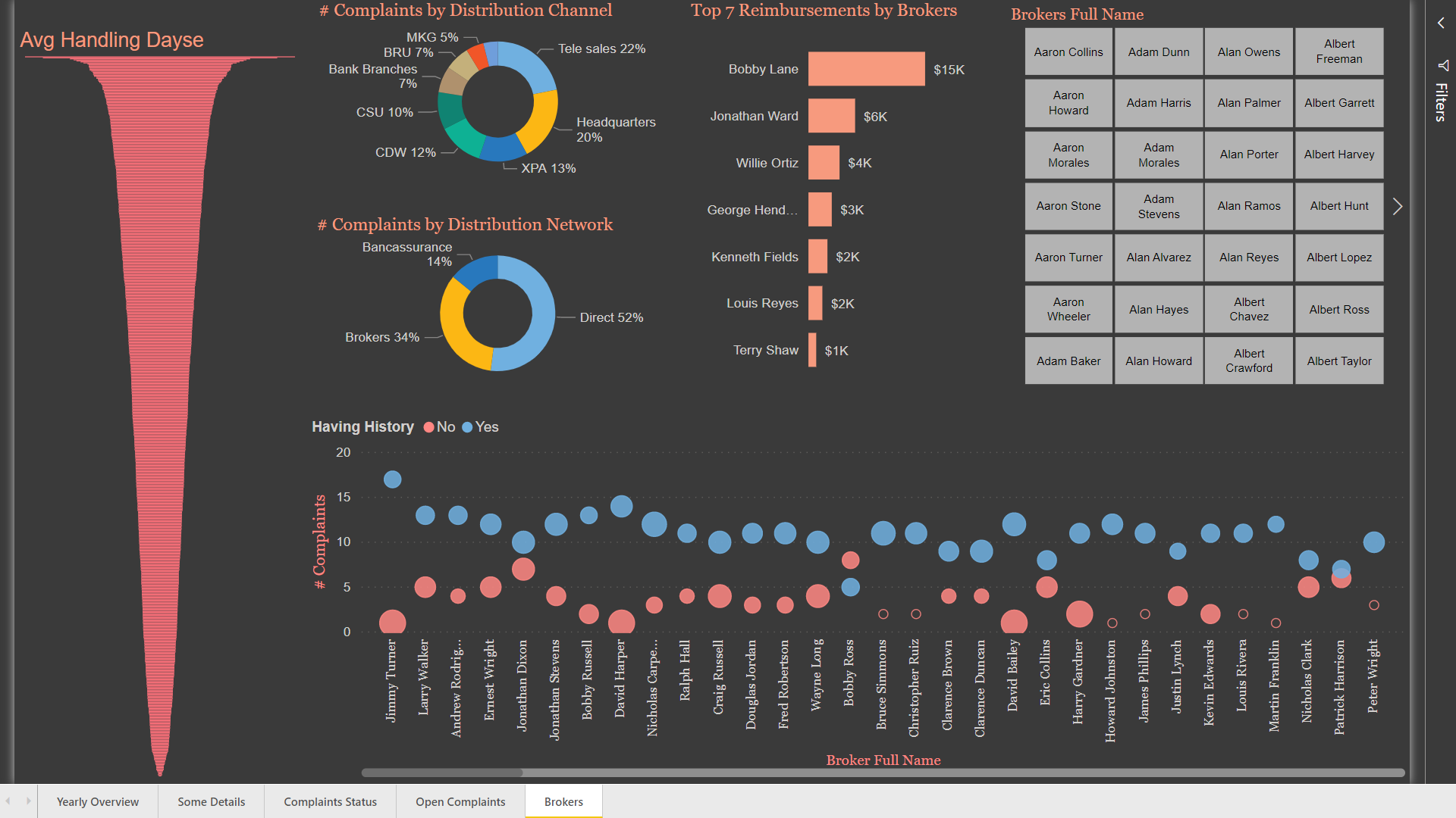
In the “Complaints Status” Page, I used a scatter plot to show the number of complaints for each broker, as well as complaints status history and the percent of satisfied people.
Best Regards
Hossein
10 Likes
Very good.
And thanks for the welcome. 
1 Like
Hello everyone, I am still learning and would appreciate any feedback about my submission please
@Eze,
Great overall entry, and I love how you have your data model structured. Here are a few recommendations:
-
If you are going to have a home page, make sure you either have a picture or a logo on it to help catch the viewers attention. I would also include a link for every page in your report on each slide, not just for the home page.
-
I think that you had too many different colors incorporated into the report. I like that you had a dark black theme, but try to stick close to colors that go with your theme.
-
The chart that you used to show the different levels of satisfaction probably would have better off using some kind of bar, or donut shape visual. I rarely use that type of chart unless I’m comparing something on a cumulative basis vs a daily basis. It looks real fancy, but most of the time doesn’t show a clear picture to the end user.
Thanks
Jarrett
1 Like
My Submission to this challenge 6.
PBIX file attached.
Please try the link below and provide your suggestions and feedbacks:
EDNA challenge 6_Mohammed Ali.pbix (2.1 MB)
12 Likes
Wow very nice
1 Like
you produce such visually appealing work DianaB. Just so clean and beautiful.
1 Like
Very nice work here. Well done.
Lots of work went into this one! Well done.
Hi @BrianJ
Could you tell me where we can get those (csv) files inside your R code ?
numcomplaints <- read_csv(“Power BI Coding/Enterprise DNA Files/Data Challenges/Data Challenge 6/numcomplaints.csv”)
Population <- read_csv(“Power BI Coding/Enterprise DNA Files/Data Challenges/Data Challenge 6/Benford Population.csv”)
reimbursements <- read_csv(“Power BI Coding/Enterprise DNA Files/Data Challenges/Data Challenge 6/reimbursements.csv”)
Here you go.
- Brian
numcomplaints.csv (210 Bytes)
Benford Population.csv (178.6 KB)
reimbursements.csv (350 Bytes)
This is amazing! How did you make it look like a pamphlet?