Wow everyone. I love the challenge so much, after seeing what quality is being produced.
#bestPowerBIcommunityoutthere
Wow everyone. I love the challenge so much, after seeing what quality is being produced.
#bestPowerBIcommunityoutthere
Here is my submission to Challenge # 5:
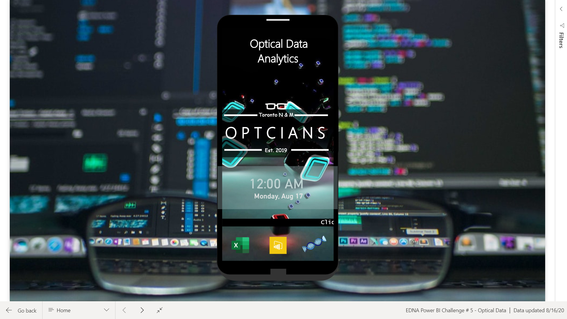
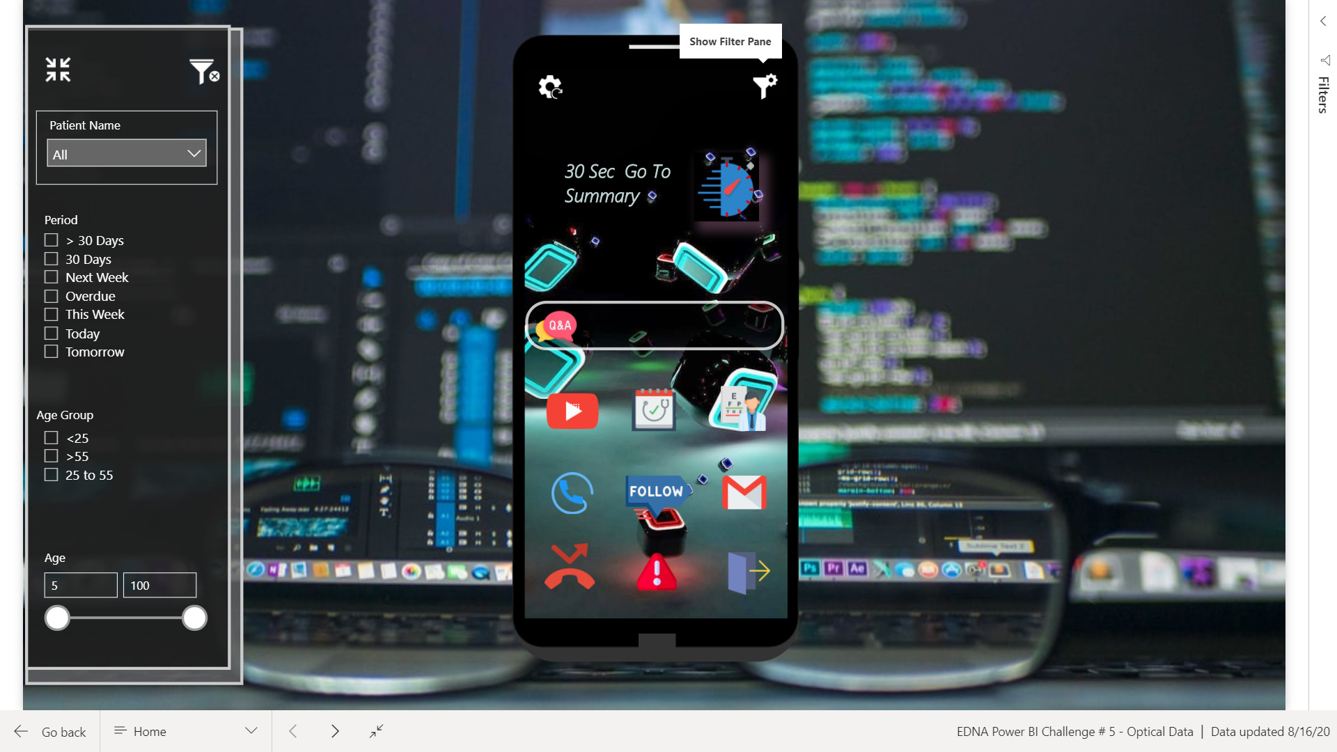
As it was mentioned that Penny & Co. aren’t tech savvy so designed a tracker inspired by mobile phone theme. Any body can use a phone right?. The report starts with welcome screen where you can see Excel, Power Bi & EDNA Icon. The reasoning behind this is if Penny wants to open the source file, she can click on excel and will update the patient details,for viewing report on Web, she will click on Power Bi Icon and for additional instructions to include in the report, pointers will be updated on the company’s shared server.
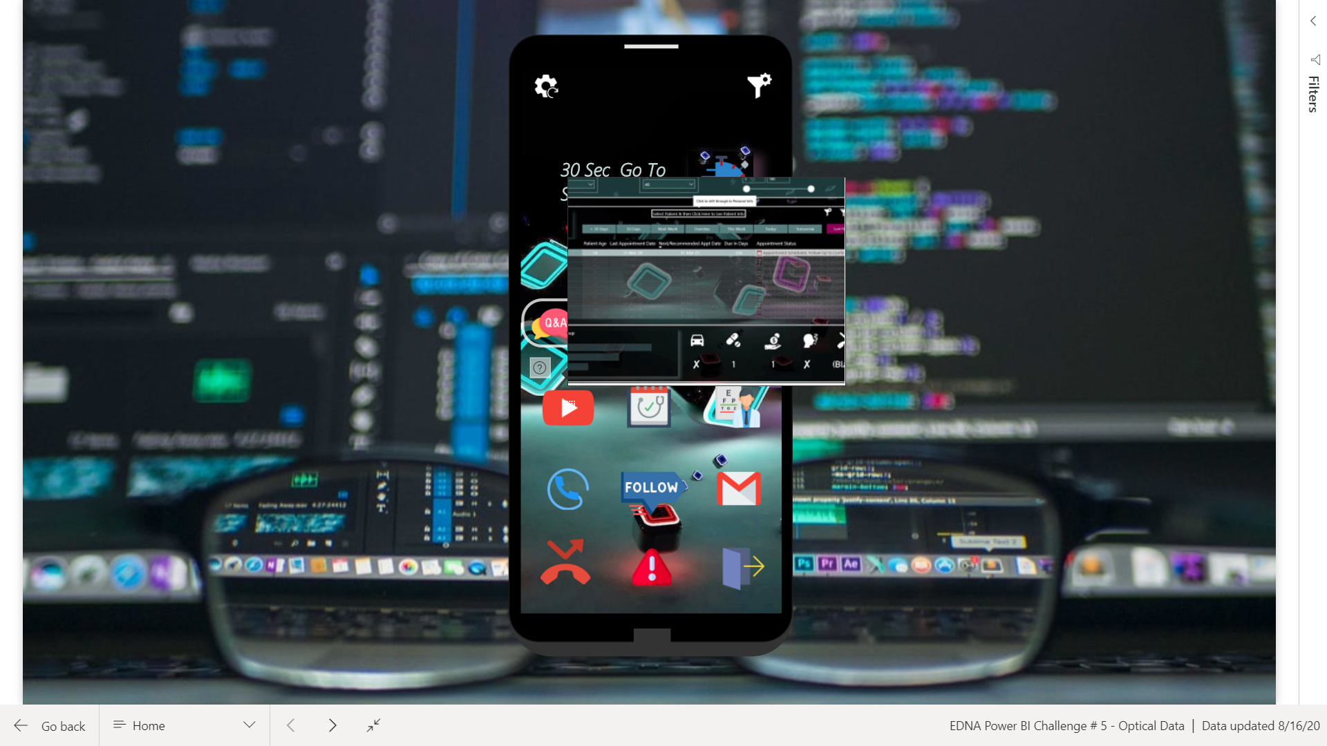
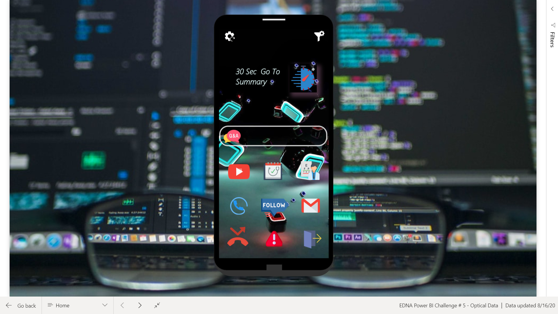
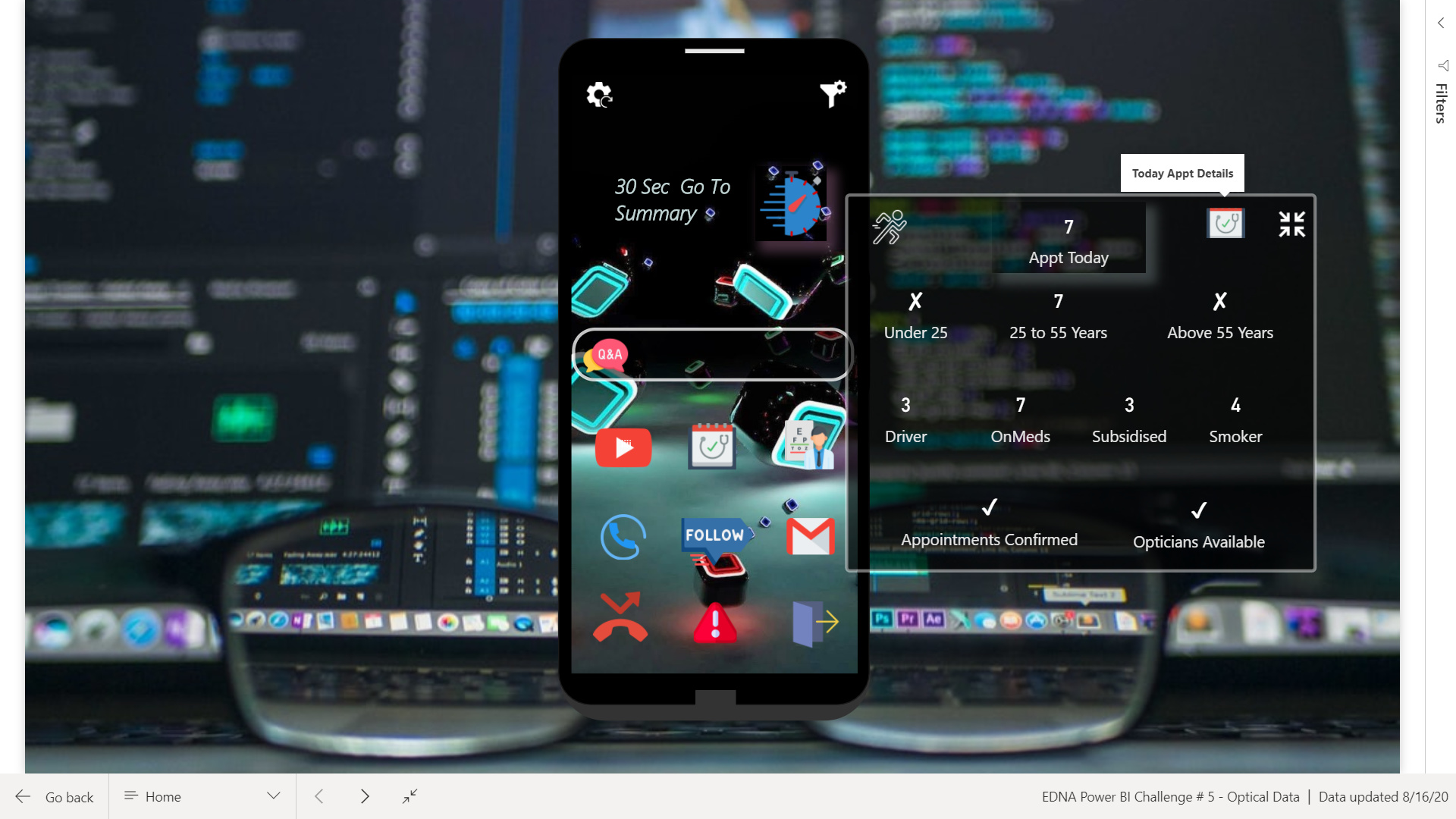
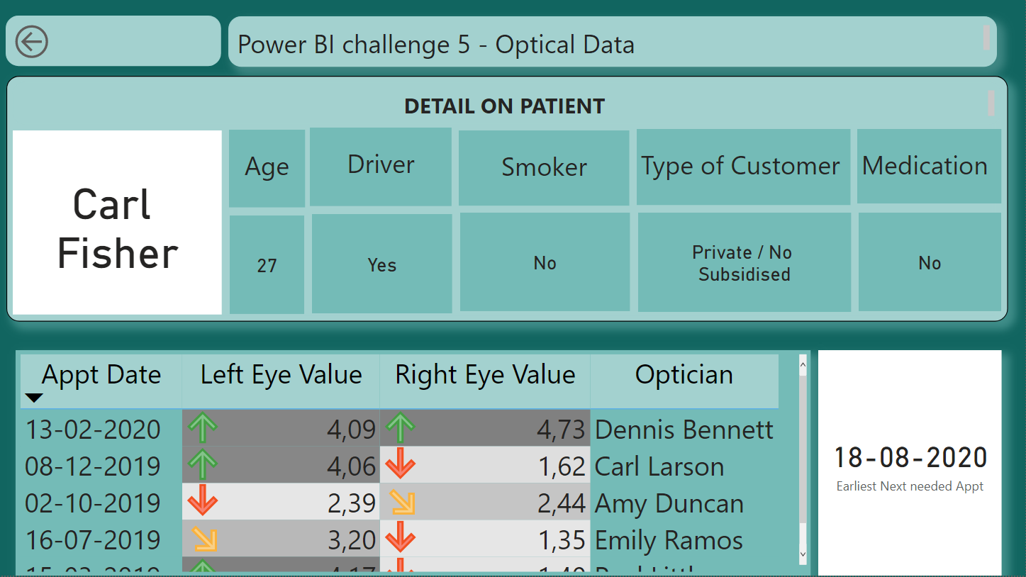
To Log in, click on the scroller, which will take you to Menu Page, which is designed as mobile phone with different menus. If opticians are busy and want a quick overview, they will click on Q&A icon and on 30 Sec Go to Summary Icon. For other details, choose different menus on the phone.
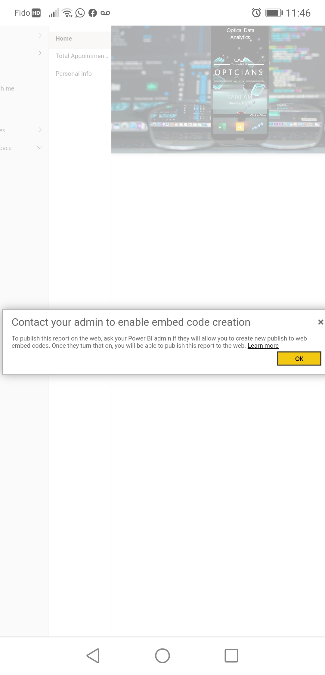
To see how to drill-through on the report, check Youtube icon. In my report I have shown 3 different ways to drill-through. I wanted to add the 4th option but for that I had to publish my report to web. However, it is not permitted by admin. With the 4th option, Penny can click on the patient name and all the details will show for that patient. Following is the link for that trick:

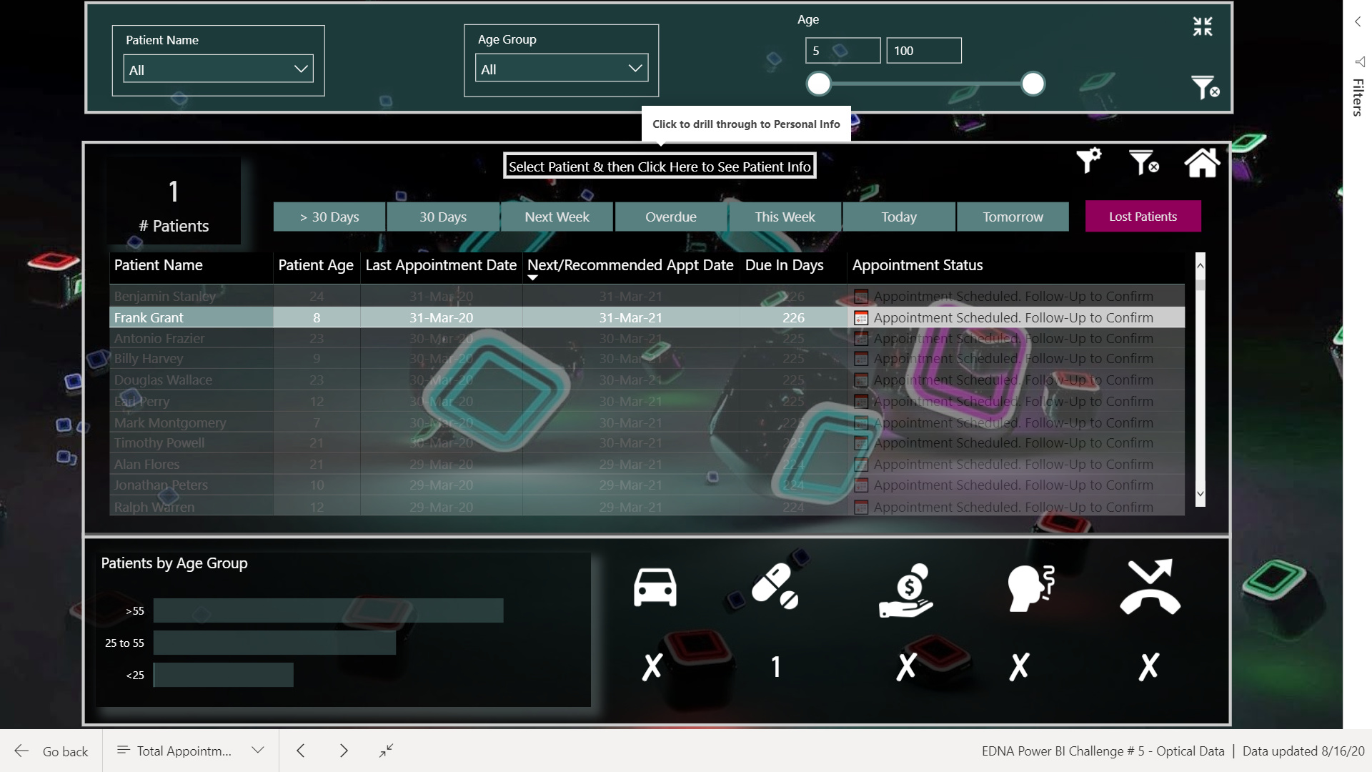
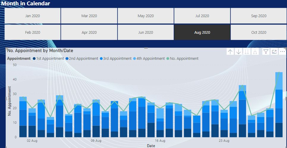
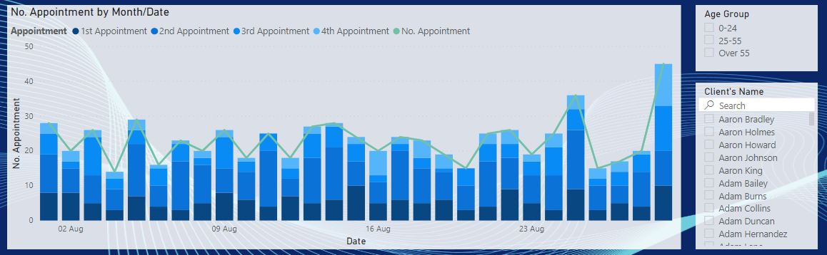
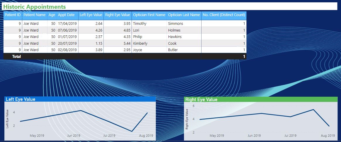
For appointment details, click on appointment icon and it will take you to next page where data can be filtered as per the requirement. To make it easier, I added icons like Gmail,Call, Red alert where data is already in its filtered state. For e.g. to see the lost patients, going to the appointment icon and then filtering it is not required, click on the red alert icon and the filtered data will pop up.
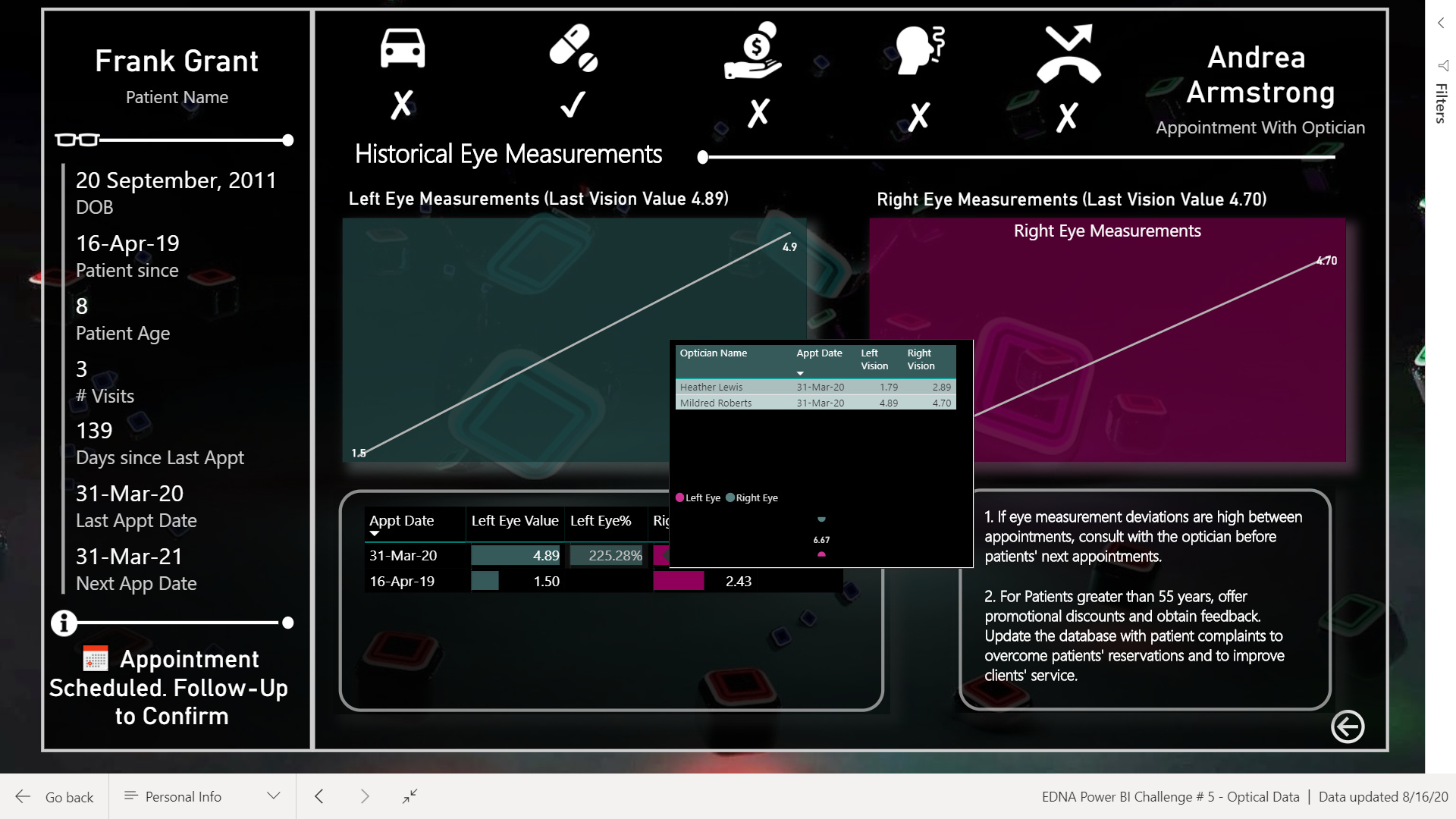
I have also used visual header tool tips to see vision details along with other appointment details.
On the drill-through page, I have randomly selected the next optician. When you hover over the vision details, it will show who was the optician on a particular appointment date therefore, monitoring eye measurement deviations with optician names will provide Penny to take necessary steps/actions. For e.g. in case of Fran Grant, it is shown that on the same day, he was examined by two different opticians with two significantly different results.
In the end , go to menu page, click Log off and it will show the welcome screen. Yes, the name of the company is OPTICANS not OPTICIANS.
Analysis which I couldn’t do because of busy schedule:
I wanted my report to be very simple and easy to navigate and hope that I managed to do so.
My DAX measures in the report are all over the place for now. I will arrange them afterwards and will also do the analysis from Optician’s point of view for my learning.
Following is the link to report:
Also attaching the PBIX file.
EDNA Power BI Challenge # 5 - Optical Data.pbix (3.5 MB)
Looking for feedback and suggestions to improve.
Thanks!
This is a remarkable entry - visually, interactively and analytically. However, I think you included the initial published link, not the publish to web link, since when I click on it requests login credentials. When you have a chance, can you please post the publicly accessible link?
Incredibly creative, amazing work. 
And thank you for the detailed writeup. Lots to explore and learn from here…
@BrianJ comments from the experts mean a lot and boost confidence and morale to learn more.
My administrative rights aren’t allowing me to publish to web. I get the following error when I try to publish on web:
Thanks for the appreciation.
Here is my submission! I didn’t see this until a few hours ago, but I thought I’d give it a go anyway!
I wanted to add some explanation on my submission too, so here it is:
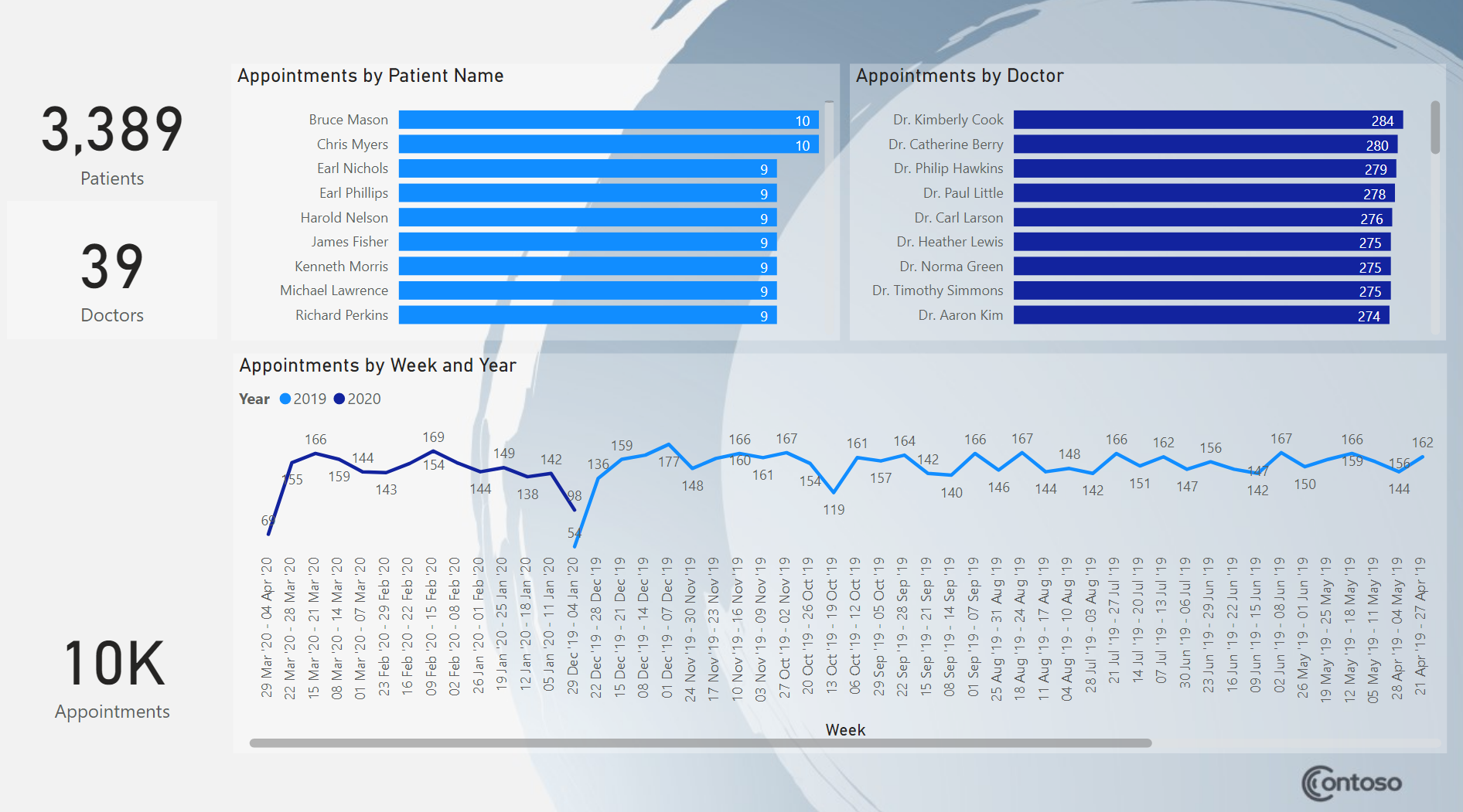
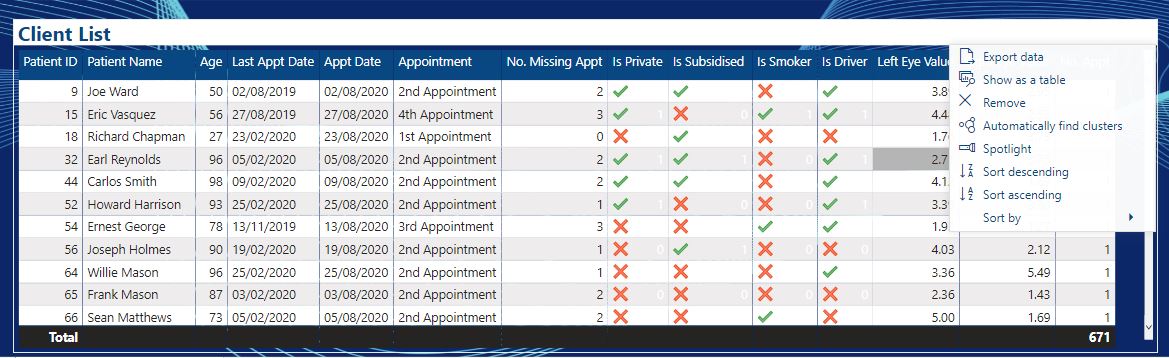
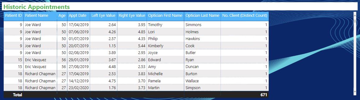
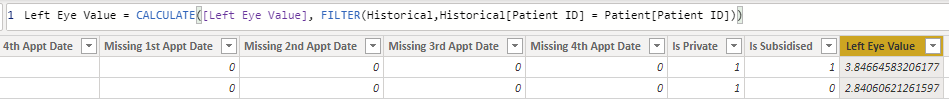
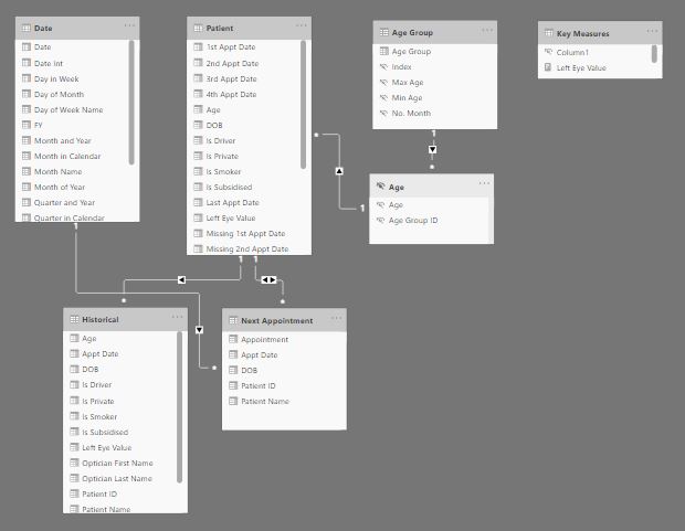
I created a separate table for “Doctors” with a “Doctor Index” and used merge to add that “Doctor Index” back into “Appointments” table. I did this because I wanted to create the “Doctor” calculated column, which would join the first name and last name together. This is more performant to do on a smaller table with 39 rows, versus 10k+ rows in the Appointments table. (If I had more time I’d have done one for Patients too!). There is a guy in the cube video that explains how to do this here: https://youtu.be/Zlu99RUtMRY
I created a field for Date Only part of the “Appt Date” and also a Time Only field. This was so I could utilize a Date table, and also provide some time analysis. (If I had more time I’d have created a Time table).
I added a date table with a week breakdown. I usually keep a simple date table definition handy, and this is my current one:
Date =
var _startdate = min(Appointments[Appt Date])
var _enddate = max(Appointments[Appt Date])
return
ADDCOLUMNS (
CALENDAR ( _startdate, _enddate ),
“Year”, YEAR ( [Date] ),
“Quarter”, CONCATENATE(“Q”,format(QUARTER ( [Date] ),“0”)),
“Month”, FORMAT ( [Date], “MMM” ),
“MonthNum”, MONTH ( [Date] ),
“WeekNum”, WEEKNUM ( [Date] ),
“WeekOf”, [Date] - WEEKDAY ( [Date], 1 ) + 1,
“Week”,format([Date] - WEEKDAY ( [Date], 1 ) + 1,“dd MMM 'yy”) & " - " & format(([Date] - WEEKDAY ( [Date], 1 ) + 1)+6,“dd MMM 'yy”)
)
Created relationships to Date table, and to the Doctors table.
I created a quick table using “Enter Data” and named it “Values” to hold my measures. I then created these measures:
Appointments = countrows(Appointments)
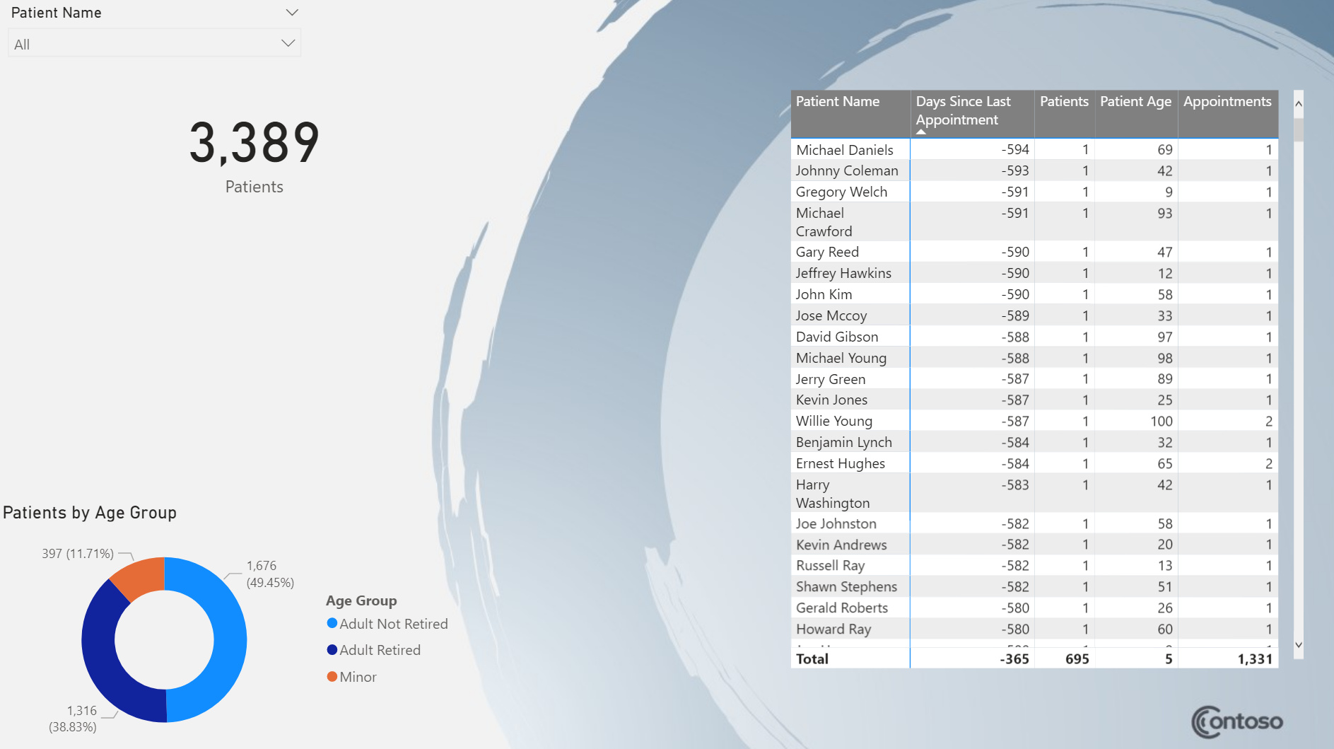
Days Since Last Appointment = datediff(today(),max(Appointments[Appt Date]),day)
Doctors = DISTINCTCOUNT(Doctors[Doctor Index])
Patient Age = datediff(max(Appointments[DOB]),today(),YEAR)
Patient DOB = if([Patients]=1,format(max(Appointments[DOB]),“dd mmm yyyy”),“Multiple Patients”)
Patient Name = if([Patients]=1,max(Appointments[Patient Name ]),“Multiple Patients”)
Patients = DISTINCTCOUNT(Appointments[Patient Name ])
Hour = format(Appointments[Appt Time Only],“HH”)
After I started creating visuals I decided I didn’t like the look of it, so I went to PowerPoint and searched through some templates for a background that I liked the look of. I picked the “Blue spheres pitch deck” and saved the slides as JPG to be used as page backgrounds.
I did bring in the Chiclet slicer for the doctor names in the weekly view. I tried a calendar visual but didn’t have much time so I abandoned it quickly.
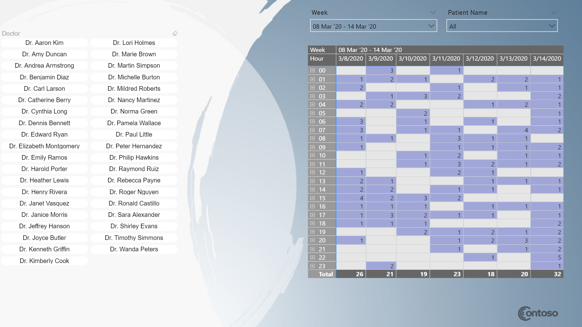
I had originally had a tooltip for Appointments measure but then I decided I didn’t like how that worked for larger number of appointments. So I instead created the drill through page for appointments.
I hid fields such as the Doctor Index and aligned things so they lined up and had a consistent feel throughout. I also changed the default behavior to cross filter instead of highlighting, so when you pick a doctor or patient, all the charts filter, not highlight on the summary page.
Other things:
PBIT file (you will need to point it to the XLSX file): https://github.com/DataZoe/PBIX/blob/master/Appointments%20Analysis.pbit
Hi @datazoe,
Like what you’ve managed to do in just a few hours (!)
Makes me wonder what you could have achieved if you had 2 whole weeks 
Seriously awesome that you’ve got an entry in, look forward to seeing more of you work.
All the best.
Super creativity on your report design
Wow fantastic work. Extreme creativity. I love it. I’ve learned something from your report, for sure.
Sam
Super design. Nice work
Hi Everyone
Please find my solution to the most recent challenge.
All advice and criticism welcome.
Thanks
Craig
Hi everyone,
At first, I would like to give a lot of gratitude to the Enterprise DNA team for their contribution to the Power BI community.
This is late, but I still want to submit my solution because this challenge is so exciting to me. 
To solve this challenge, I focus on Penny’s requirements as below:
Base on these requirements and the context of the situation (their current appointment system has issued), I decided to develop only one report to support Penny’s need and
my report will have some functions as below.
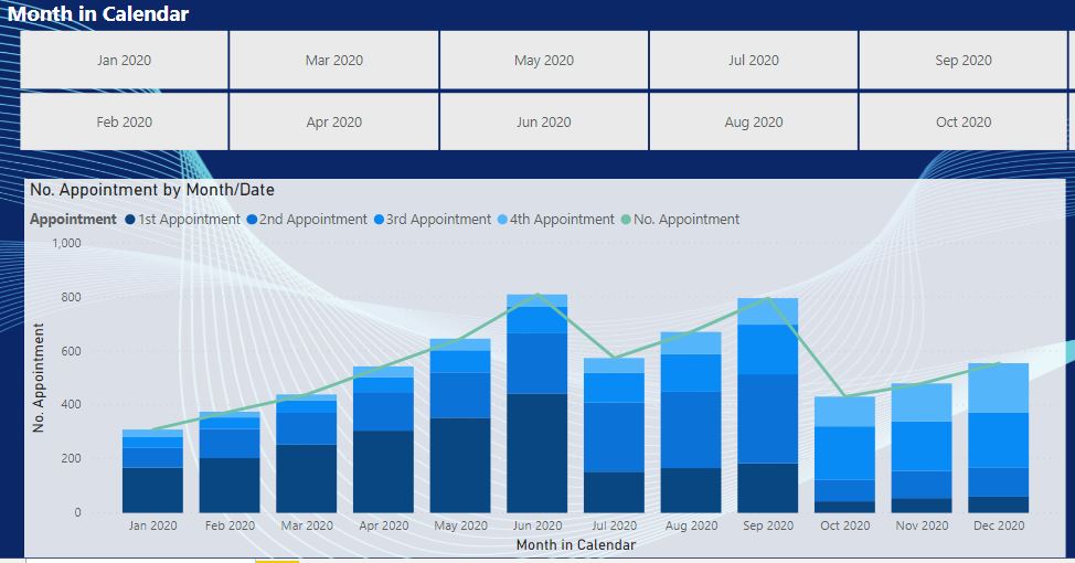
And here are some demo of my solution.
With the Monthly Chart, Penny’s team can easily schedule their resource for the client’s demand.
These are some of my demos and I also want to share some techniques that help I built this report.
The first is the data relationship.
 .
.
Some things that I learned from this challenge
This is all information that I share today and I hope it can contribute enthusiasm to the Power BI’s lovers.
Nhat Lam
Optical.zip (2.6 MB)
Craig,
Thanks for participating in the challenge. Would love to take a look at your entry, but unfortunately I think you posted the initial published link, rather than the publish to web link since when I click on it it requests my log in credentials. If you could please repost the public link, along with screenshots of your report and the PBIX file attached so that others can view your entry, that would be terrific.
Thanks!
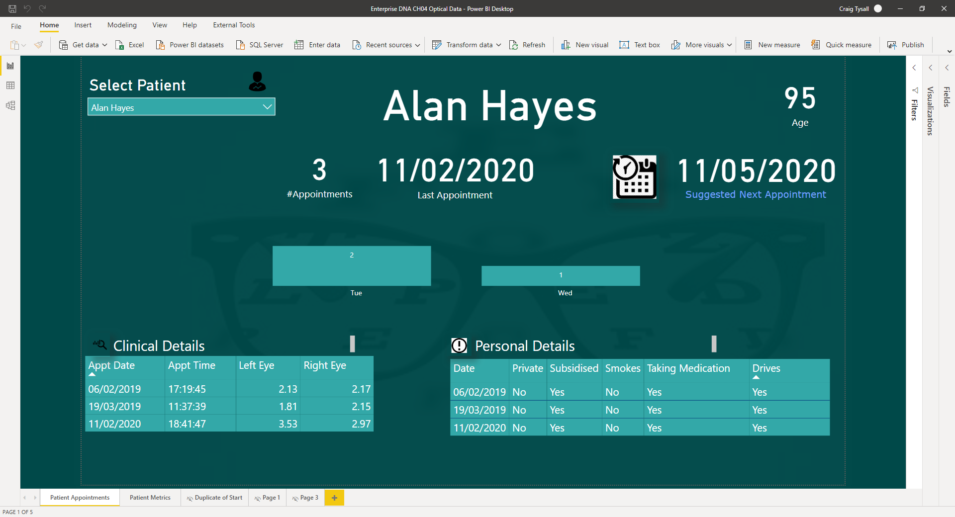
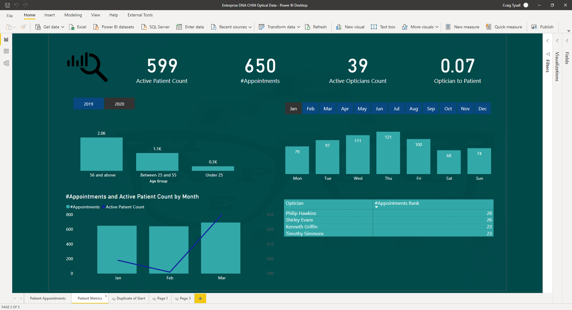
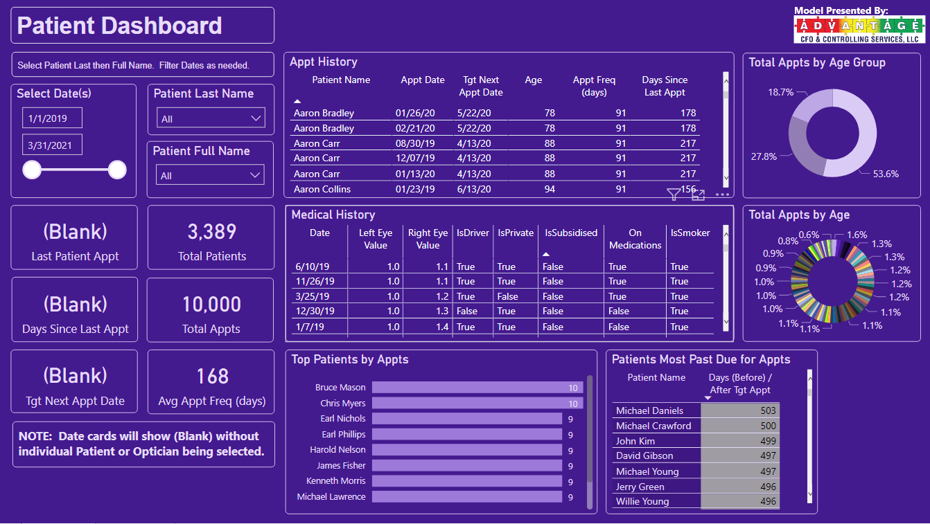
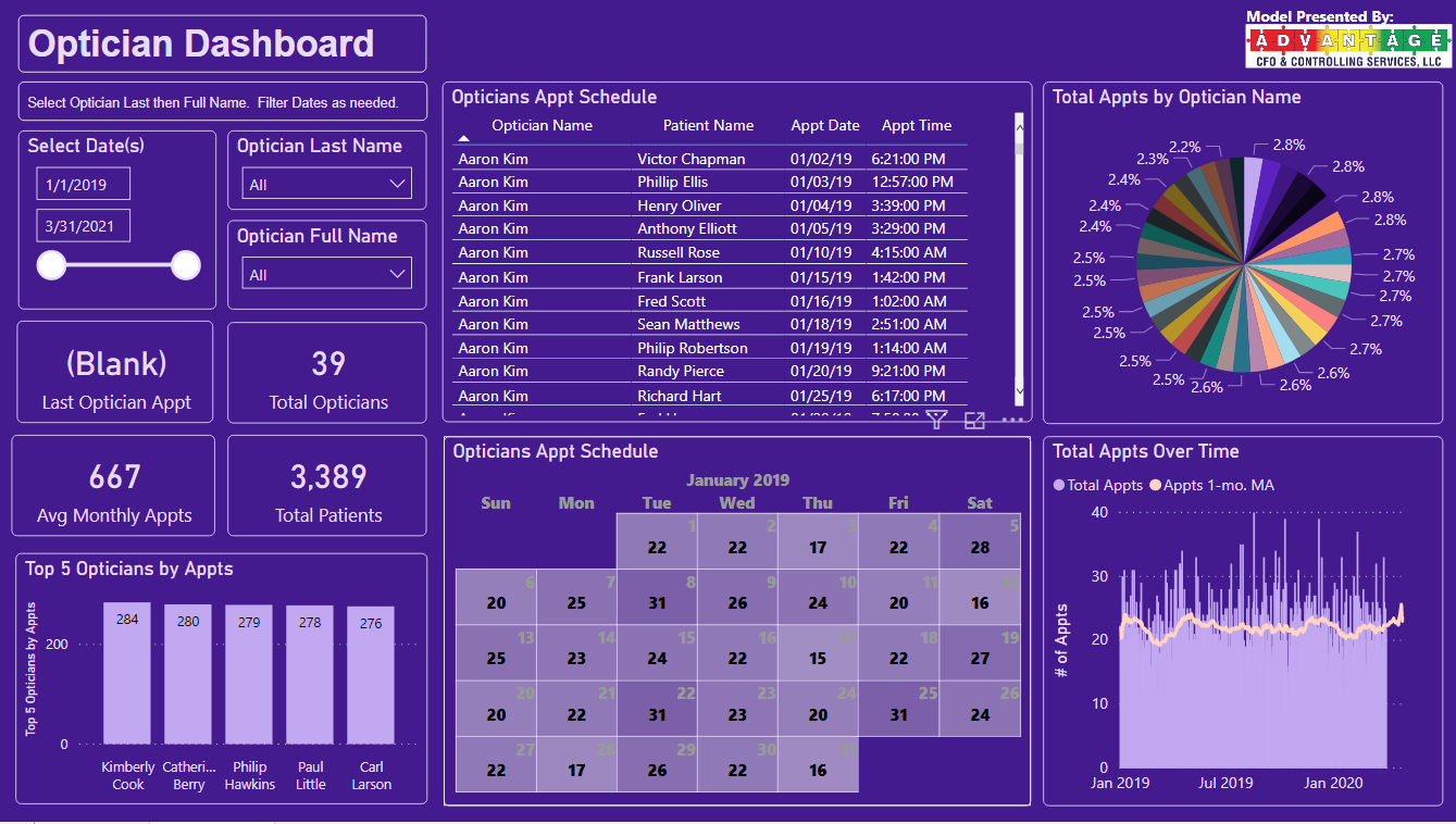
Good morning, Good afternoon, Good evening, around the group - here is my submission for Challenge #5 Optical Data.
And a link to the published report…
Really nice reports and ideas ladies and gents!
Love how you have everything structured in your report, but one area that I would change is the use of Pie Charts. In my opinion, you would be better off using a “Stacked Bar” or “Stacked Column” Chart, due to the amount of items you are filtering. Great effort!
Thanks
Jarrett
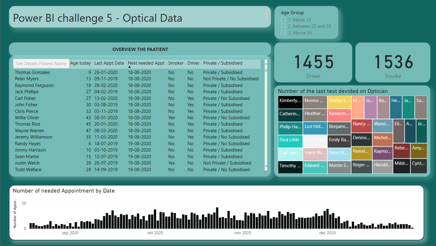
Hi all
I’am late with the report but now I have done it. If there is any comment which could improve the report, I will appreciate it.
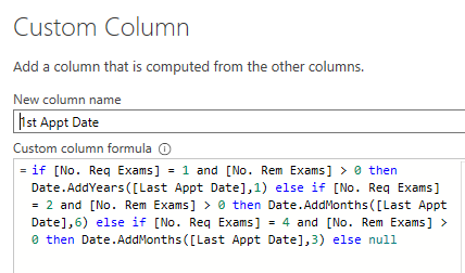
Challenge 5 was not easy. It was very difficult to find a way to calculate the next appointment in DAX. I cannot M to this level.
It was difficult as new appointment always will be dynamics as tomorrow it will be a new date for needed appointment. I used YEARFRAC so I get decimal on the years. But I think YEARFRAC count exact number of days. There will be a divergence on about up to 15 days depending on the persons age I think due to Leap Year and February which change from 28 to 29.
Around YEARFAC I used VAR SWITCH and Then SWITCH with a link to VAR. I found this very heavy to manage.
If you, when the challenge has expired, It will we good if you afterwards could place a link to you submission with the PBIX file. Then we can see how other have calculated the age up to TODAY. Which I found very difficult.
Thanks to all the submission. Lot of the visualization is like a artwork.
Link to PBIX file:Power BI Challenge 5 - Optical Data.pbix (697.3 KB)