@Greg Good report and great explanation of what you have done in the report. I like the PDF export concept in the report too. I was wondering how you did you calculate the Next Optician for a particular patient.
Are next optician was selected randomly or you used/assumed a particular concept behind this?
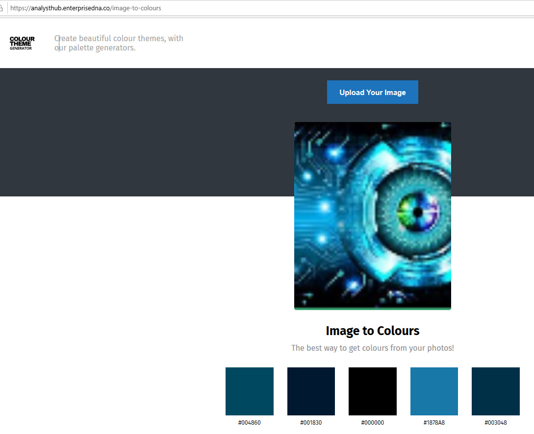
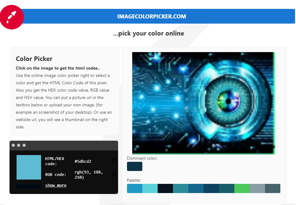
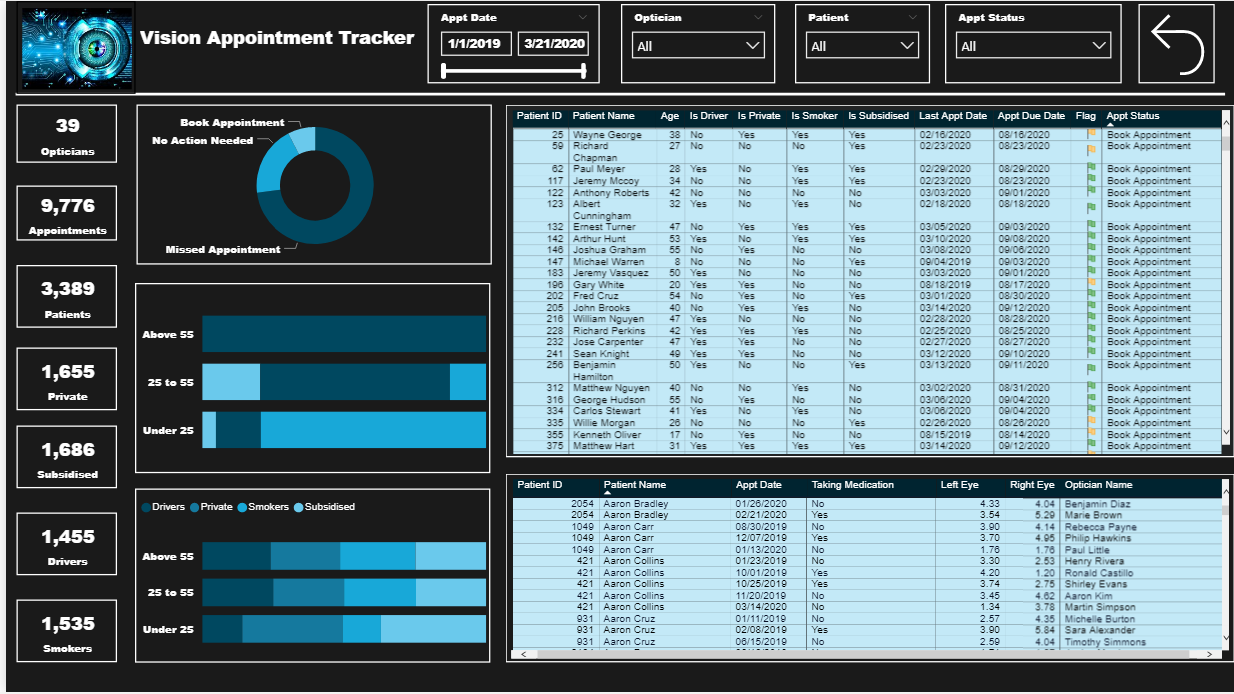
I like the way you structured your report, and showed all of the data that was required. One area I would suggest to improve on is the color theme. This is one thing, even if you are a newbie to Power BI , can help take you to the next level! First of all, I will proclaim that I’m color blind, and without the help of additional tools my report color schemes would be awful. You have a great image in the top left corner of the report. Use this to your advantage, and create your color scheme off this. Here are step by step instructions to help create this.
** If you want to take these colors a step farther and create your own JSON theme, go to this site and enter all of the HEX codes: https://themes.powerbi.tips/
Selecting a color scheme is very first thing I do when I’m creating reports. Nothing beats a great first impression!
@JarrettM
Thank you very much for your input and feedback. I am learning a lot with the challenges and valuable feedback from others. This will really help me for next my challenges.
You raise an awesome and very important point here that I think is relevant to the vast majority of us here on the forum. The eDNA content does SUCH a good job on DAX training, that for almost all of us that’s our comfort zone.
However, @nick_m and @melissa have both said something to the effect of (and I’m grossly oversimplifying here) “if something can be done upfront in Power Query, it probably should be”. This was a huge revelation to me, but as I’ve tried to implement it more and more over the past few months rather than just jumping right into DAX, I’ve come to realize that in many/most cases, it is the best approach both from a performance standpoint and also in terms of making your DAX much simpler and easier for others to understand.
Toward that end, I can’t recommend @melissa’s Enterprise DNA TV YouTube Videos highly enough. By working through these in detail (often multiple views per video) and forcing myself in my own work not to jump immediately into back DAX when I struggle with PQ, I’ve started to gain a much more balanced skill set that has been enormously beneficial. It’s hard work at times, but also really rewarding because, while totally different in structure and operation from DAX, M code is incredibly interesting and powerful in its own right.
So, you are spot on in thinking about DAX as just one force among many.
Once again I look at these and fail to see how they help us to get any better.
I look at the submissions and figure why am I doing this I’m not a graphic artist or a design person.
It’s intimidating at best to us out there that don’t have any design/artistic abilities. What is wrong with a couple of charts and a couple of tables to get the point across.
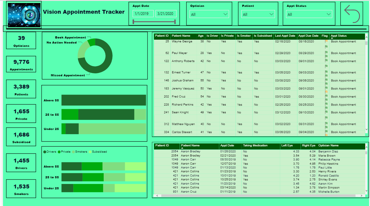
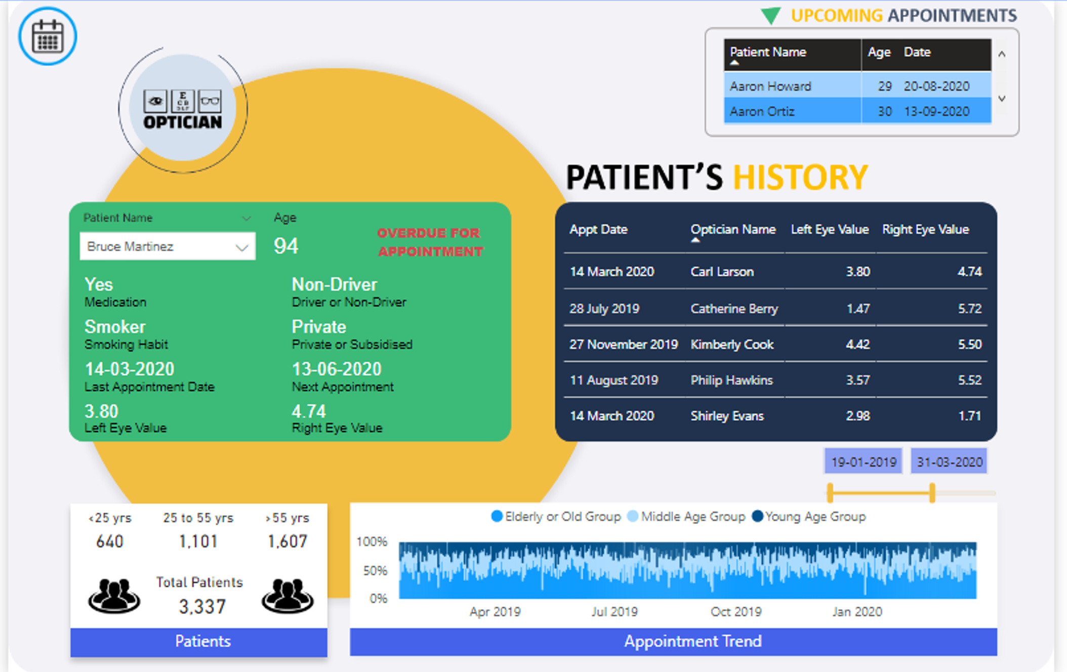
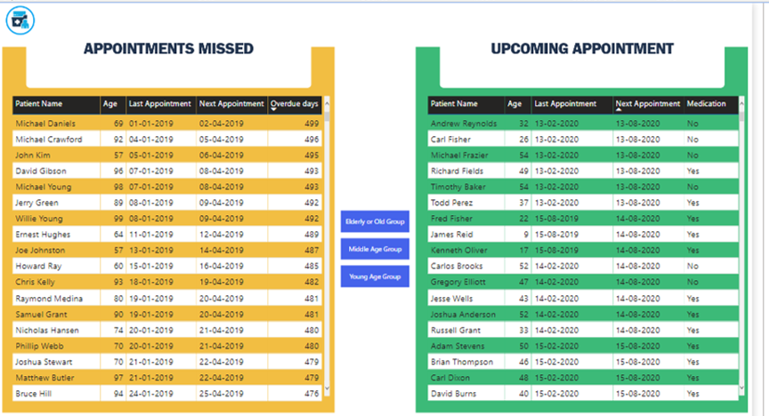
@GuyJohnson It is all about Data Story telling, if your end user can get the idea of what you are showing them in first 10 seconds of seeing the dashboard then your end goal is achieved. You don’t need to decorate a dashboard to make it look good, only few elements related to the data and boom you have a great report, for example someone above used glasses and without even looking at the data I know this report is somehow related to eyes.
Without debating the relative merits of the various design elements (or anything other than basic design elements at all), I would say if you don’t find the design aspect relevant for you and your work, just ignore it and focus on the incredible range of PQ, DAX and visualization techniques exhibited across the range of the submissions. These techniques are extremely versatile and can be applied across a wide range of problems, industries, etc.
I can say for certain that I’ve gotten significantly better in a number of areas by participating in these challenges and learning from the entries submitted and the subsequent write ups/discussions, and find it very hard to imagine that wouldn’t be true for everyone, although individually our takeaways will be different.
@GuyJohnson Don’t forget that its all about your audience, and what they expect. If the “report” will be client-facing or executive-facing, then they’re (often) used to high-quality presentations/graphics. One has more latitude when developing for internal audiences, but I’ve personally had many (consulting, granted) instances where a blocking “must” is something like:
> … if the layout and formatting are not consistent and ideal, how can I trust the data? …
So, for good or bad, the audience rules … whatever they need to have confidence in their analysis/decisions, and each organization/report series will have their own design criteria.
The truth is that time pressure always puts me back in my comfort zone. Although I can’t solve problems with DAX like a walk in the park I know where to look for resources that can help me to get to a solution within a certain time. On the other hand I can’t find so many resources on M code. Well there are resources, but the amount of DAX resources seems much larger to me. Maybe I have to improve the way I search… I don’t know for sure.
I will certainly look at @melissa’s Enterprise DNA TV YouTube Videos. Thanks!
You’re spot on about the gap between the quality and quantity of M versus DAX resources (at least until we can finally convince @Melissa to write “The Definitive Guide to M”…). in the interim, we have put together the following resource list, which is the best of what we found out there, but encourage everyone to add to this list as you find other good resources:
In addition, you may find this video helpful in terms of M practice strategies and tools: