@ChadD
I struggled with the same issue with DATEADD and I used EDATE function instead. Hope this helps.
Regards,
Neb
@ChadD
I struggled with the same issue with DATEADD and I used EDATE function instead. Hope this helps.
Regards,
Neb
I should just write the same issue.
I will allow myself to expand the question.
What she do Manually
Is she checking the difference between two appointment for each eyes?
The appointment with the measure from the appointment just before.
And then what Brian write “naturally occurring patterns”
/Amdi
If you want to solve this in DAX, you already have the key components needed to solve.
Here is my hint: The 3 data points you will need are Age Group, MAX Appt, & Days until next appointment.
** Take those 3 data point and form a SWITCH statement to solve it. Here is a video from Sam to help you out. **

Here is a great resource in the EDNA Knowledge Base
https://info.enterprisedna.co/dax-function-guide/switch/
Thanks
Jarrett
@sam.mckay and @haroonali1000 this is the link to my work Optical Data Analytics - EDNA Day 5 Challenge
Hi All,
Great to see you are all getting stuck into the challenge.
Just to clarify a point around the left eye and right eye values.
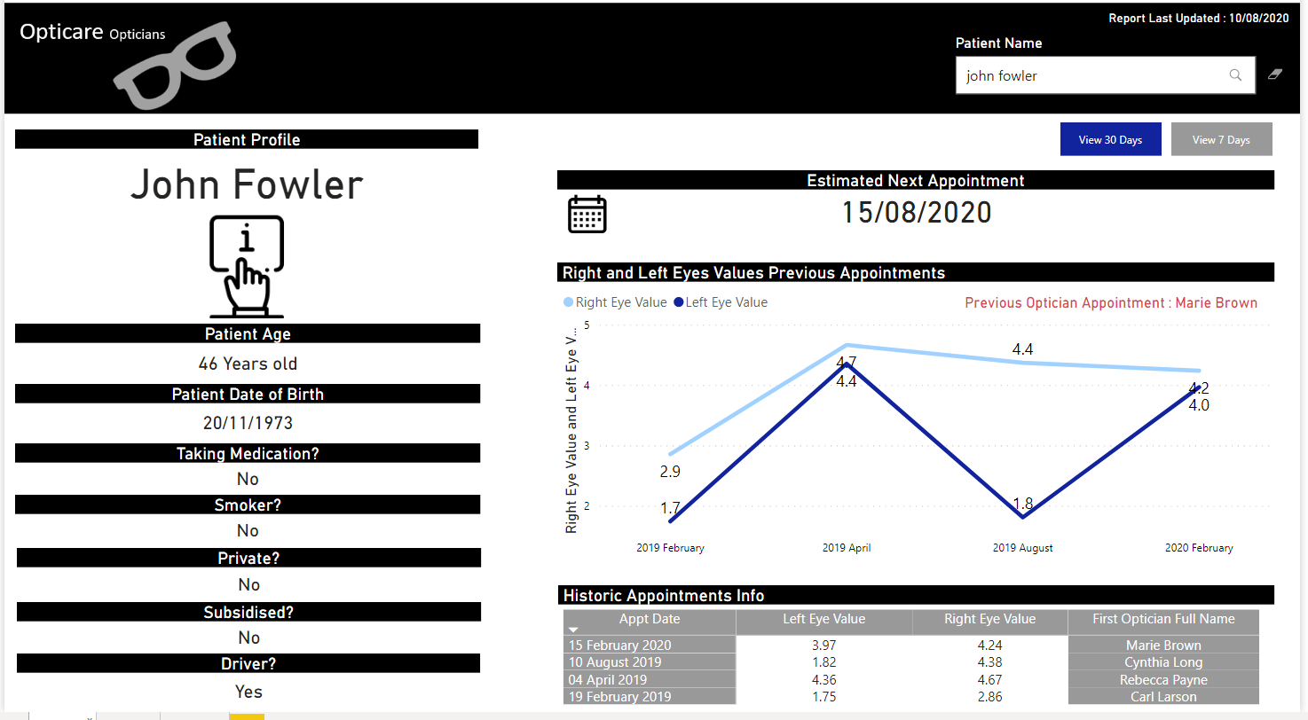
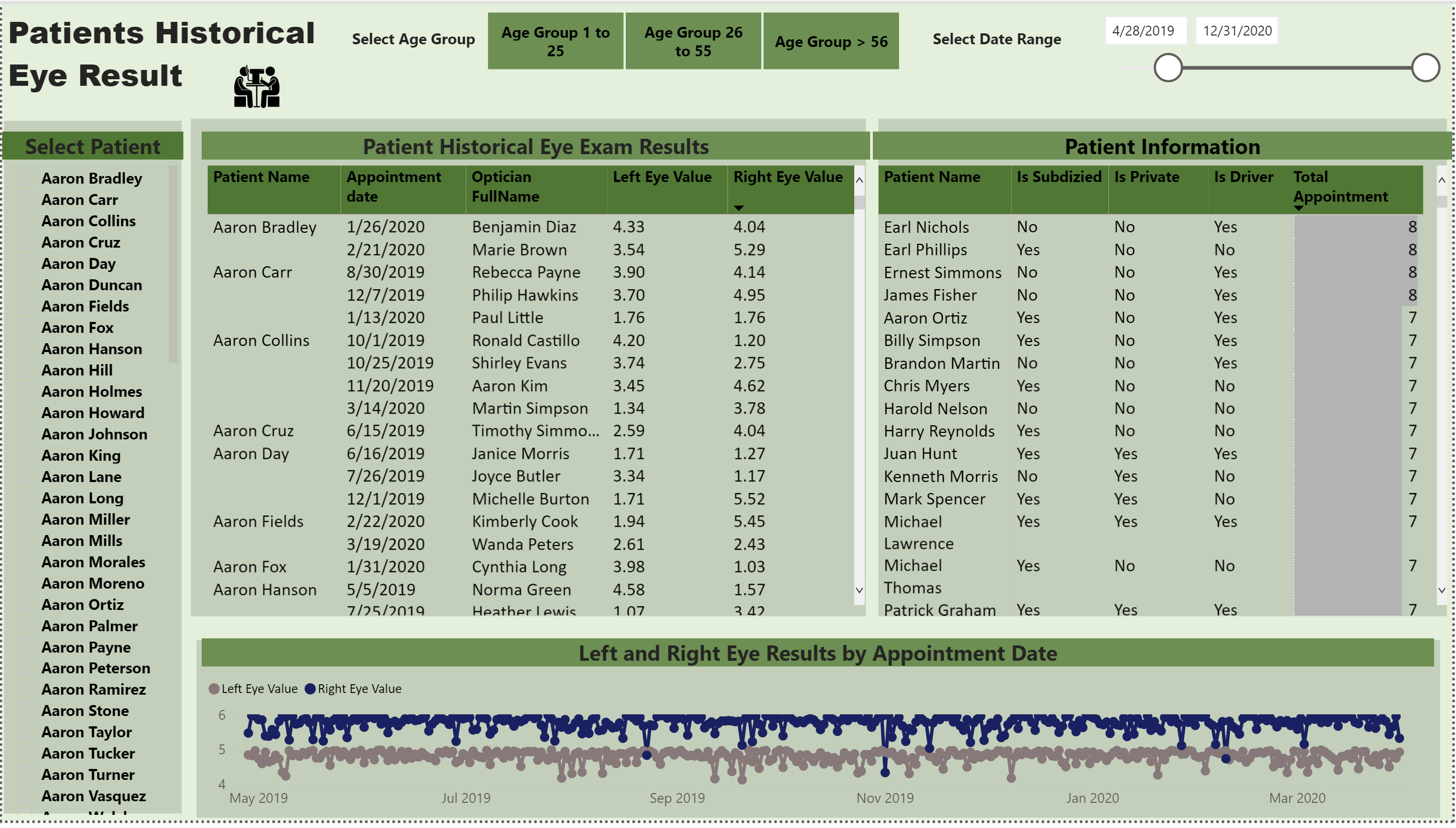
For this particular aspect of the report we are not asking you to calculate the differences or create any calculations (feel free to do so if you think it adds value but as @BrianJ mentioned this is difficult without supporting information ). The ask is so that if a single patient was selected then previous appointment values are also visible.
I hope you have also seen the post from my colleague @BrianJ about the newcomer category a great initaive be sure to check it out.
Hope this helps.
Regards,
Haroon
Great – thanks for the clarification. That definitely makes things simpler…
Thanks Haroon for the update
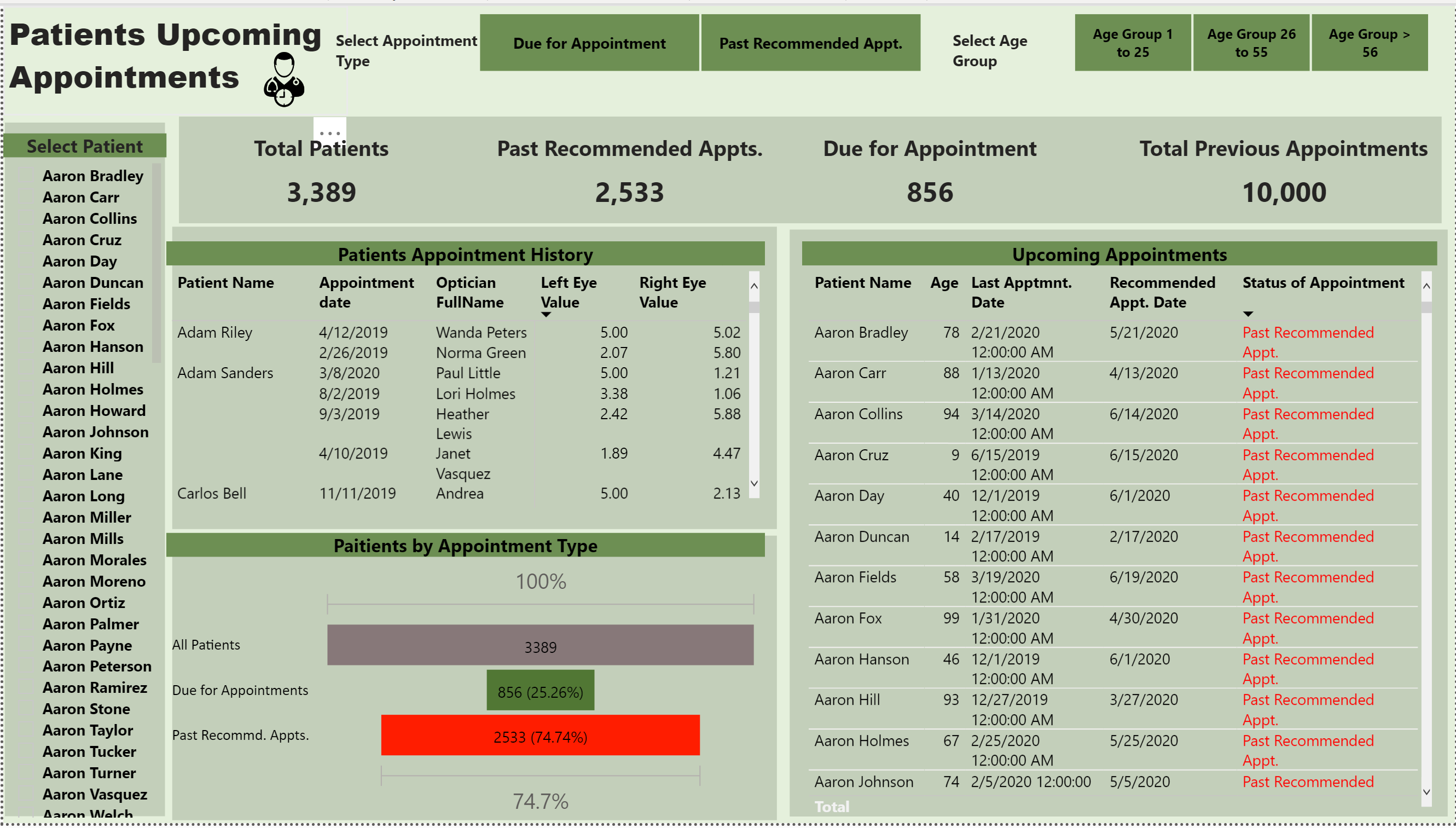
the next appointment is tricky, do we need to just show next appointment date or several next appointment? also as the time pass by, the patient age will also increase so showing appointment for the next 5 years may change the interval
Hi everyone,
This is my first post on the forum and first challenge  So thought I’d post my design up
Had alot of fun participating and looking forward to the next challenges.
I created 3 pages,
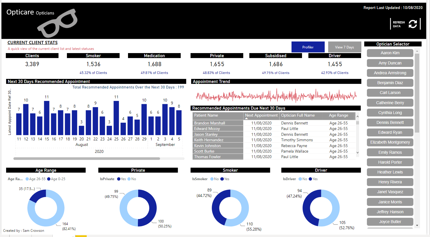
Theory is, you see a clients name on the recommended next appointment table in either the 7 or 30 day page, then if you require any further info you can type their name in the search bar of the profile page to get all relevant details . I created a optician filter, so a optician could filter his name, to view how many clients he has, along with any recommneded future appointsments.
Thanks,
Sam
Hello Everyone,
Here is my submission for Challenge 5. critiques and feed backs are welcome.
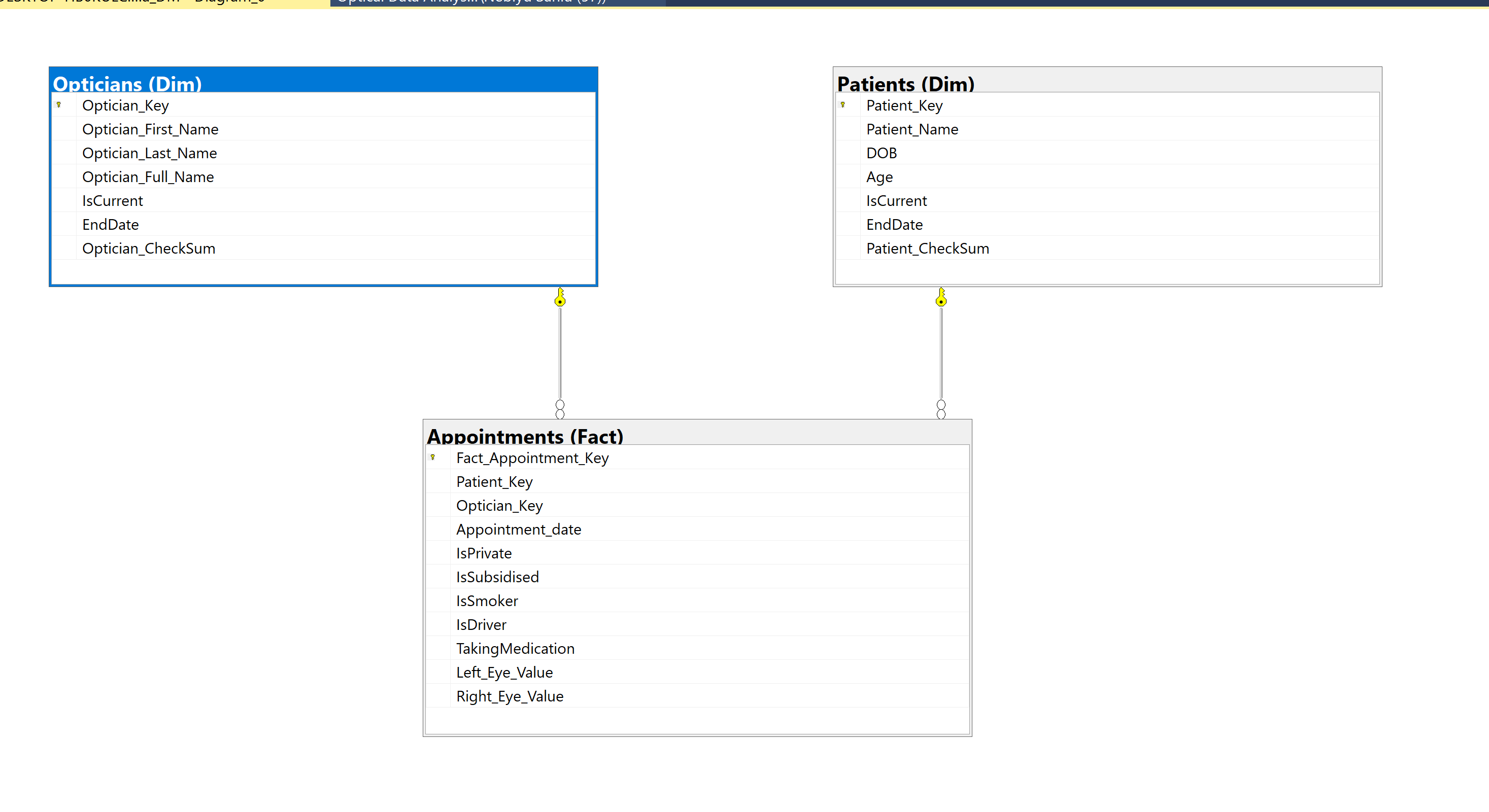
First I loaded the Excel Data source provided into SQL Server using SSIS to create a small Data Mart ( As a relatively new Power BI user , I check the validity of my measures using SQL Server).
The Data Mart contains Dimensions Patients and Opticians and the Fact table is Appointments :-
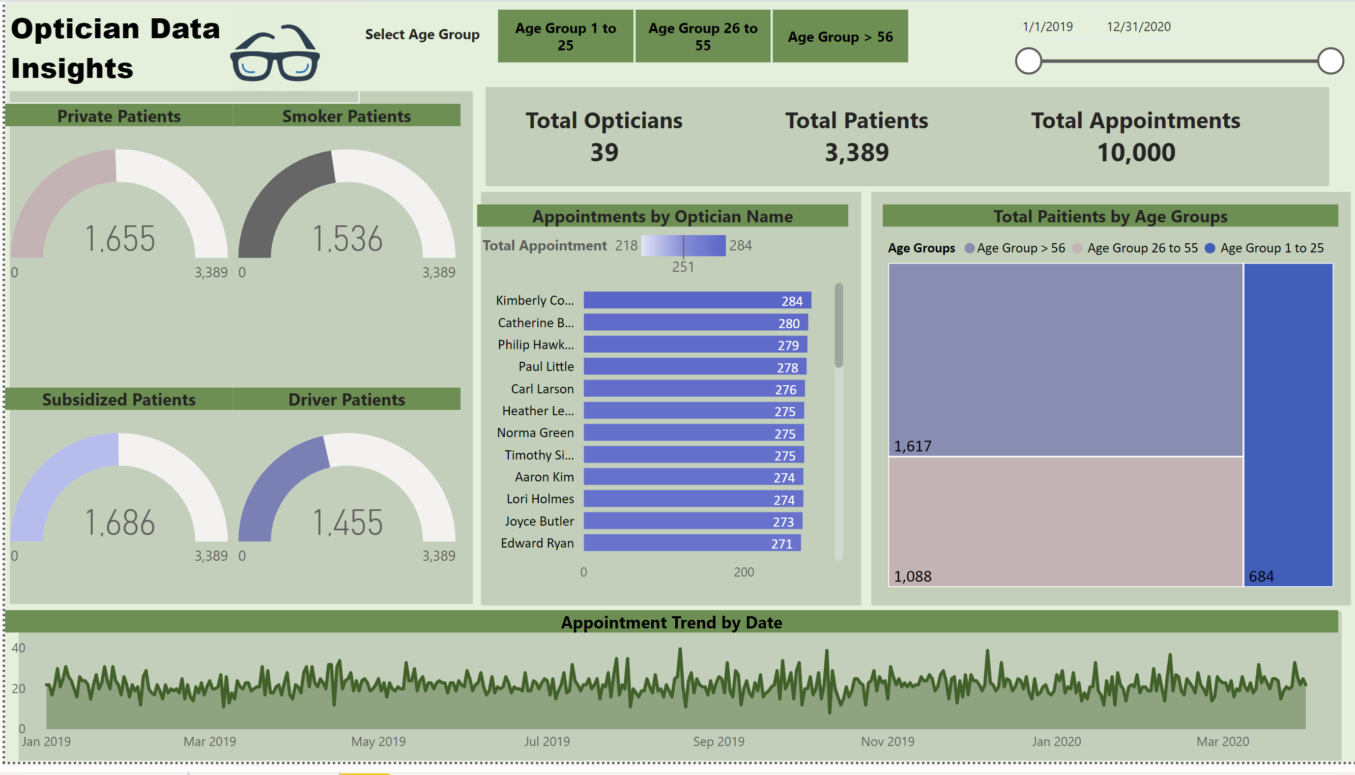
I created three pages for this requirement.
Page 1 :- Overview of the Data set.
Page 2 : - Patients Eye results.
Page 3 :- Appointments.
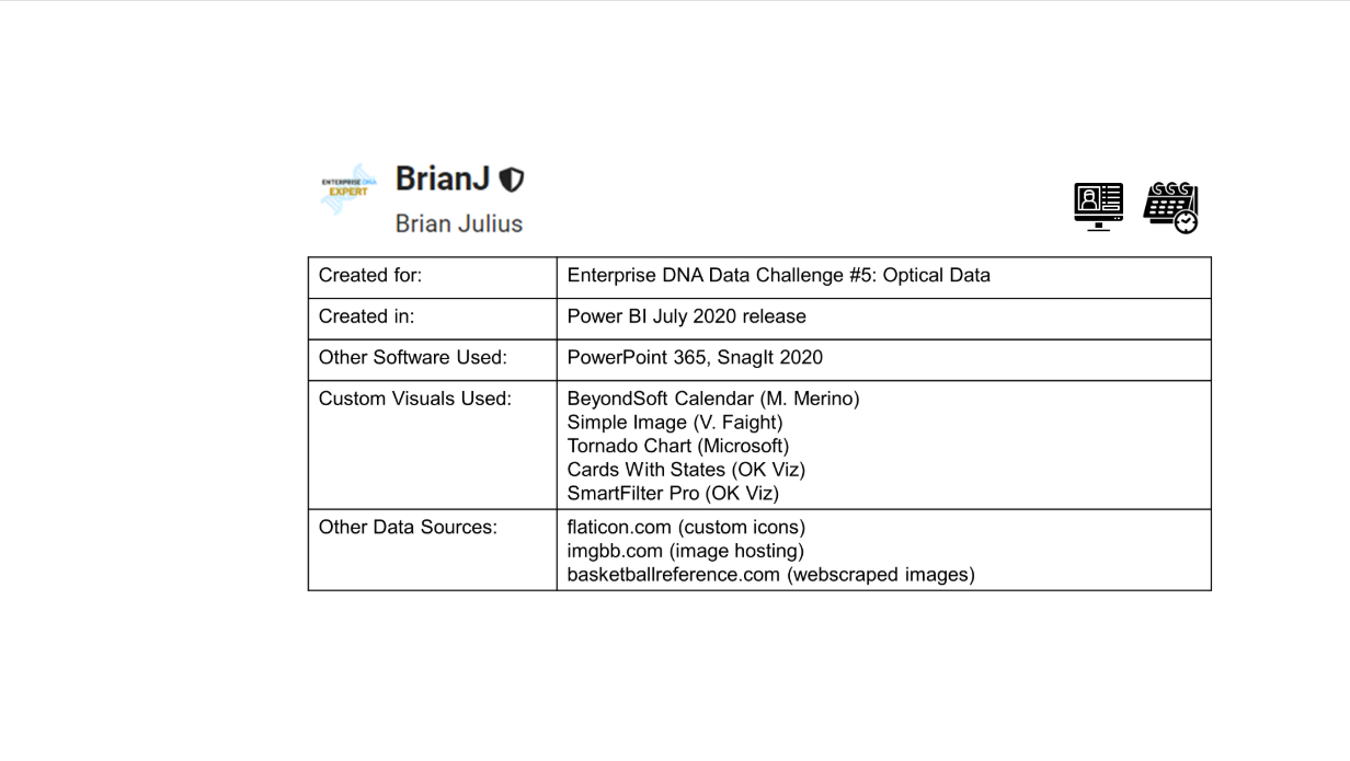
I used EDNA color palette creator for the visuals. (Awesome resource BTW)
Page 1 :- Overview of the Data set.
Page 2 : - Patients Eye results.
Page 3 :- Appointments.
Here is a link to the Published Report
https://app.powerbi.com/view?r=eyJrIjoiY2MzYTQ2MDAtNjg0Mi00Zjg3LTg2ZjgtZGI4MjRkMDAxYzBkIiwidCI6ImI2ZjNjOTE3LTBhODEtNDc1NC1hODMyLTI4MGQxMjJhOGMxYyJ9
Thanks and Regards
Forum Members,
Here’s my submission for Data Challenge #5. I will provide a full write up after the closing date, but I had three major learning goals I wanted to focus on in the development of this entry:
Link to the live report:
As always, constructive feedback welcomed and appreciated.
Good luck to all! Can’t wait to see your entries.
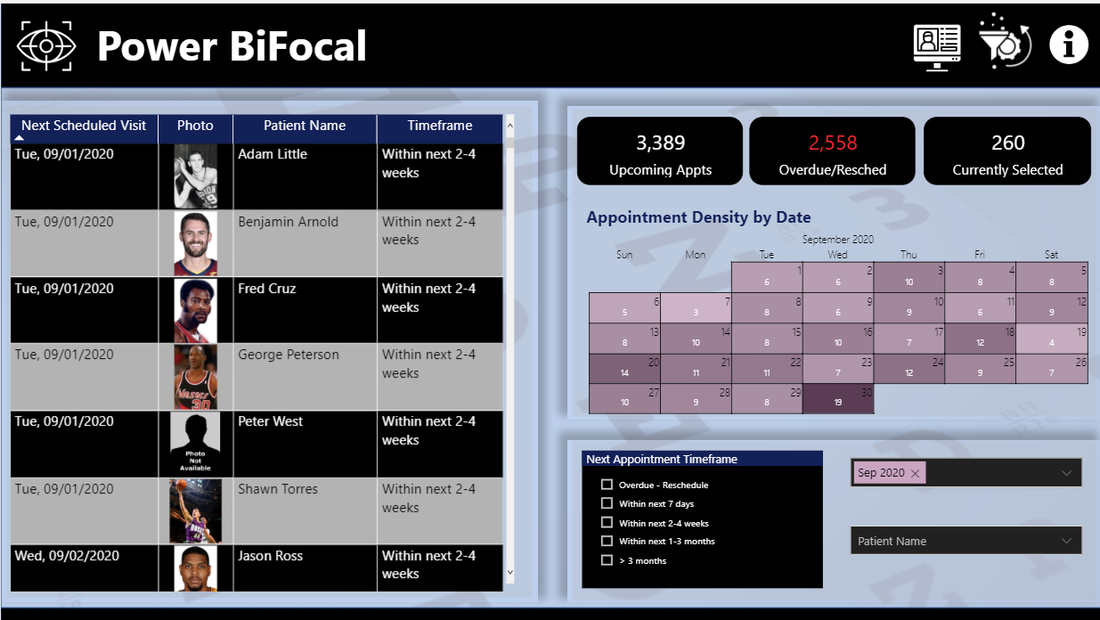
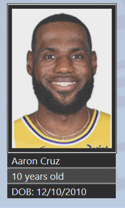
P.S. The decision to web scrape my patient images from basketballreference.com resulted in some fantastic age mismatches. You can see above that 96 year old smoker Adam Baker looks astonishingly good for his age (though he’s no longer driving). But my favorite is 10 year old Aaron Cruz, who is currently scoring 365.7 points per game in his third grade basketball league, and has applied to skip his fourth-grade season to become the first pick in the 2021 NBA draft.
Welcome to the forum! Awesome way to introduce yourself with a terrific entry. Really clean, intuitive design that incorporates a lot of analysis and technique in a compact report, and thumbs up on the added functionality from the optician’s standpoint - that never occurred to me to build that in.
@BrianJ… Great work on the visualization. I really liked the concept of incorporating patients’ images in the report. Moreover, appointments by date in calendar view is very useful to see which dates have more appointments and opticians can plan accordingly.
This challenge is more towards building good visualization techniques than analysis so will be very interesting to build a report.
I will learn how to web scrape and manage images within power query too.
Lastly, the colors used in the report are very pleasing to look at.
Great submission!!
@BrianJ
Impressive work once again. I really like how you showed a detailed information of the clinic’s patients data individually ( we were told they are not tech savvy especially Penny. she will be convinced by these entries ) but also they want to see the coming appointments. Your Reports did show as detail appointments by day with the patients information. For sure it would be valuable for any clinic. I am learning from all these sophisticated and well thought entries.
P.S. Who knew Aaron Cruz would be a top talent such at young age  .
.
Thanks,
Nebiyu
As always, brillant entry @BrianJ…
Can you share the idea for the calender - scratching my head for 2 days now… Getting incorrect results with my DAX.
Thanks in advance
Thanks! For the appointment density calendar, I used a custom visual called BeyondSoft Calendar. I thought about doing this by hand in DAX. Overall, it’s very similar in implementation to the custom heat map I created in Challenge #1. The challenging part would be the repositioning/reformatting of the matrix blocks that would need to be recalculated each month. At that point, I’d already put in enough time on this entry that it was beginning to feel like an unwelcome houseguest, so I went with the simpler custom visual approach. 
I hope that’s helpful.
@MudassirAli and @Neba ,
Thanks very much for your feedback – greatly appreciated.
I totally agree with your assessment here. I used a very simple data model, and wrote very little DAX for this report (mostly simple SELECTEDVALUE harvesting measures and some IF and SWITCH statements for graphics/icon handling, since I did the heavy lifting on the appointment processing in Power Query). Big departure from the last challenge, which was extremely analysis-intensive.
I like the way @haroonali1000 is mixing these up - never know what to expect from one challenge to the next.