A brief overview of what I have done in this report.
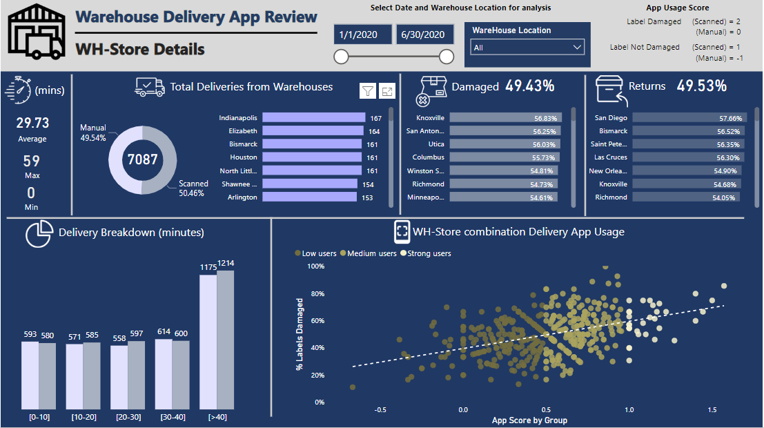
In order to analyse which WH-store combination is using the App regularly, I have created a metric called ‘App usage score’ and the average value of each WH-store combination is calculated.
The scoring criteria to calculate ‘App usage score’ for each delivery I use is
The goal is to benefit the app users more (those who scan) for scanning, even when the label is damaged, and to penalize those who do not scan even when the Label is perfectly OK.
The average app score for all WH-Store combinations is then used to segment in Groups (Strong, medium and low) based on their App usage and compared with % Label Damaged in a scatter plot. It can be seen that most WH-Store combination show some kind of a trend to use the Delivery App, while some are not using it at all. This will help the management to see the WH-Store combination where app usage is greatest and also the percentage of label damages.
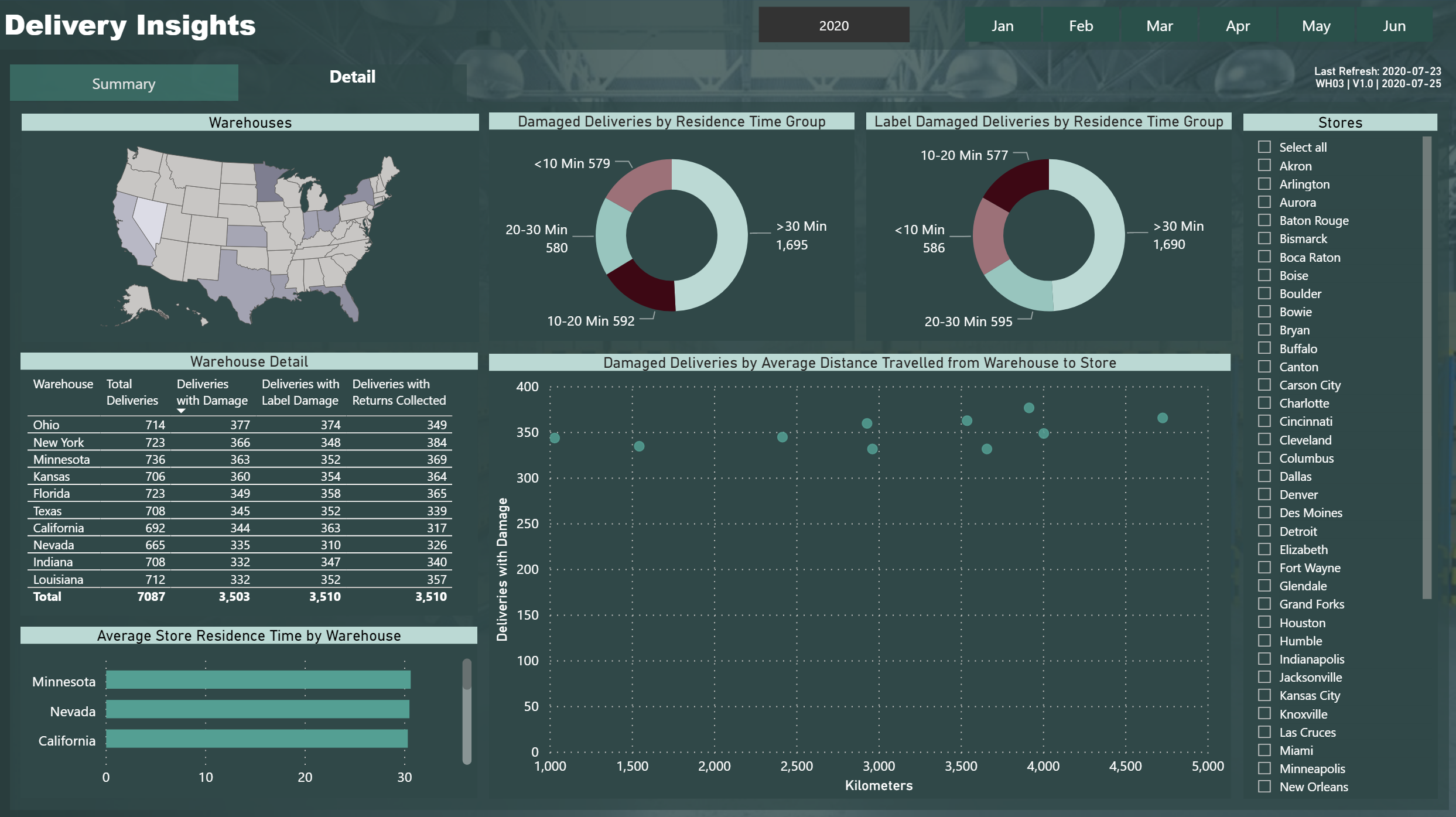
I have also segmented the time spent in store in 5 categories, [0-10], [10-20], [20-30], [30-40] and [>40] for all deliveries.
Hello Forum,
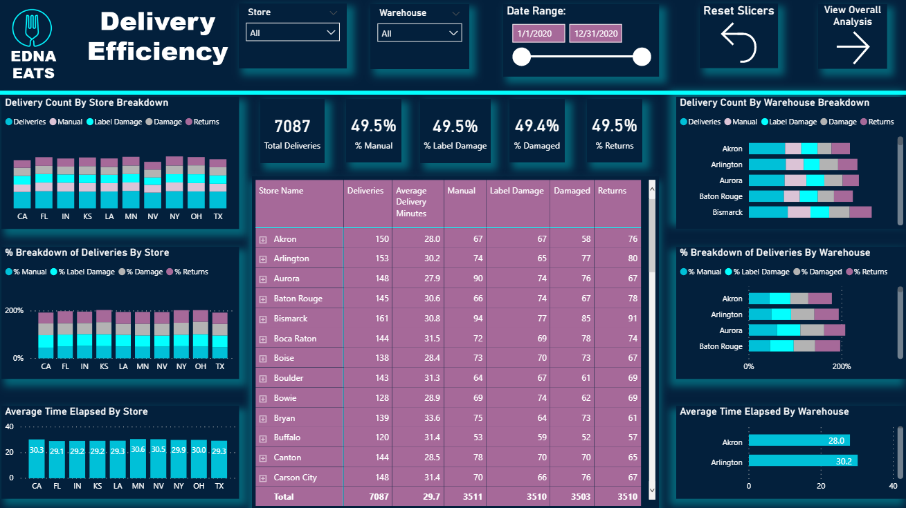
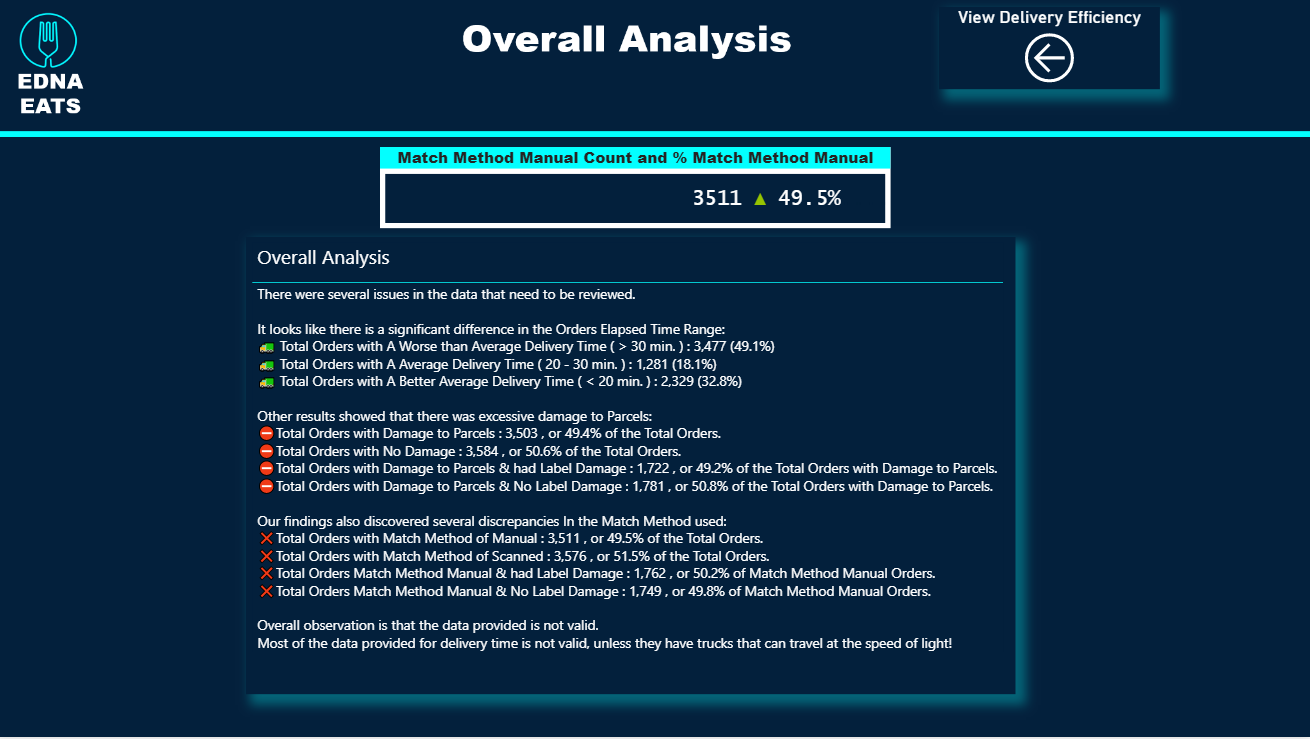
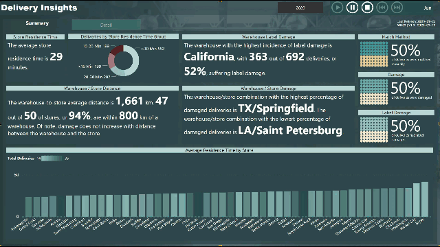
Please find the snapshot for my submission for Challenge 4.
Looking for any type of feedback on the report will help me to learn and improve more.
Below please find my submission for Data Challenge #4. I took quite a different tack on this one, so hopefully it provides some interesting food for thought. My approach has four major components:
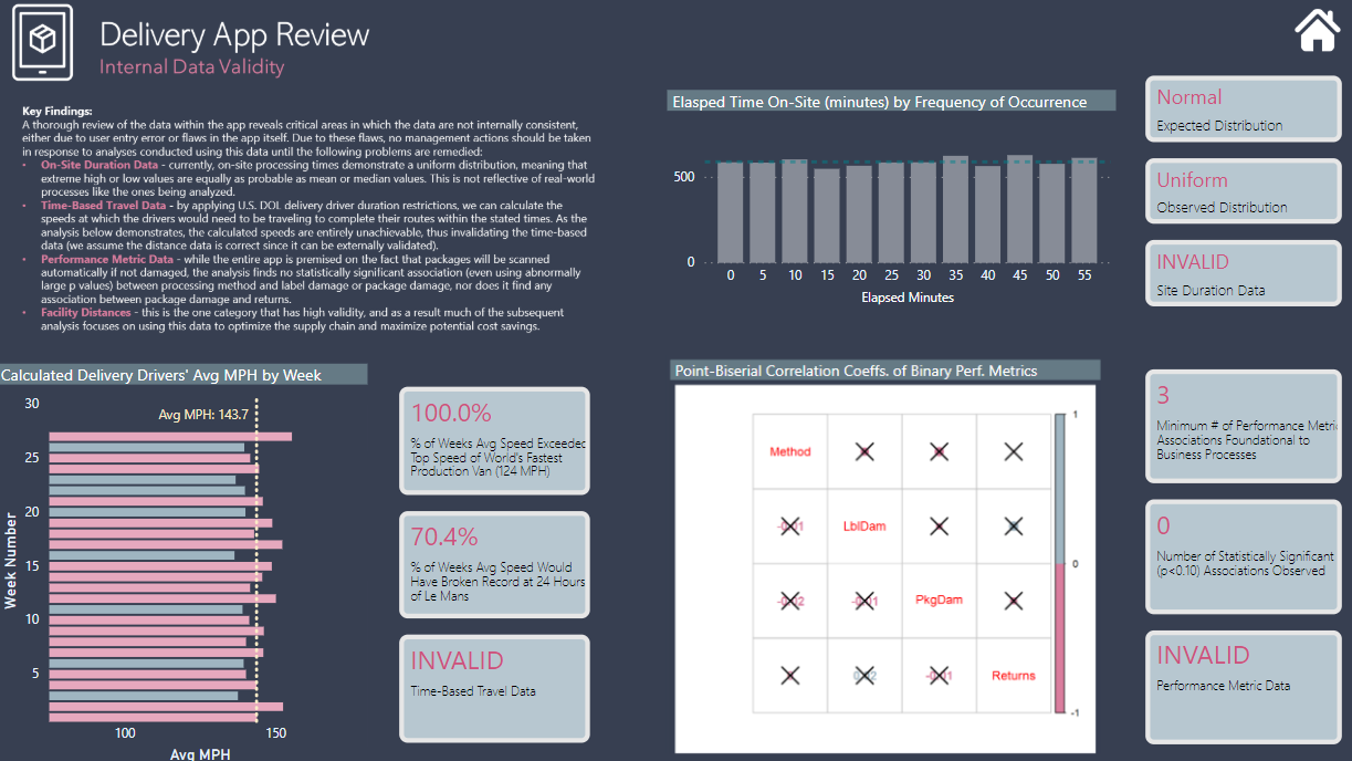
Data Validity - I started with a detailed statistical analysis examining whether the data in the app meet basic thresholds of reliability and validity (spoiler alert: 75% NO), and thus whether they could/should serve as the basis for management decision-making.
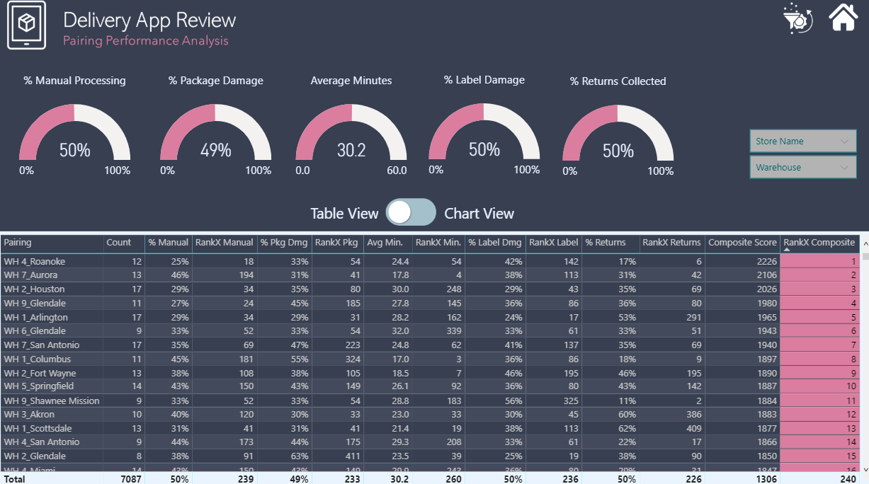
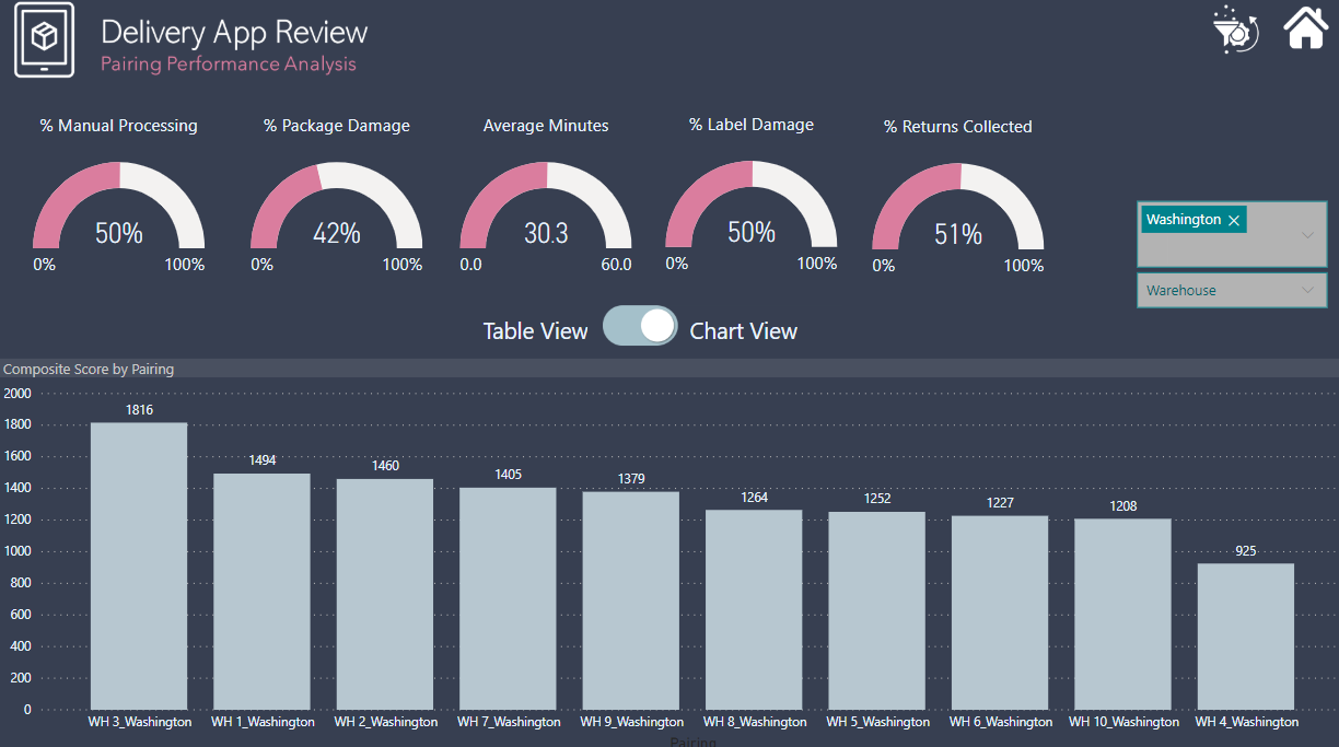
Performance Analysis - Despite the concerns generated in 1. above regarding the validity of the performance metric data (e.g., label damage %, package damage %, return %, etc.), I wanted to provide a proof of concept for how a dynamic, composite metric based on combined ranking across the five performance metrics could be done.
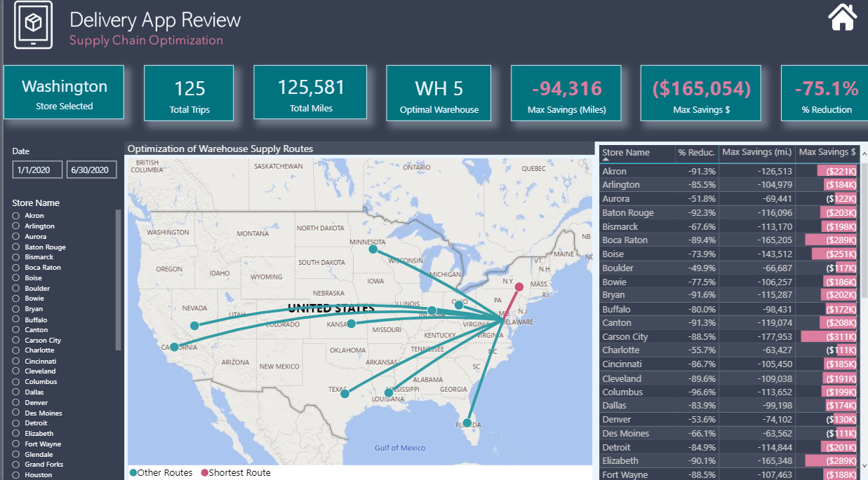
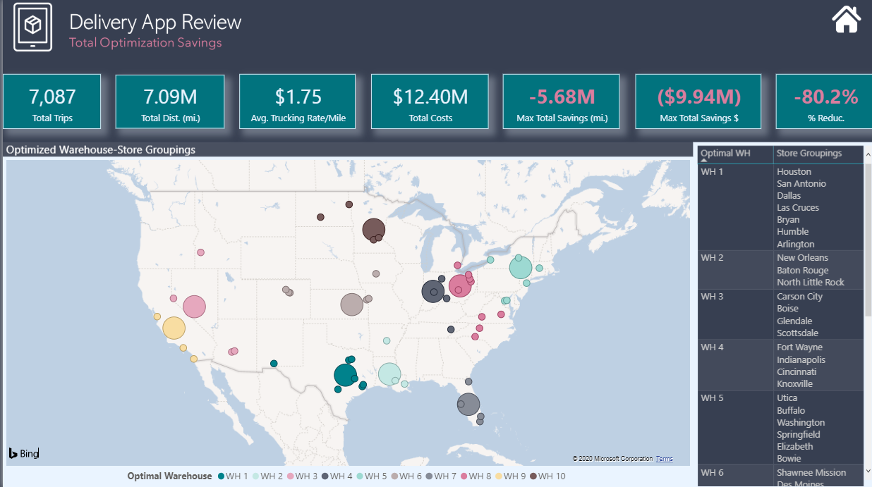
Supply Chain Optimization - This is really what I view as the focal point of my analysis. Seeing that all stores are served by all 10 warehouses seemed grossly inefficient to me, so I wanted to see if with the addition of latitude-longitude data for each city and warehouse whether we could use the data in the app to analyze the supply chain and create efficiencies by rerouting supply chains through more proximate warehouse-store pairings.
Cost Reduction - Once the supply chain analysis was complete, it was a simple matter to add a single parameter (current US trucking cost per mile) to convert the distance savings realized through the supply chain optimization to monetary savings.
There are definitely some major simplifying assumptions embedded above that would be explored more fully in a real-world analysis (for example, I’m assuming that each store could be fully serviced by its most proximate warehouse, and thus the distance and cost savings are framed as “maximum potential savings”, given that real-life considerations probably would prevent complete implementation of such a simple decision rule).
If there’s interest, I can definitely do a more detailed post on the specific analyses summarized above. Here are my screenshots along with a published a web link if you want to play with the live report. One other note, on the data validity analysis, my R script runs fine locally but throws an error when I publish it to the service. Thus for the live report, I replaced the dynamic chart with an image. For those interested I have attached a copy of the R script to this post.
Very interested to hear your feedback.
Finally, thanks to my friends @paul and @JarrettM, the first for his generous guidance and phenomenal forum posts on all things GIS, without which I couldn’t have done #3 or #4 above, and the latter for the entertaining and enlightening Skype chats while we were both up late working on our entries.
imported Delivery data to staging table, then used as reference for Deliveries and Match Methods tables
used multiple transformation in Power Query to process the [DateTime arrived at store] text data into valid datetime values
used “Enter Data” to create Yes/No lookup tables for Damage, Label Damage, and Returns Collected and Manual/Scanned lookup table for Match Method
used eDNA extended date table
searched web for background image for warehouses
used 3-step PowerPoint process to darken image: apply 0% linear black gradient background (dark right to light left), import image, apply overlay 20% transparent rectangle using dark green colour from PBIX palette
used eDNA Colour Theme Generator to extract colours from background image; augmented colours with others from palettes found on various other websites
took inspiration from Diana Bello’s winning challenge #3 submission and used “tab” buttons and rectangles with slightly differing font sizes, font colours, and background colours
Analysis of Warehouse vs. Store
it appears that every store gets deliveries from every warehouse, and there appear to be many US cities with the same name
there were many matches for some stores/cities, so I made choices
there was no city name for warehouses, so I made choices (different than store cities)
the arrival datetime value was in minutes (no seconds), therefore used only minutes for [Store Residence Time (Minutes)]
Other
used Play Axis (Dynamic Slicer) custom visual to animate the month slicer on the Summary page
used Enlighten Data Story custom visual for static text/dynamic measures on Summary page
used Enlighten Waffle Chart custom visual for Deliveries Match Method (Scanned/Manual), Deliveries with Damage, and Deliveries with Label Damage on the Summary page
used gradient legend on Average Residence Time by Store column chart
used eDNA DAX Clean-up Tool to format all DAX queries
Follow-up
I know this was sample data, but if accurate city names and longitudes and latitudes were available, the key insights on the Summary page would be relevant
again, the sample data does not show this, but one would have expected an increased level of package damage and label damage with increased delivery distance (and the inherent increased number of handling/movement events); this was the goal of the scatter chart on the Details page
also, as @BrianJ noted, every warehouse delivers to every store, which is an unlikely situation
one would expect that each warehouse would be assigned a “radius” within which to deliver to stores; this was the goal of the Warehouse / Store Distance section on the Summary page
Hello everyone,
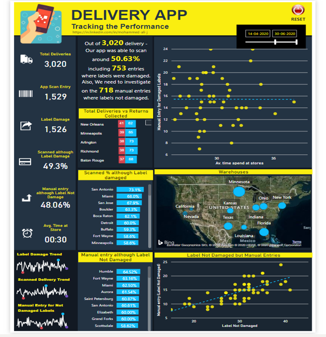
My submission for this challenge #4, An infographic inspired Dashboard with simple variables. Do let me know your views, feedback & suggestions.
Great points. I used the same simplemaps.com city dataset and the approach I used was to group cities by name in Power Query and then select the one with the largest population. In most cases, it was a comparison of major metropolitan areas to small towns, but the one I remember being questionable was Aurora, IL versus Aurora, CO. The latter is larger by approximately 150,000 people, but I have the creeping suspicion my decision rule got this one wrong since Denver is also in the dataset, but Chicago is not, leaving the Chicago metro area uncovered. Despite the uncertainty, I still treated this data as valid, since it would be immediately verifiable with the client.
For warehouses, I used the geographic center of the state, which seemed like a reasonable assumption, given that each warehouse served multiple states, even post-optimization. Again uncertain, but easily verifiable. How did you choose to locate your warehouses?
I didn’t use a rule to assign cities to stores and warehouses, as I figured I’d be wrong regardless. I chose to concentrate instead on the logic of the analysis rather than the validity of the data, knowing it was, for me (engineer by training, then BI guy), quite unlikely that I’d make reasonable logistics choices.
For cities, I chose exact matches where available, but when there were multiple possibilities, I chose the one I was most familiar with (I’m Canadian, so US geography is not my strong suit…).
For warehouses, I again chose cities I was familiar with, only modifying it when I had already used the city for a store (and for Texas, I chose a city outside of Dallas); I did this to ensure I didn’t have any "zeros’ in the warehouse-to-store distances.
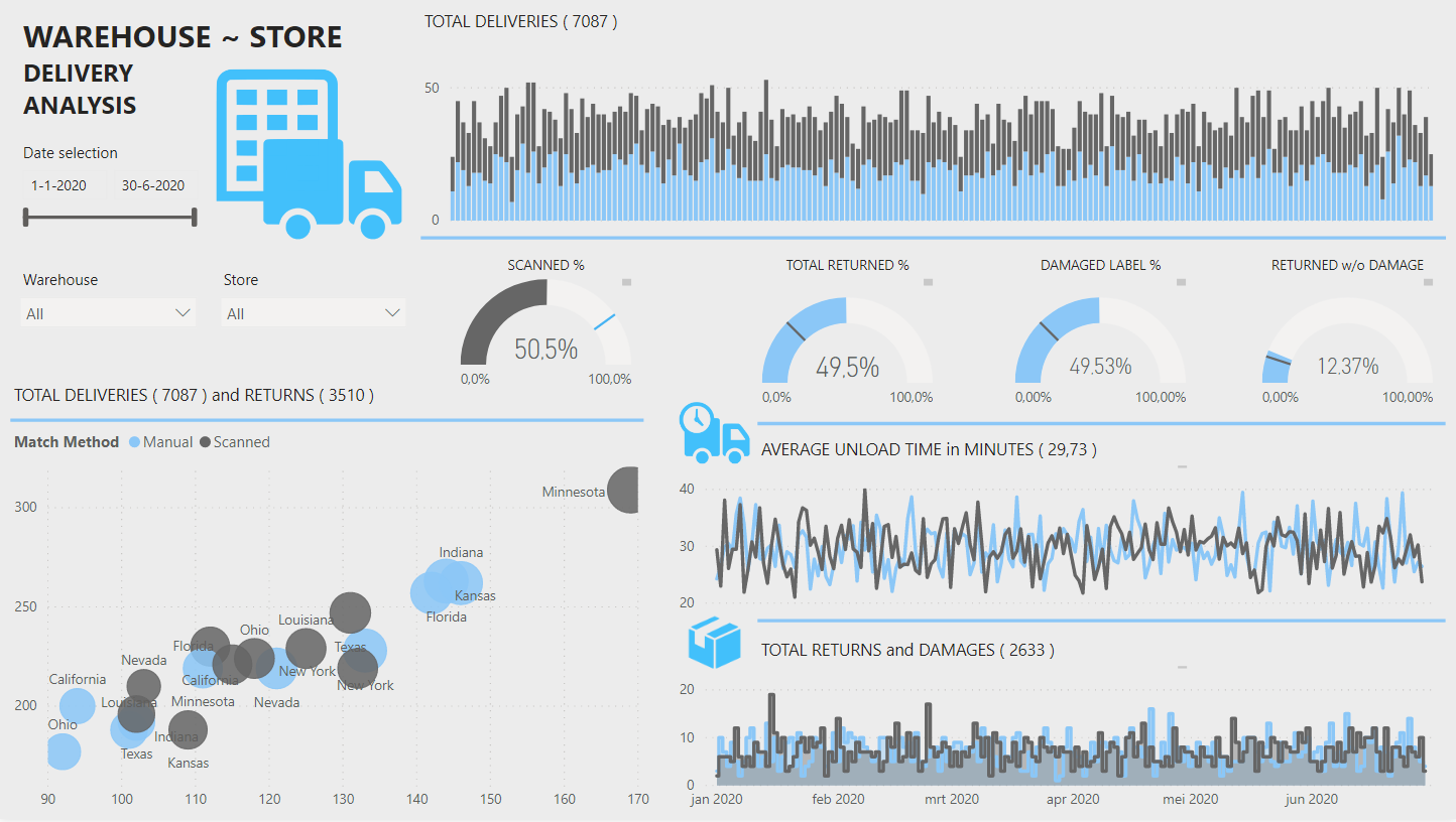
I focused my calculations mostly on order Item Entry type ( manually entered or scanned ) to visualize how the orders were being processed did make a difference and which method is efficient.
While working on this challenge, I created a date table which I planned to use for some Time Intelligence, but I don’t know if it is because of the time stamps on the store arrival and left columns or something else, the relationship was not working for me. So, I created calculated month and quarter columns to use as a slicer and did the calculations using the existing columns on the Fact table.
I would appreciate it if someone can explain to me why it didn’t work?
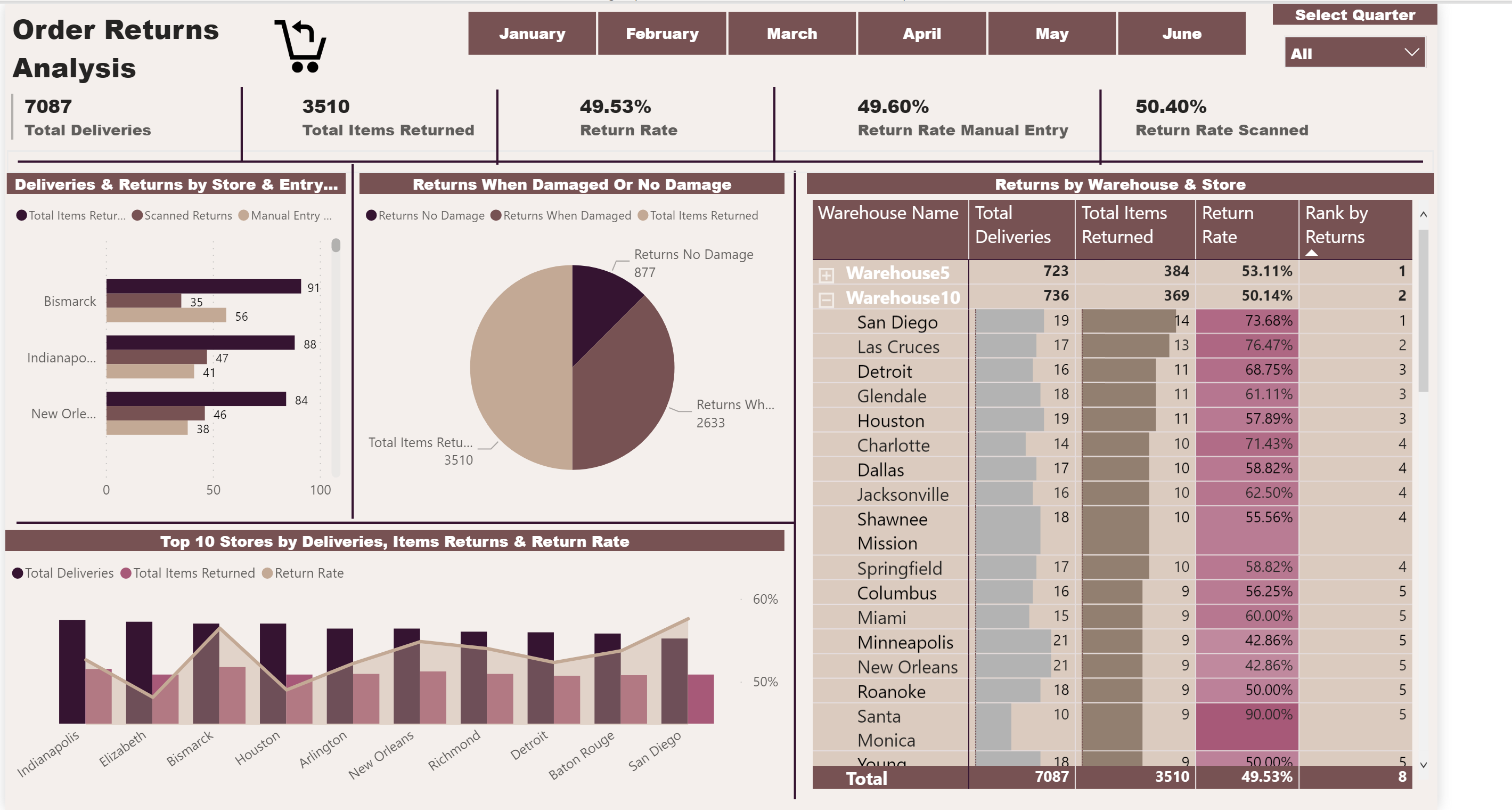
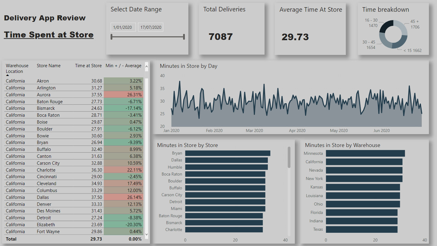
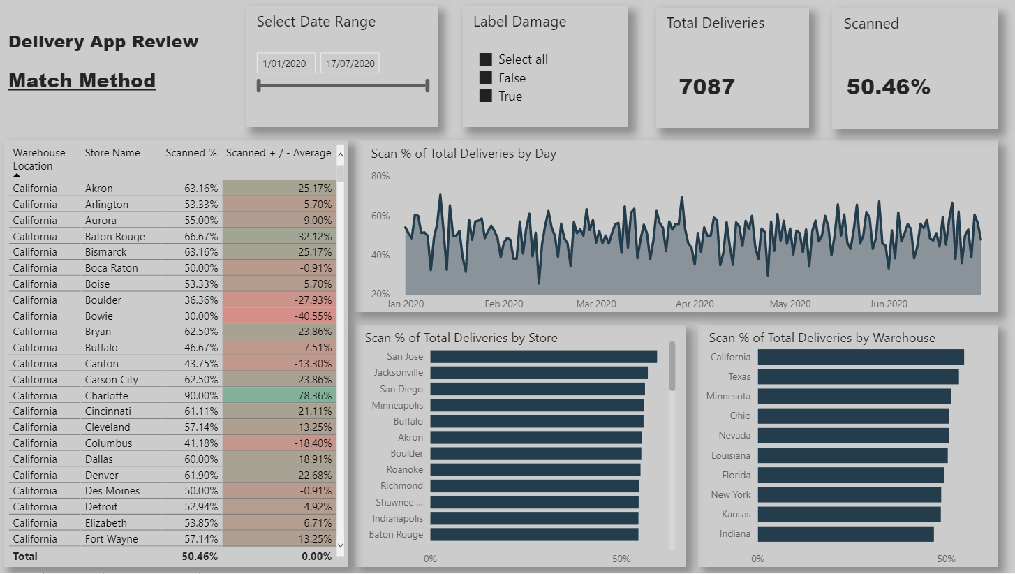
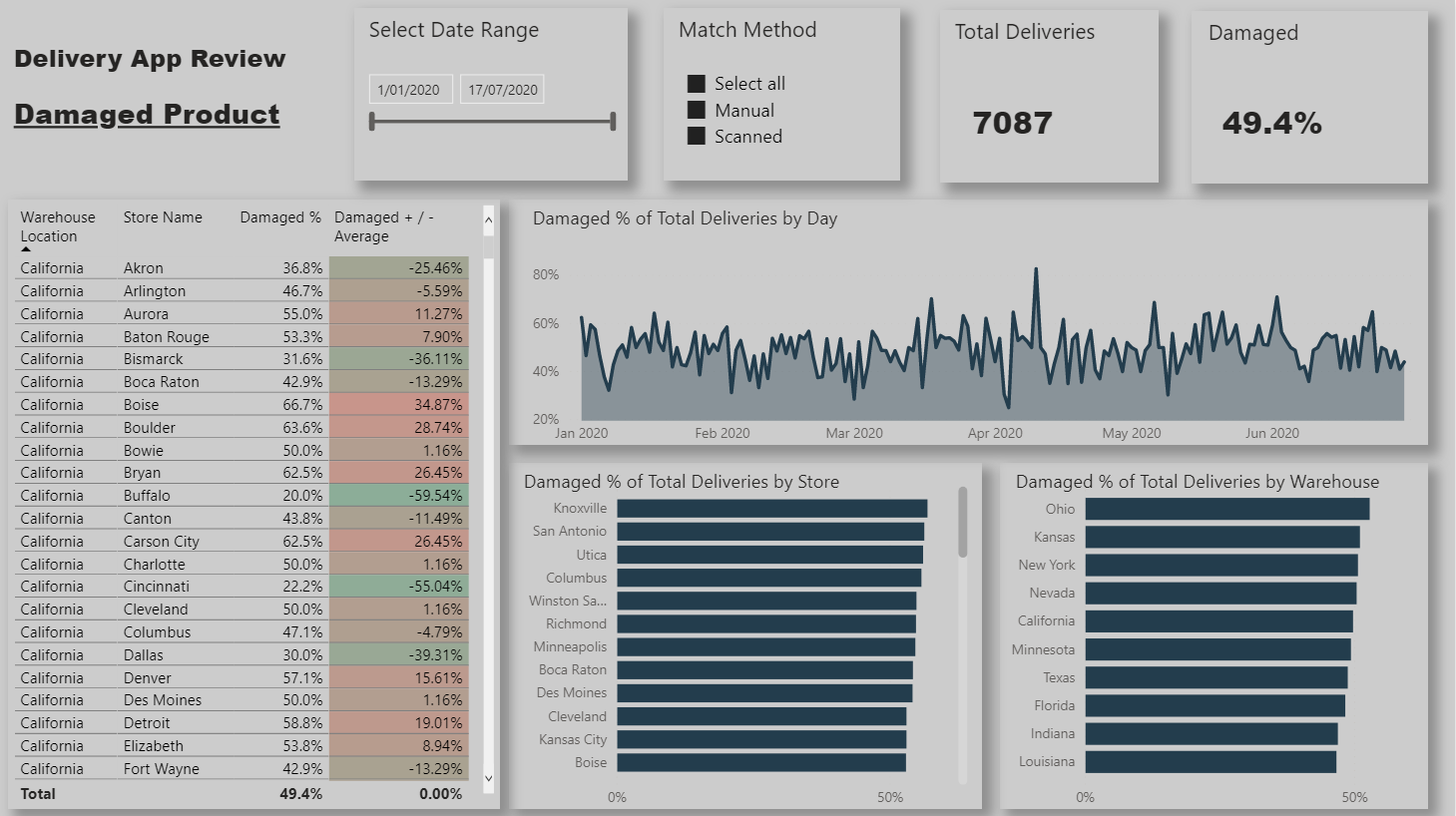
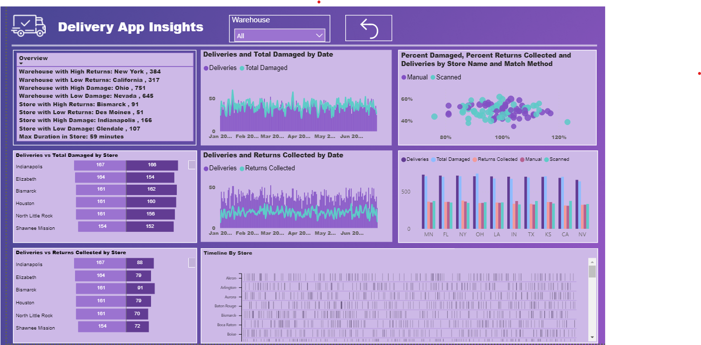
Here is my submission. I have created a report page for each of the key metrics that management are interested in. Each page is filterable via the bar charts so that individual store / warehouses can be viewed.
Store / warehouse combinations are shown in the table along with their performance compared to the average.
The Match Method page is filterable via whether or not it has scan damage so that we can identify stores/warehouses not scanning when they should be and remaining pages filterable via the match method so that we can view the performance when the app is used and when it is not.
. I like this entry a lot – it’s clean, attractive, and most importantly it directly answers the questions at hand without making the client do a lot of work on their own to find the answers.
If I might, two minor constructive suggestions:
I like the top 10 charts at the bottom of each page. However, I think it would also be really helpful to add a toggle that lets the manager/client switch to a bottom 10 view and back. Would take up very little real estate on the page, but add substantial additional analytical power and insights.
For the line charts, I would suggest adding an average line to each. Alternatively, I might suggest replacing the line chart with a frequency or probability histogram for each metric. Personally, I find the latter easier to read and better able to generate actionable insights from.
Need to split the arrival date and then format again as the date time column and calculate the duration between the Arrival time and Departure time, join with date.
Created Key measures to get the count of deliveries, matched, scanned, returns, total damaged and percentages.
Created overview key measures to get the dimensions & measures for min and max damages, returns for warehouses and stores
Used some custom visuals like cards with states for word wrap, tornado chart between 2 measures, timeline to get overview.
Thanks @BrianJ for the kind words and really appreciate the feedback! Fully agree with both points. Both would have been fairly simple to implement and provide further insight.
Wanted to steal some minutes from your time to check three assumptions:
In an ideal process for everything to be perfect, the input should be scanned, no damage to label or general damage. Returns would be a separate process as it can also represent the customers options to return it and not an actual defect.
If Label Damage and Damage are set to false, it means it was an actual choice to input it manually and not to scan it.
If Label Damage and Damage are set to false but still returned, it means it was a customer choice or a business reason behind.