Thanks @BrianJ, @Amdi, and @sam.mckay for your comments.
I little bit of my thinking while I built this report
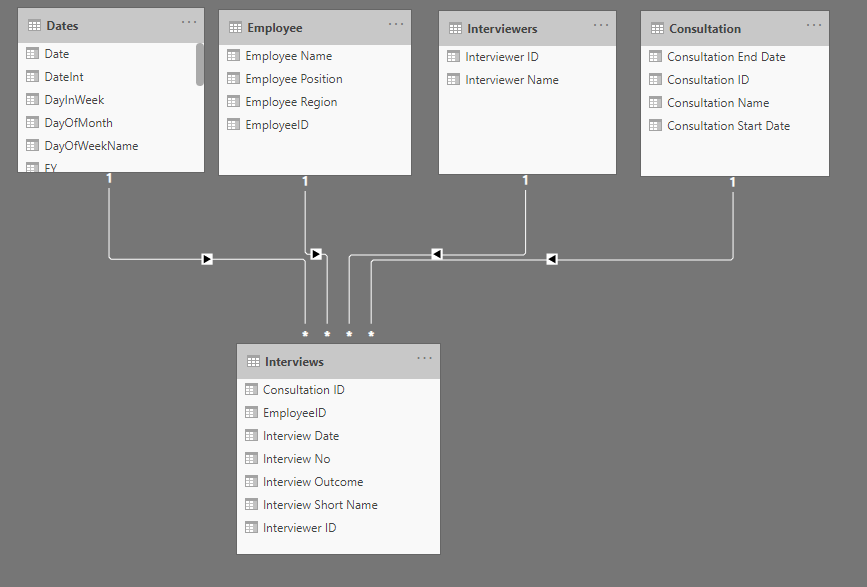
Data Modeling : Steps for creating my dataset in Power BI, this was my quickly thinking, I can be wrong.
To normalize the data, we need to eliminate data duplication and ambiguity as possible.
In this data set we have that our measure or numeric values are the interview Outcome, the count of Happy, Neutral or Unhappy answers by different point of view, this point of view are my dimensions. So, we can see the outcome by interview, date, interviewer, consultation, Employee Name and Region.
From the source file I created a unique value for my dimensions.
For the measure I isolated interview 1 and interview 2 and then appended the two queries and got my Interview table, in this table also keep my key values to make my relationships with my dimensions: Consultation ID, Employee ID, and Interviewer ID.
I have a code for the Dates dimension (from Enterprise DNA) that I use always that I need a Date dimension.
At the end, my dataset looks like:
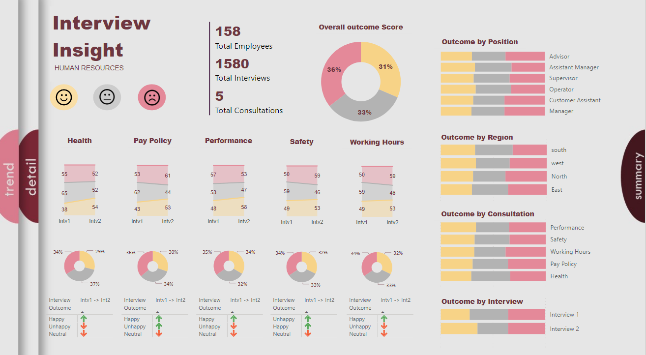
For me a report is about Questions and answers. In this case I think the main question is who is happy, neutral, or unhappy, and where and when, and the most important is Why so we can take an action to improve, assuming we want them happy. We do not have data to answer the Why, so I designed my report to answer the other questions.
Summary View, that maybe I should call it Overview, thanks Martin for your comment.
- Overall view of the three measures (Happy, Neutral, and Unhappy)
- View of the changes from Interview 1 to Interview 2
Detail View, in this view we can see the result by Employee, I order to see first the top more Happy, Neutral, or Unhappy, again I added lots of filters to have the option to see the data from the different points of view.
Trend View, in this view I wanted to show how happy, neutral, or unhappy the different dimensions are. Also, the participation in the different interviews, having a second look at this view I think I could do something different, but we can always improve.
I did not make a more deeper analysis of the data, there is so many components that we can look at that as I said, we can always improve, at the moment I am trying to improve my knowledge in the use of Power BI. Always is good to learn how others think. Two heads think better than one.
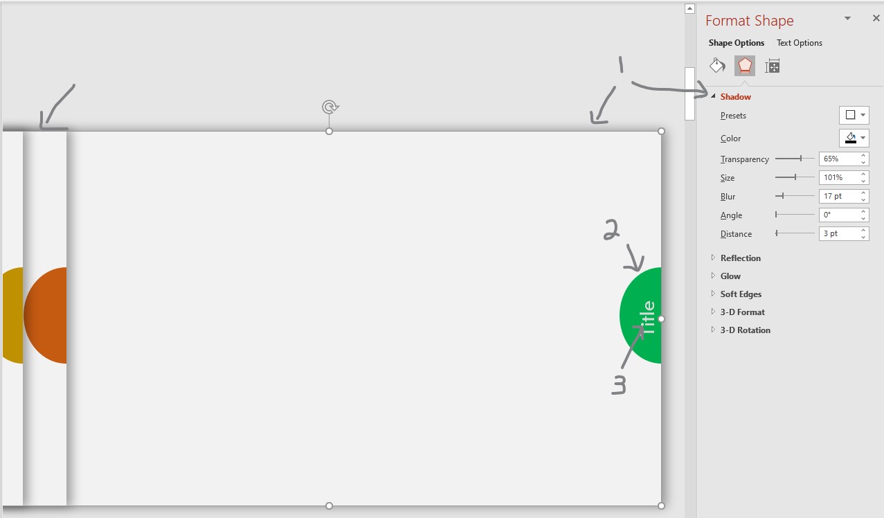
Report Design . For this I use PowerPoint to create the background and I always sketched out some ideas on paper before start on the computer, to see how to use the space and have an idea of the order and size. For the theme I look at some pictures in internet that give the color idea.
I love this kind of assignments; I like to analyze data and convert the data in visualizations that can tell a story. I also love to learn new things
Here is my solution PBIX report.
HR Data Insights - Diana Bello.pbix (363.9 KB)
Thanks,
DianaB