@BrianJ
How can I post the PBIX
If I’d had time on this challenge, I definitely would’ve run that analysis to test the correlation between interview #1 and interview #2. I also would have run the 5 consultations against each other to examine the correlations between the sentiment on those issues. There’s actually a pretty good custom visual from Microsoft to do this that I used in challenge #2. It’s a little wonky since it requires you to install an older version of R (3.3.0 or earlier) plus the R Corrplot package. You don’t actually need to run any R, just install these two components and the visual writes and runs the R code for you. Once you get it properly set up, it works quite well and is very customizable.
Alternatively, there’s a quick measure in the Microsoft Community Gallery to calculate the Pearson correlation coefficient:
These would be interesting tests to run, since my experience analyzing this type of data is that peoples’ sentiments and preferences are not nearly as stable as you might expect. Even well-established personality tests (like MBTI) show more variance over time that I ever would’ve anticipated.
- Brian
2 Likes
Hi all
I find all this challenge very good, which give learning and a lot of inspiration from all of you.
My report in 3 pages.

4 Likes
1 Like
Really awesome work around your reports for the Power BI Challenge 3. I’m really enjoying working through all these submissions and there is so many great techniques embedded into a lot of these reports that are being posted.
I’m going to be posting a project update around my own submission into the relevant category very soon.
Look out for more from me in the near future
Sam
1 Like
My write up from my submission can be found here
1 Like
- Go to your original post and click the pencil icon at the bottom to edit

- In the toolbar at the top, click the up arrow icon to select upload

- Once you’ve selected and uploaded the file, click Save Edit to repost

Thanks!
- Brian
P.S. alternatively, at step #2, you can just scroll to the bottom of your post and drag and drop the file from your File Explorer lwindow
1 Like
Hi all,
Find my report for Challange-3.
It wasn’t quite easy to manoeuvre the dataset. It took me longer that expecte to nail the dataset after several non conclusive attemps.
I pivoted the dataset gain some few columns but increased the rows in order to arrive at my expections.
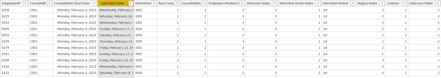
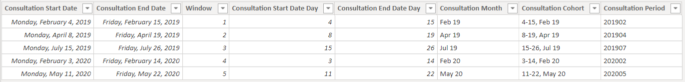
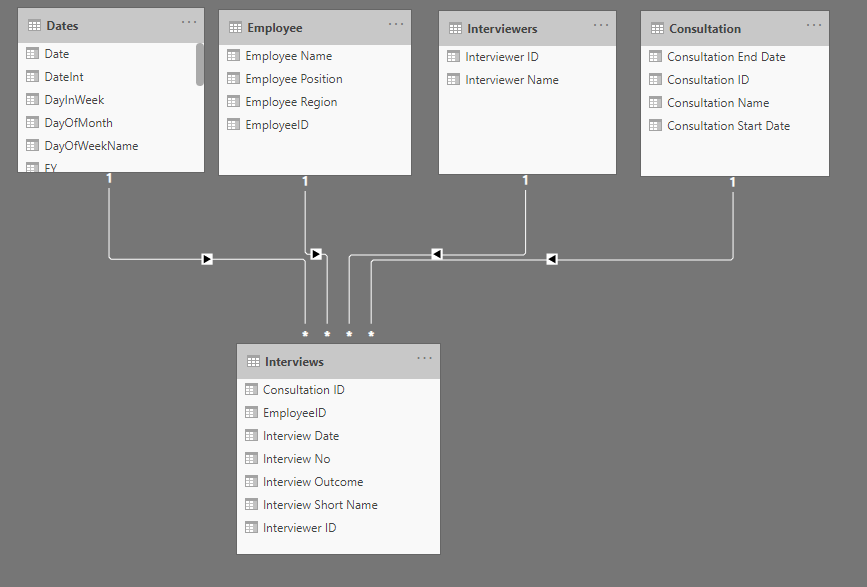
A snapshot of my fact table is below with only the interview date retained in the date format for the final model.
The consultation start and end dates were promoted as dimensions with derived columns included. My aim was to produce a single key that could directly relate with the fact table. The derived columns from the demension were then merged and referenced with the fact table. Below is the start and end date dimension table.
To develop a dynamic perception of employees reponses, a supporting table was created in order to work-out the logic for attribution values to outcomes with the aim of assigning each employee a score based on the response. As you will notice below, numerical values are assigned to outcomes in the fact table .
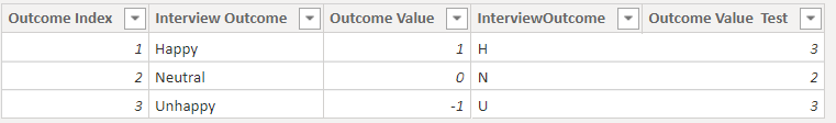
The following DAX formula was used in the Model to assign distinct employee with a pseudo score based on response.(from 1 -Happy, 0-Neutral and -1Unhappy).
Employee Sentiment Segment = CALCULATE([DistinCt Employee Name],
FILTER(VALUES(Employee[Employee Name]),
COUNTROWS(
FILTER(‘Employee Sentiment’,
[Total Outcome Value]>=‘Employee Sentiment’[Min] &&
[Total Outcome Value] <=‘Employee Sentiment’[Max]))))
The logic enables the assesment of all employees.
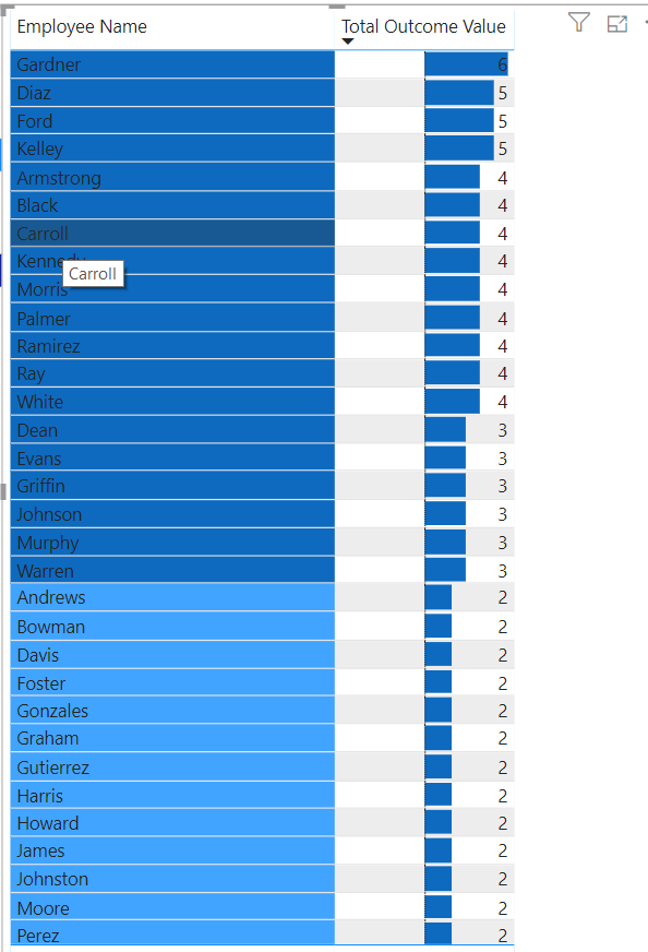
This was however not presented as such in the final report. Rather, employees were groups based on their score (first table within the Segmentation category ) and a count of employee table capturing distinct employee’s perception with regards to policy change based the the total score as defined in the supporting table.
You will find snapshots of my final submission in turn:
4 Likes
Brian this is such epic thinking. I would have never have thought to look at the data like this, but after reading through your notes it makes a lot of sense.
I really love how you thought out of the box on this one, and it’s amazing what diversity in thinking you can have for the very same problem, for example the challenge that we are putting together and the scenario that we are working on.
This diversity of thought is what is really going to take our members analytical abilities and critical thinking to another level.
Reading this it just makes me think how we can extract as much information out of your brain as we can without placing any more burdens on your time! Appreciate your efforts on this and I’ve learnt something and feel smarter from reading through your thought process here.
Sam
4 Likes
Wow @BrianJ seriously awesome share thank you! Not something iv’e come across before but makes so much sense definitely something to consider going forward.
Great work all again some outstanding submissions. There is still time to submit if you haven’t yet done so.
Regards,
Haroon
Being a self learner, started learning Power BI from Enterprise DNA and a lot more to learn with awesome work done by others in these challenges.
@sam.mckay @haroonali1000
Thank you Enterprise DNA team for the initiative and your time!!!
Thanks very much for the kind words. I think years of working on litigation has drilled into me that before asking the question “what do these data mean?” it pays to ask “are these data any good?” (e.g., from the standpoint of internal consistency, data collection/sampling approach, calculation methodologies, etc.).
I think you hit the nail on the head in terms of the incredible value of diversity of thought. My favorite posts on the forum are always those where four or five people post different solutions to the same problem. These data challenges are that same thing taken to the nth degree. Having people from all over the world, with different jobs, skill sets and perspectives working on the same problem with the same tools is really pretty amazing when you think about it, and I find I learn something from every single entry submitted in these challenges.
Glad to have the opportunity to contribute to that learning with perhaps a different set of experiences and perspectives. Plus it’s given me a bunch of new ideas for videos… 
- Brian
4 Likes
Thanks @BrianJ, @Amdi, and @sam.mckay for your comments.
I little bit of my thinking while I built this report
Data Modeling : Steps for creating my dataset in Power BI, this was my quickly thinking, I can be wrong.
To normalize the data, we need to eliminate data duplication and ambiguity as possible.
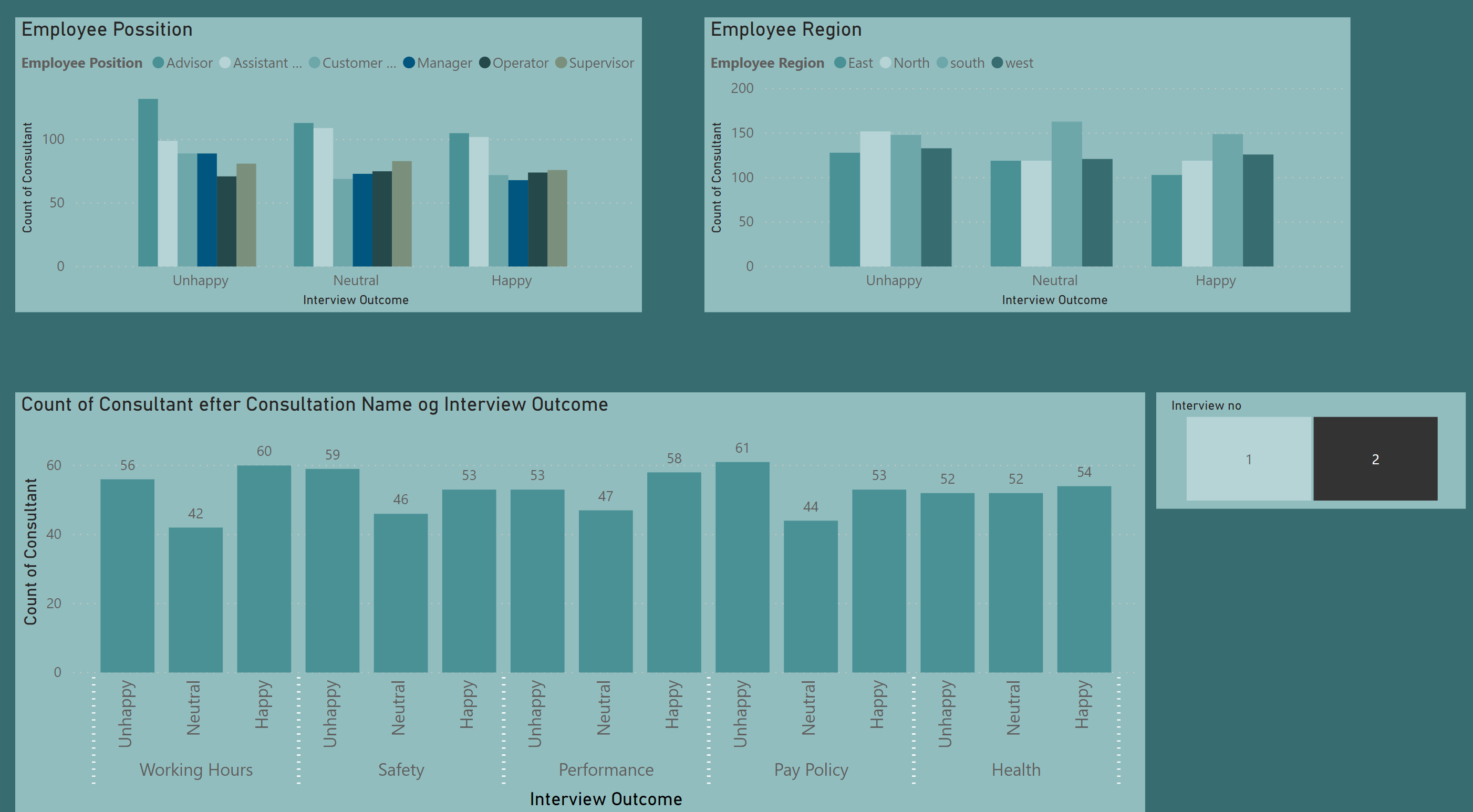
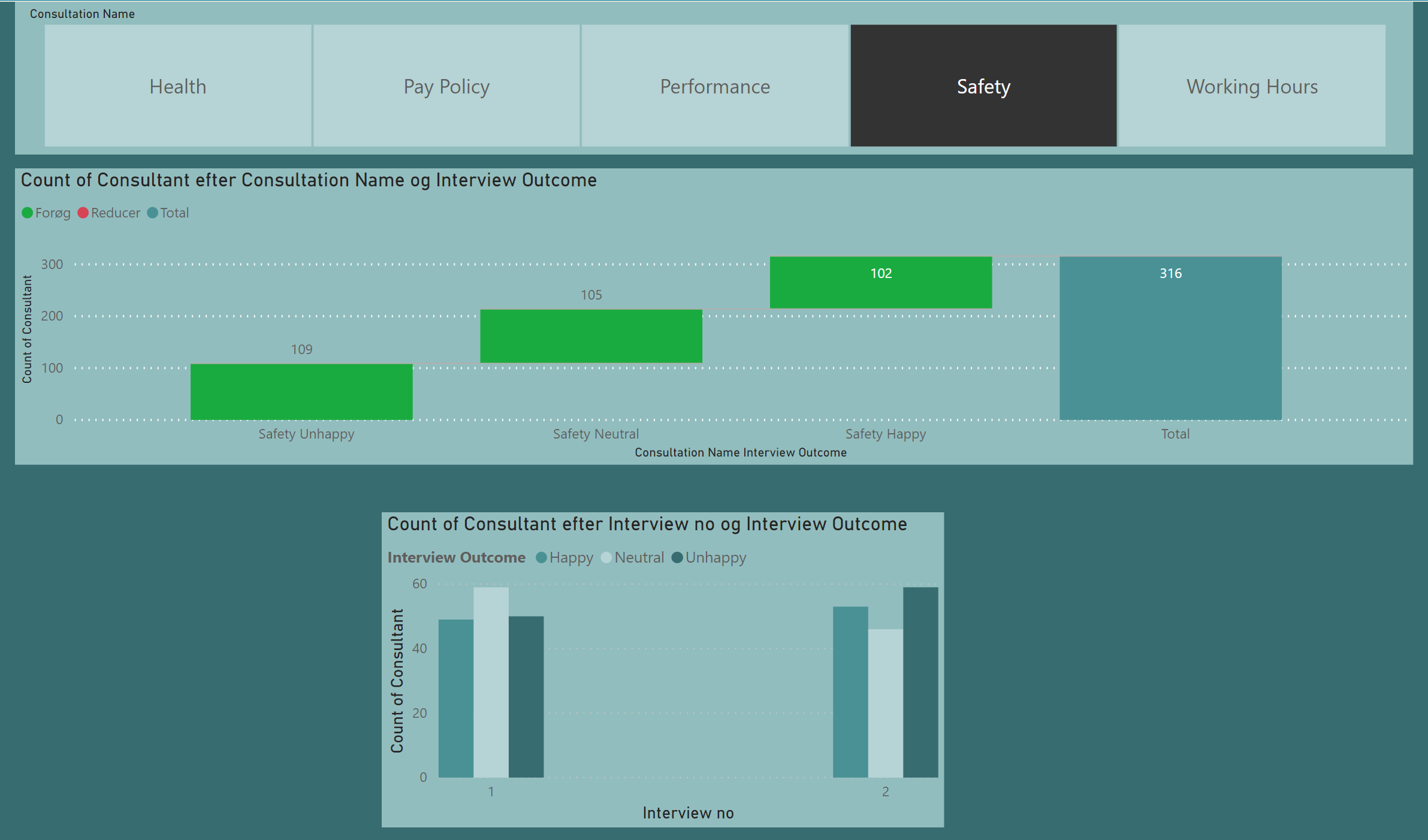
In this data set we have that our measure or numeric values are the interview Outcome, the count of Happy, Neutral or Unhappy answers by different point of view, this point of view are my dimensions. So, we can see the outcome by interview, date, interviewer, consultation, Employee Name and Region.
From the source file I created a unique value for my dimensions.
For the measure I isolated interview 1 and interview 2 and then appended the two queries and got my Interview table, in this table also keep my key values to make my relationships with my dimensions: Consultation ID, Employee ID, and Interviewer ID.
I have a code for the Dates dimension (from Enterprise DNA) that I use always that I need a Date dimension.
At the end, my dataset looks like:
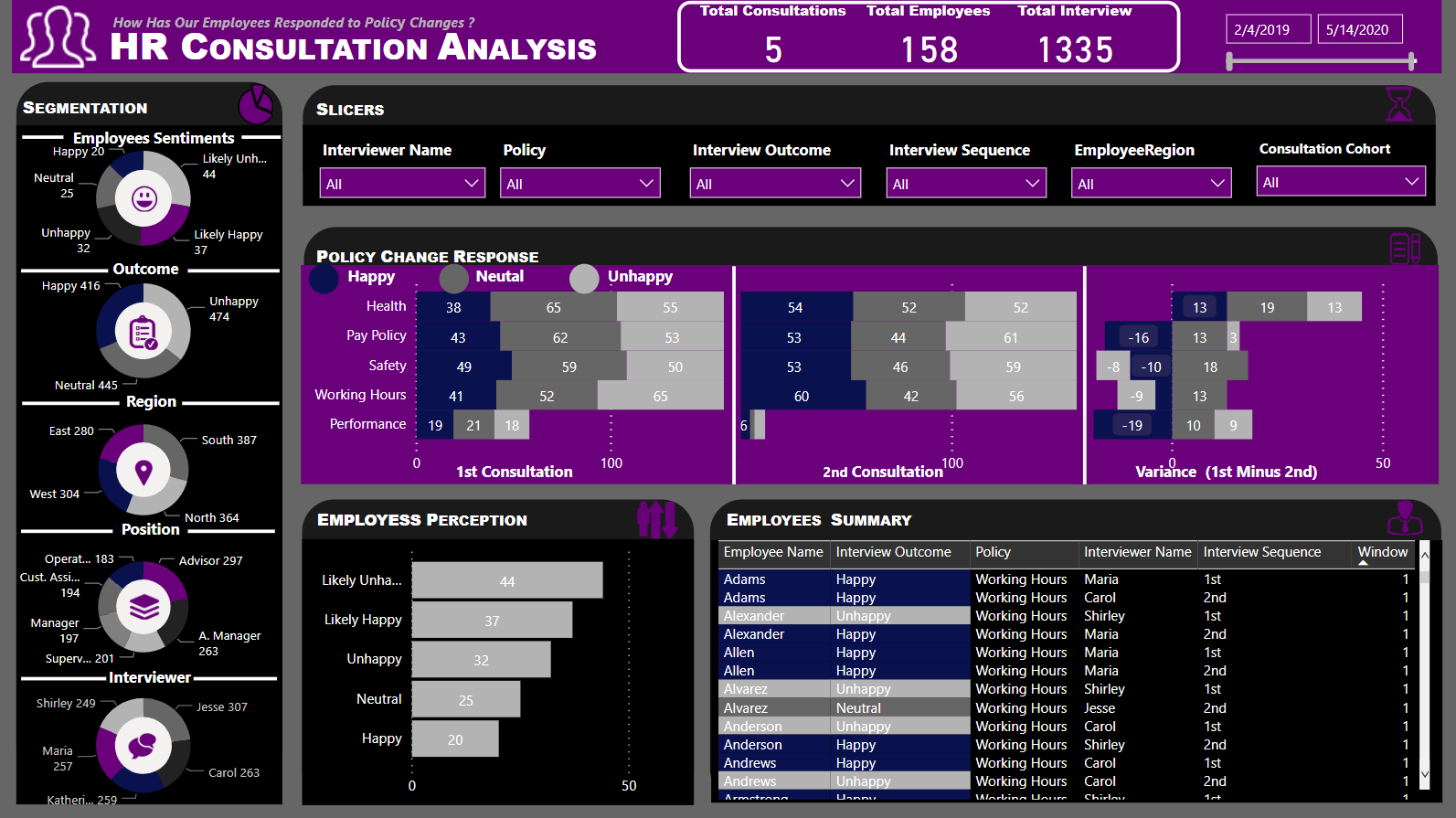
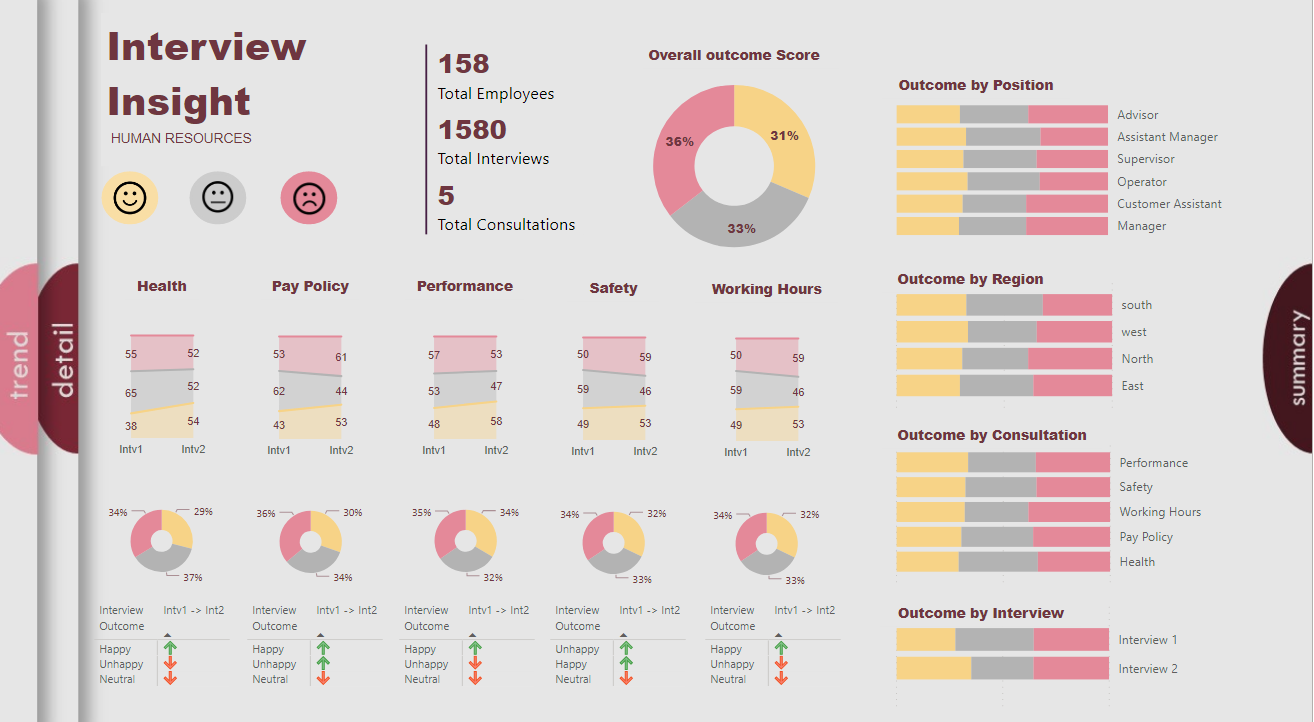
For me a report is about Questions and answers. In this case I think the main question is who is happy, neutral, or unhappy, and where and when, and the most important is Why so we can take an action to improve, assuming we want them happy. We do not have data to answer the Why, so I designed my report to answer the other questions.
Summary View, that maybe I should call it Overview, thanks Martin for your comment.
- Overall view of the three measures (Happy, Neutral, and Unhappy)
- View of the changes from Interview 1 to Interview 2
Detail View, in this view we can see the result by Employee, I order to see first the top more Happy, Neutral, or Unhappy, again I added lots of filters to have the option to see the data from the different points of view.
Trend View, in this view I wanted to show how happy, neutral, or unhappy the different dimensions are. Also, the participation in the different interviews, having a second look at this view I think I could do something different, but we can always improve.
I did not make a more deeper analysis of the data, there is so many components that we can look at that as I said, we can always improve, at the moment I am trying to improve my knowledge in the use of Power BI. Always is good to learn how others think. Two heads think better than one.
Report Design . For this I use PowerPoint to create the background and I always sketched out some ideas on paper before start on the computer, to see how to use the space and have an idea of the order and size. For the theme I look at some pictures in internet that give the color idea.
I love this kind of assignments; I like to analyze data and convert the data in visualizations that can tell a story. I also love to learn new things
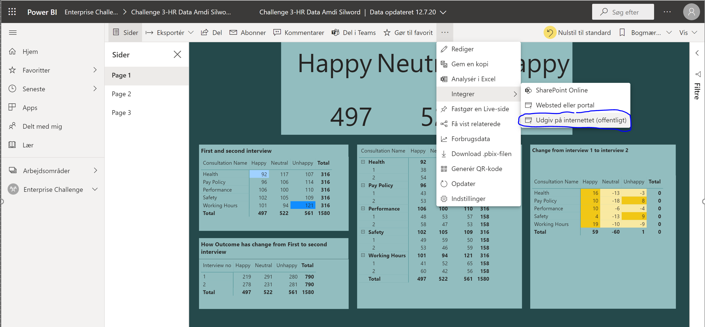
Here is my solution PBIX report.
HR Data Insights - Diana Bello.pbix (363.9 KB)
Thanks,
DianaB
10 Likes

Well done Diana. Superb write up. Really like what you did with the fact table. And the navigation…wow.
1 Like
I think the clarity around the outcomes is great, and the simple icons you’ve used make it easy for the eye to comprehend
4 Likes
Hi,
Thank you very much to all for your encouraging comments. I really appreciated, I feel motivated to continuing participating; this is an awesome opportunity to improve my skills and learning from very professional and smart people. I wish all the best to all of you.
About the navigation. In PowerPoint I created a background to use in Power BI. Is a rectangle with a shadow, and a circle at the end, the trick here is to have half the circle visible, just look in internet for How to create a half circle in PowerPoint? I used a text on top of the circle, finally group all and I copy and paste to create as much as you need, in this case 2 more and put then to the left. Drag one by one from left to right to create the effect of moving in the following slices. I read this in some place in internet some time ago, I just do not remember where.
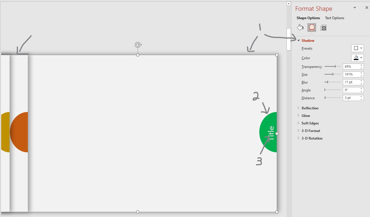
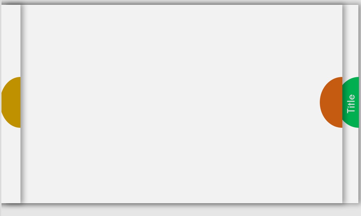
I change the colors and titles to use it in this presentation and save it as jpg.
I added the pictures in Power Bi as the background of my pages and put a buttons on top of the tiles, I make the buttons invisibles and added the action to the buttons, you can see that in the PBIX
Thanks,
Diana
9 Likes