@Luke
Nice work, Luke. Keep going and we all are learning
Hi @sunip. Just a normal button with “Reset” icon shape and “Bookmark” action, to activate the “Reset Slicers” bookmark I made. Greg
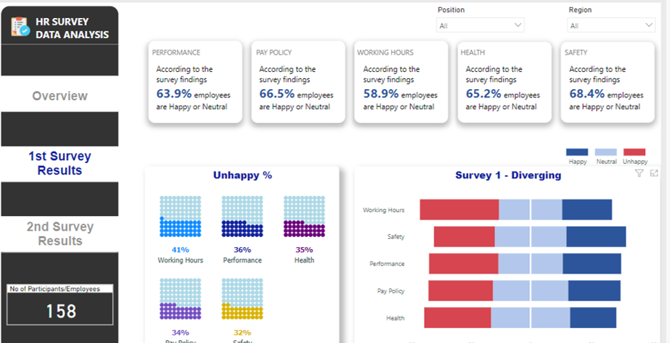
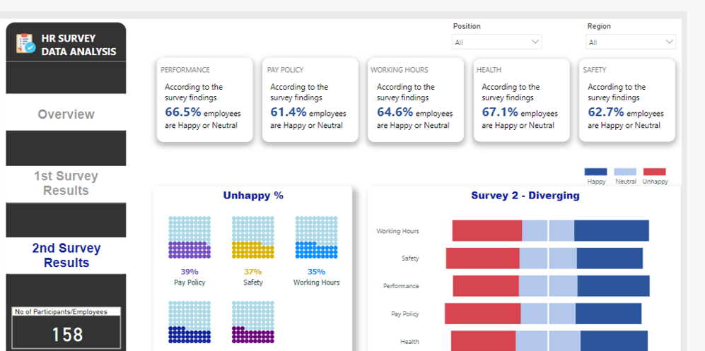
Here is my submission for the 3rd Challenge. Did this without creating any measures. I’m away on holiday, but put this together pretty quickly!

Here is weblink:
Thanks
Jarrett
5 Likes
Due to a very busy week on the forum with a unusually high number of very difficult questions, plus work on the Enterprise DNA TV YouTube videos, I just didn’t have the time to put together a full entry on this challenge. However when I started putting my entry together, I pulled on what I think is a pretty interesting thread that I haven’t seen addressed in the other entries yet so I wanted to share it here.
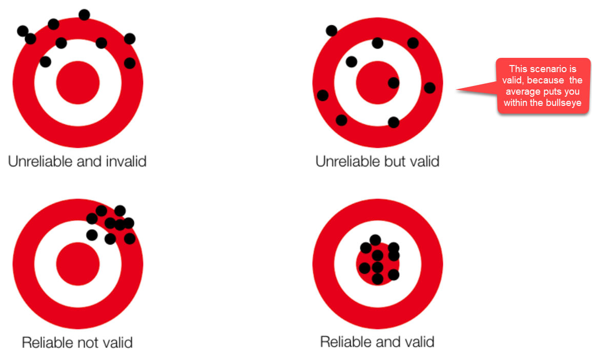
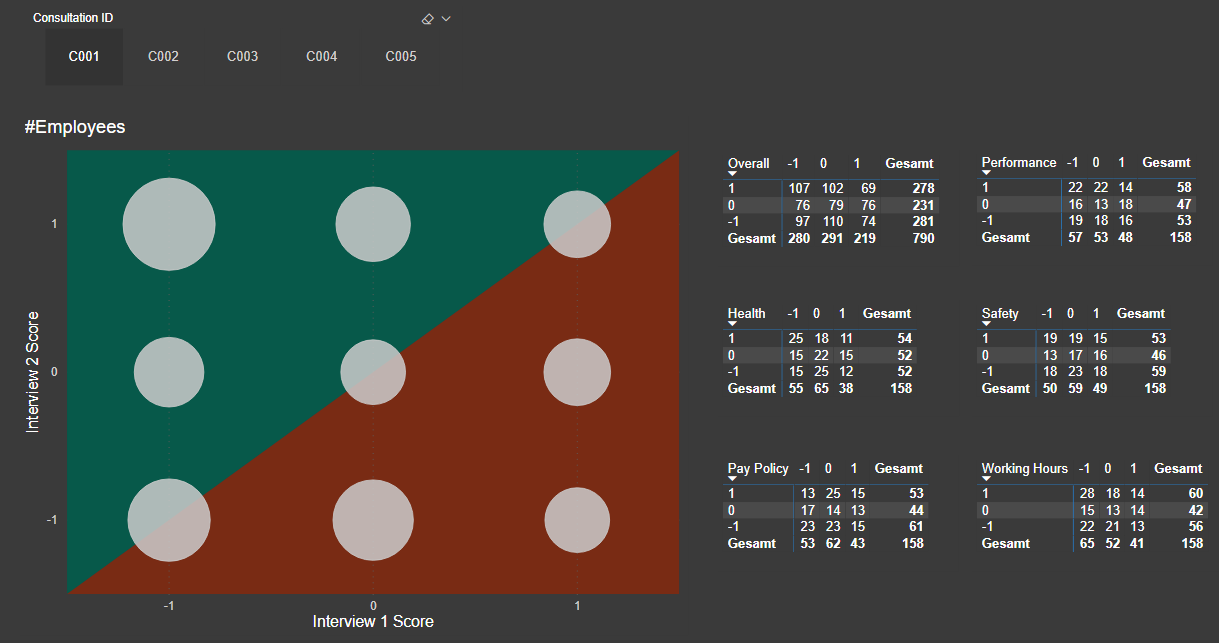
My first thought in looking at the interview data was “are these data are reliable and valid”? ( Reliability addresses the consistency of a measure, and validity adddresses the accuracy of a measure. This graphic is a good illustration of the difference between reliability and validity:
In analyzing reliability and validity, I first created a numeric metric called Internal Consistency Score Squared (ICS Sq). For each interview, Unhappy was assigned a score of -1, Neutral = 0 and Happy = 1. I then took the difference of the Interview #1 and Interview #2 scores and then squared the difference, to put an increasing weight on larger deviations. ICS Sq has a max value of 4 (if one interview was scored Happy and the other Unhappy, or vice versa) and a min score of 0 (if the score for Interview #1 and #2 was the same). Every single step deviation (e.g, Unhappy to Neutral, Neutral to Happy, etc) gets a score of 1,
To assess reliability of the interview process, I compared the average ICS Sq for Interview #1 and Interview #2:
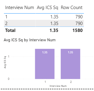
Results don’t get any more reliable than that. So, on to validity…
In terms of “accuracy”, we don’t know what each interviewee’s “true” score is, since there will be some natural variability in peoples’ scores. This variability could be due to additional consideration given/information acquired between the first and second interviews, peer and/or supervisor interactions, or factors completely unrelated to the relative merits of each policy (e.g., interviewee had an excellent breakfast and a traffic-free commute before the second interview, or conversely a loud argument with their surly teenage kid…). The key issue in assessing validity here is to make sure that the interviewer is not injecting their own variability/evaluation bias into the interview process. Fortunately, within the data we have an excellent control and experimental groups with which to explore this issue, since a little over 20% of the interviews were conducted by the same interviewer for both interview #1 and #2.
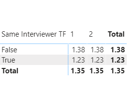
So, the first thing I looked at was whether average ICS Sq score differed by whether the interviews were conducted by the same interviewer or not:
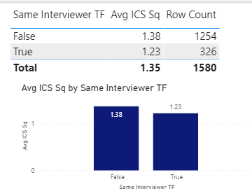
Average scores were slightly lower when the same person did both interviews, but the difference was not statistically significant.
So, what about if you break this down further by interview?
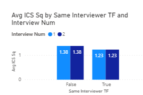
Exact same result as above, and not statistically significant.
Now, what about individual interviewer effects?:
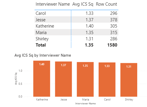
Some slight variability, but not even close to statistically significant.
And what if we break this down further by interview?
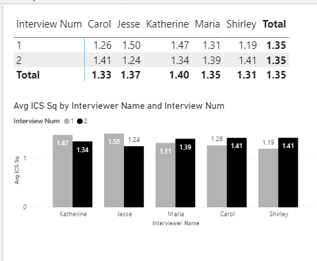
Again some variability observed across interviewers, but not approaching statistically significant.
So, we can sign off on validity as well, right? Not quite - we still have one more comparison to look at, and that’s the interaction between same/different interviewer and individual interviewers:
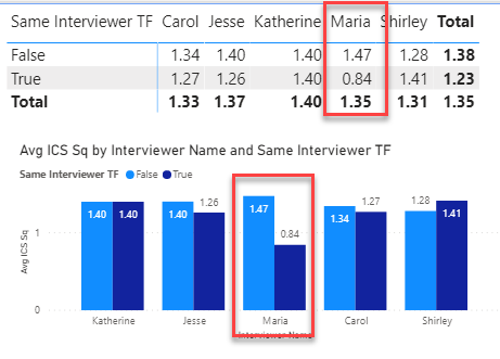
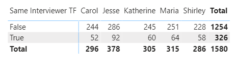
And this is where the red flags go up and the alarm bells go off, since Maria’s scores are exactly 75% higher when she is paired with another interviewer than when she is doing both interviews herself. This effect is statistically significant at the p = .06 level, and this is likely not a small sample size-driven finding, since Maria conducted 315 total interviews (2nd most) and for 25.5% of them she was the sole interviewer. When Maria is removed from the data and the analysis rerun, the differences do not approach statistically significant.
BOTTOM LINE
There is good reason to be concerned about the validity of Maria’s interviews. Before making any policy decisions based on this data overall, I would look at all the results both with and without Maria’s interviews included (i.e., include an interviewer slicer with which we can recalculate our report including and removing Maria).
- Brian
12 Likes
Please find below my first Challenge submission. Open to any constructive feedback.
Best regards

9 Likes
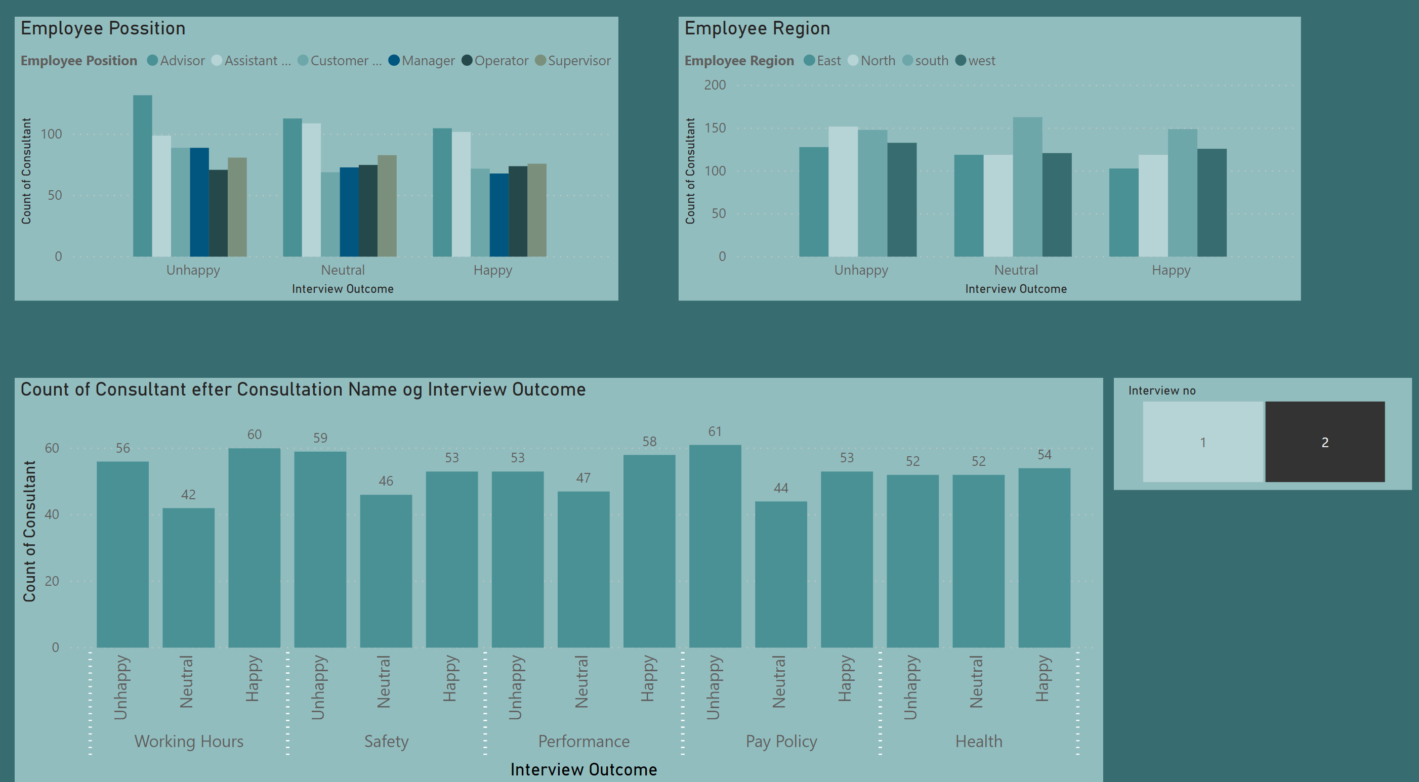
I agree with Martin - really like the modified heatmap on page 1. Very creative, information-rich visualization that I haven’t seen done exactly in this way before.
My one constructive suggestion would be to apply a different sort order to your stacked bars on page 2. Instinctively, I think people expect the order to be unhappy on the bottom, neutral in the middle and happy on top.
Overall, really nice job.
- Brian
1 Like
Excellent analysis, @BrianJ ! Whenever looking at survey result, I should request this kind of data first before paying attention to further outcomes.
This brings me to the question: Is this data random? I just had a look at the correlation between first and second response and in a real world scenario I would expect that employees that don’t change their mind dominate (= largest bubbles along the diagonal axis). Actually, this is my personal hypothesis. If this is real world data, then it would proof my hypothesis wrong:
4 Likes
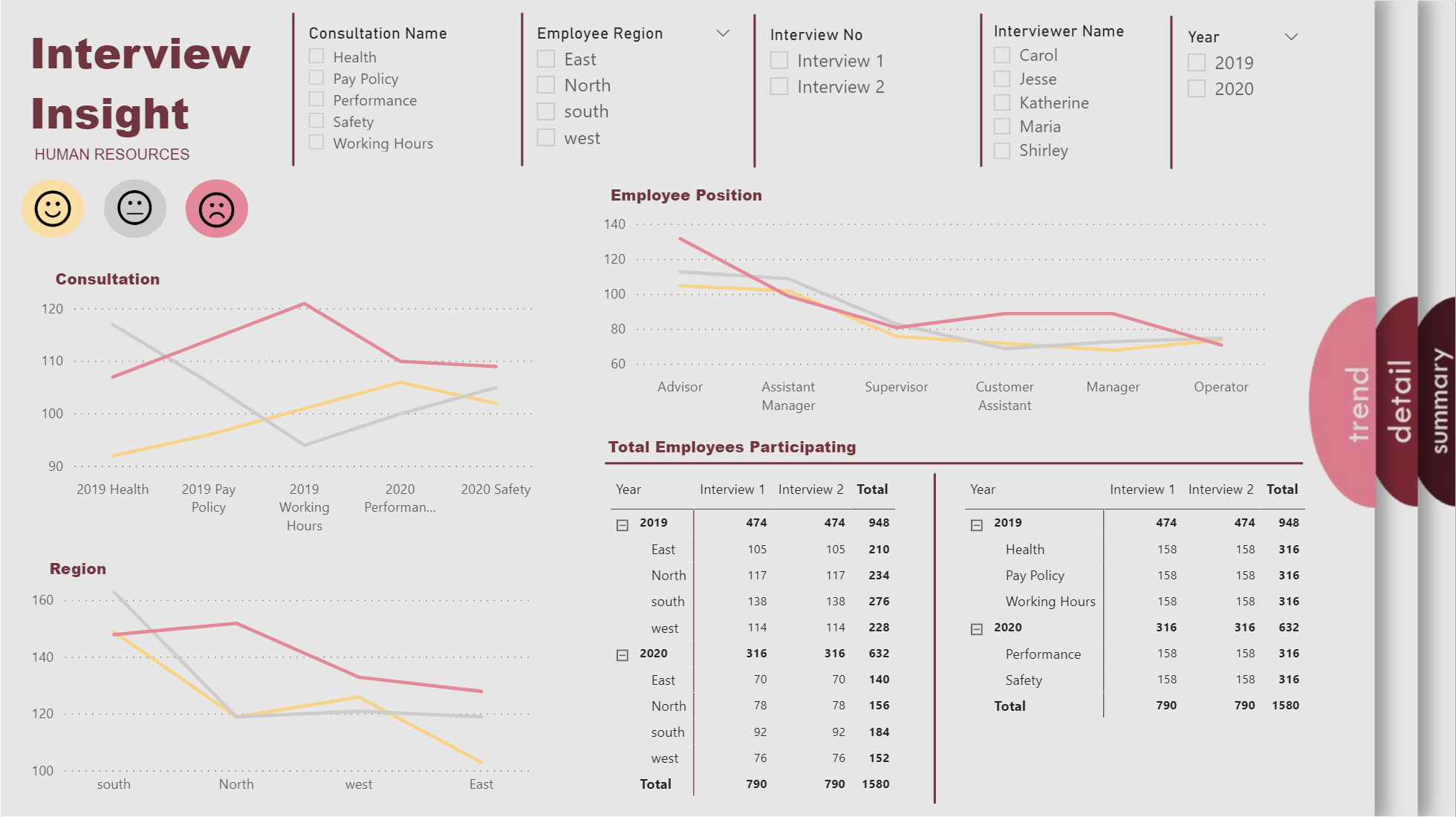
Hi All,
This is my report for Challenge 3. I am not too much into the dark side and I am a little minimalist, but this time I did something different. In my last showcase from Sam, I learned about buttons, so I wanted to use buttons, you can click in the buttons to change page. So, this is the result, I hope you like it and any feedback is welcome.
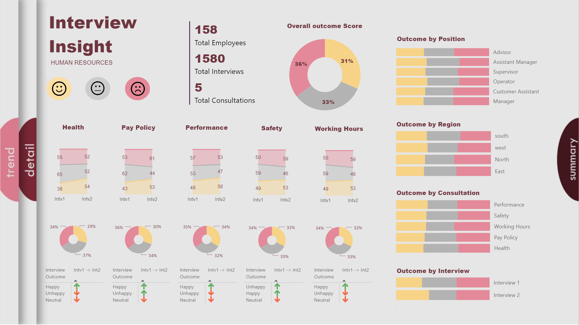
I did not record my work, is not like I sit and do everything at once, I am busy during the week, so I did it in the weekends.
Last weekend:
- I read the Challenge and download the data.
- I create my Power BI dataset (Measures and Dimensions), the data was very strait forward, so I did everything in Power Query.
- I review the information provided to see what kind of insight we can get from the data.
This weekend: - I look from some inspiration for my design. I created my background in PowerPoint and I use the Color Theme Generator Tool to create my theme. I love this tool I am using it all the time.
- I sketched out some ideas to see how to order the information on the space.
- And finally, I started the report, the fun part, I created a very simple Measures, I did some adjustment to my design and Voilà!!!
I use Power BI Server from work, but I cannot publish personal reports there. I do not know how to publish my report in another place so you can access, any recommendation is welcome.
Thanks, and have a wonderful summer.
14 Likes
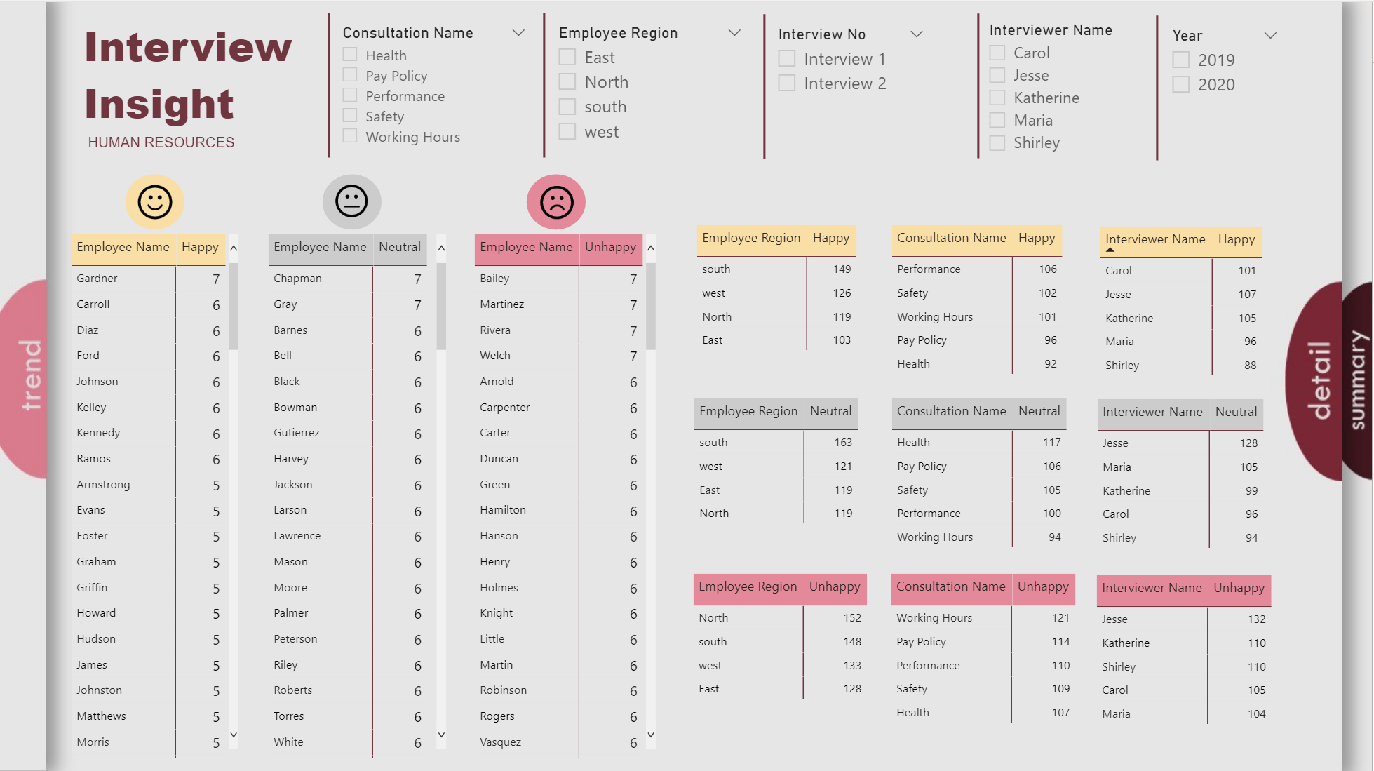
Hello everyone,
Great outcomes till now, can’t wait for the rest.
Below is my point of view :
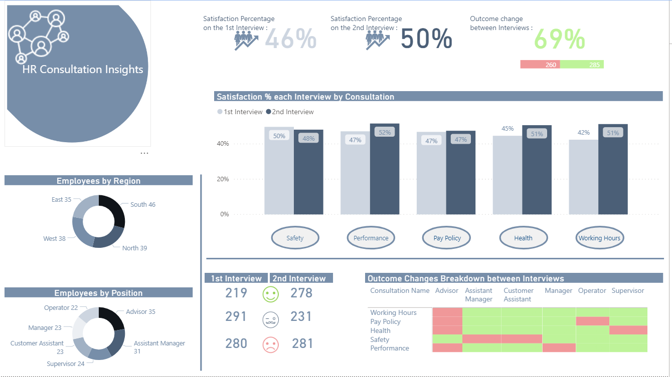
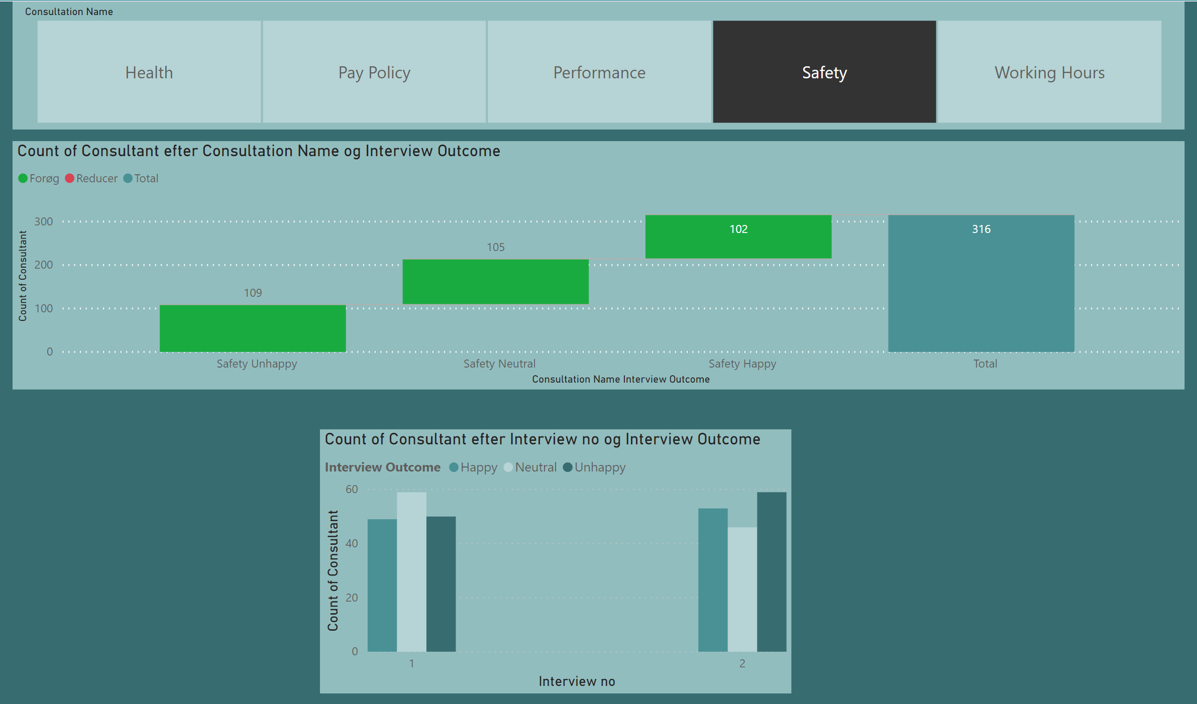
In this challenge I tried to make something easier to read from an HR perspective without overcomplicating the report.
Every visual interacts with each other and the cycles in the main visuals act as buttons in order to filter the individual consultation.
I hope you like it and would appreciate any feedback.
Thank you,
Michael
10 Likes
Wow love it. Love to learn more about how you did this one
Very impressive Diana
Wow, @DianaB I love your naviagtion. And I learnt something for myself: “Summary” is not a good page title. It’s better to be precise. It could mean “overview” or “conclusion”. I did the same mistake 
1 Like
That design is gorgeous. I love the 3D tab effect.
Would you mind posting your PBIX?
Thanks!
- Brian
P.S. @alexbadiu - I was going to ask you the same thing.
P.P.S @haroonali1000 - Maybe this is could be a standard part of submitting an entry? Would make it easier for everyone to explore and learn from all the cool stuff people are doing in their reports.
If I’d had time on this challenge, I definitely would’ve run that analysis to test the correlation between interview #1 and interview #2. I also would have run the 5 consultations against each other to examine the correlations between the sentiment on those issues. There’s actually a pretty good custom visual from Microsoft to do this that I used in challenge #2. It’s a little wonky since it requires you to install an older version of R (3.3.0 or earlier) plus the R Corrplot package. You don’t actually need to run any R, just install these two components and the visual writes and runs the R code for you. Once you get it properly set up, it works quite well and is very customizable.
Alternatively, there’s a quick measure in the Microsoft Community Gallery to calculate the Pearson correlation coefficient:
These would be interesting tests to run, since my experience analyzing this type of data is that peoples’ sentiments and preferences are not nearly as stable as you might expect. Even well-established personality tests (like MBTI) show more variance over time that I ever would’ve anticipated.
- Brian
2 Likes
Hi all
I find all this challenge very good, which give learning and a lot of inspiration from all of you.
My report in 3 pages.

4 Likes