Here’s the entry from one of our non-member participants, Sabine.
6 Likes
8 Likes
8 Likes
Thanks for these words @BrianJ.
I tried a few new things on the visualization and rest of the time was mainly focused on getting the correct metrics from the dataset. I have always believed that EDNA challenges are not only a great way to learn and improve PBI skills but also putting together these small bits of learning can vastly improve your report for each challenge. The inspiration one gets from PBI reports of gurus like @sam.mckay, @alexbadiu, @MudassirAli and others gives you that extra bit of motivation and confidence to try something new.
Your appreciation and kind words just highlight this fact and gives me the satisfaction on slowly moving in the right direction.
2 Likes
@KimC ,
Really nice report! Conveys a lot of information, truly in a one page report (though much respect also to the entrants who figured out how to cram a six page report into a one-page “box”…), without feeling cramped. I really like in your writeup how you talk about adjusting the scope based on available time. I think what you’ve chosen to focus on tells a very clear, specific, and interesting story.
Excellent use of a wide range of techniques, including my favorite – a great application of the QueryOn Timeline custom visual. I also really like when a report reveals a finding or pattern that wasn’t initially apparent to me ,such as your finding of the dramatic decrease in the age of F1 World Champions.
Per your writeup, the list of things you’ve learned through this challenge is incredibly impressive, and ultimately the true mark of a successful challenge entry. The progress you’ve achieved between your first challenge entry last month and this month’s entry is phenomenal.
One constructive suggestion – I think instead of using the horizontal list slicer for number of world championships, a greater than or equal to single value slider would make for an improved user experience, though a very minor point.
Great job, and thanks for participating!
– Brian
2 Likes
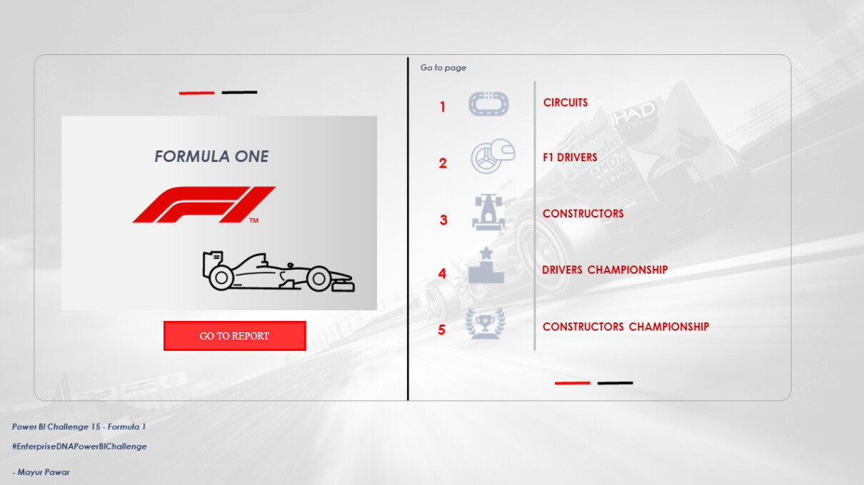
Hi Everyone!
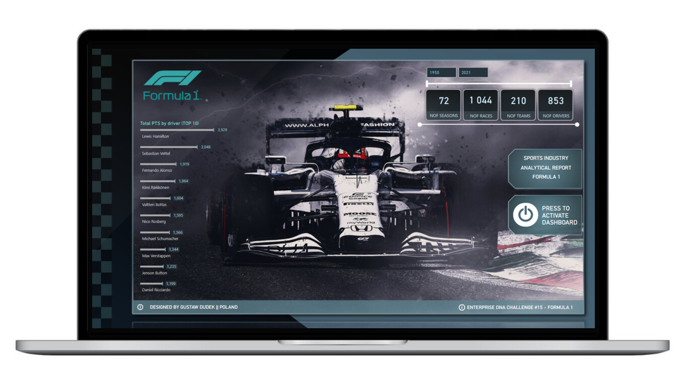
I’d like to share my submission for challenge #15.
Link to the on-line report:
I will also provide much more detailed description of the process as soon as it’s possible (with covering such topics as general context, visual techniques, measures and other fun functionalities).
For now, I honestly say that I have any knowledge related with formula 1 and following report was just made by intuition, along with some basic number veryfication using available sources (like e.g. formula1.com). If there is any topic that I’ve covered in the report, but it should be presented or measured basing on a different specliastic sport foundations, I’will be glad for any feedback in that matter.
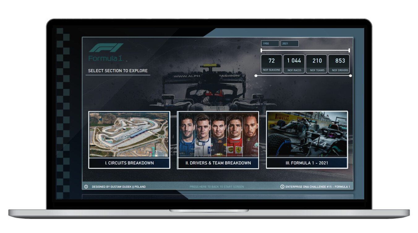
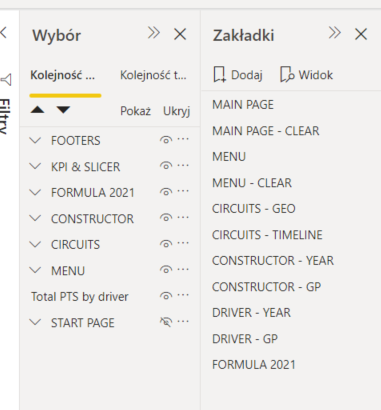
According to the basic challenge requirements, I’d like to say that the whole report is physically just a one page with bunch of bookmarks techniques, object groupings, additional ppt backgrounds, tooltips etc.
There was a few fun challenges along the way, such as text/symbol coding (mostly related with names of drivers, names of circuits and others). There is also a bit challenging to identyfi +200 records (depending on a given data base) that automaticaly converted some decimal numbers into dates, that led to inadequate measures.
Below I would list some niuances related with functionalities and UI.
- Every page provides access to footers (hyperlinks and also bookmark that allows to come back to start page.
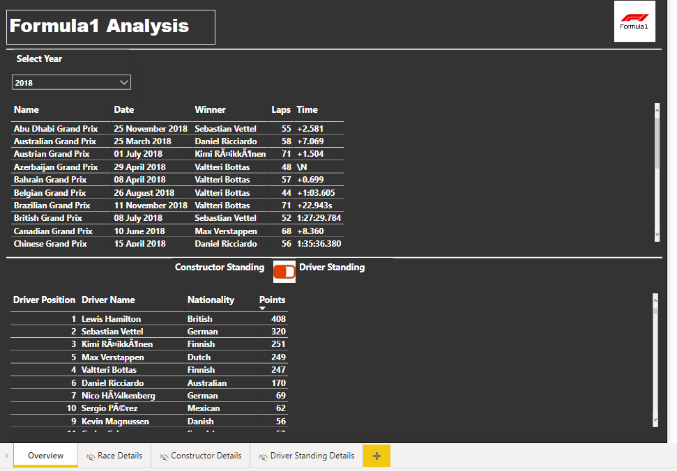
- Every “subpage” base on the same date context, except the last analysis, which filters all data only to 2021 year and then erease that filter as soon as You come back to “menu” page
- Beside of using one main ppt background there are additional 3-4 background that are added as an objcets (pictures) to visualy diversify different sections.
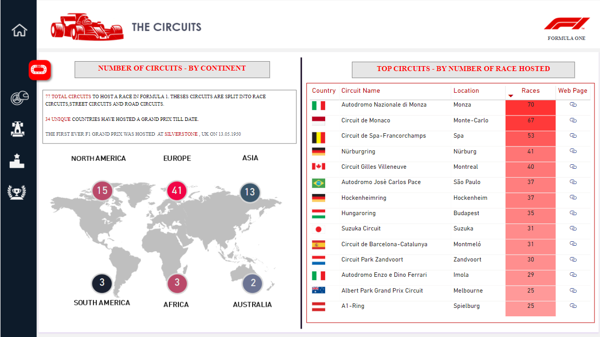
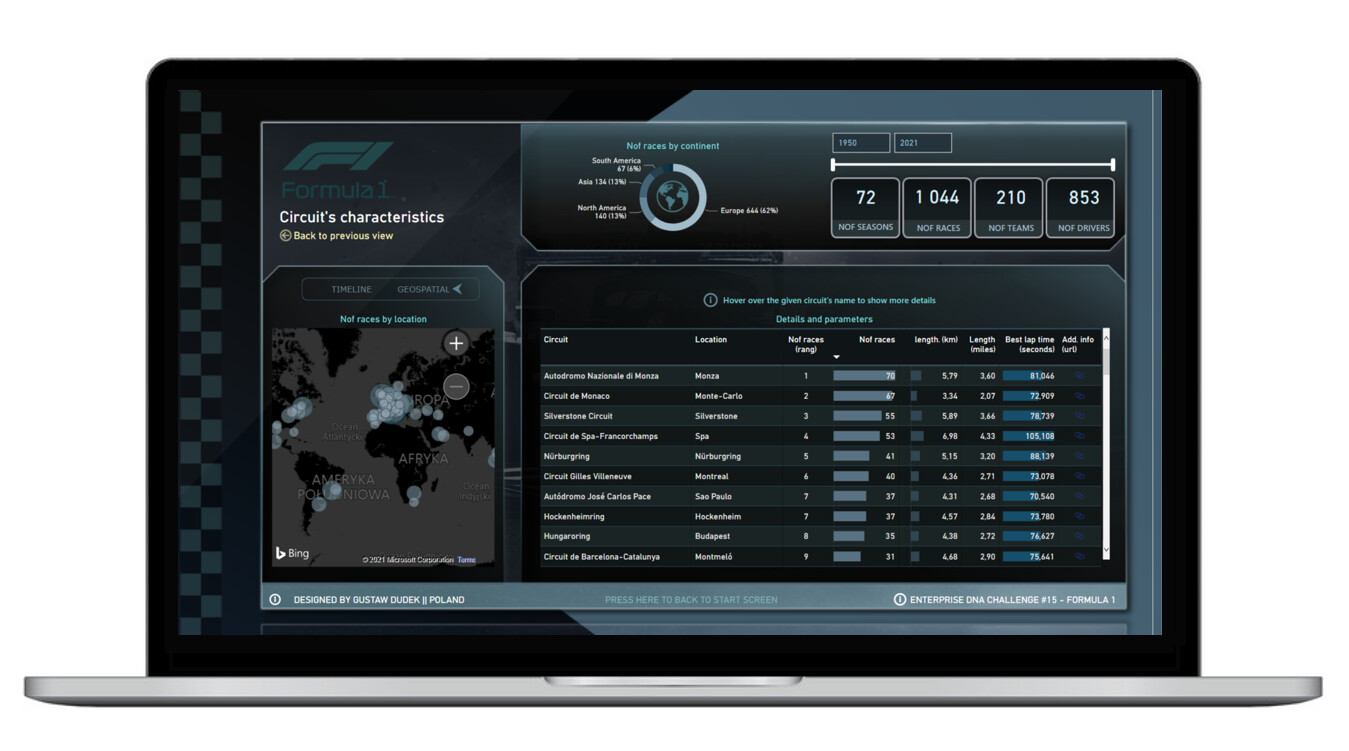
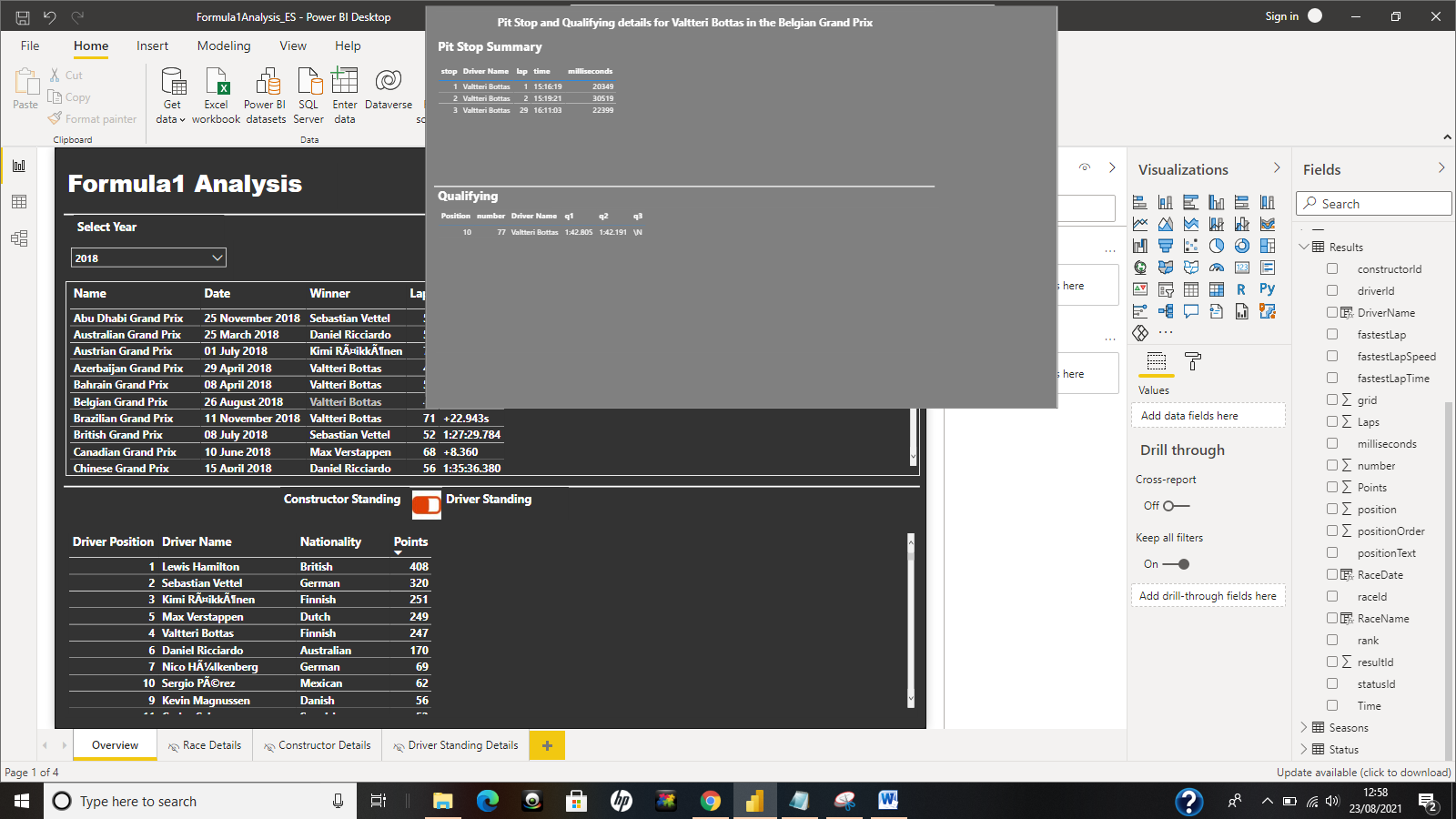
- Page: Circuits: Each position in “circuit table” have additional tooltip with details.
- Page: Circuits: Upper donut chart is supposed to filter geographical data and make it much more readable. I intentionally used such type of map, as it has not provide excesive amount of additional labels while zooming.
- Page: Circuits: there is additional switch between “timeline” charts and map. Timeline chart helps me to undestand how many races has been executed per year (with some visible trends) and it identifies gaps between given years. Another chart shows how best lap times has been changed through the years.
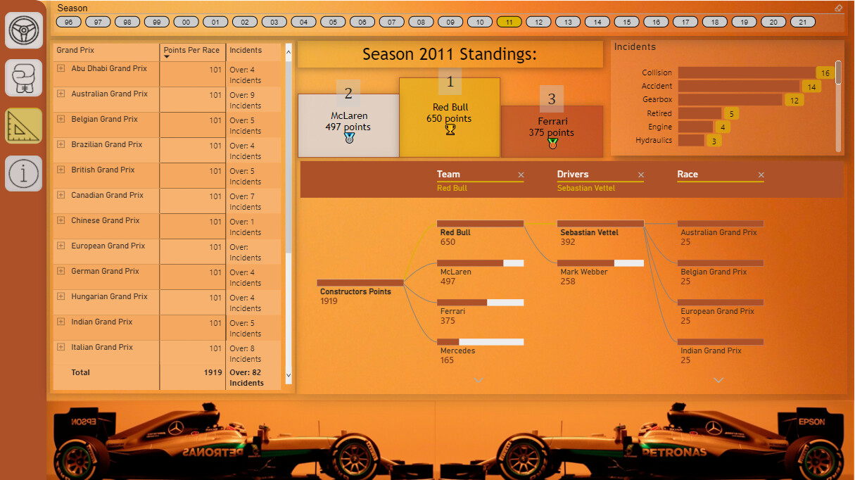
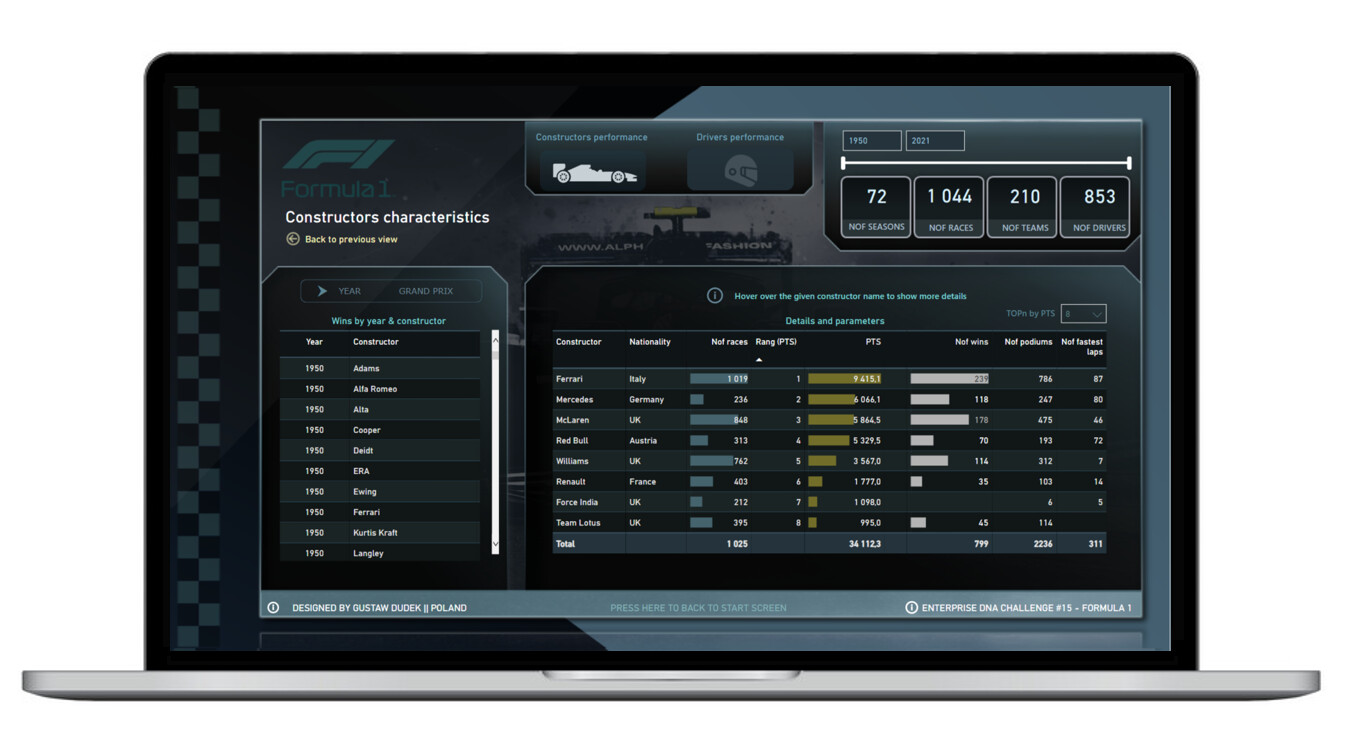
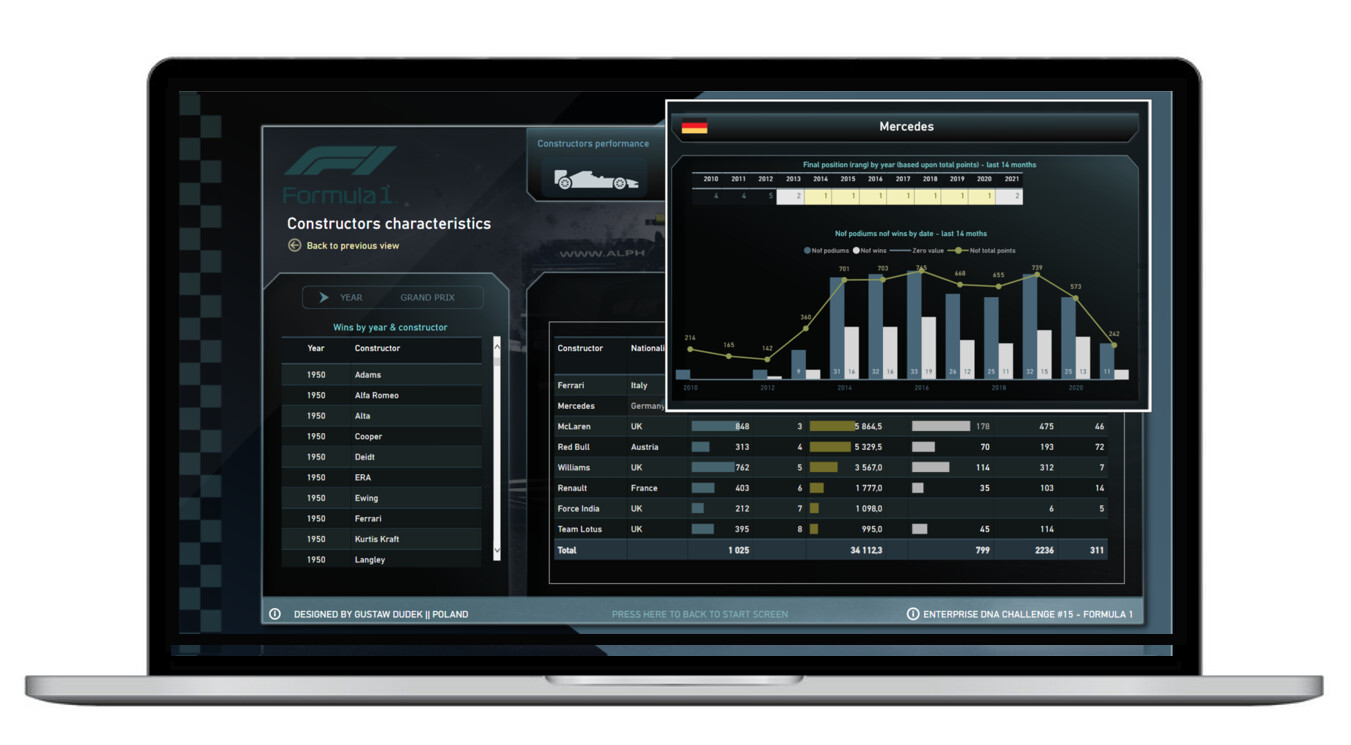
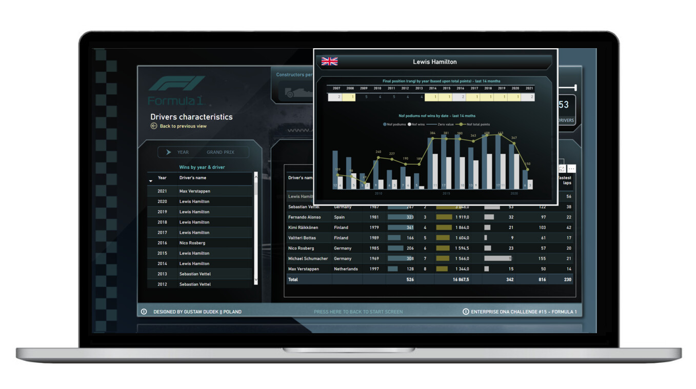
- Page: Constructors/drivers: there is visual switch between constructor analysis (which is defaualt) and driver’s analysis. Additionaly You can analyse 1st places by either year or GP.
- Page: Constructors/drivers: table provides broader context by hoovering tooltips (it shows positions - ranks by year along with some trends in general number of points/wins/podiums per year)
- Page: Constructors/drivers: There is “TOPn” slicer, that allows to filter either constructors or drivers by the highest number of pts gained. It’s just more like a feature, that helps to reduce size of table and shows just a couple of rows.
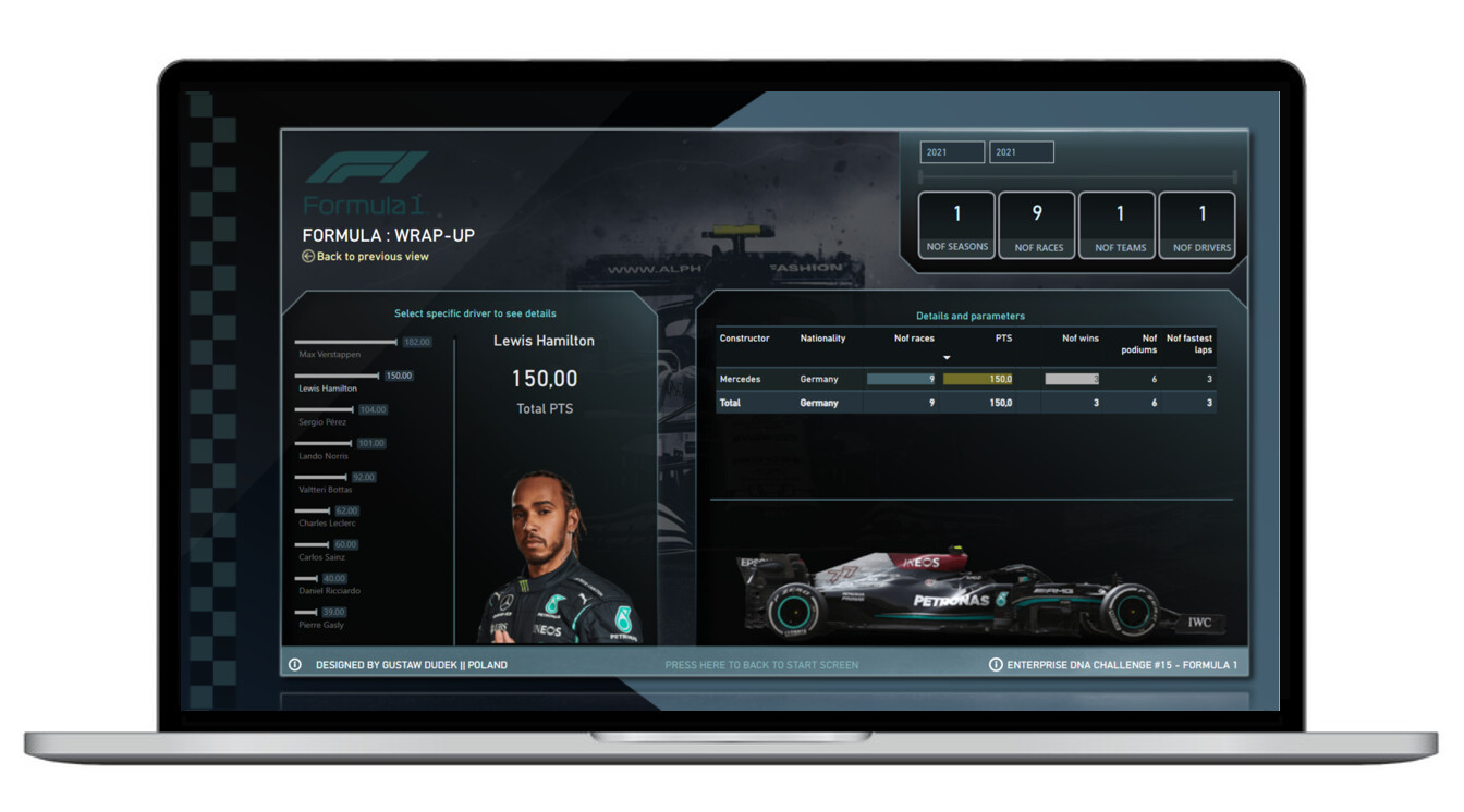
- Formula 2021 - it’s just wraps some metrics associated with 2021 GP, with some additional graphics (that F1 cars just look great…).
Hope You’ll enjoy it.
17 Likes
Thanks for the encouragement @BrianJ 
I am happy with my progress and continue to be inspired by all the amazing entries in this challenge.
3 Likes

He managed to top his last challenge entry…somehow (Just gonna go and pick up jaw up from the floor)
1 Like
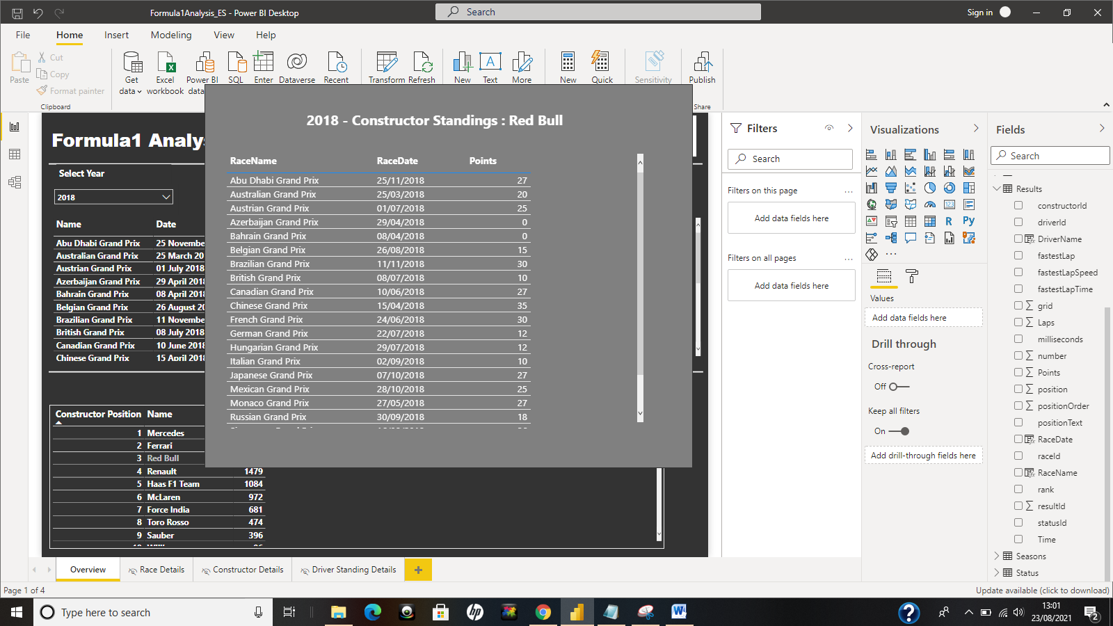
Hi All
Apologies for missing the deadline, below is the screen shots and comments for my submission on challenge 15.
Measures
- Used the RANKX function to get the Positions on the Driver and Constructor Standings tooltip
- Had selected text using these measures (Selected Constuctor, Selected Driver and Selected Race) which was
displayed on a CARD visual in each of the respective tooltips - Calculated 3 Average measures (ie. Avg. LapTime Position,Avg Qualifying Position and Avg. Race Position)
and use them on the Driving Standings lookup page
Learning Outcomes
- Use a button toggle button feature to switch between the Constructor and Driver Standings pages and show this on the same page. Enhanced my knowledge in using bookmarks to achieve this.
Things to Learn/Improve on
- Ability to add more compelling insights on a single page
Overview Page
Race Lookup
Driver Standings Lookup
Constructor Standings Lookup
5 Likes
That is stunning and incredible
1 Like
@BrianJ ,
Thank you very much for the feedback and your kind words which have just cheered me up because I was not really satisfied with the work provided.
Regards,
Mehdi
2 Likes
Thank you very much for the feedback and the advice. I can confirm that participating in such as challenge improve skills.
This is just my second participation and for this report I integrated for the first time a specific theme. So I’m definitely improving my skills maybe small steps but like we said in French “Petit à petit l’oiseau fait son nid” (Little by little the bird makes its nest)
Regards,
- Mehdi
3 Likes
@MehdiH We all started from zero my friend, no one was ever born an expert. I just keep on trying to improve day by day, being part of eDNA will only accelerate that process for both of us.
3 Likes
@DavieJoe Last year this time, I came to know that there is such a thing called “BOOKMARKS” in Power BI. 
2 Likes
You’ve done pretty well since then 
2 Likes