Wow, amazing work Brad
4 Likes
Wow awesome work everyone, looking forward to reviewing.
Still time to submit!
Thanks,
Haroon
Thanks @sam.mckay! I wish I could have submitted the final version that connected directly to the source data since that version was scaleable to global data and most countries but it was still fun working with data from my home state.
1 Like
I was able to update the Advanced Modeling page final visual for those who are interested!
2 Likes
HI @bradsmith ,
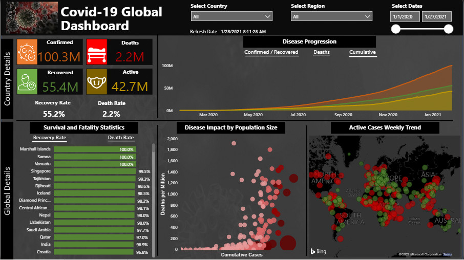
Cool work Brad. Is there anyway to get a clearer view of the dashboard? When I click on the screenshots, I am unable to zoom in – I particularly want to see the demographic section because I been meaning to find something like this.
Also, have you thought about adding a forecast of new cases into the model? I am wondering if this is possible. I suppose it would need to look at averages over the last 7 days or so and then project forward, but maybe you have more knowledge of how something like this would work.
Hi Everyone
Please see my submission for Challenge-11.
I will post a detailed review on the working methodology once the deadline for submission is over. You can experience the complete report at the following link.
Looking forward to any suggestions / feedback.
Regards
Abu Bakar Alvi
6 Likes
Hi @emercado777,
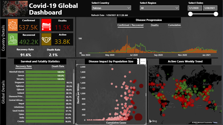
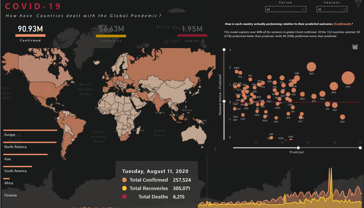
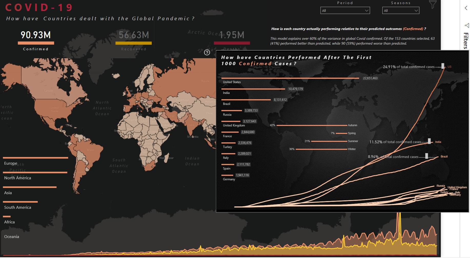
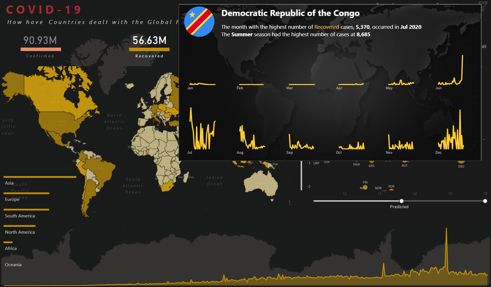
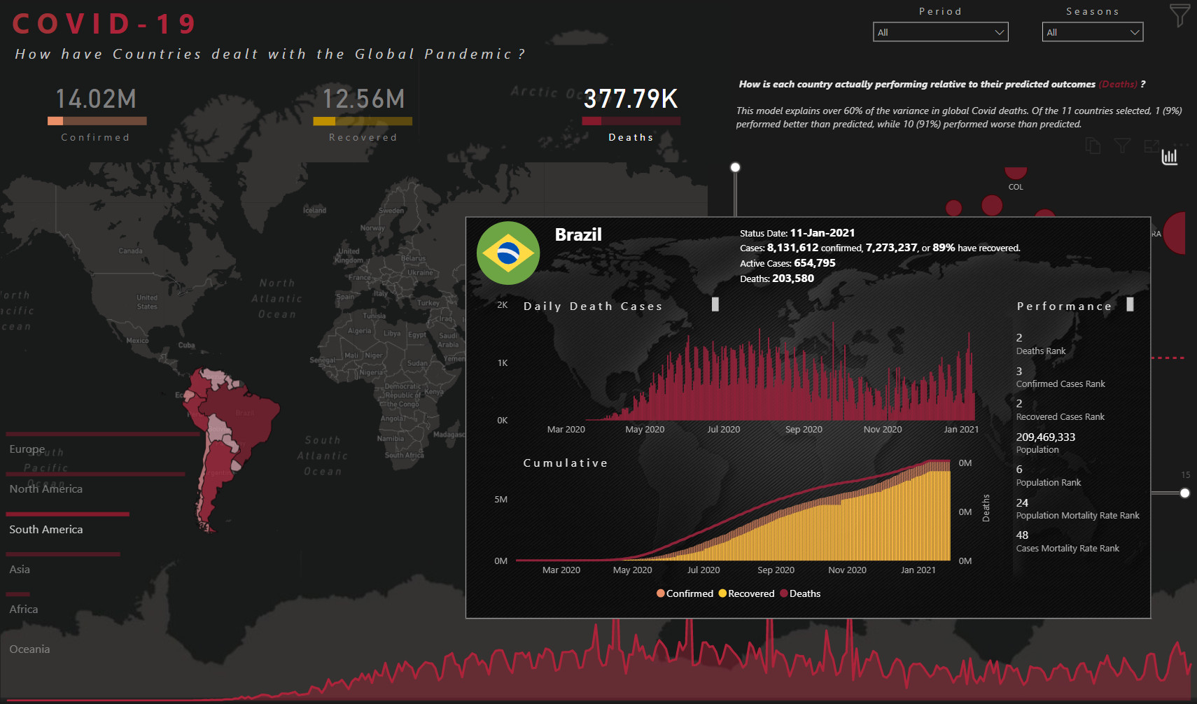
I went and split some of the larger slides up and included them as a reply in the project update forum post for my submission (Power BI Challenge 11 - Covid 19 Reporting from Brad). The demographic data was really what drew me into focusing on a specific state so that I could really do it justice.
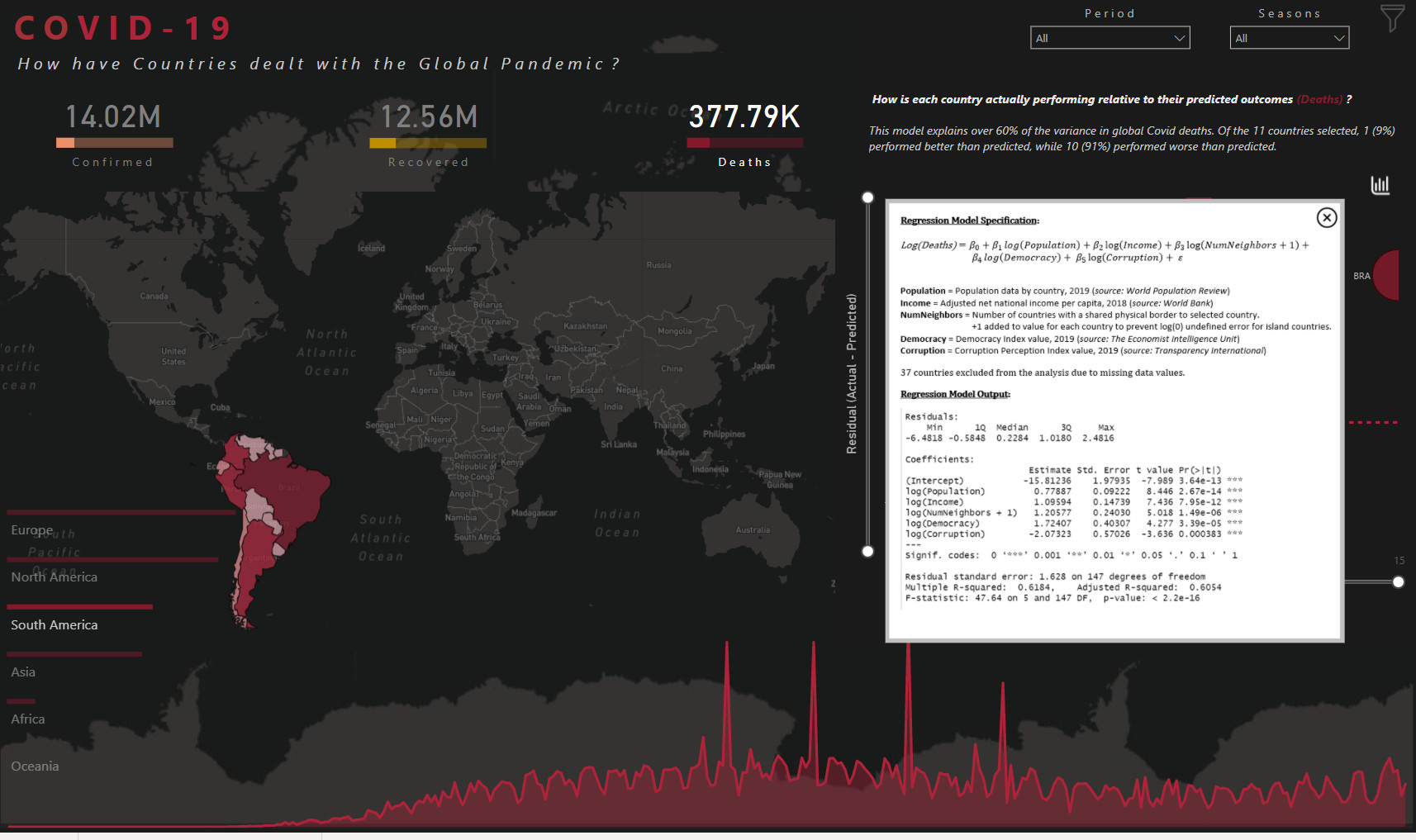
And I didn’t really consider adding a forecast of new cases as a variable, but as one of the charts I did. That’s probably the most common use of the SEIR model and almost every forecast put out by a health organization uses a variation of the SEIR model. I take it back, I did consider using a LSTM model but the main drawback to that is that LSTM models for viral infections generally just focus on the number of infected and ignored other factors that truly have an impact on cases. It would be interesting to create a hybrid approach that uses the two together. It has actually been very interesting to see how these models have changed due to COVID.
Most of the models used were originally created fairly early into the pandemic and were created from much smaller/shorter outbreaks/pandemics. This is why many of these models only forecast 7-14 days out, they never had the such vast amounts of data for a single pandemic nor has it been this wide reaching so the models are subject to overfitting. A number of variants of the SEIR model have been developed as a result and some of them are truly incredible. There’s one in particular out of India that I really wanted to try but is much more complex and I didn’t have time to implement.
If you can’t tell, I get pretty excited about machine learning and these types of models haha
2 Likes
Alex, I’ve just gotta say I’m always so impressed at the elegance of your reports!
2 Likes
Thank you @bradsmith! I am also very impressed by your analytical skills & attention to details! I also enjoy reading your write ups! Your ability to describe your approach is inspiring! We also feel your passion for machine learning and data science 
2 Likes
Thanks @bradsmith for providing your thoughts of how you worked through this challenge. The SEIR model sounds like a more evolved forecasting method than taking the average total cases over the last 7-14 days – even better would be the hybrid that brings in additional information (perhaps health, lifestyle, age, etc). I hope I will be at the level to create it in the future. Nonetheless, very fascinating.
Also thanks for creating better screenshots of the demographic section. There is a definitely a lot of details there. I will need to sit and absorb it. You have given me a some good material to read this week. Thanks
Hi All.
Here is a collaborative effort from a group of experts. We wanted to go through the process that many of may experience in your work environments, and see what benefits and limitations arose. As well, part of the reason for the collaborative effort was to do a dry run for a future course/webinar on collaborative Power BI development that we’ll be putting together for release later this year.
So, without further ado, here is the collaborative submission from JMAP (Julius, Moore, Ali, and Philps).
(GP: I was the lucky one who got to make our post, but others did an overwhelming portion of the development, so …)
We’re still trying to figure out the best way to share our experiences in this group development effort, and more will become available shortly.
Thanks again to Enterprise DNA for hosting and administering these challenges, and congratulations to the Enterprise DNA community for all your efforts. Bon chance!
Greg (on behalf of @BrianJ, @JarrettM, @MudassirAli, and @Greg)
17 Likes
You can think of it like this: a moving average forecast is like a microwaveable dinner-quick, maybe not the best option, but it’ll be sufficient. The SEIR model is like a recipe. It can be as basic as Mac n cheese or as complex as a paella. Neither is really difficult as long as you have the ingredients and follow the recipe.
The great thing about the SEIR model is that it’s what’s called a compartmental model which is really just a model explaining how different people interact. Each letter in the model is a different group of people (in this case: Susceptible, Exposed, Infected, and Recovered). People can move between the groups but it’s generally in the order the letters are in. And since each letter is a group it can be really fairy basic like a SIR model (Susceptible, Infected, Recovered) or complex like the mode from India I was talking about, the SEIAQRDT model (Susceptible, Exposed, Infected, Asymptomatic , Quarantined, Recovered, Deaths, and Insusceptible).
And you’re welcome! I’m glad you found the extra detail helpful! Let me know if you have any questions!
2 Likes
@bradsmith wow wow my friend.You have done something extraordinary here. The analysis, the visuals & the explanation, everything is outclass. Well done & thank you for participating in the challenge. Really amazed to see this type of work being produced here. Excellent.
1 Like
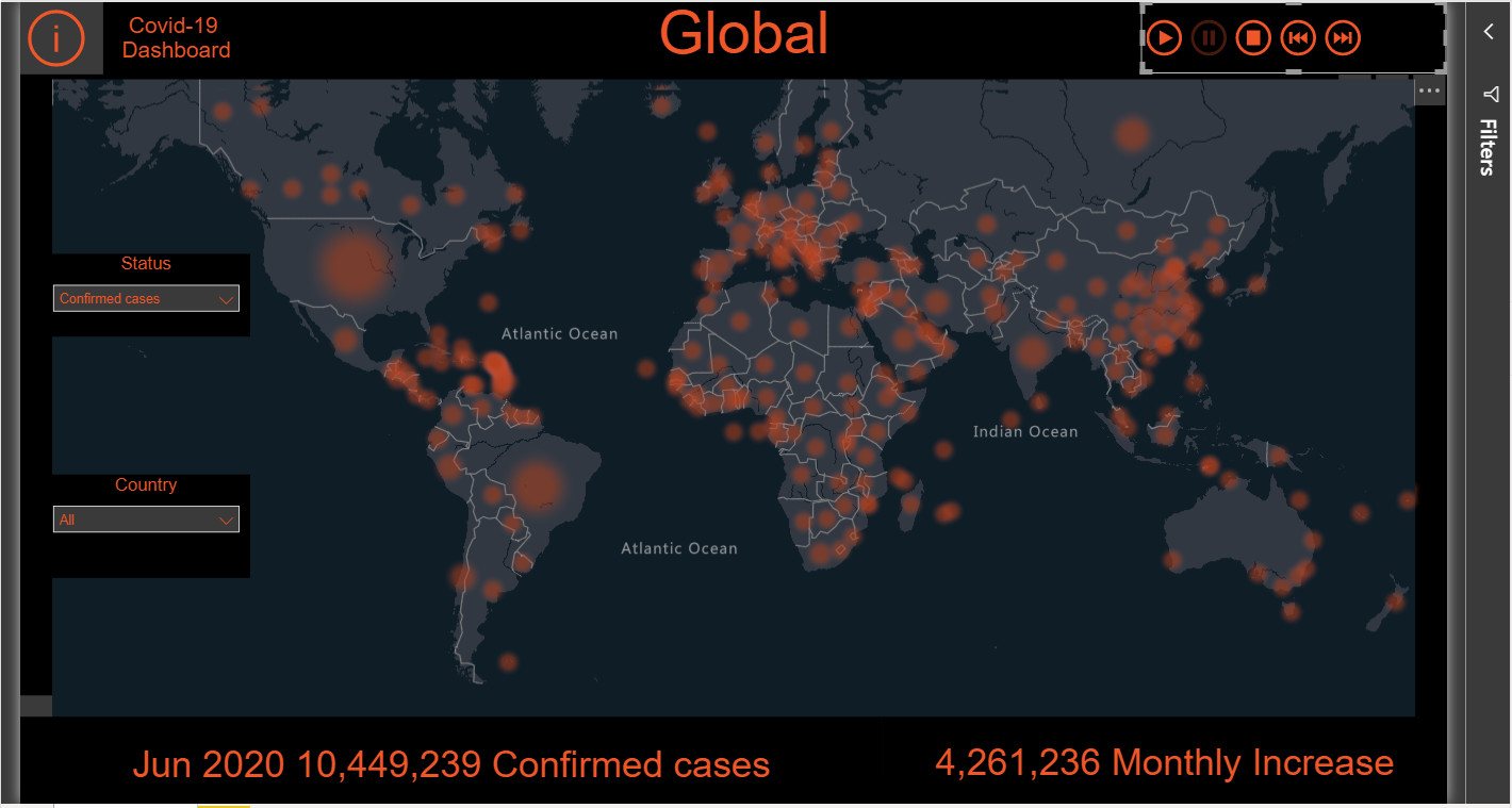
Whoops… It appears that Azure Maps is not supported. So, I’ve changed the map now. Other than that, a great challenge…
2 Likes
@bradsmith, that is super fascinating. This is my first time coming across this model, so it takes me some time to process it. Nonetheless, it looks by far more robust than a moving average although a moving average is good for providing some quick insight…
You mentioned a nice metaphor around “ingredients”. Using the SIR model is it easy to find the ingredients. I mean, how to group people in each bucket? Perhaps we need to make assumptions about the population? I can understand that it would be easy to know who has/had covid, but how to determine Susceptible? Could this be everyone who has not gotten covid, or would this be a selection of the population that represents high risk?.. Excuse the many questions, but thinking through these questions is quite fun, especially since we can dive a bit deeper into the construction of the measures
1 Like
Oh you don’t have to apologize for asking questions! I love answering these types of questions. For a SIR model, the groups would be defined as:
- Susceptible: The total number of people who have not been infected. Typically everyone starts here until they are either infected, recovered, or immune
- Infected: The total number of people who have been infected.
- Recovery (This is also commonly called “Resistant”): The total number of people who no longer can get the virus.would include those who have recovered, died, or are immune.
There are certainly different parameters that’s can be included to make this much more robust and that’s generally where we’d start seeing assumptions. Things like transmission rates, reproduction rate (the number of people an infected person can infect), the recovery rate, are all commonly assumed to be universal regardless of which country/state/county someone is in and there are ways to calculate these as well as published reports by the WHO, CDC, and other health organizations that provide best estimates for these.
The great thing about the model is that you can add more parameters to fine tune the model as more information becomes available and continuously improve on it. That’s when things really start getting complex.
2 Likes
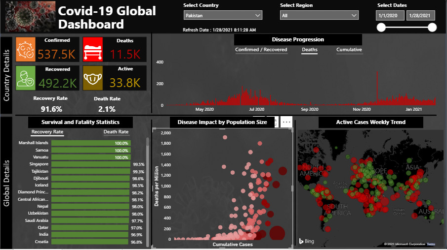
I really like what you’ve done here. This is a really clean looking, accessible and intuitive dashboard. What I particularly like is the way you’ve normalized the data in multiple ways to make it more directly comparable and meaningful through the use of rates, per capita impacts, and time trends. In particular, I think the active cases weekly trend visual is a home run. My two suggestions for improving it further would be to add the country name to the tooltip and then ideally be able to filter the visual at minimum by positive/negative trend (maybe through the inclusion of a legend) or ideally a slider that lets you filter which countries are visible based on the trend range selected.
I felt this one really met the spirit of the brief in being a true one pager, easily understandable by the layperson, yet providing great insight and depth within the confines of one page. Well done!
- Brian
2 Likes
Thank you @BrianJ for your valuable feedback especially about the legend/slider for the Active cases visual. It would definitely allow ease in viewing and to navigate the map better.
Thanks again!! 
1 Like
All,
I should’ve remembered to offer this earlier, but for any of you having trouble with publish to web, please feel free to email me your PBIX file at brian.julius@enterprisedna.co, and I will be glad to publish it on the eDNA tenant for you and send you back a publish to web link that you can include with your challenge entry and/or writeup. I feel entries “show” better when the user can experience the report with the full navigation/UX working as the developer intended.
- Brian
2 Likes