The Problem
The ‘Supplier Insights’ problem was unique in the sense that the information was just available on the quantity of material having defects and the resulting production downtime at each plant location due to the materials. The materials, coming in various categories and material types were being supplied by various vendors to different manufacturing plants. The information on the total material supplied by each vendor was not available in the data.
In a common manufacturing setup the supply chain works from the vendor to the manufacturer. The material defects can be categorized by the category and type of the material and also the vendor supplying that material. These material defects cause ‘downtime events’ at the manufacturer’s plant, which can create ‘Production Downtime’ in the manufacturing process ranging from a few minutes to a few days. Apart from the downtime duration, the net result in the manufacturing process depends on the ‘Defect Type’, which could have an ‘Impact’, ‘No Impact’ or lead to the material being ‘Rejected’. The cumulative effect of the ‘Production Downtime’ could add up to several days at each plant and hundreds of days for the company as a whole.
Data cleaning
There were some typos and unclear terms in the ‘Defects’ field and needed to be corrected to make the data clean and ensure data quality. Some of these include ‘Out of Spec’ as compared to ‘Out of Specification, ‘Wrong Spec’ as compared to ‘Wrong Specifications’ and a few others such instances.
Data transformation and modeling
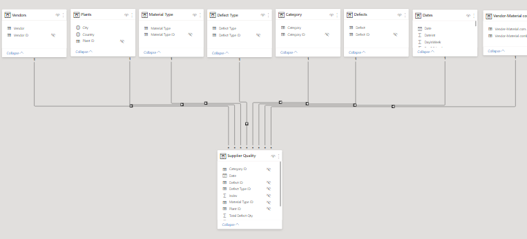
The model was relatively straight forward with the classical ‘Dimension-Facts’ relationships quite simple to build. For the sake of analysis, it was important to have a ‘Vendor-Material’ field so that the effect of this combination could be seen more clearly, however, I realized later that these could be combined through smart use of measures, but I still proceeded with this combination in the model
Data Analysis
My analysis was focused at the questions posed in the Problem Brief and I looked at the following aspects in the supply chain
- ‘Material Types’ and ‘Category’ leading to materials having most defected quantity.
- ‘Material-Vendor’ combination responsible for most defected quantity
- ‘Material-Vendor’ combination causing the most ‘Downtime Events’ at plants
- How the same ‘Vendor-material’ combination performing across different plants and responsible for most defected quantity, although this gives little insight at pinpointing the actual reason for the defected quantity without the data on total material being supplied
- The relationship of ‘Downtime Events’ with ‘Downtime duration’ at plants
- Which ‘vendor-plant’ combination is producing the most defected materials and causing most downtime in number of days
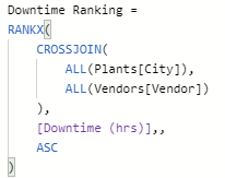
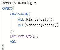
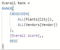
- Calculate an overall score for worst performing ‘Vendor-Plant’ combination and determine the overall ranking based on that score.
This was achieved by using measures and some ranking techniques to come up with the ‘overall score’ for the worst performing ‘vendor-plant’ combination for each year.
Data Visualization
Data Visualization was segmented into 4 sections based on the problem statement
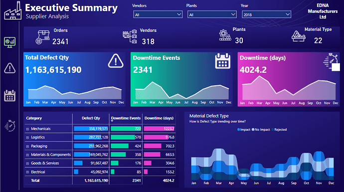
a. Executive Summary: Gives an overview of the key measures ‘Defect Qty’, ‘Downtime Events’ and ‘Downtime duration’ and their trending over time. The slicers provide a self-service BI experience to the end user so that these key measures can be explored across various vendors, plants, material category / type and defect time over time.
The theme for the visualization was inspired by a recent online event on dashboard design I attended recently and available at the following link.
https://powerbiexperience.com/en/examples-of-reports-and-dashboards-with-power-bi/
The color associated with these key measures have been replicated across the report.
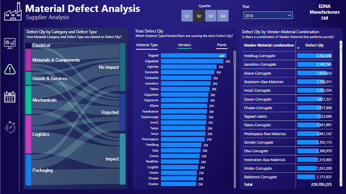
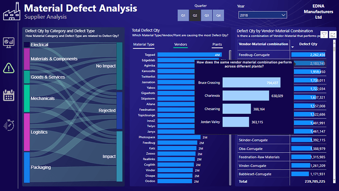
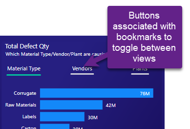
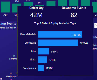
b. Material Defect Analysis: This section focuses on the ‘Defect Qty’ across Material types, Vendors and Plants at a quarterly level. A tooltip shows the ‘Top 10’ defects across these dimensions. I have used buttons and bookmarks to switch between these views on the page.
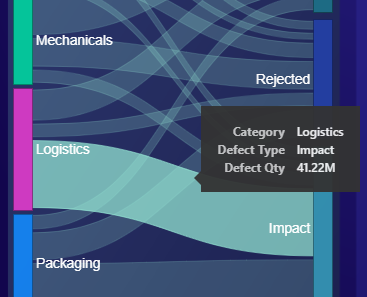
A custom visual of the ‘Sankey chart’ highlights how ‘Material Type’ and ‘Defect Type’ are related to the ‘Defect Qty’. There is no built-in Sankey chart available within Power BI and the custom visual has certain limitations and limited controls but it still does a decent job to show the flow of defected material across these dimensions.
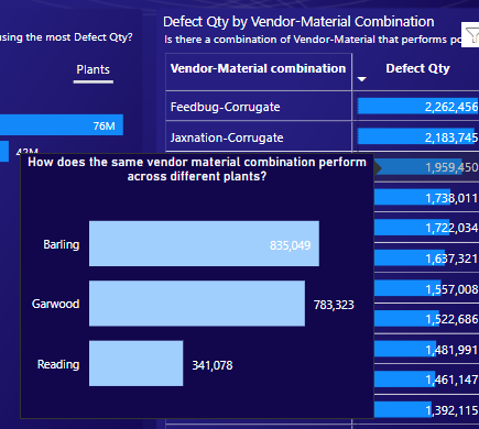
The last visual shows the relationship between ‘vendor-material’ combination and the tooltip highlights how each combination performs across different plants. This visual would have been much useful if the details of the total material supplied had been available in the data.
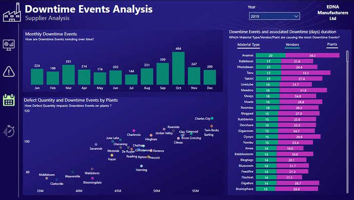
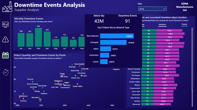
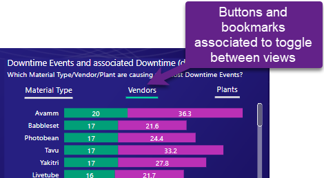
c. Downtime Events Analysis: This section focuses on the ‘Downtime Events’ and the associated ‘Downtime duration’ across plants, while also looking at the ‘vendors’ and ‘material types’ responsible for these events at a monthly level. Buttons and bookmarks have been used in the same manner as the previous section
A scatter chart show the relationship between ‘Defect Qty’ and ‘Downtime Events’ across all ‘Plants’ and the worst material types contributing towards the ‘Defect Qty’.
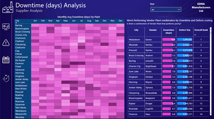
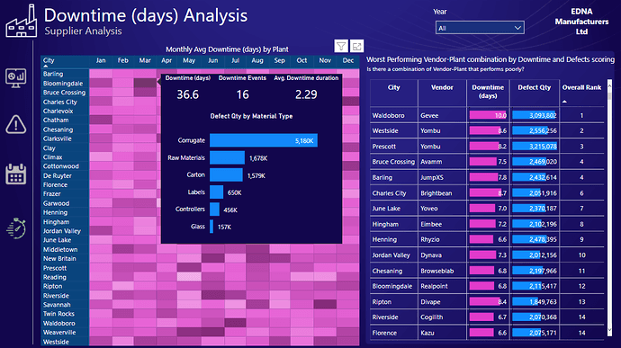
d. Downtime duration Analysis: This section focuses on the ‘Downtime duration’ across plants at a monthly level and shows the ‘Avg. duration’ per event in a heatmap. This measure is different from the overall downtime duration because there are many plants where higher downtime duration can be seen because of very few events and vice versa. This calculation takes into account the effect of both these variables. The tooltip also shows the ‘Material Type’ of the associated defect qty.
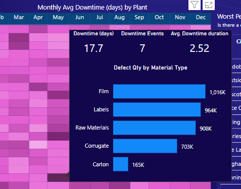
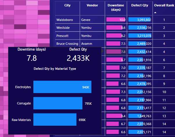
The other visual shows the overall score for ‘vendor-plant’ combination. The score calculation uses the ranking score (in descending order) across ‘Defect Qty’ and ‘Downtime duration’ for each ‘vendor-plant’ combination. The score for each measure is added up and ranked in ascending order to list the worst performing ‘vendor-plant’ combination. The tooltip also shows the ‘Material Type’ contributing towards the ‘Defect Qty’.

Overall the challenge was exciting and fun to work on especially as I had missed out on challenges 7, 8 and 9 for personal reasons. Please leave your comments, suggestions and feedback for my learning and continuous improvement. Proud to be a part of this wonderful community.
Regards
Abu Bakar Alvi