Hi All:
Here is my submission for eDNA challenge #5, Optical Data.
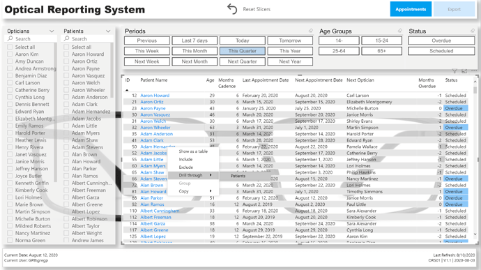
I tried to make this “report” look more like an app, so I made minimal use of analytical visuals, instead concentrating on the main “Appointments” page; the secondary “Patients” page was to be accessed as a drill-through target of the “Appointments” page only, and the “Export” page was added to allow not only allow easy export of the patients needing appointments, but one that would “sync” with the main “Appointments” page.
NOTES:
Data:
- made assumption that the optician that did the patient’s last appointment would do the next appointment
Data Model:
-
imported [Optical Data Set.xlsx] as a staging query, and created references in new [Data Model] group for [Patients], [Opticians], [Appointments]
-
[Patients] table:
- deleted [Age] from table and recalculated from “today” using Power Query (https://radacad.com/age-calculation-in-power-bi-using-power-query#:~:text=In%20Power%20BI%20Desktop%2C%20Click%20on%20Transform%20Data,Birthdate%20column%2C%20and%20the%20current%20date%20and%20time)
- kept whole number portion of year
- split name into first name and last name as well, while keeping full name; added [Last Name First Name] column using “Column From Examples”
- added calculated columns for [Last Appointment Date], [Cadence Months], [First Appointment Date], [Last Appointment Date], [Last Appointment ID], [Next Appointment Date], [Next Appointment Status] (Scheduled/Overdue), [Overdue], [Last Optician], [Next Optician], [Age Group]
-
[Opticians] table
- merged first and last name columns; duplicated column; split columns to re-create first name and last name
-
added [Dates] table using eDNA Extended Date Table M Code;
- marked as Date table
- used parameter to get and set start date to Jan 1 of first appointment year
- used parameter to get and set end date to Dec 31 of the year after this year
-
added [Periods] table using eDNA Period Table M Code (Dynamic Date Range Slicer- Query M); adjusted for “this” and “next” periods (week, month, quarter, year)
- formatted M code using tool at https://powerqueryformatter.com/
Measures:
- formatted measures using eDNA DAX Clean Up tool https://analysthub.enterprisedna.co/dax-clean-up
Visuals:
-
General:
- added pages for [Appointments], [Patients], [Export]
- hid all pages except for [Export] page for so PDF export (in either Power BI Desktop or Power BI Service) will output only the [Export] page
- added buttons for page navigation to header (font bold white for current, font regular grey for options)
- added card for [Session Admin] to footer to display last refresh, report ID, report version, report version date (these in card title and whitespace character in card field well)
- added card for [Report Admin] to footer to display current date, current user (these in card title and whitespace character in card field well)
- made extensive use of the [General] section in the Visualizations pane to confirm and adjust the values X/Y/Width/Height as necessary
- used object layering (selection pane grouping) to make the user experience more “app-like” (https://www.youtube.com/watch?v=PKIcjGz_Swg)
- calculated whether user was accessing report in Power BI Desktop or the Power BI Service and used this info to present tooltips relevant to the user’s environment
- (used difference between NOW() and UTCNOW() to see if user was on Desktop or Service; I know this is a hack, and doesn’t work if the time in your time zone is the same as UTC, and I would have preferred to use USERNAME() and USERPRINCIPLENAME(), but against my understanding, for whatever reason [perhaps my free PBI license type?], these both gave me the same value irrespective of environment) (*** I’m not happy with this method, I’m still looking for a better way, and would be interested in anyone’s experiences/thoughts/comments ***)
-
[Appointments] page:
- used standard list slicers complete with “Search” for (Next) Opticians and Patients
- used “Chiclet Slicer” custom visual for Periods, Age Groups, and Next Appointment Status
- used “Reset Slicers” button complete with bookmark to allow user to easily return to the original state
- changed font colour of [Patient Name] column to blue to indicated that you can do something (in this case drill-through to [Patients] page for the selected patient)
-
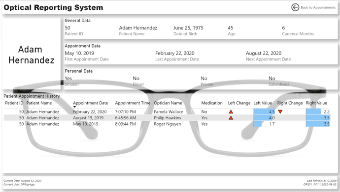
[Patients] page:
- used 3 multi-row cards to display General, Appointment, and Personal information for the selected patient
- set “Patient Name” as drill-through target
- presented the patient’s appointment history in a table, complete with data bars and up and down triangle icons as necessary to denote a changed right-eye or left-eye value from the previous appointment
-
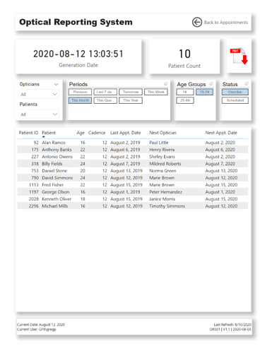
[Export] page:
- changed page size to “Letter” and increased spacing from edges in case PDF export was printed
- used “Chiclet Slicer” custom visual for Periods, Age Groups, and Next Appointment Status
- sync’d slicers to [Appointments] page to allow export of the patients/appointments that had been selected (via slicers) on the [Appointments] page
- added PDF Download icon to permit use of the current environment (Desktop, Service) to display the tooltip relevant to the user’s environment


