Normal Distribution Curve

Fellow Power BI Users -

I am able to generate a bell curve that goes out +/- 3 standard deviations based on a certain data set. However, I want the bell curve to be more dynamic and change based on a different time frame, or other natural filters I put on the page. Can you think of a way that I can create a table of values that dynamically change based on a different date range filters (or any other filter for that matter) that can generate a new standard deviation,and mean to create a new bell curve with updated +/- 3 standard deviations that includes all of the normal distribution values in between in order to generate the curve?

Thanks for any advice. I hope this makes sense.

I’m sure it can be done.

Is it possible to share more of your current solution you have so they I can see what adjustments could be made.

As many images as possible would be great.

Also what formulas are you currently using and what visual do you currently have

Chrs

Hey Sam,

Sure. Here is what I have going…

I am starting with these formulas to create a table.

Mean (μ) = CALCULATE(average(Customer_AR_Tbl_Reciept_Date[Gross Profit - USD]),FILTER (ALLSELECTED ( Date_Tbl ), Date_Tbl[Date] <= MAX ( Date_Tbl[Date] ) ))

Stand Dev. (σ) = CALCULATE(STDEV.S(Customer_AR_Tbl_Reciept_Date[Gross Profit - USD]),FILTER (ALLSELECTED ( Date_Tbl ), Date_Tbl[Date] <= MAX ( Date_Tbl[Date] ) ))

X + 3σ = [Mean (μ)]+3*[Stand Dev. (σ)]
X - 3σ = [Mean (μ)]-3*[Stand Dev. (σ)]

Then the table I generate is from the below formula

Normal Distribution = 
Var MinValue = floor([X - 3σ],1)
Var MaxValue = ceiling([X + 3σ],1)

Return
SELECTCOLUMNS(cALENDAR(MinValue,MaxValue),"X",Int([date]))

I then use this formula to generate the values to create my bell curve.

f(x) = NORM.DIST('Normal Distribution'[X],[Mean (μ)],[Stand Dev. (σ)],0)

shown in the screen shot below

When I select a different year, the (Normal Distribution’[X] values do not update with the new mean and standard deviation. How can I make this table more dynamic or is there a different way to set this up. Sorry for all of the extra information in the screen shot.

Thanks will have a look into this one, and come back if have any other questions.

Bit to this one, but a nice project.

First already what you have is really smart. Nice one.

I just played around with your table idea…

Normal Distribution = 
VAR MinValue = FLOOR( 0 - 2000, 1 )
VAR MaxValue = CEILING( 0 + 2000, 1 )

RETURN
SELECTCOLUMNS( CALENDAR( MinValue, MaxValue), "X", INT( [Date] ) )

This is an interesting combination I wouldn’t have thought off using.

You should also be able to use a function called GENERATESERIES. Maybe simpler. Personal preference I guess.

image

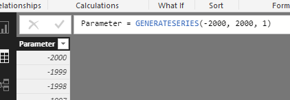
You could place you Min and Max Value in here.

After have a good think through this. I’m not sure you will be able to dynamically change the axis size (or bounds) dynamically through a filter selection. I do believe you can do this on refresh, but I’m sure you already know that.

This was the ultimate normal dist. formula I created for the table. Seems to work fine

Normal Distribution = GENERATESERIES( FLOOR( [X - 3], 1 ), CEILING( [X + 3], 1 ), 1)

I’ll keep working on this tomorrow and see if I can work through some more. This has been on my list to review for sometime anyway.

Hey Sam,

I changed the formula to reflect the GENERATESERIES, which I agree it is much easier, but if you change a date filter (lets say from 2017 data to 2018 data) you should get a different mean and standard deviation. However, the table does not reflect the updated floor and ceiling values in the GENERATESERIES FORMULA.

I wonder if I need to have a Calculate function placed in this somewhere so that it recognizes this change.

Thanks for looking at this with me. I tried looking for other examples of what I am trying to do from your mentoring videos but didn’t see anything. Look forward to seeing what you discover today.

The issue here is that the table just doesn’t adjust until you refresh the entire report based on a new selection.

I’ll keep digging to see if this can be improved.

Sorry delay on this one. Just taking a little more mind power and time to re-create a lot of the solution and get head around it.

Will come back as soon as a I have something meaningful to share.

No worries Sam. I appreciate you taking the time. I am still thinking of ways as well.

Hey Sam,

Have you had a chance to brainstorm more on this? Thanks.

Sorry this is my bad. It has been on my work on list this week, but keeps taking more time than I have. Will try get on this asap

One thing that I think is going to be difficult here is changing the axis size with a change in selection within the report page.

Tables only adjust when the report is refreshed. And that’s the same for calculated tables.

So eventhough these numbers may change within the measures, it won’t update inside the table until a refresh is done.

image

This is one of the downsides of using tables or calculated columns for anything dynamic in reports.

Everything with the chart is still dynamic for you at your end though I believe?

I think this actually is probably a good idea.

Let’s just think of a scenario.

Maybe you want to compare different distribution against each other. By keep the axis as it is, and layering on different distributions to the chart, this give a nice stable comparison.

The measures are still doing all the hard work here and are creating the calculation seamlessly and dynamically within the visual. This give you a look of flexibility in my view to really extend this a lot and work out a variety of interesting calcs.

Let me know what you think around this.

Chrs

I see where you are going with this, and I think your right. The question is how what would the dynamic formula look like to lay over the original distribution table?

Actually I figured it out. I just put an if statement to only show the f(x) values that fall with in the changing floor and ceiling values. Let me know if that is how you would approach it. Thanks Sam.

Sounds like a good idea.

Just to check can you show me the formula you’re using?

Sorry Sam for the delay, the formula does not work like I though it would. The original curve that is generated from creating the table, but any additional changes that I overlay on top of that does not give me a different distribution curve to compare. I am somewhat stuck trying to solve this one.

Just so I understand what you are attempting here…

Are you trying to calculating different distributions to compare against each other?

What are the formulas you’re using that aren’t working?

I’m not really sure where this isn’t working. Probably need a bit more specific detail to assist I think.

Chrs

Hey Sam,

Since the “original” distribution table is on a fixed axis and will not change when I click on any natural filters I have on the page, I want to do as you said from previous posts and layer different distribution curves on the same chart to provide a different comparison.

For example:
My the table that I first generated was distribution data over the past thirty years of my business. That is based on the formulas from the previous posts. Now I want to compare 2018 data and view that distribution curve and compare to over thirty years.

The problem is that I need to make this formula dynamic so that I can overlay based on choosing different filters

Current Formula f(x) = NORM.DIST('Normal Distribution'[X],[Mean (μ)],[Stand Dev. (σ)],0)

Proposed Formula f(x) Filtered = NORM.DIST('Normal Distribution Filtered'[X Filtered],[Mean (μ) (filtered)],[Stand Dev. (σ) (filtered)],0)"

where

Mean (μ) (filtered) = CALCULATE(average(Customer_AR_Tbl_Reciept_Date[Gross Profit - USD]),Date_Tbl[Year]=2018)

Stand Dev. (σ) (filtered) = CALCULATE(STDEV.S(Customer_AR_Tbl_Reciept_Date[Gross Profit - USD]),Date_Tbl[Year]=2018)

X - 3σ (filtered) = CALCULATE([Mean (μ) (filtered)]-3*[Stand Dev. (σ) (filtered)],Date_Tbl[Year]=2018)

X + 3σ (filtered) = CALCULATE([Mean (μ) (filtered)]+3*[Stand Dev. (σ) (filtered)],Date_Tbl[Year]=2018)

However,

I can not get away from having to generate another table to calculate a curve based on the selected filters, i.e. Year, State, City, etc…

I need to somehow create a virtual table so that the formulas can update based on the selected filters. I know I am close, but I am not seeing it. What are your thoughts.

Sorry for the delay

This is certainly a tough one.

Do you think you can work me up a simple example of where you are at and let me test how you would complete what you need?

This would be the quickest way to work out the solution I think.

Thanks

CWalters,

I am very interested in doing something similar with my dataset. If you could share your final product/expression(s), that would be awesome. Thanks for the good post!