Moving Average in Stacked column chart

Hi Fellow Power BI Users -

I have a simple but somehow complicated task at hand.

I am supposed to build a stacked column chart showing the following:

The problem I have is showing the avg 12 mnth and the avg last mnth as columns. They can be interpreted as 30 and 360 days, like this:

MA 30 = 
AverageX(
     DATESINPERIOD(
                  'mart DimCalendarDaily'[CalendarDailyKey];
                  LASTDATE('mart DimCalendarDaily'[CalendarDailyKey]);
                  -30;
                  DAY);
     [Waste Water actual])

My problem is that it only works in a table, where the context is a date column.
What I wanted to do was to calculate 9 measures and show them as a column: Like MA 30, MA 360, Today - 6, Today -5, …Today.
Any idea how to solve the above?

Best,
Lars

It’s an interesting one here. Power BI isn’t perfectly suited to this type of thing. I’ll test some thing and come back.

Is there any reason why the have to be in the same visual?

You can’t create difference visuals? One using the dates and the other for the summary information?

That would really simplify this and be more suitable from a Power BI perspective.

Here’s how to create a chart for just the summary.

You need to create a supporting table that assists with the visual. Maybe you’ll get some good ideas from this mock up.

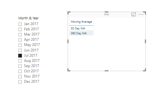
First you need to create a simple table like the below which will be used as the axis

Have it sit in the model out to the side

Now we have the axis setup

image

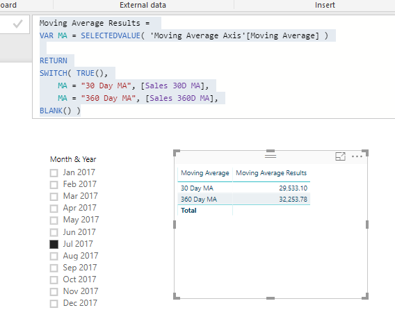
Then create a measure using this technique

Moving Average Results = 
VAR MA = SELECTEDVALUE( 'Moving Average Axis'[Moving Average] )

RETURN
SWITCH( TRUE(),
    MA = "30 Day MA", [Sales 30D MA],
    MA = "360 Day MA", [Sales 360D MA],
BLANK() )

Add it to the table

image

Then turn to a visualization

image

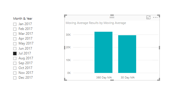
So this is really the technique to use here

See how you go with this and let me know how you go

Chrs
Sam

1 Like

Thanks Sam, it is a very elegant solution and easy to implement. The only change to your solution is that instead of letting the user choose a period I just always choose this week as a relative selection and then hide it from the user.

Ok nice one. Chrs