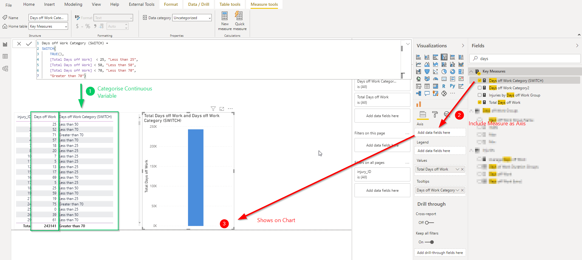
I have this common analysis scenario where I have a continuous variable that I need to group and segment, to then use this grouping as a dimension in a chart. The switch statement makes the first part possible
Searched PBI visual market place to see if a non-standard viz allows this behaviour - couldn’t find one
I could potentially introduce a dummy supporting table as per the EDNA video linked to above, but I need a way to overwrite the values/grouping bands that would be built into the model as this data model is shared by 300 clients and their band labels and min-max would be different on a client by client basis. Not sure how.
someone mentioned calculation groups may be a way to change measure behaviour but not sure how.
There are a couple of ways to achieve this, but based on the information given you could try a calculated table.
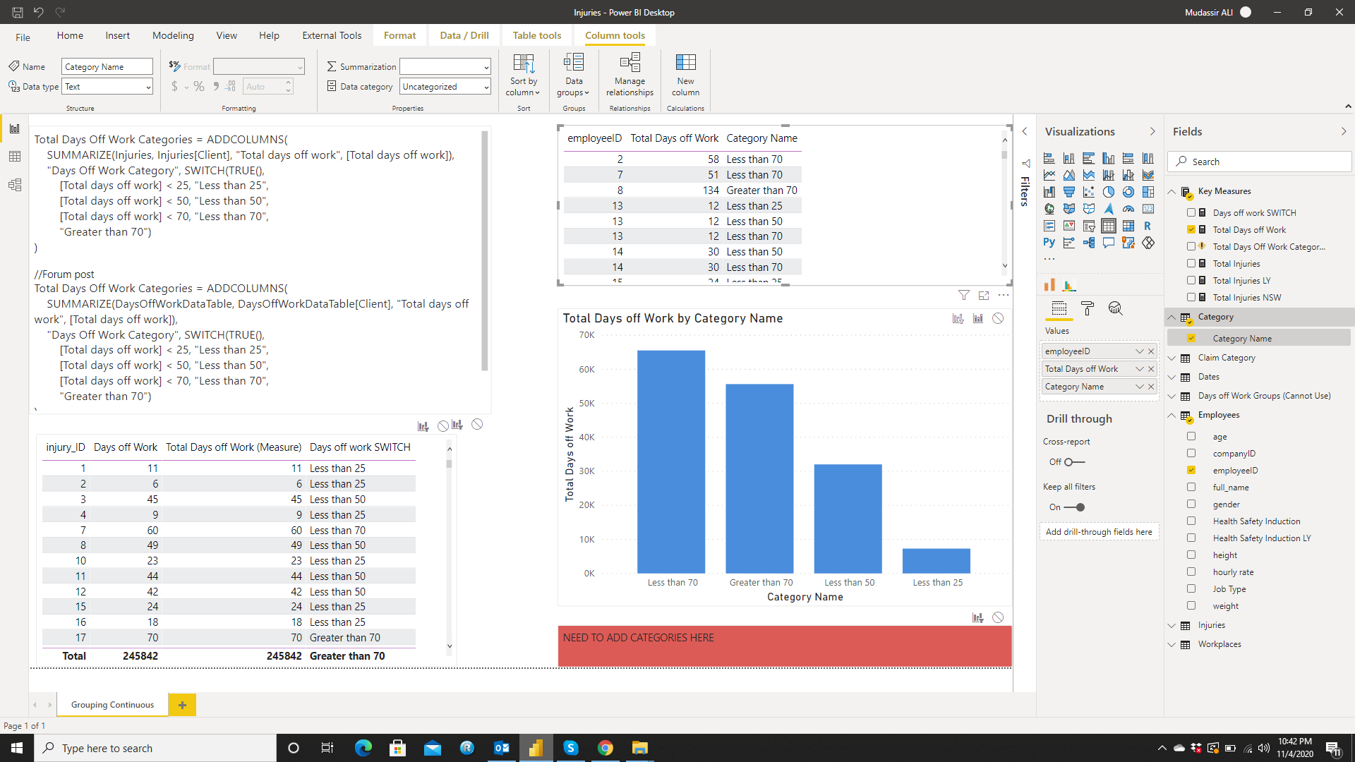
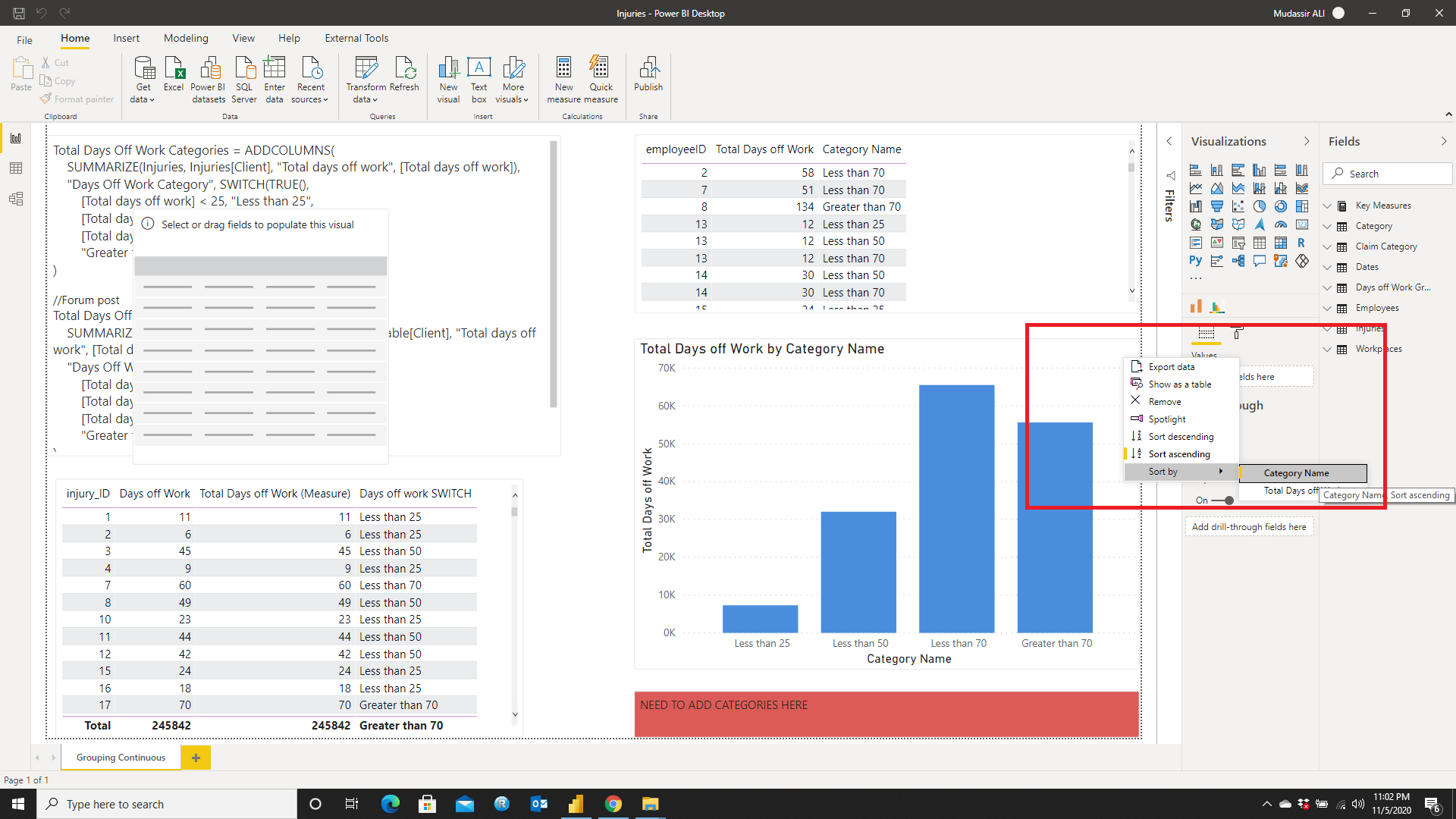
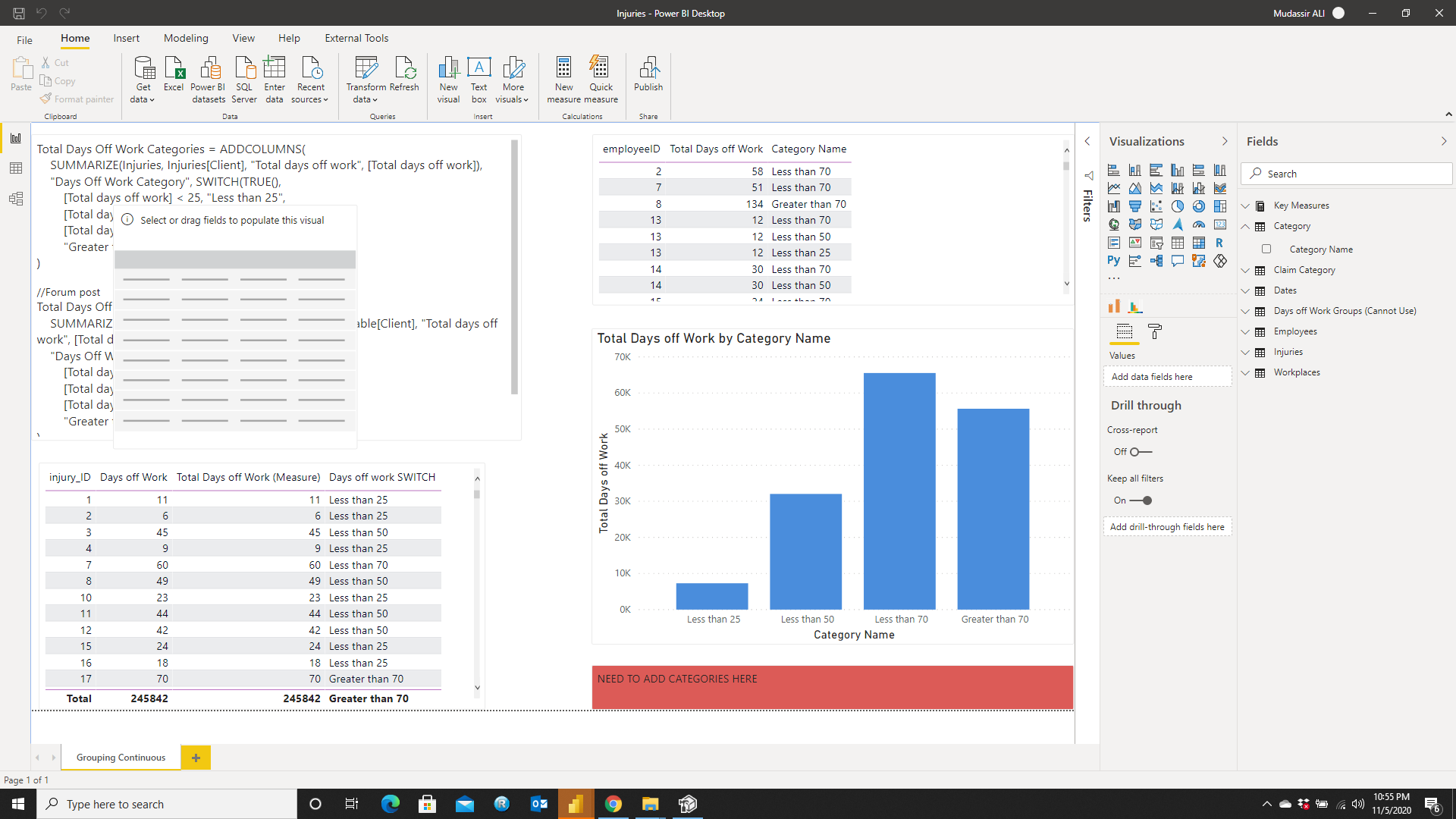
Total Days Off Work Categories = ADDCOLUMNS(
    SUMMARIZE(DaysOffWorkDataTable, DaysOffWorkDataTable[Client], "Total days off work", [Total days off work]),
    "Days Off Work Category", SWITCH(TRUE(),
        [Total days off work] < 25, "Less than 25",
        [Total days off work] < 50, "Less than 50",
        [Total days off work] < 70, "Less than 70",
        "Greater than 70")
)
Then you could set the row level security to that table if you wanted to prevent clients from seeing eachother’s information.
If this doesn’t work for you, can you share a sample pbix for us to be able to work with so that we can make sure the data matches up with what you are trying to achieve?
Hi @Cameron, we aim to consistently improve the topics being posted on the forum to help you in getting a strong solution faster. While waiting for a response, here are some tips so you can get the most out of the forum and other Enterprise DNA resources.
Use the forum search to discover if your query has been asked before by another member.
When posting a topic with formula make sure that it is correctly formatted to preformatted text </>.
Use the proper category that best describes your topic
Provide as much context to a question as possible.
Include demo pbix file, images of the entire scenario you are dealing with, screenshot of the data model, details of how you want to visualize a result, and any other supporting links and details.
Hi @bradsmith, thanks for this. Spent a hour or so on this, but couldn’t quite get the syntax to work. End up with a “The expression refers to multiple columns, Multiple columns cannot be converted to a scalar value.”
The client replicates is using PBI embedded, and run a script to replicate the PBIX across all 300 client workspaces then remaps a parameter to each clients DB, then their application picks the reports up to embed in their application. At this stage they haven’t looked a Row Level Security in their architecture.
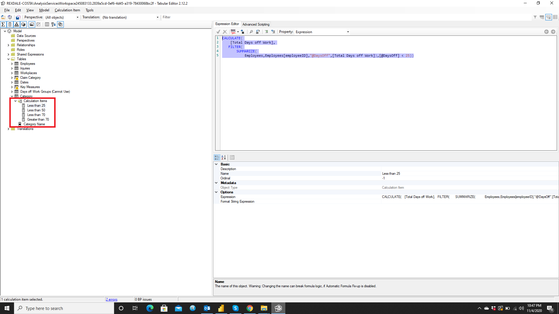
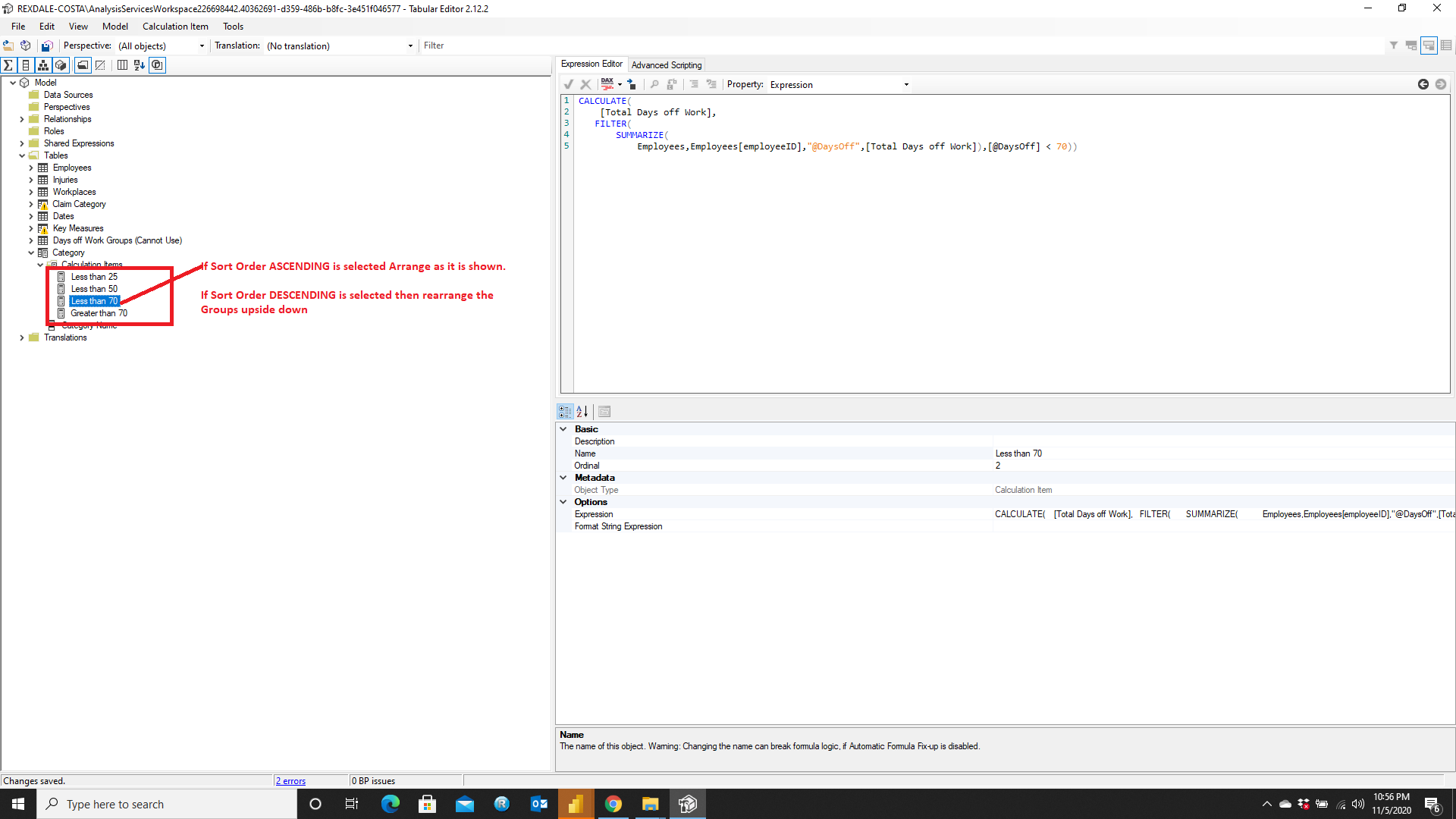
I have used the following measures (One for Each Criteria) in the Tabular Editor:
CALCULATE(
[Total Days off Work],
FILTER(
SUMMARIZE(
Employees,
Employees[employeeID],
“@DaysOff”, [Total Days off Work] //Hard coded the measure. You can use SelectedMeasure()
),
[@DaysOff] < 25 //Create separate measures for <50, <70 & >70
)
)
I must commend you on how you presented your requirement in a PBIX file. It was very very helpful and I hope that the Calculation Group method do fulfill your requirement.
I go to sleep and before I even wake up @MudassirAli has already solved the problem before I even found out there was one! Well done as usual my friend!
The solution provided by @MudassirAli should be able to solve this problem!
Now, regarding your note at the bottom… Is this going to be DirectQuery connection? Or is it a live connection? If it’s a DirectQuery connection, what type of data source do they use? I ask because in the October release of Power BI they added a new feature that allows dynamic M query parameters which, from the sound of this project, could significantly improve the query performance.
@bradsmith Thanks Brad. Frankly speaking, even I didn’t know that there was a solution as I have only seen people creating calculation groups and using them as Slicers in the report page. However, my experience with Charticulator came to the rescue as I created many datasets to practice that kind of gave me the idea. I think this technique can also be used as Dynamic X-axis by just adding SelectedMeasure in the tabular editor instead of hard coding it.
Thankyou @MudassirAli (I did reply to your notificaiton by email but doesnt seem to have posted). Working quite well. There are a few new concepts to master here for me.
I am not familiar with the"@DaysOff" and [@DatesOff] notation - what do you call that?
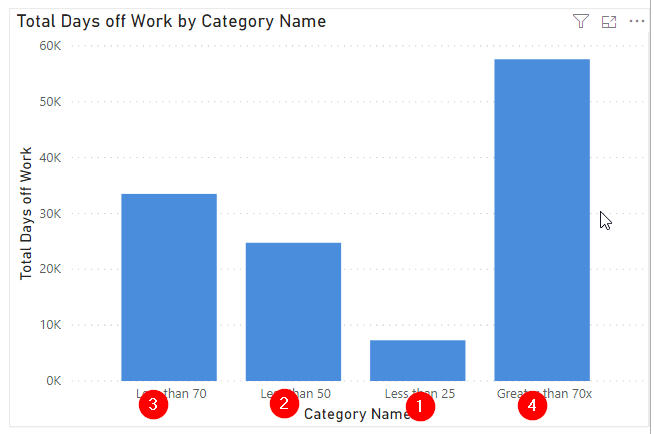
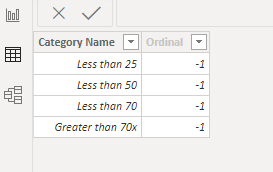
There was one question I had about the sort order of things. Is it possible to add a column in the somehow to the calculation column to dictate the sort order of the categories we have have just calculated. I would normally use a sort order column then sort in the Table view to control this.
remembering that I do not have a create new column option is not available back in PBI desktop.
@bradsmith - the data lives in azure sql. They connect to it in PBI to do their modelling. This PBI model is then scripted to be sent to each client workspace. When reports are created, a database string is changed to point to the correct DB.
All reporting developed connects to this clients version of the PBI model and is saved to that clients workspace.
@Cameron
Using @ annotation is just to tell the user that the column is temporary created inside the virtual table meaning it does not physically exist. You can refer to the following blog post:
There is a very simple trick to arrange in the order you want (by the way the trick I just discovered) is to select the sort order by Category from the visual first: