Hi @ysherriff,
I would like to answer - it depends what you try to achieve.
But from May 2022 in Power BI field parameters are available. Provide so much slice and dice flexibility. More about field parameters you can find at:

Example of sliced by field parameters you can find at my last challenge
if you need you can add category of sliced by dimensions like it was explained in video.
If you would like to compare YoY or QoQ maybe to add some additional comparison. More you can find at:
Calculate Difference This Year vs Last Year In Power BI With DAX [2022 Update] - YouTube
It depends what you try to analyze - maybe you need ABM, Gen etc (so need to transform a little bit) and then by the year…
Maybe you can add conditional formatting - icons / data bars what you prefer or both:
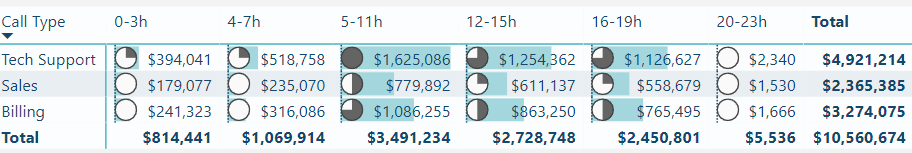
If you decide to put some dimension in columns & matrix - pay attention that there has just couple of values because the number of columns grow like this:
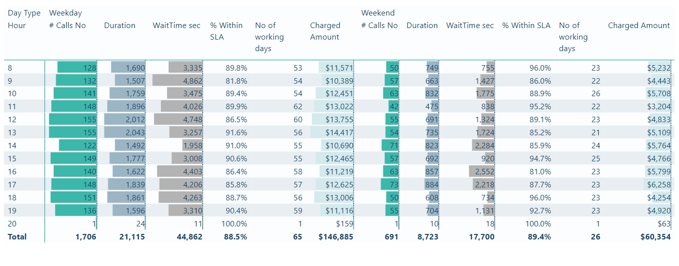
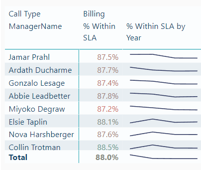
You can add sparkline like:
There are so many opportunities.
Hope it helps a bit.