How we compare which candidate will best fit the employer based on Survey taken from Candidates and Employers(Separately)?
I have Survey data from Candidate vs Employer. I have few matching criteria’s like- Skills, interest, years of experience, living location.
Is there any template or sample that shows candidates that best for a employer visually? using maps or other visuals?
@pshetty ,
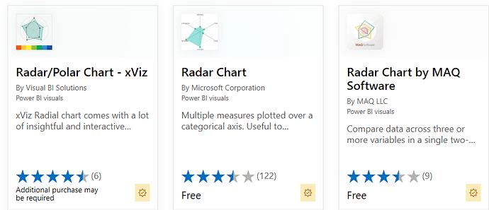
I think a Radar/Spider chart is useful for these types of multiattribute comparisons.
There are three certified Radar chart custom visuals available for Power BI in App Source.
This excellent article lays out the pros and cons of radar/spider charts, and offers some practical alternative visualization options:
I hope this is helpful.
- Brian
Thanks for the suggestions. I will check those and let you know if it works. 
Hi @pshetty, did the response provided by @BrianJ help you solve your query? If not, how far did you get and what kind of help you need further? If yes, kindly mark as solution the answer that solved your query.
I hope that you are having a great experience using the Support Forum so far. Kindly take time to answer the Enterprise DNA Forum User Experience Survey, we hope you’ll give your insights on how we can further improve the Support forum. Thanks!
Hi @pshetty, we’ve noticed that no response has been received from you since the 23rd of June. We just want to check if you still need further help with this post? In case there won’t be any activity on it in the next few days, we’ll be tagging this post as Solved.
Hi @pshetty, due to inactivity, a response on this post has been tagged as “Solution”. If you have a follow question or concern related to this topic, please remove the Solution tag first by clicking the three dots beside Reply and then untick the check box.
Hi Brian,
I did not use the chart that you suggested in the response but it did help me think through the issue. It was a quick one time report, so, client did not bother about any special chart.
