Hi All,
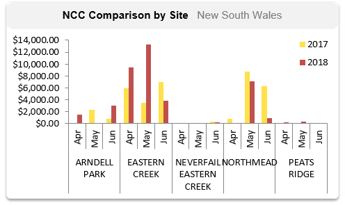
Any idea on how to get a chart looking like the image attached, i presume this was done in Excel.
I can’t get 2 categories on the x axis and then 2 measures in the plot area.
Any custom visuals that might be able to do it?
Hi All,
Any idea on how to get a chart looking like the image attached, i presume this was done in Excel.
I can’t get 2 categories on the x axis and then 2 measures in the plot area.
Any custom visuals that might be able to do it?
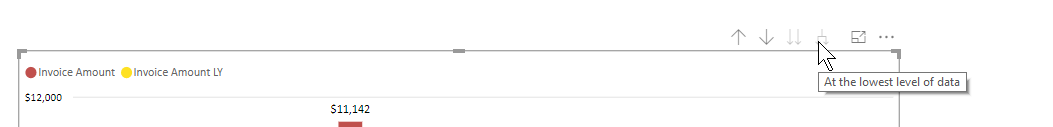
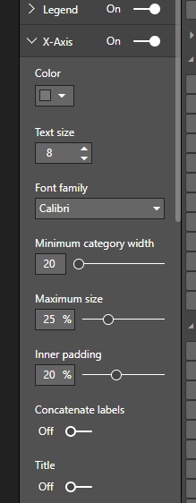
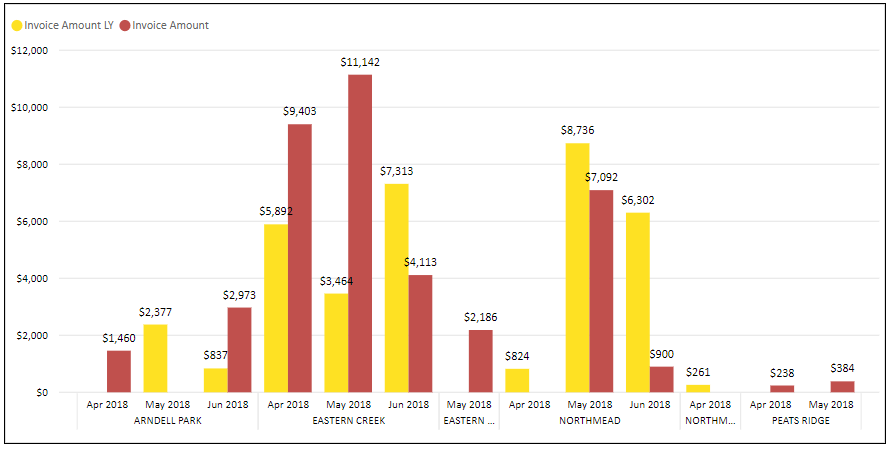
Got it in the end
Use the Clustered Column Chart
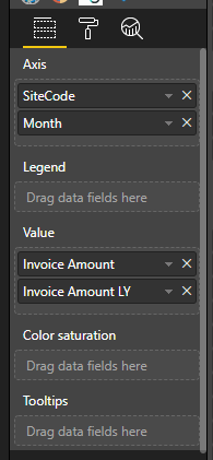
Drill to Lowest level
Turn Concatenate Labels off
Got the result, would prefer if the month columns were shown if there was no data.
Wow that’s actually really cool. Nice one. Like it a lot