Hi,
We have opportunities with best case start date, best case end date, best case probability and best case amount.
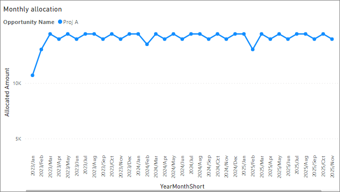
Requirement is to display the monthly allocated amount by months that fall between the best case start and end dates. The only filter/slicer is Opportunity Name.
I have been able to calculate the monthly allocation, but not able to display in a line/bar graph the monthly allocated amount by all the months that fall between the specific best case start and end dates for the selected opportunity.
Ex. if an opportunity has best case amount of 12,000 (after multiplying by probability) with start date ‘2021/01/24’ and end date ‘2021/12/20’, then it should show on x- axis all the 12 months from Jan 2021 to Dec 2021, each month displaying amount of 1000 on y-axis.
Please help!
Display monthly allocation in a graph between specific dates.pbix (129.4 KB)
Amount allocation to months between specific dates.xlsx (17.7 KB)
Best regards,
Deb