Dear Experts,
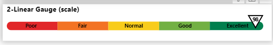
Need your guidance if can help me make a Deneb chart similar to below based on my data set.
I have tried doing it by changing the data to my own dummy data but still i am unable.
i am attaching the power bi file for reference.
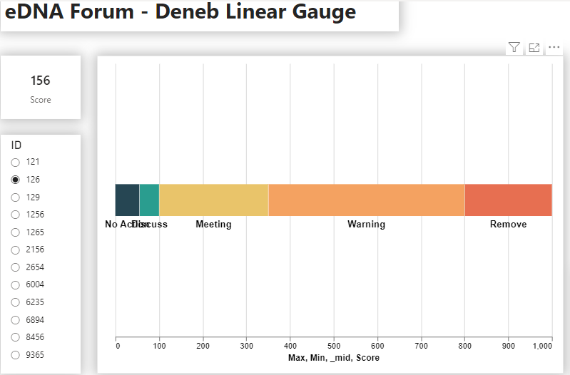
based on ID selection the score will show that i want to show in this grpah.
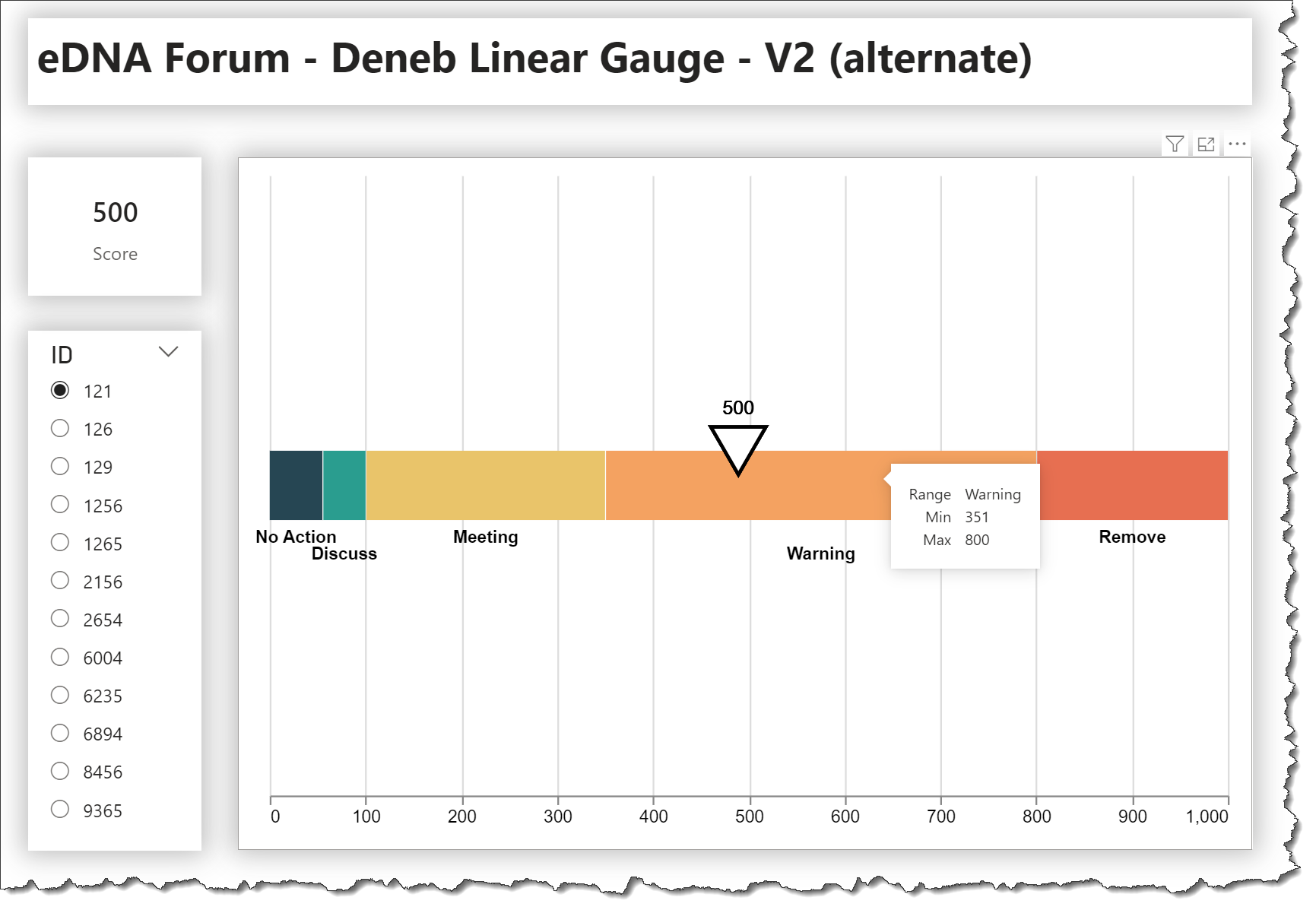
Thanks for the kind words. The linear gauge sample of mine you referenced uses a fixed, 100% scale. From my first quick at look your data, the scare min/max values vary from 0 to 9,999,999, so not sure what the scale should be (10 million wide?).
In order for me to have a better idea of what you are trying to create, perhaps you can create a couple of simple mock-ups (in Excel or PowerPoint) for, say, ID = 121 where score = 500 and ID = 1265 where score = 19K (18652).
Thank you for your reply and guidance.
I think Deneb should be next skillset I should work on as it gives so much flexibility and custom graphs.
Yes, your graph is based on percentage which is 100%.
But in my dataset I want to have it on values.
Basically its a performance score of the staff members.
The MAX value I have set for score is 9,999,999 assuming this will be the highest.
However, the in my actual dataset the MAX value I have is 253,932.
Your request for mockup in excel, you want me to create a similar graph?
Please let me know than I will do it.
I took a flier and threw together a quick test to see what it might look like with a 0-20,000 scale. Here’s what I came up with:
Even with a 0-20,000 scale the first 4 ranges get dominated by the last range, and while the score pointer and score label both show in the correct spot, I’m not sure it displays anything useful for you. Once we see the mockups perhaps we can try again, but it looks to me that the size of the last range will overwhelm the first 4.
Thanks a lot for guiding and helping me out.
I am amazed that you put the video.
Appreciate your help.
Yes, indeed the last bucket size have min value of 1000 but MAX value can reach to any number max be max of 253,932. with that it will effect the graphs buckets.
I thinks of two ways of handling it.
based on the score range make another buckets for graph that are equal in size so that it look visually good.
cant we have a Min of the last bucket that is 1000 and no MAX values.
so any value above 1000 goes in the last bucket.
Let me do it in excel or google sheets or i will share some dummy data visualization which i have made in the report. I update you in some time.
Once again thank you so much for taking time out of your busy schedule to help me out.
I have tried multiple options like below to adjust the buckets.
making log buckets for each MIN and MAX range.
taking the difference of MIN and MAX for Each bucket and mutiple with evan number to get some how each bucket size considerably same.
None of them work so what i did i adjust the last bucket of 999,999 to 1000.
And in the score i put a measure if the score is above 1000 than return 1000.
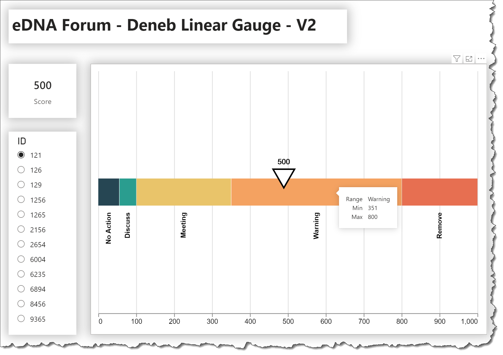
here is what i have achieved and buckets look fine. also it gives the impression that how buckets are planned so that if they decide to amend the bucket sizes.
Also, I will put the assumption that score above 1000 is scaled down to max 1000 in order to show on graph. it will be on 2-5% of full data set.
Can you please help and guide me
how to put the Score point back because when i put the score_limit calculated column it gives an error.
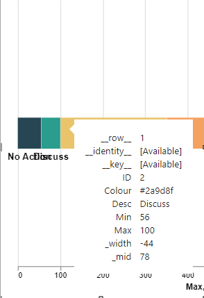
I tried to edit the tooltip to show only the Bucket min and Max range.
But i noticed “tooltip”: {“content”: “data”} is used, how can i change that instead of showing this.
Make the bucket labels Vertical instead of Horizontal so that first two do not overlap.
Based on your experience and expertise what you suggest me in order to make it more presentable and understandable to audience.
Q1: How do you re-add the Score point?
A1:
1 - You removed the Score measure from the field well; add it back
2 - add a calculate transform to compose the score limit then use the new field for the “x” encoding for the score symbol and label
Q2: How do you adjust the tooltip to show only the Bucket Min and Max range (“tooltip”: {“content”: “data”} is currently used)?
A2: Change the mark tooltip key:value pair to “tooltip”: true and add a tooltip object to the encoding block
Hi @Greg
Thank you so much for your detailed guidance and explanation.
The graph is working fine and I have used it on my live data.
It look fantastic. Really appreciate your assistance.