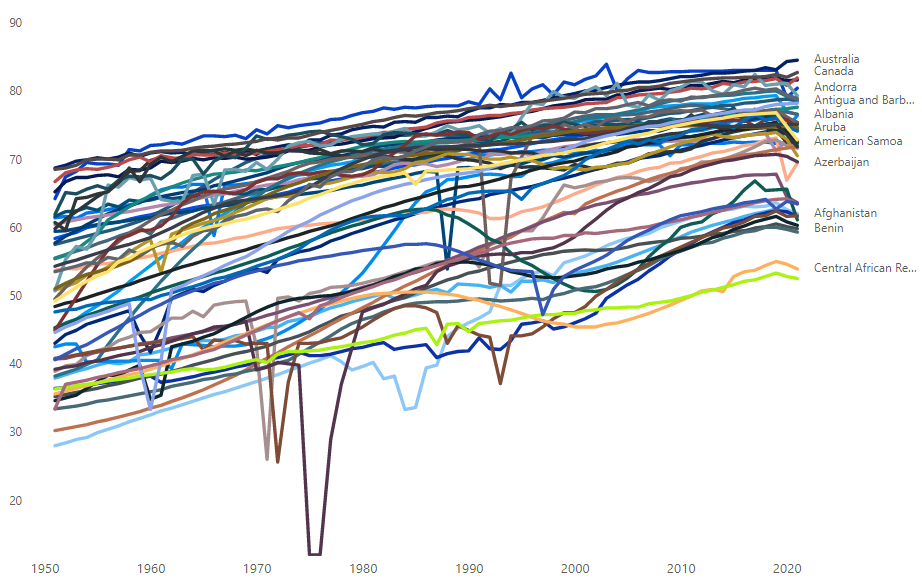
In this next challenge, you have the life expectancy of all countries from 1950-2020. You can see the graph on the right is an awful mess.
Your mission if you choose to accept, is to untangle this mess so that the end user can make some sense out of it.
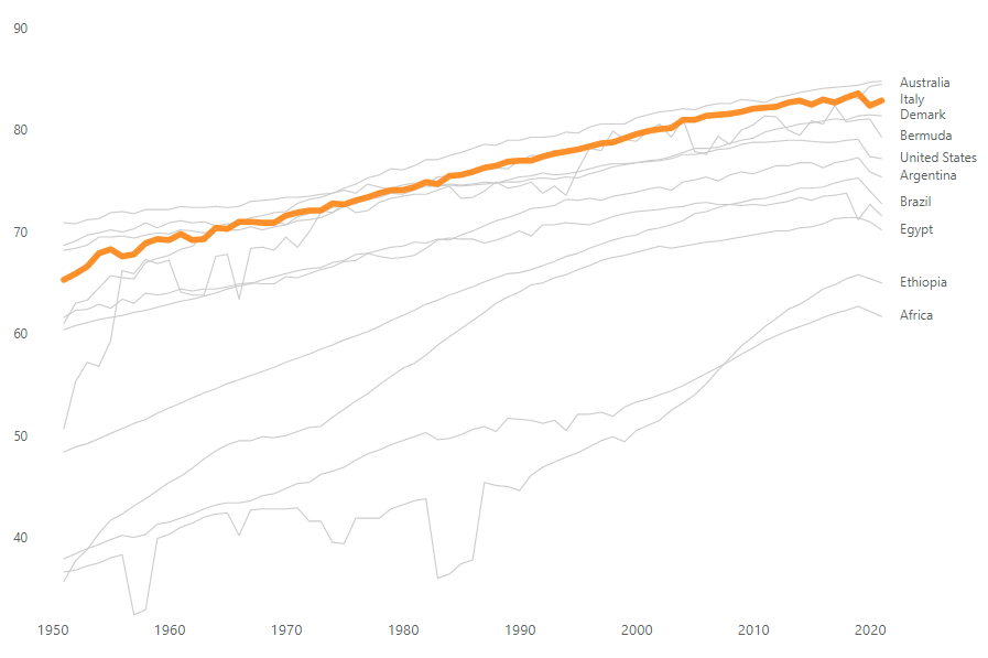
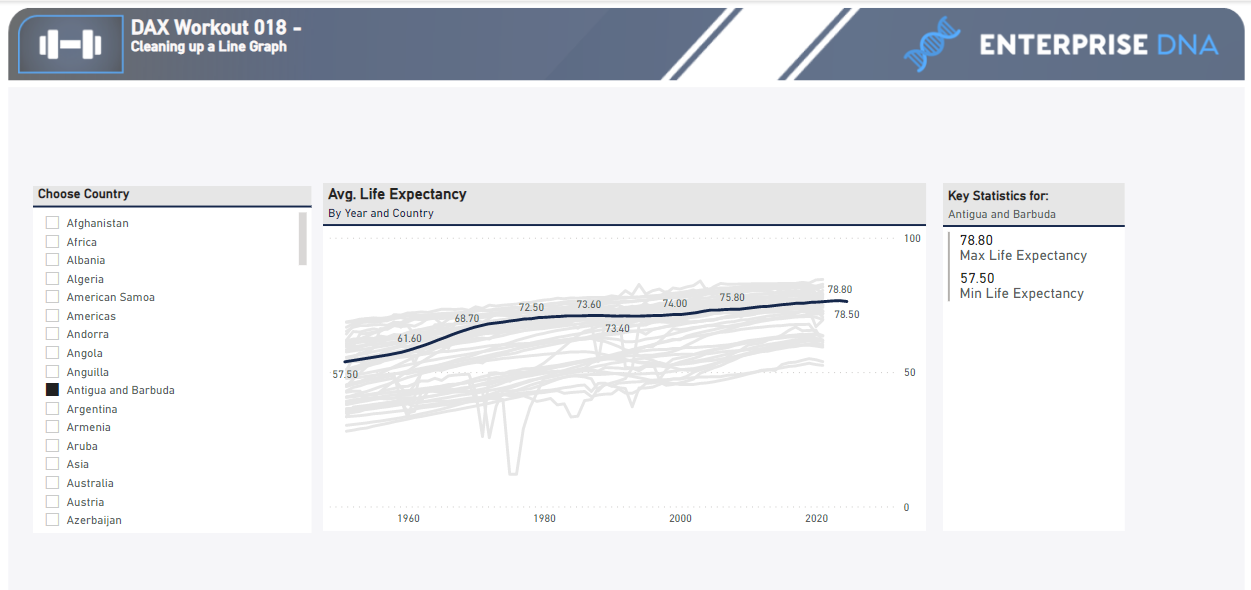
You will need to create slicers and measures having a list of countries that when the SELECTEDVALUE is chosen, the line for that country is highlighted and all others greyed out.
The main challenge is NOT to have an overlaying of two graphs; one behind the other. And add a nice tooltip for that selected country.
Load the supplied data file into a new Power BI file, create your solution, and reply to this post. Upload a screenshot of your solution along with the DAX measure. Please format your DAX code and blur it or place it in a hidden section.
Period
This workout will be released on Thursday, May 18, 2023, and will end on Sunday, May 21, 2023. But you can always come back to any of the workouts and solve them.
hi paul.
thanks for this challenge. you’ve mentioned that the main challenge is not to have overlaying of two graphs, but I figured it out that to have other lines in grey we must have two graphs over each other. Do you mean there is another way to make other lines fade without dual graphs?
sincerely mahdi safiri
Hi, It must be solution. On Data Visualization last workout is a similar task and there, in the end, I find a solution for how to do it in one chart using Dax. But it looks like @Paul.Gerber complicated the graph a little more and exactly the same solution does not work here.
Hello everyone and thank you for participating in this workout. Many of you asked how to do this. @BrianJ did an excellent video explaining which inspired me to make this a DAX workout. Which it was!
It is really a brilliant way of fixing these visuals.
@Paul.Gerber - Yes he did a great job explaining it but only has a 4 few lines on that chart which he created a measure for each one. In the dataset for this challenge / workout there are 256 distinct. I don’t think creating all of those measures is feasible. I know there has to be a better way. Which I will eventually figure out.
So, is my understanding that this can only be done with a very limited number of items correct? Otherwise the only option left is the two-graph overlay?
Nice. I wanted to explore a different way than creating separate measures for each category. I have field parameters inside of my viz. That is why I was wondering what other solutions were available. At any rate, I will be on the lookout for your LinkedIn post.