1. File import
from google.colab import files
uploaded = files.upload()

2. General information about the dataset
# import libraries
import pandas as pd
import io
# Read the uploaded file into a DataFrame
bestsellers = pd.read_csv(io.BytesIO(uploaded['bestsellers_with_categories.csv']))
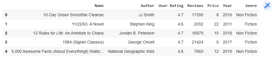
# Display the first 5 lines of the bestsellers
bestsellers.head()
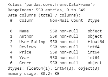
# Let us see info about our dataset
bestsellers.info()
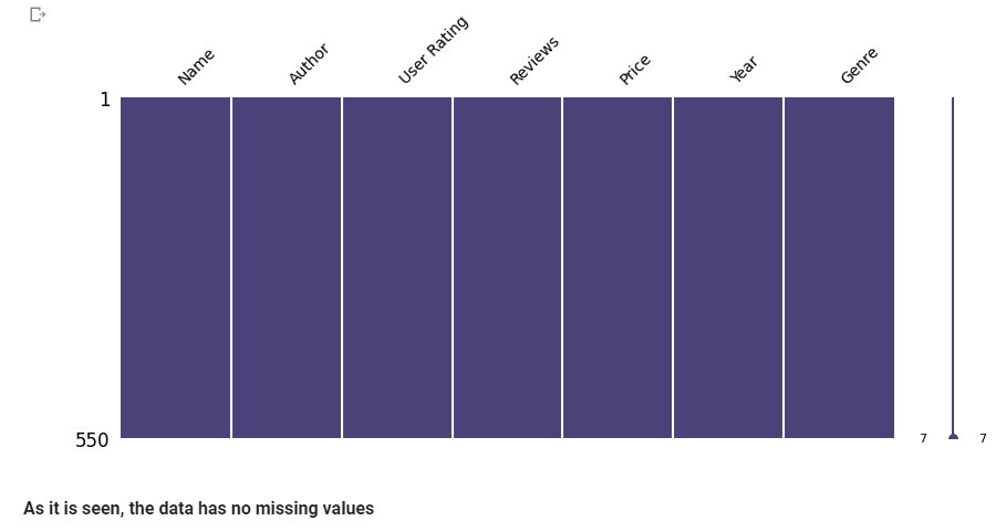
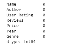
3. Missing data
# Check for missing data
bestsellers.isnull().sum()
# Double-check for missing data by visualizing missing values.
import missingno as msno
import matplotlib.pyplot as plt
import matplotlib.colors as mcolors

# Set color for non-missing data
color = mcolors.hex2color('#4b4279') # The first color from viridis

# Build a matrix of missing values
msno.matrix(bestsellers, fontsize=10, figsize=(10, 4), color=color)
plt.show()
4. Spelling errors and duplicates
pip install fuzzywuzzy
pip install fuzzywuzzy[speedup]
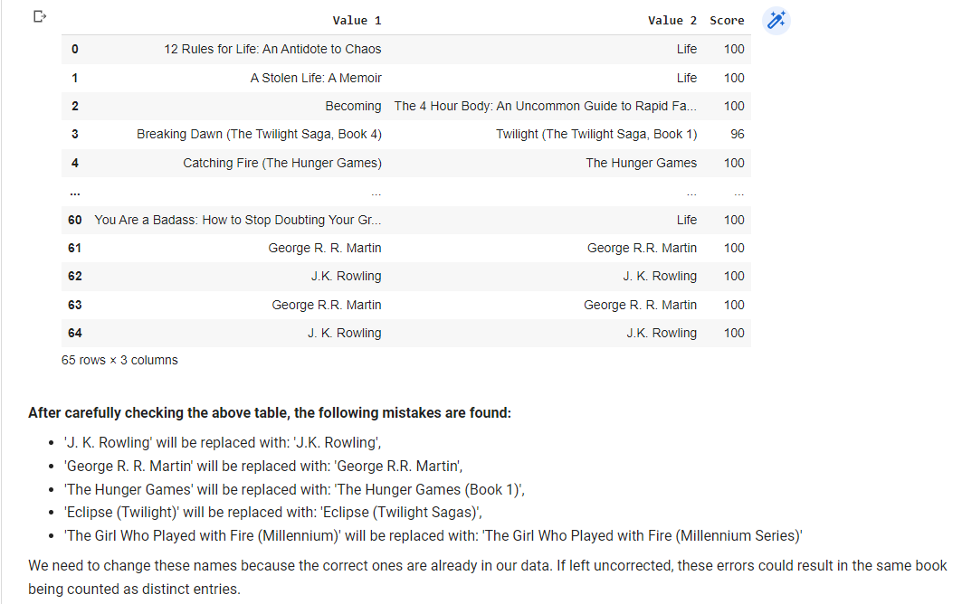
# If there are spelling mistakes in the titles of books or authors, then they are similar to each other and have slight differences in spelling. Let's find them and fix their mistakes.
# Import the 'fuzz' and 'process' modules from the fuzzywuzzy library
from fuzzywuzzy import fuzz, process

# Set threshold for matching
threshold = 90

# Prepare list to store duplicates
duplicates = []

for c in ['Name', 'Author']:
    unique_values = bestsellers[c].unique()
    for i, v in enumerate(unique_values):
        # Find potential matches
        matches = process.extract(v, unique_values, limit=2, scorer=fuzz.token_set_ratio)
        for match, score in matches:
            if match != v and score >= threshold and {v, match} not in duplicates:
                duplicates.append((v, match, score))

# Convert duplicates list into a pandas DataFrame
duplicates_bestsellers = pd.DataFrame(duplicates, columns=['Value 1', 'Value 2', 'Score'])

# Show DataFrame
duplicates_bestsellers
# Replace values with correct ones
replace_values = {
'George R. R. Martin': 'George R.R. Martin',
'J. K. Rowling': 'J.K. Rowling',
'The Hunger Games': 'The Hunger Games (Book 1)',
'Eclipse (Twilight)': 'Eclipse (Twilight Sagas)',
'The Girl Who Played with Fire (Millennium)': 'The Girl Who Played with Fire (Millennium Series)',
}
duplicates_bestsellers = duplicates_bestsellers.replace(replace_values)
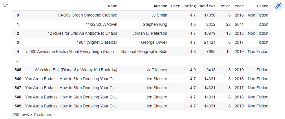
# Apply the changes to the original data
bestsellers = bestsellers.replace(replace_values)
bestsellers
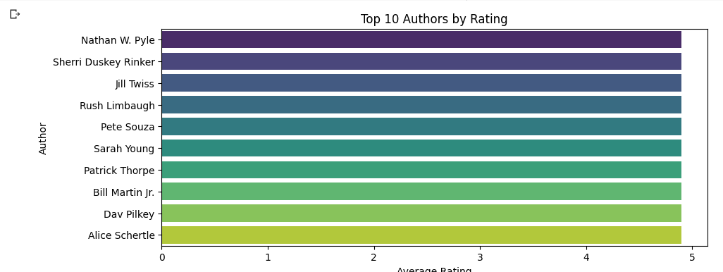
5. Top 10 authors by rating
# Import only seaborn. Matplotlib has already imported above
import seaborn as sns

# Group the dataset by 'Author', calculate the mean 'User Rating' for each author, sort them in descending order, and select the top 10 authors
top_authors = bestsellers.groupby('Author')['User Rating'].mean().sort_values(ascending=False).head(10)

# Plot the result
plt.figure(figsize=(10, 4))
sns.barplot(x=top_authors.values, y=top_authors.index, palette='viridis')
plt.title('Top 10 Authors by Rating')
plt.xlabel('Average Rating')
plt.show()
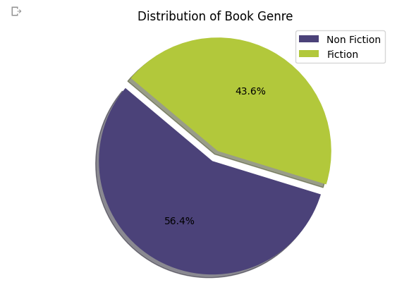
6. Distribution of book genre
# Define a list of color codes
colors = ['#4b4279', '#b2c83b']

# Define explode parameters
explode = (0.1, 0)

# Plot the pie chart without labels on the slices
genre_counts = bestsellers['Genre'].value_counts()
plt.pie(genre_counts, explode=explode, colors=colors, autopct='%1.1f%%', startangle=140, shadow=True)
plt.title('Distribution of Book Genre')
plt.legend(labels=genre_counts.index, loc='upper right')
plt.axis('equal')
plt.show()
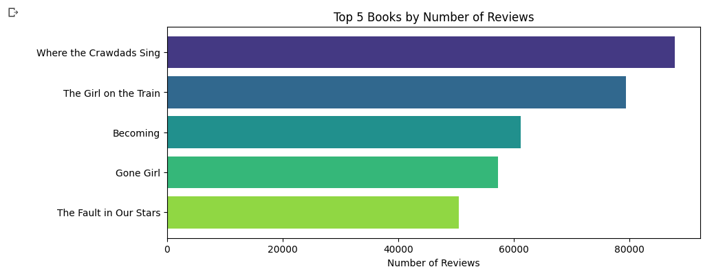
7. Top 5 books by number of reviews
# Define number of colors needed
num_colors = 5

# Create a color palette
color_palette = sns.color_palette('viridis_r', num_colors)

# Convert color palette to list of RGB values
colors = color_palette.as_hex()

# Create a temporary DataFrame with duplicates dropped
df_temp = bestsellers.drop_duplicates(subset='Name')

# Plot top 5 books by number of reviews
top_books = df_temp.sort_values('Reviews', ascending=False).head(5)
top_books = top_books.iloc[::-1] # reverse the order of the rows

# Plot the result
plt.figure(figsize=(10, 4))
plt.barh(top_books['Name'], top_books['Reviews'], color=colors)
plt.title('Top 5 Books by Number of Reviews')
plt.xlabel('Number of Reviews')
plt.show()
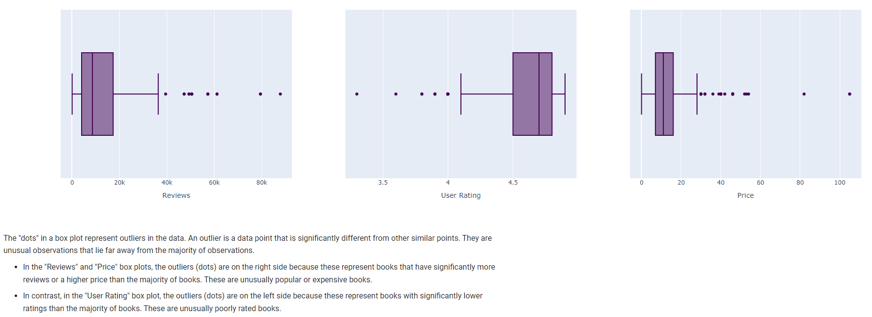
8. Outliers
from plotly.subplots import make_subplots
import plotly.graph_objects as go
import plotly.express as px

# Create subplots: 1 row, 3 columns
fig = make_subplots(rows=1, cols=3)

# Create box plots
box1 = px.box(bestsellers, x='Reviews', color_discrete_sequence=px.colors.sequential.Viridis)
box2 = px.box(bestsellers, x='User Rating', color_discrete_sequence=px.colors.sequential.Viridis)
box3 = px.box(bestsellers, x='Price', color_discrete_sequence=px.colors.sequential.Viridis)

# Add box plots to subplots
fig.add_trace(go.Box(box1.data[0]), row=1, col=1)
fig.add_trace(go.Box(box2.data[0]), row=1, col=2)
fig.add_trace(go.Box(box3.data[0]), row=1, col=3)

# Add title to each subplot
fig.update_xaxes(title_text="Reviews", row=1, col=1)
fig.update_xaxes(title_text="User Rating", row=1, col=2)
fig.update_xaxes(title_text="Price", row=1, col=3)

# Show plot
fig.show()
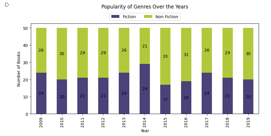
9. Popularity of Genres Over the Years
# Group by 'Year' and 'Genre' and count the number of books
genre_popularity = bestsellers.groupby(['Year', 'Genre']).size().unstack()

# Define a list of color codes
colors = ['#4b4279', '#b2c83b']

# Plot the result
ax = genre_popularity.plot(kind='bar', stacked=True, color=colors, figsize=(10, 4))
plt.title('Popularity of Genres Over the Years', y=1.08, pad=20)
plt.xlabel('Year')
plt.ylabel('Number of Books')

# Add annotation on each bar
for p in ax.patches:
    width, height = p.get_width(), p.get_height()
    x, y = p.get_xy()
    ax.text(x+width/2,
            y+height/2,
            '{:.0f}'.format(height),
            horizontalalignment='center',
            verticalalignment='center')

# Move the legend to the upper center with some distance from the data series and arrange the legend entries in one line
ax.legend(loc='upper center', bbox_to_anchor=(0.5, 1.14), ncol=2)

plt.show()
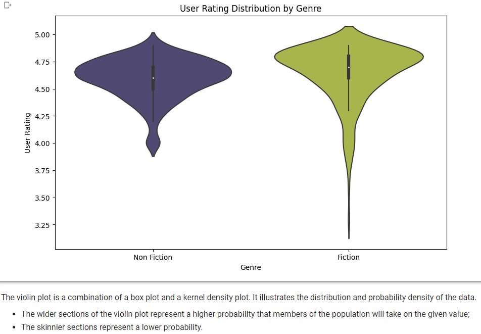
10. User Rating Distribution by Genre
# Define color palette
colors = ['#4b4279', '#b2c83b']

# Create a Violin plot
plt.figure(figsize=(10, 6))
sns.violinplot(x='Genre', y='User Rating', data=bestsellers, palette=colors)
plt.title('User Rating Distribution by Genre')
plt.xlabel('Genre')
plt.ylabel('User Rating')
plt.show()
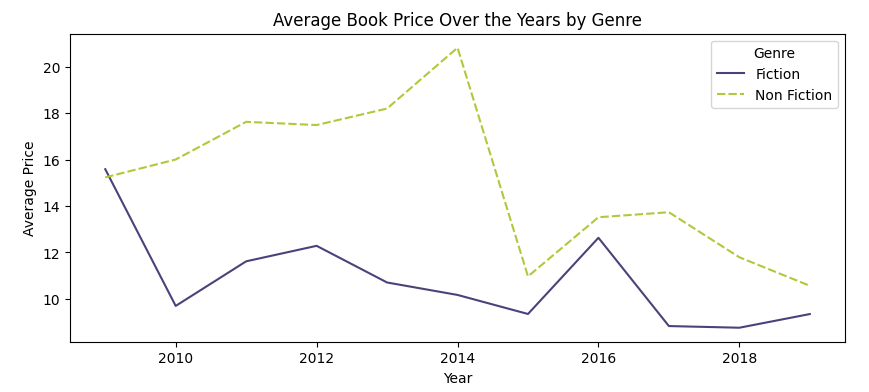
11. Average Book Price Over the Years by Genre
# Define the color palette
colors = ['#4b4279', '#b2c83b']

# Group by 'Year' and 'Genre' and calculate average 'Price'
average_price_by_year_genre = bestsellers.groupby(['Year', 'Genre'])['Price'].mean().unstack()

# Plot the result
plt.figure(figsize=(10, 4))
sns.lineplot(data=average_price_by_year_genre, palette=colors)
plt.title('Average Book Price Over the Years by Genre')
plt.xlabel('Year')
plt.ylabel('Average Price')
plt.legend(title='Genre')
plt.show()
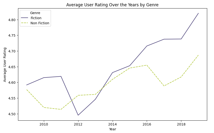
12. Average User Rating Over the Years by Genre
# Group by 'Year' and 'Genre' and calculate average 'User Rating'
average_rating_by_year_genre = bestsellers.groupby(['Year', 'Genre'])['User Rating'].mean().unstack()

# Plot the result
plt.figure(figsize=(10, 6))
sns.lineplot(data=average_rating_by_year_genre, palette=colors)
plt.title('Average User Rating Over the Years by Genre')
plt.xlabel('Year')
plt.ylabel('Average User Rating')
plt.show()