Data Analysis Workout 05: Tip Analysis

Level of Difficulty:

Objective: This workout provides practice in exploring the relationships between different variables in a dataset.

Download the dataset here: https://buff.ly/3GOlScS

Challenge Questions:

  1. Delete the Unnamed 0 column
  2. Plot the total_bill column histogram
  3. Create a scatter plot presenting the relationship between total_bill and tip
  4. Create one image with the relationship of total_bill, tip and size.
  5. Present the relationship between days and total_bill value
  6. Create a scatter plot with the day as the y-axis and tip as the x-axis, differ the dots by sex
  7. Create a box plot presenting the total_bill per day differentiation the time (Dinner or Lunch)
  8. Create two histograms of the tip value based for Dinner and Lunch. They must be side by side.
  9. Create two scatterplots graphs, one for Male and another for Female, presenting the total_bill value and tip relationship, differing by smoker or no smoker

Simply post your code and a screenshot of your results.

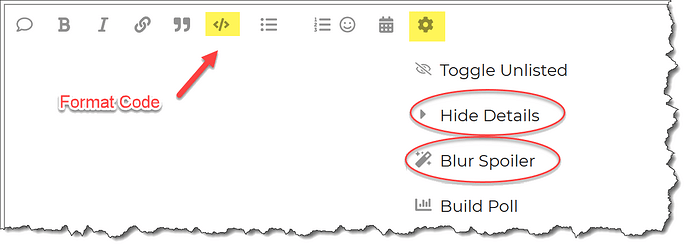
Please format your Python code and blur it or place it in a hidden section.

This workout will be released on Monday April 24, 2023, and the author’s solution will be posted on Sunday April 30, 2023.

1 Like

Great Exercise! thanks again

2 Likes

Great job @JordanSchnurman

Hi,

fun exercise. Tried to use quarto this time.

Data Analysis Challenge 05 - Tip Analysis.docx (128.9 KB)

Thanks

1 Like

@Ondrej - fantastic work!

What do you think of Quarto?

I’m working on my solution now, and will post my raw Quarto file, which I think you’ll find has some useful tricks in it.

Keep up the great work and thanks for participating!

@kedeisha1 ,

I really enjoyed this workout. Using these primarily as a way to learn Quarto, and this one was really useful for that. Also used this as an opportunity to demonstrate one of my favorite viz packages in R called ggpubr, used to easily generate publication-ready statistical charts.

Here’s my solution:

Enterprise DNA Data Analysis Workout 005.docx (59.4 KB)

For those interested, here’s the Quarto code I used to generate the above document.

Click for R Code within Quarto

---
title: "Enterprise DNA Data Analysis Workout 005"
author: "Brian Julius"
date:   2023-04-29
format: docx
theme:  cyborg
editor: visual
warning: false
editor_options: 
  chunk_output_type: console
---

# Setup Chunk

#| label: setup
#| include: false

```{r}

library(tidyverse) 
library(ggpubr)
library(ggthemes)

tips <- read_csv("https://raw.githubusercontent.com/guipsamora/pandas_exercises/master/07_Visualization/Tips/tips.csv", col_types = cols(...1 = col_skip()))

tips$day <- factor(tips$day, levels = c("Thur", "Fri", "Sat", "Sun"))
tips$time <- factor(tips$time, levels = c("Lunch", "Dinner"))
tips$size <- factor(tips$size, levels = c( "1", "2", "3", "4", "5", "6"))

##Structure of “tips” file to be used in analysis:

Note: Q1 incorporated in file import step


#| label: data overview
#| echo: false
knitr::kable(head(tips, 5))

Q2: Plot the total_bill column histogram

#| label: Q2
#| echo: true

gghistogram(tips, 
    x="total_bill",
    fill = "lightblue",
    bins = 15,
    rug = TRUE,
    add = "mean",
    xlab = "Total Bill",
    ylab = "Count",
    main = "Distribution of Total Bill"
  )


Q3: Create a scatterplot presenting the relationship between total_bill and tip

#| label: Q3
#| echo: true

ggscatter(tips,
    x="total_bill",
    y="tip", 
    xlab = "Total Bill",
    ylab = "Tip",
    conf.int = TRUE,
    add = "reg.line",
    add.params = list(linetype = "solid", color = "red"),
    main = "Relationship Between Total Bill and Tip"
  ) 

Q4: Create one image with the relationship of total_bill, tip and size

#| label: Q4
#| echo: true

ggscatter(data = tips,
    x = "total_bill",
    y = "tip",
    xlab = "Total Bill",
    palette = rev( c("#d73027","#fc8d59","#fee090","#e0f3f8","#91bfdb","#4575b4")),
    ylab = "Tip",
    color = "size",
    size = "size",
    main = "Relationship of Total Bill, Tip and Size"
    ) + guides(size = guide_none()) + labs(color = "Size") + theme(legend.position = "bottom")

Q5: Present the relationship between days and total_bill value, differ the dots by sex

#| label: Q5
#| echo: true

ggstripchart(data = tips,
  palette = c("red", "blue"),
   color = "sex",
    x = "day",
    y = "total_bill",
    xlab = "",
    ylab = "Total Bill",
    main = "Distribution of Total Bill by Day"
    ) + labs(color = "Gender") + theme(legend.position = "bottom") 

Q6: # Create a box plot presenting the total_bill per day differentiated by time

#| label: Q6
#| echo: true

ggboxplot(data = tips,
    x = "day",
    y = "total_bill",
    fill = "time",
    xlab = "",
    ylab = "",
    main = "Distribution of Total Bill by Day and Time"
    ) + labs(fill = "Meal") + theme(legend.position = "bottom") 

Q7: Create two histograms (side by side) of the tip value based for Lunch and Dinner

#| label: Q7
#| echo: true

gghistogram(tips, 
    x="total_bill",
    fill = "time",
    bins = 15,
    rug = TRUE,
    main = "Distribution of Total Bill by Time",
    facet.by = "time",
    xlab = "",
    ylab = ""
    ) + labs(fill = "Meal") + theme(legend.position = "none") 

Q8: Create two scatterplots (Male and Female) presenting the total_bill value and tip relationship, differing by smoker/non-smoker

#| label: Q8
#| echo: true

ggscatter(tips,
    x="total_bill",
    y="tip", 
    conf.int = TRUE,
    palette = c("cyan", "navyblue"),
    color = "smoker",
    facet.by = "sex",
    add = "reg.line",
    xlab = "Total Bill",
    ylab = "Tip",
    add.params = list(linetype = "solid", color = "red"),
    main = "Tip by Total Bill by Gender and Smoker"
    ) + labs(color = "Smoker") + theme(legend.position = "bottom") 
  • Brian
tips_df = tips_df.drop("Unnamed: 0", axis=1)
import matplotlib.pyplot as plt

plt.hist(tips_df["total_bill"], bins=10)
plt.xlabel("Total Bill")
plt.ylabel("Frequency")
plt.title("Histogram of Total Bill")
plt.show()
plt.scatter(tips_df["total_bill"], tips_df["tip"])
plt.xlabel("Total Bill")
plt.ylabel("Tip")
plt.title("Total Bill vs Tip")
plt.show()
fig, ax = plt.subplots()
scatter = ax.scatter(tips_df["total_bill"], tips_df["tip"], c=tips_df["size"], cmap="viridis")
ax.set_xlabel("Total Bill")
ax.set_ylabel("Tip")
ax.set_title("Total Bill, Tip, and Size")
legend = ax.legend(*scatter.legend_elements(), title="Size")
ax.add_artist(legend)
plt.show()
import seaborn as sns

sns.boxplot(x="day", y="total_bill", data=tips_df)
plt.xlabel("Day")
plt.ylabel("Total Bill")
plt.title("Relationship between Days and Total Bill")
plt.show()
sns.scatterplot(x="tip", y="day", hue="sex", data=tips_df)
plt.xlabel("Tip")
plt.ylabel("Day")
plt.title("Tip vs Day (Differentiated by Sex)")
plt.show()
sns.boxplot(x="day", y="total_bill", hue="time", data=tips_df)
plt.xlabel("Day")
plt.ylabel("Total Bill")
plt.title("Total Bill per Day (Differentiated by Time)")
plt.show()
plt.figure(figsize=(12, 4))

plt.subplot(1, 2, 1)
sns.histplot(tips_df[tips_df["time"] == "Dinner"]["tip"], bins=10)
plt.xlabel("Tip")
plt.ylabel("Frequency")
plt.title("Dinner")

plt.subplot(1, 2, 2)
sns.histplot(tips_df[tips_df["time"] == "Lunch"]["tip"], bins=10)
plt.xlabel("Tip")
plt.ylabel("Frequency")
plt.title("Lunch")

plt.tight_layout()
plt.show()
male_df = tips_df[tips_df["sex"] == "Male"]
female_df = tips_df[tips_df["sex"] == "Female"]

plt.figure(figsize=(12, 4))

plt.subplot(1, 2, 1)
sns.scatterplot(x="total_bill", y="tip", hue="smoker", data=male_df)
plt.xlabel("Total Bill")
plt.ylabel("Tip")
plt.title("Male")
plt.legend(title="Smoker")

plt.subplot(1, 2, 2)
sns.scatterplot(x="total_bill", y="tip", hue="smoker", data=female_df)
plt.xlabel("Total Bill")
plt.ylabel("Tip")
plt.title("Female")
plt.legend(title="Smoker")

plt.tight_layout()
plt.show()

@kedeisha

Hope you can advise me if what I did is right.
Workout 1v2.pbix (993.1 KB)

Is my understanding right that the complexity of this challenge lays on the power query stage where we need to assign dates to the transactions based on day name (Friday, Sat,Sun…) and creating a date table that will match it? Would you have any advise on how to simplify the getting of dates from day name in the future?

Thanks!