there are several tools for storytelling in Power BI, and you can see some of them put to great use in the various challenges that we do.
Some things to look for in making your file look less “report like” are:
- Use dynamic text (the standard text box & smart narrative in this link are now merged as a single visual type): https://docs.microsoft.com/en-us/power-bi/visuals/power-bi-visualization-smart-narrative
- You can actually create infographics with the Infographic Designer visual: https://appsource.microsoft.com/en-us/product/power-bi-visuals/WA104380898?tab=Overview
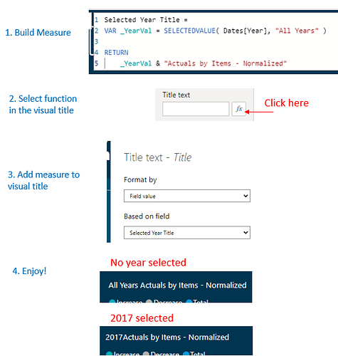
- Consider using formula-driven visual titles instead of just static ones (see below)
- You can add images and color to your report, and they can even be data-driven (great discussion and links here): Can we change the logo and theme in the same power BI report based on parameters? - #4 by BrianJ
- Probably the hardest part is determining the story to tell, read through some of the Challenge report submissions, often the report designer talks about what they wanted to show in their report.
variable visual title:
