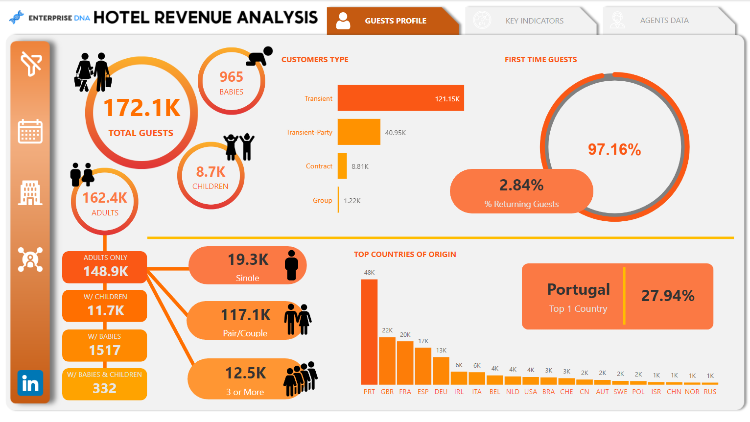
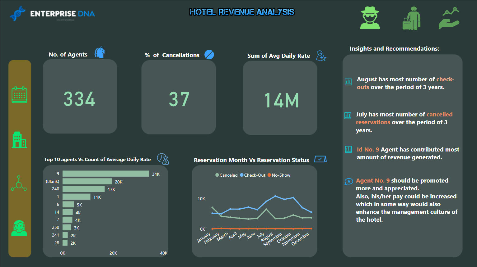
Hi everyone, this is an entry submitted by Jenelyn Rosales via email.
Here’s how Jenelyn Rosales Hosen described it:
There are 3 tabs in my report: Guests Profile, Key Indicators and Agents Data. I’ve broken down the Guests Profile to show the demographics of the hotel’s guests.
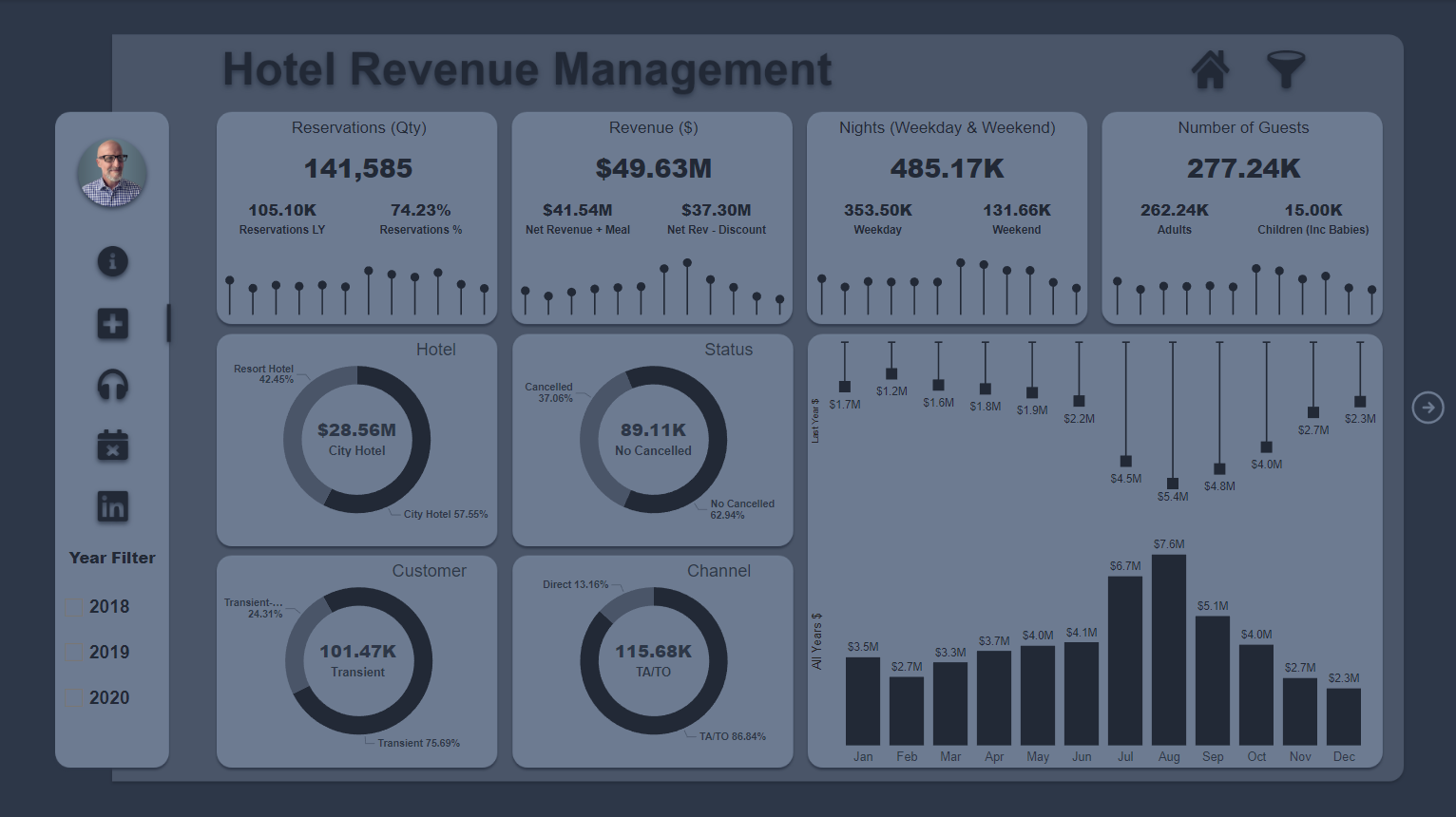
Hi everyone, this is an entry submitted by Aman Kumar Singh via email.
Here’s how Aman Kumar Singh described it:
"I am glad to be a part of the challenge. While making this report for this challenge, I got better in understanding the data and using DAX measures."
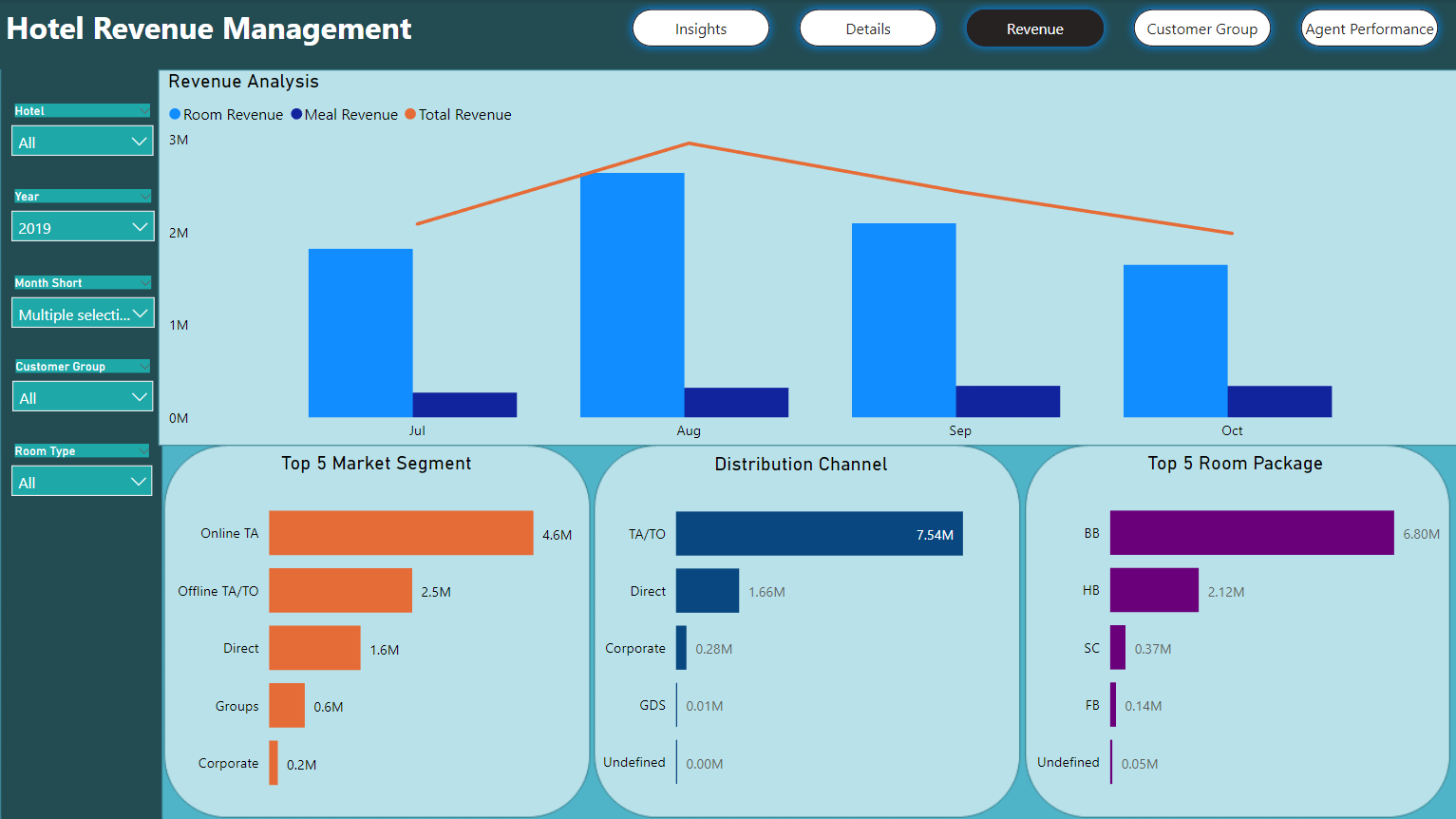
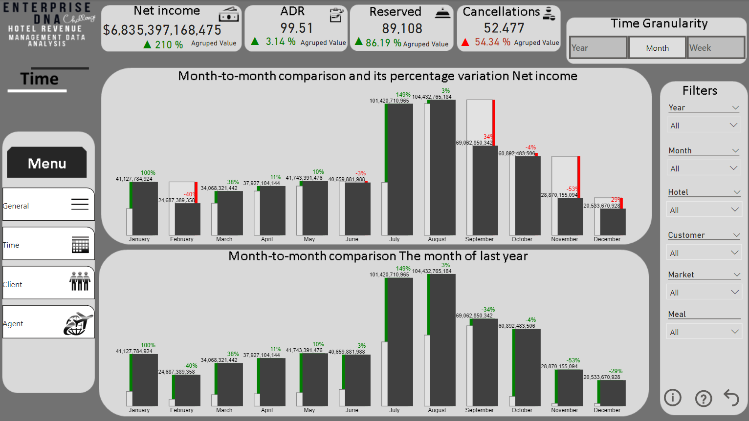
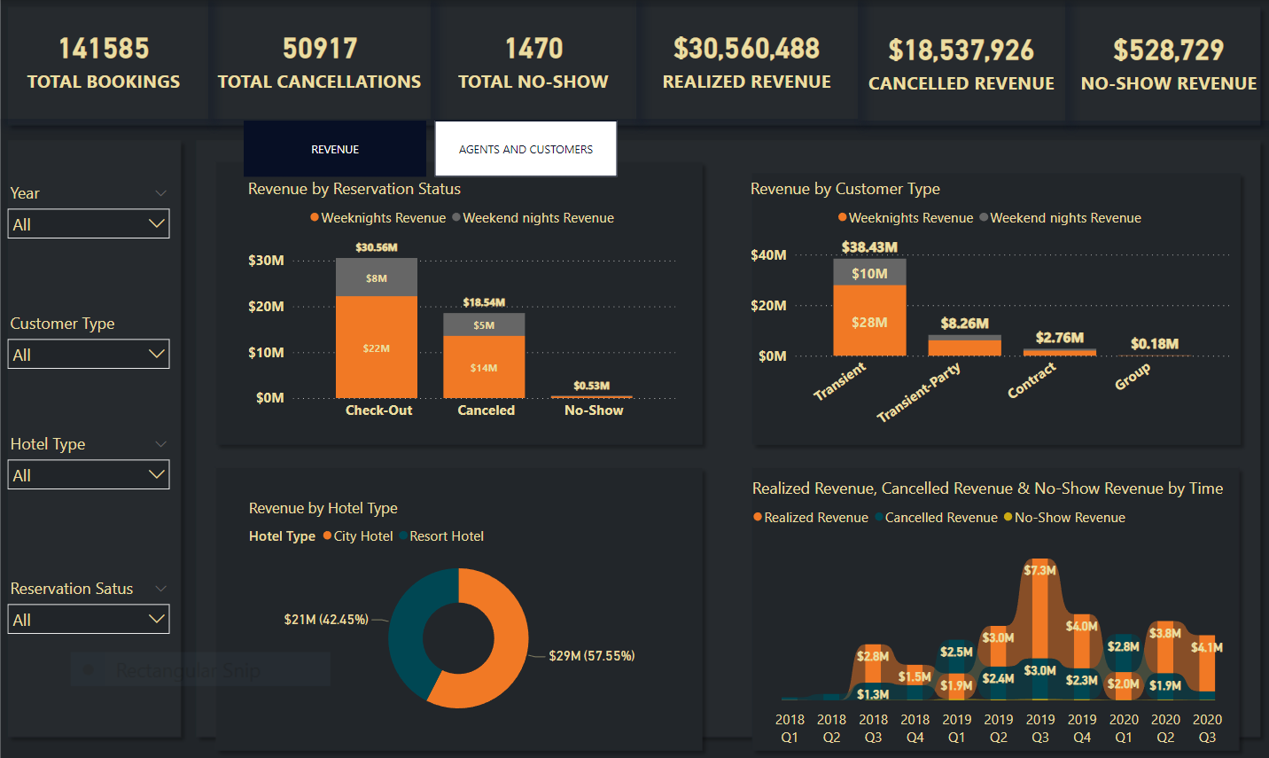
Hi everyone, this is an entry submitted by Vicente J Juan Magallanes via email.
Here’s how Vicente J Juan Magallanes described it:
"I worked on the scorecards in Power BI and put into practice the creation of new comparison graphs with DENEB. Interesting and fun dataset to work on time intelligence. "
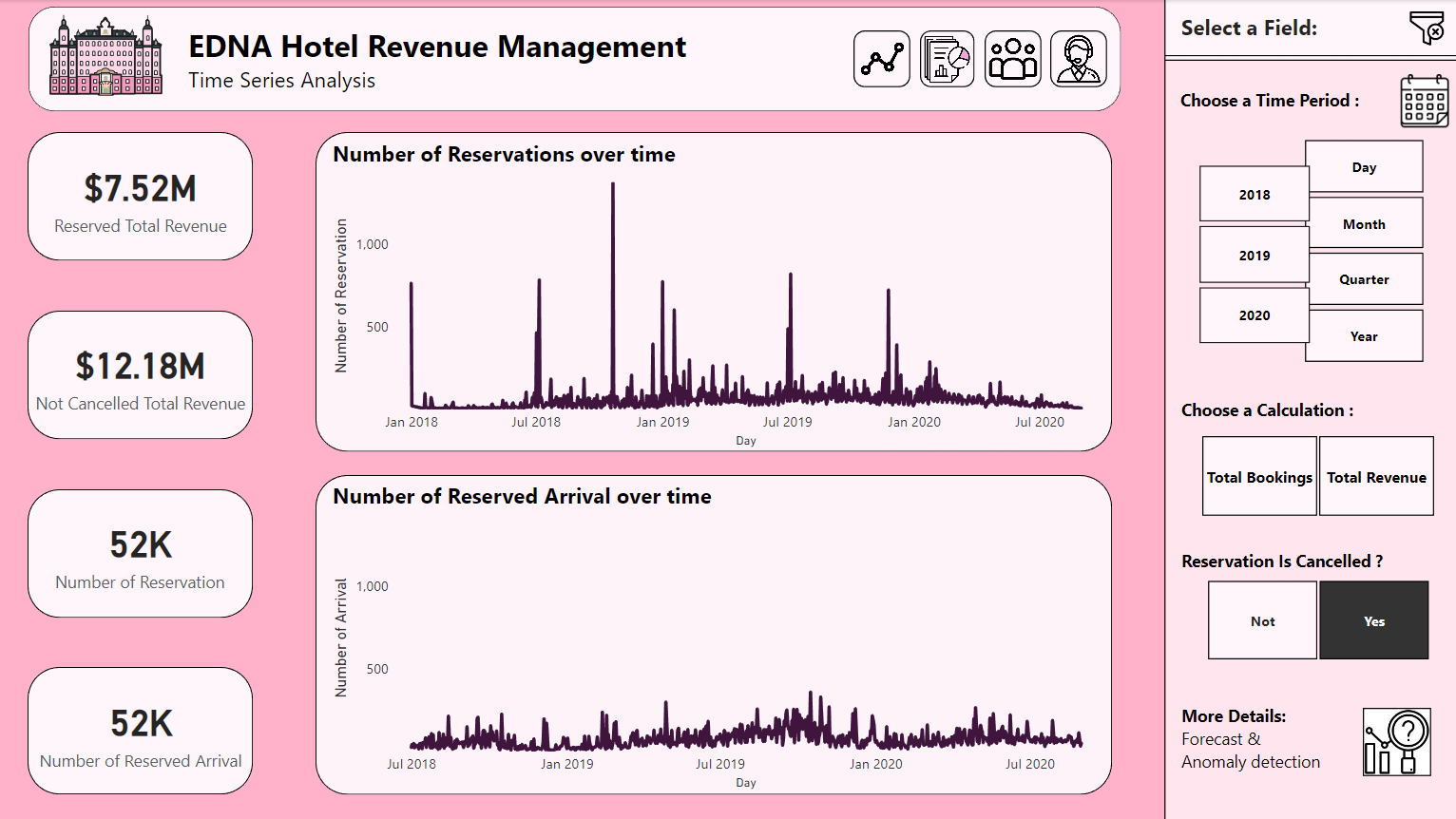
Hi everyone, this is an entry submitted by @FPastor
Here’s how Federico described it:
I continue with my experimentation and visualization tricks with the error bars visuals. The challenge Brief provides some insights into some of the requirements of the project. I hope, I have addressed these.
Hi Federico, This dashboard is really amazing. I am coming from a tableau background to power BI and at the moment am struggling with creating the same visual I did in tableau. I know it’s a big ask however the tableau community you can download workbooks however don’t see this option here as I like to reverse engineer as helps my learning. Could you share this with me so I can see how it is done. Kev
I am flattered you like my report. Most visuals can be created in Power BI, with a little bit of help. You have Charticulator and Deneb for super custom visuals, see links below.
Another resources are custom visuals for Power BI, these can be load into your file within Power BI desktop but my personal choice is Visualisation tricks with Native Power BI Visuals.
Please see link to my report below - any questions please letm e know.
Thanks that really helps me just to see how a report is built. I check out the other resources as well. Really appreciate it as like to learn by reverser engineering. Can ask about the background do you make that up in powerpoint also how do you match the sizing. Thanks again.
I use Adobe XD, everybody into Figma, so I go the other way but very achivable in Power Point. Sizing is trial and error until you get it right for your purpose. It is a little problem with fixed backgrounds but more effective performance wise.
I am learning a lot from the workbook so far still got loads to dig into. So far,
How to create folders in my Dax measure table, Love it.
How to create LY stats and use divide.
How to use cards for KPI and loads of formatting tips and tricks
How to order months on the lollipop chart.
How to create a Lollipop Chart
Also I see you put the revenue into the data source. I knew I had to use SUMX function however first I used a SUM(weekends + weekdays) think DAX would know the row context but that did work as must just take overall sum.
Is this a case where be better adding a column to the data source? As need to create a few for food costs, number of guess etc.
Something That think be useful is a workbook with common chart types by use like deviation, correlation, change over time, ranking, distribution, part to whole, magnitude etc. Something like what the FT done. Anyway really had a lot of fun going to fully create the reports so understand what like to produce that way I can setup my own process. Thanks again
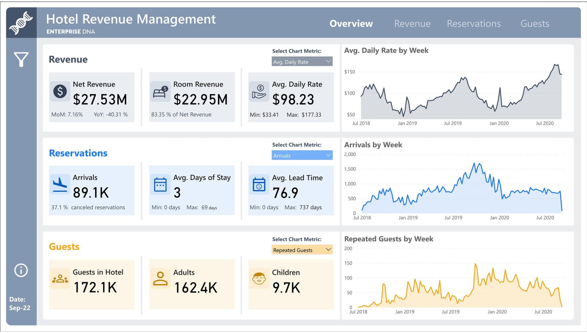
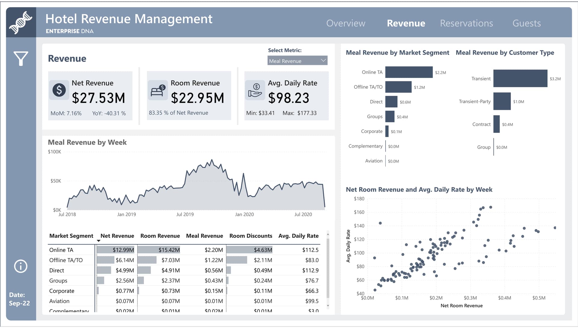
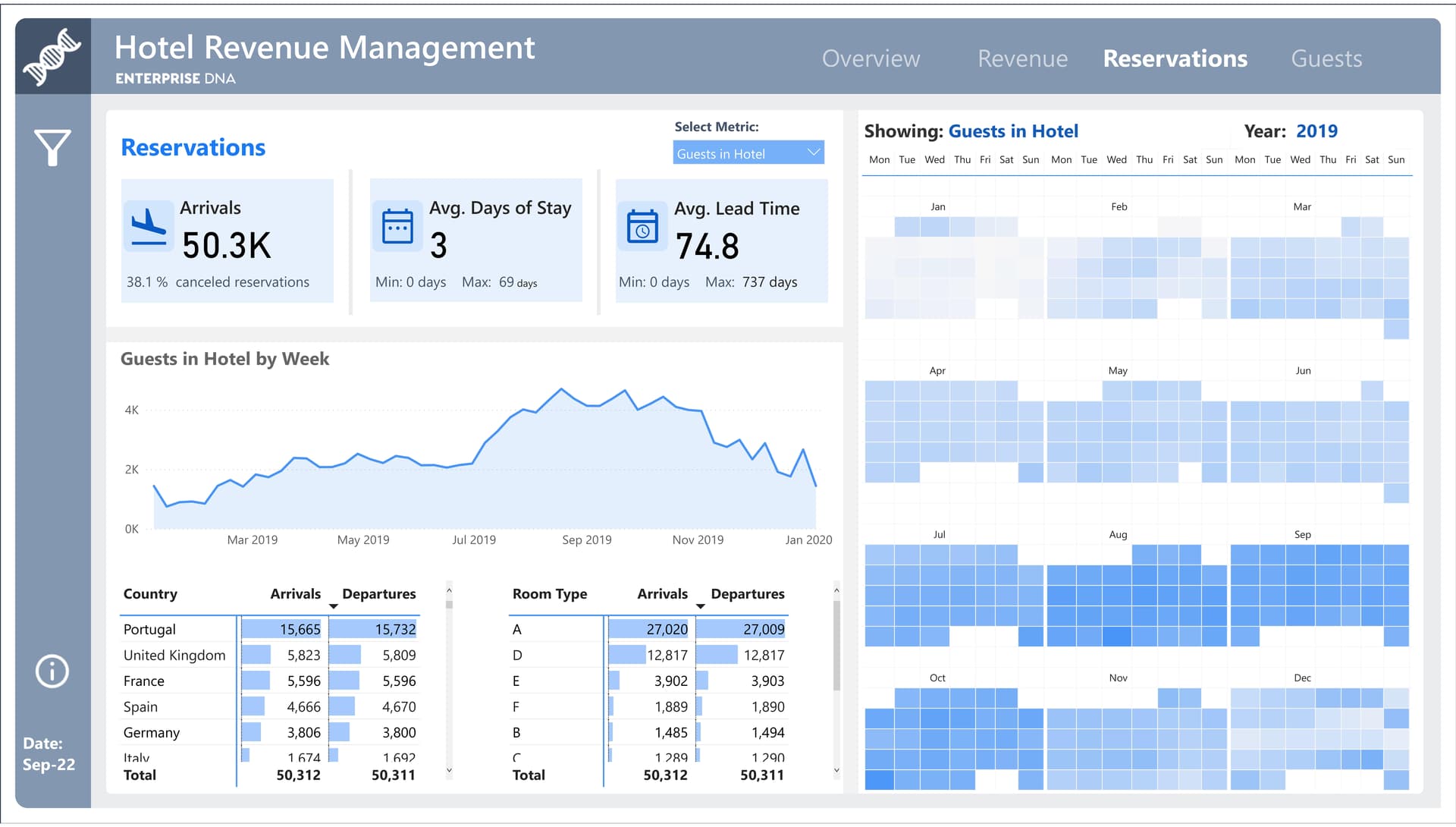
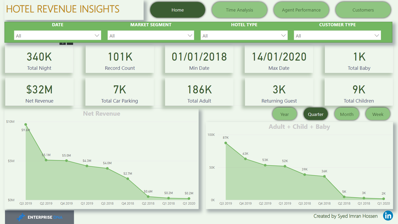
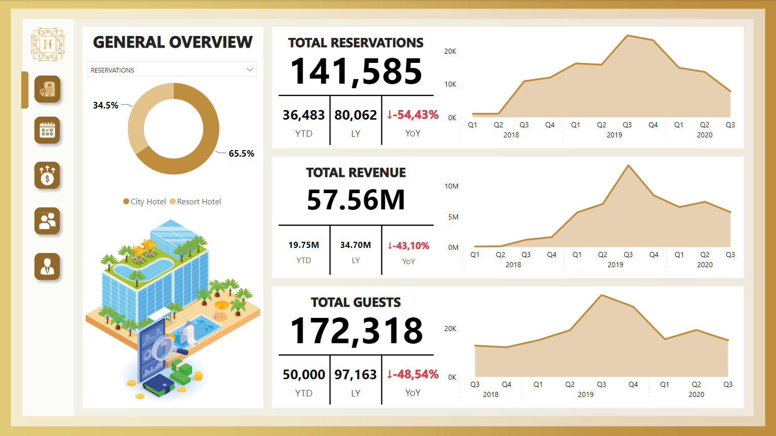
Hi everyone.
Here’s my submission for the Challenge 22: Hotel Revenue Management.
I used this as an opportunity to put together all of the things I’ve been learning over the last few months around report design and DAX. My idea was to create a report that is somewhat exploratory and the user can explore to find trends across business sections.
This is great example of explanatory dashboard. I like the use of colour as you clear linking each metric. Easy to navigate and can imagine a manager of hotel would fined this useful and give them a clear understanding of their business. Well done. I save this for inspiration. Did you learn most of these techniques here on EDNA or other resources that you use as well to support your learning.
This is just a suggestion for EDNA as now you have a showcase however not all them make it to the portal. I think be great resource if every entry was available so that we can all learn from each other. Guess coming from a tableau background I could download any workbook and learn from it.
A lot of my learnings regarding Report Design and Visualisation, especially, has come from the platform via courses and inspiration from the amazing work by the community.
 but very achivable in Power Point. Sizing is trial and error until you get it right for your purpose. It is a little problem with fixed backgrounds but more effective performance wise.