Ohhh, little thing so cute!!! I like the name “Excel”
Thanks for sharing.
Wow!!!
Yep…I do really like it…a winner maybe in the mist?
Excellent work!!
Thanks for your entry,
Federico
Afraid not, that is a picture of my landing page/front page….not submitting my report as it’s terrible and incomplete.

I know u will complete it and surprise us 
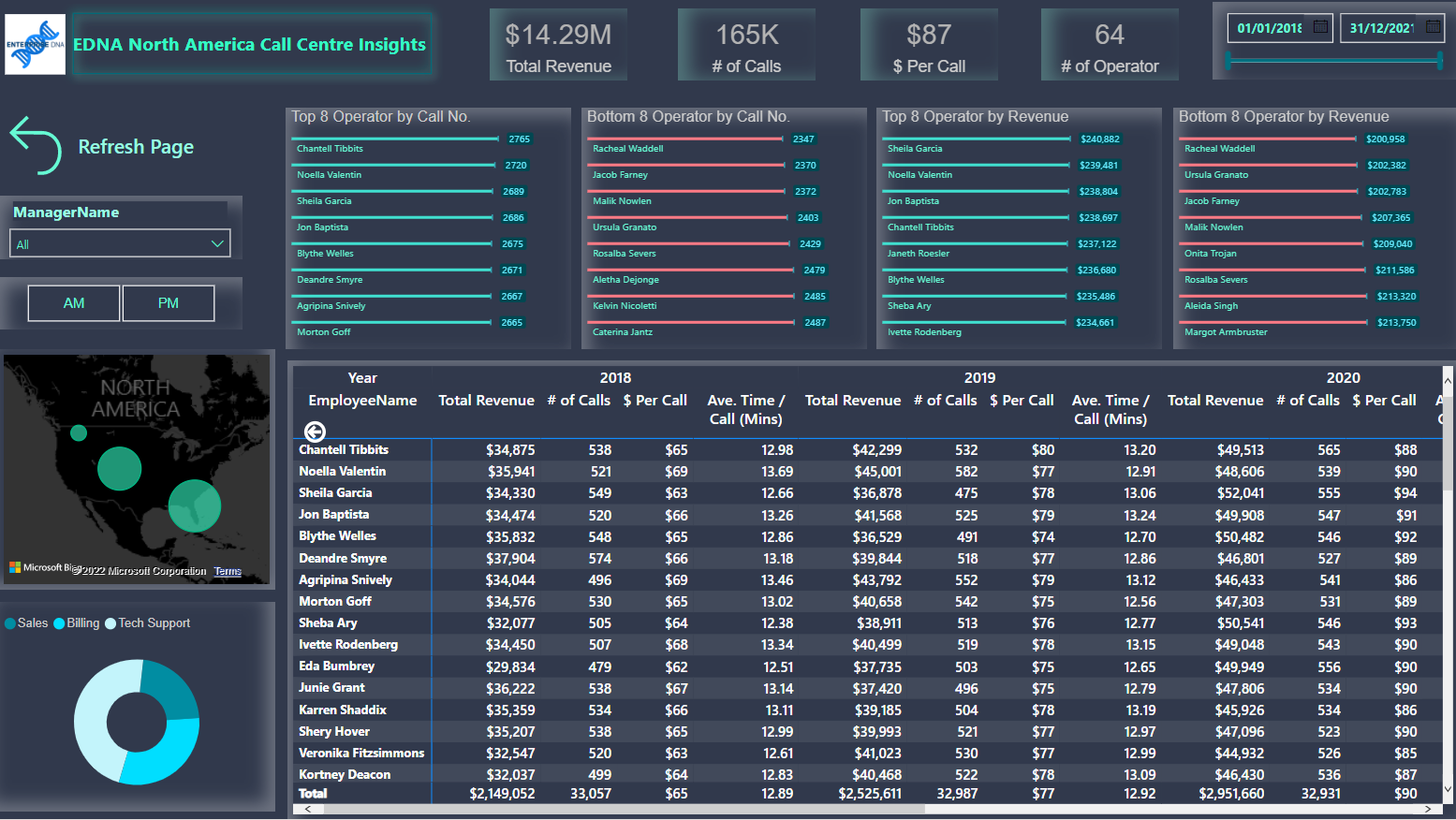
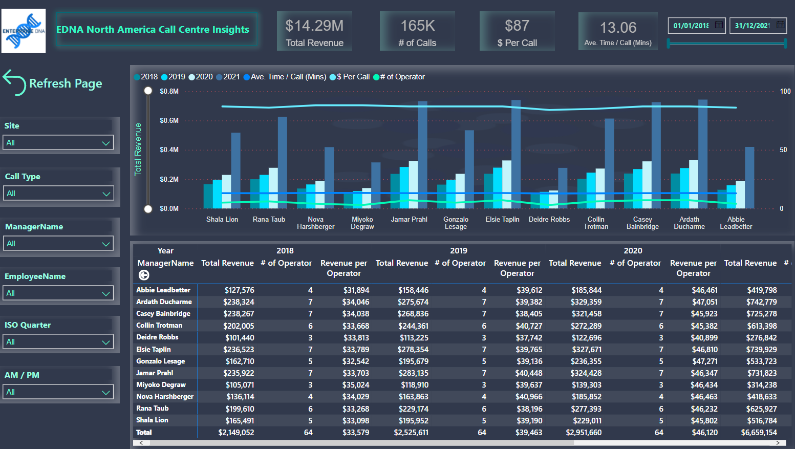
Hello All,
Here is my Attempt at this Challenge.
Here is the Link to the Working copy on WEB :
In total probably about 1.5 - 2 hours. It’s so easy when you have your visual template already setup. My eyes are wide open at the possibilities with resources like this now
Wow, fantastic job. Great report!
Well done everyone, a fantastic array of reports. Excited to get to the judging part of this round
I agree 100% his intro page is just…

Welcome to challenge 19, great entry!!
Can I please have a copy of your Power BI file please.
Does Power BI Elite crypto currency challenge sounds familiar to you?
Thanks
Federico Pastor
Hello @FPastor
Thank you
Following are the 2 files that i worked upon, 1) PBX File, and 2) power point file.
Although I am not particularly aware of the Power BI Elite crypto currency challenge, After creating my analysis, and struggling with design and colour scheme ideas for over 7 days [ and I often find myself struggling with], I looked for some design Inspiration online. and came across a video from BI Elite (https://www.youtube.com/watch?v=l6NspVReKz0&t=223s )
So I tried to recreate the same in my report - As I Found it the best way to represent my analysis
And for Colour Scheme, I picked colours from Your Report, As I thought they were the ones matching with EDNA’s Actual Theme.
Challenge 19.pptx (1021.3 KB)
Challenge19 pbix.pbix (4.7 MB)
Hello everyone,
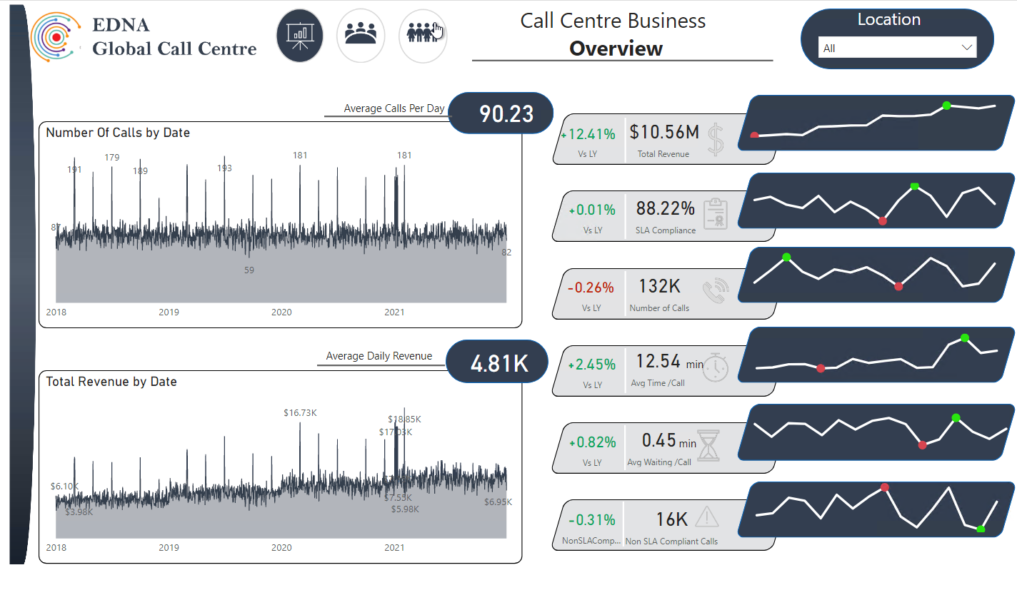
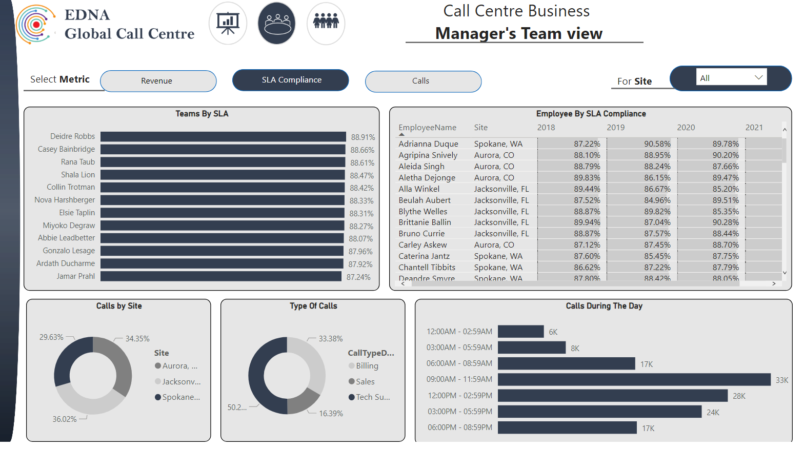
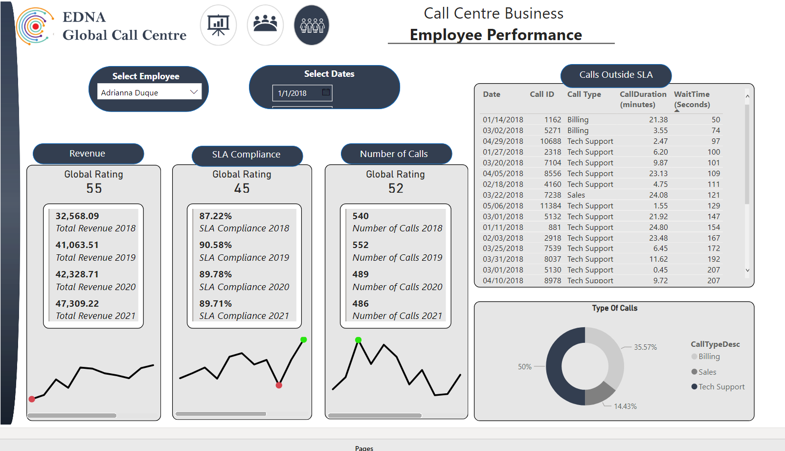
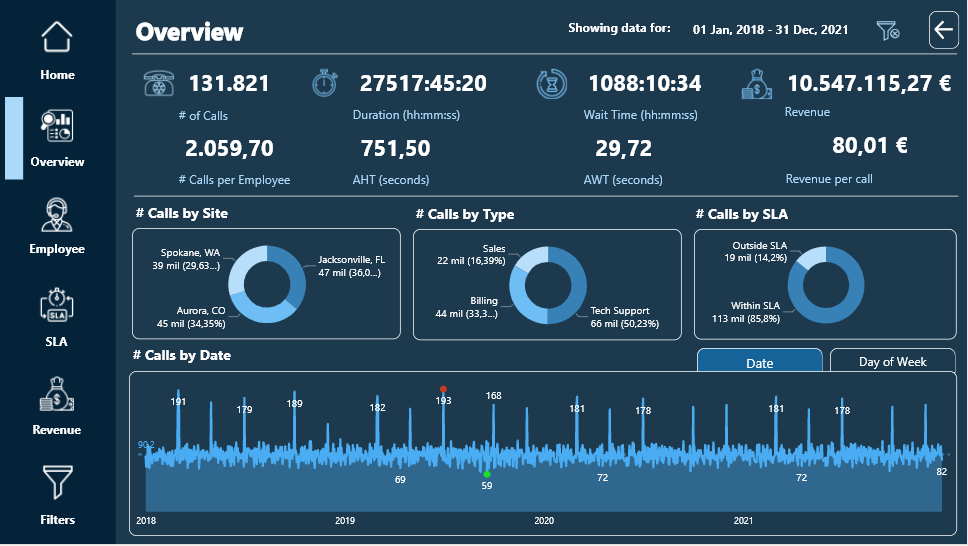
This is the report development process for EDNA Call Center analysis.
During the process of developing this report, I have attempted to apply the knowledge learned in the Report Development Best Practices course taught by @Greg.
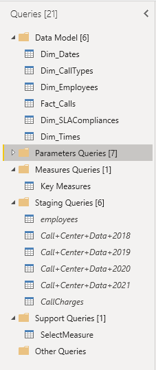
First of all, I have created two pbix files:
DS_CallCenterDataReporting_JAFP.pbix: File that only contains the Report Dataset, that is, the data and the data model.
It is created from a pbit template file containing the settings suggested by @BrianJ in the video (70) The Four Horsemen of the Power BI Apocalypse - YouTube along with the date table created by @Melissa for EDNA.
DB_CallCenterDataReporting_JAFP.pbix: File that connects to the previous Power BI Dataset and contains only the Graphical Interface.
It has been created from the same previous pbit file, eliminating the date table.
The development process consists of the following steps:
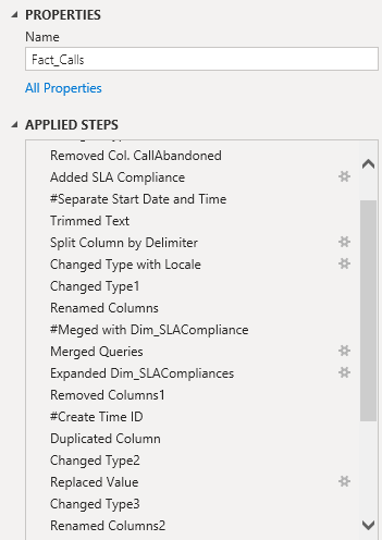
• Organization of consultations in groups.
• Rename the steps followed in the transformation process of each query.
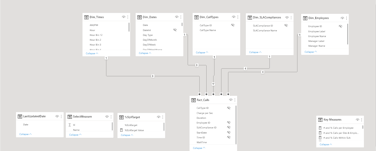
2. Data Modeling
• I have followed the Star Scheme to model the data.
• For its graphical representation I have used the cascade design.
• The modification of the metadata of the columns of the queries, I have done with the external tool Metadata Mechanic Pro belonging to the set of external tools that Greg Deckler has developed for EDNA.
3. Creating DAX Measures
• All measures have been organized in folders within the Key Measures table.
• The Dax code of all the measurements I have formatted using EDNA’s DAX Clean Up.
• To display Duration and Wait Time in hh:mm:ss, I used Chelsie Eiden’s Duration measure developed by Greg Deckler in the external tool Quick Measures Pro.
4. UI design.
For the design of the report I have used the flaticon iconography and the theme has been generated with the EDNA ColourTheme Generator tool.
The visual objects are grouped in the Selection Panel.
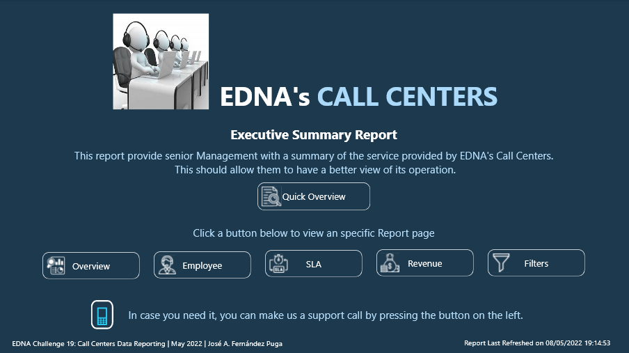
The report consists of the following pages:
• Home
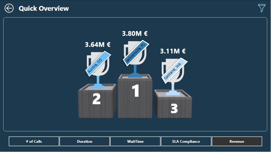
• Quick Overview
• Overview
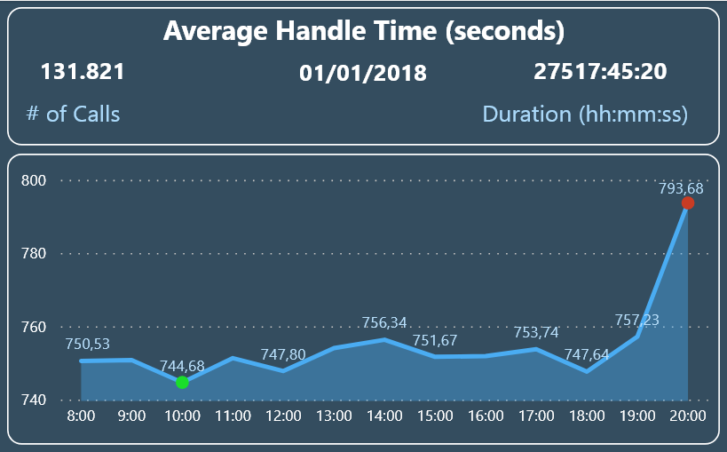
• Tooltip Calls by Date
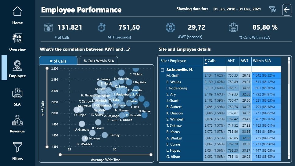
• Employee
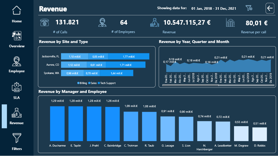
• Revenue
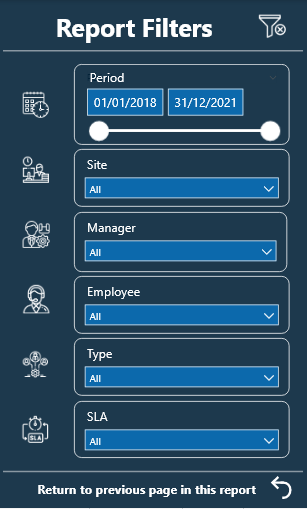
• Filters
I have used Bookmarks to switch tabs within the Overview and Employee pages. Initially I used a Bookmark Navigator but when calling the Bookmark to clear the filters, the Bookmark Navigator did not return to its initial state. @Harsh confirmed it for me on the forum and told me how to do it with individual buttons.
Each of the report pages has a button to clear the filters and another button to the right of it to display highlighted information using the Smart Narrative visual.
The custom visual objects that I have used have been:
HTML Css Viewer from K Team Solutions, with the free 1-month license. With the help of the video (70) How To Ace Your Power BI Challenge 19 - YouTube by Pascal Kiefer, I have added a button on the Hpme page that allows the user of the report to make a phone call to the support center in case need.
PureViz Infographics and the free license that allows the animation of infographic elements only in design mode.
I have created a video so you can see the animation:
Sparkline by OKViz to see the monthly evolution of the SLA by Type of Call.
Here is the link to the report.
Regards
Hi Brian
Where can I send you the report so you can publish it? I sent to this address as well: powerbichallenge@enterprisedna.co
@Ibarron20
Please send to federico.pastor@enterprisedna.co and please copy powerbichallenge@enterprisedna.co
Thanks and Regards,
Federico
@BINavPete If i show you my first ever report, you will throw your computer and will never look back at Power BI.

Honestly speaking, your overall report is great and you have done the justice with the theme and used consistent colors throughout the report. I really love the information and help icons as they show very useful information about the report and how to navigate it. Moreover, drilling manager and agent information separately is very intuitive and doesn’t cause any ambiguity because of the drill icon that pops up when a row is selected on a particular table.
Amazing job on this one and thanks for participating and making this community great!
P.S. I reckon @DavieJoe pulled out after looking at your report 
True story 
Hey @MudassirAli
Thanks for positive feedback. Much appreciated
Reckon @DavieJoe was taking in the sun in the UK and ran out of time to submit.
Pete