Hey @JohnG thanks for the kind words & feedback. This was my first submission for any sort of challenge, I guess I put a fair bit of time into setting up my theme, layout & colours. Took the yellow & pink directly from @MudassirAli Challenge 10 submission, they really stand out from a dark background.
With regards to changing the time frame, @MudassirAli said something on a video along the lines of “using the visuals to slice the data and not actual slicers themselves”. Each page has either a visual that has a monthly axis or daily axis so you slice the data by using them.
Thanks for you questions. I’ve been using Charticulator for quite some time now. The KPI cards tools hours to put together, due to the amount of measures that are needed to make it look like it does. The Heatmap took about 20-30 minutes, and the 2 Rose Bar Charts on the 1st page took about 10-15 mins. Charticulator is not something I would recommend to a beginner, but for those that are already very familiar with the native visuals in Power BI, definitely need to give it a shot. The PBIX files should be posted in a couple of weeks, so make sure you have a look when it becomes available.
The design (of the ‘Average Intervention Time’ page) provided in the report is the 4th version. It evolved with the evolution of the report and the percentages was the last brick.
First of all thanks Haroon for organising the such an interesting Challenge. I am overwhelmed by the quality of submission. Sorry for not posting a bit about my entry earlier.
Please my story below:-
There’s many things that went through my mind with regards to the data set but Haroon’s food for thought guided me to focus mainly on the critical aspect of getting people treated immediately as the emergency services is a Life & Death business. On this note created a Visual which shows Urgency (having been on an ambulance) made me appreciate how precious time is and how stressful is the work of paramedics/hospital staff.
Dark backdrop which depicts a sense of Urgency
I created a map to help users understand the logistical challenges e.g. location/density/congestion impact on arrival time.
Minimise the amount of slicers to improve real estate. Had 2 days to prepare before deadline.
Show the importance of getting treatment urgently for life threatening event e.g. cardiac arrest, lightning, allergic reaction…so that the call handlers / hospitals can benchmark against one another to improve response time.
All in all trying to tell a story of the dedication of health-care workers which no one can put a value to.
Technical aspect, not really that much
Simple Average of time measure but extracting the minutes in the Query Editor took some working for me.
Looking up coordinates in google for location of hospitals
Nice work on the scatter chart exploring the relationship between the number of calls and length of calls and their relationship to ambulance departure while the dispatcher is still on the call.
Again, I know very little about Emergency Services, but intuitively, I think you’re on to something that an expert could investigate further.
Another absolutely stellar entry. Such a polished, clean look that is becoming a identifiable style for your Challenge reports. Really outstanding choice of visuals that are drawing some unique insights out of this dataset - particularly with regard to calls and departure timing. Also great use of color - I really like the use of a single dominant color, and then a high contrast color to draw attention to the most important elements.
I’ve spent the last hour or so analyzing your work with Bookmarks. Before doing so, I’d watched a few tutorials about how they could be used, but nothing about the mechanics of making it happen.
At this point, I think I know enough to be dangerous.
I have a couple of questions, but understand that I don’t expect a prompt response - whenever you have a few free minutes.
My questions may contradict the statement I just made above. To create each Bookmark, you setup the page as you wanted to appear, say AHT View, or No of Calls View, and created each Bookmark using the appropriate View, correct. The same applies to the ADT View, AAAT View and AHAT View. Correct. [imagine a question mark after the ‘corrects’. I have a problem with my SHIFT key].
After that, it’s a matter of linking the Button to the appropriate Bookmark, correct.
Now, I have a less explicit question. I hope I explain it so you can understand. The ‘interactive’ aspect of the page is automatic, correct. That is, even though the user is on a Bookmark, they can interact with the visuals without any additional setup by you, correct.
Thanks for the kind words.
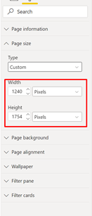
That was the whole purpose, to have minimal information on the main pages with the ability of drilling to the details. I wanted to think a bit out of the box and modify the Page size / orientation because Power BI can also represent the page in Portrait
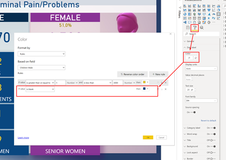
Another feature that I used quite much was the conditional formatting on the Tooltips, if value is blank then use the same background color
That will give a better representation. Well, I missed some though
Is just like in Excel, if you don’t want to see the #DIV/0! , just put an IFERROR( [Original formula];””). That’s the beauty of it, to find more tricks, isn’t it?
Cheers
Sorin
What I tend to do, once I’ve decided how many bookmarks I want is to create all my bookmarks and name them intuitively so AHT View etc. Then I’d make copies of the visuals which would be “switching” in and out when using the bookmarks. I always name the individual objects by using Title in the formatting, even if it’s a shape etc, it makes life so much easier when using the selection pane. Then I’ll select my first named Bookmark and hide all the visuals I don’t want to see, repeat the process for each bookmark. Did this make sense and answer your questions?
I’m not sure I understood your last point about interactivity.
That’s the answer I was looking for. That is, the bookmarks don’t make the page static. On one of tutorials [non Edna], a statement was made that I interpreted as the page would reflect the data as it was when the page was attached to the Bookmark, and didn’t support interactivity.