Thanks Brian! Email is on the way!
Diana
1 Like
Sorry to ask this again, but I am ok to submit my report Sunday evening UK time?
As a regular “keep tinkering right up to the deadline” Challenge Guy, I can tell you that as long as you submit before it hits midnight on July 11 in Los Angeles, you’re good to go.
SUBMISSION DUE DATE - Sunday, 11th July 2021 (PST)
– Brian
2 Likes
@FPastor ,
Welcome to the Challenges! This is a terrific first entry.
I really like the dark background theme, and the organization and navigation makes for an excellent user experience. You’ve added some really nice UI touches (I particularly like the “bounce” when you mouse over the main page buttons). Very effective use of the donut charts – I really like including the target value in the center. I think the heat maps are a very effective way of conveying the information you are depicting (one suggestion there – I really like the single color approach on that page, but I would’ve preferred a wide range of hues in the heat map to make the differences in values “pop” a bit more.)
Overall, a really well-conceived, well-executed entry. 
Thanks for participating!
– Brian
1 Like
Thank you Brian for the feedback. I do agree with you on the heatmaps 1 colour choice.
FP1967
2 Likes
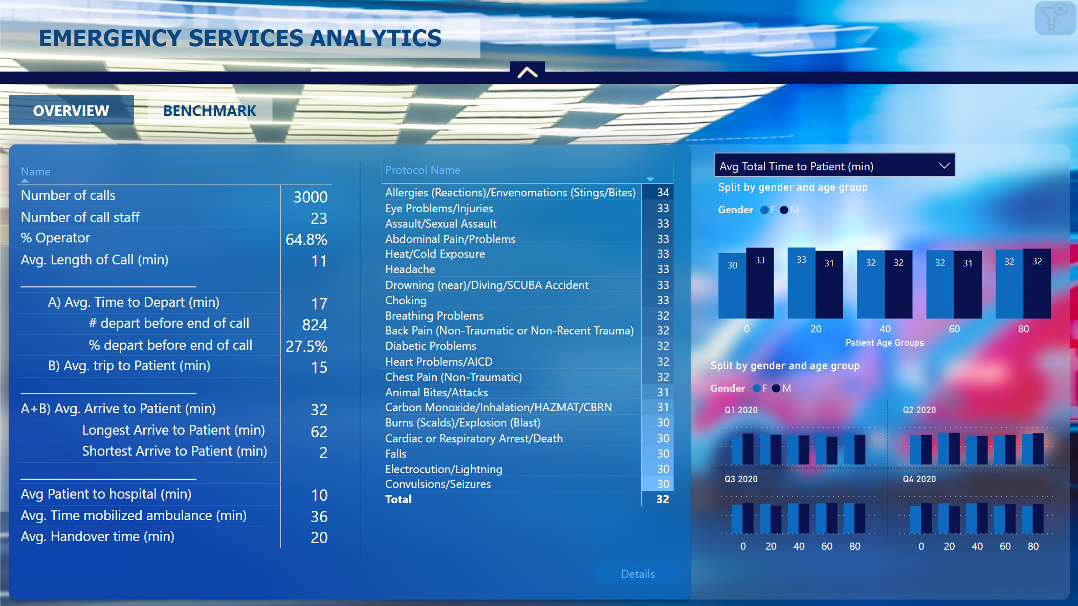
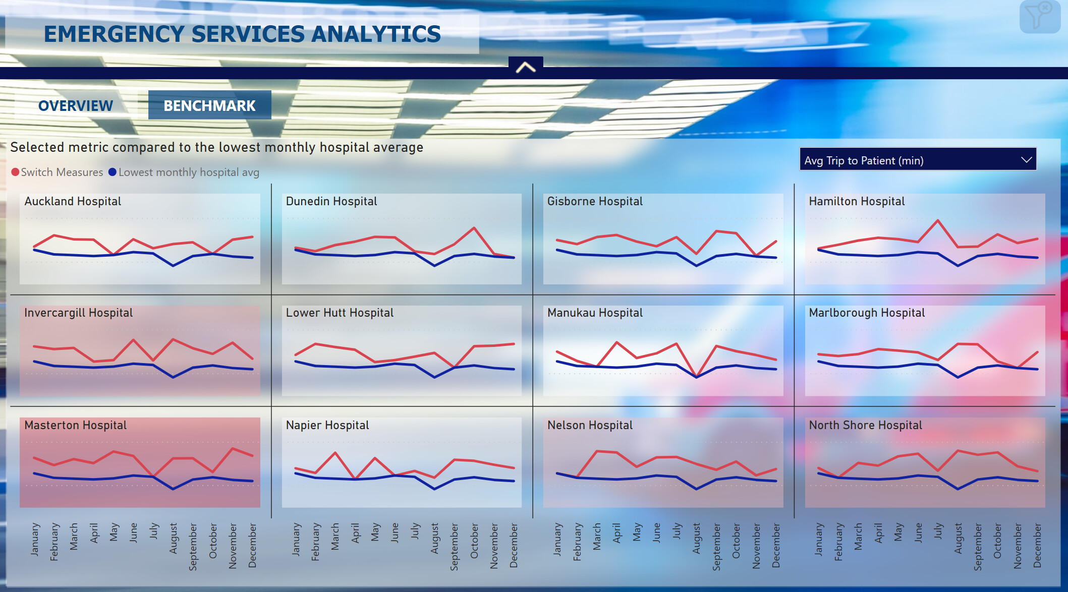
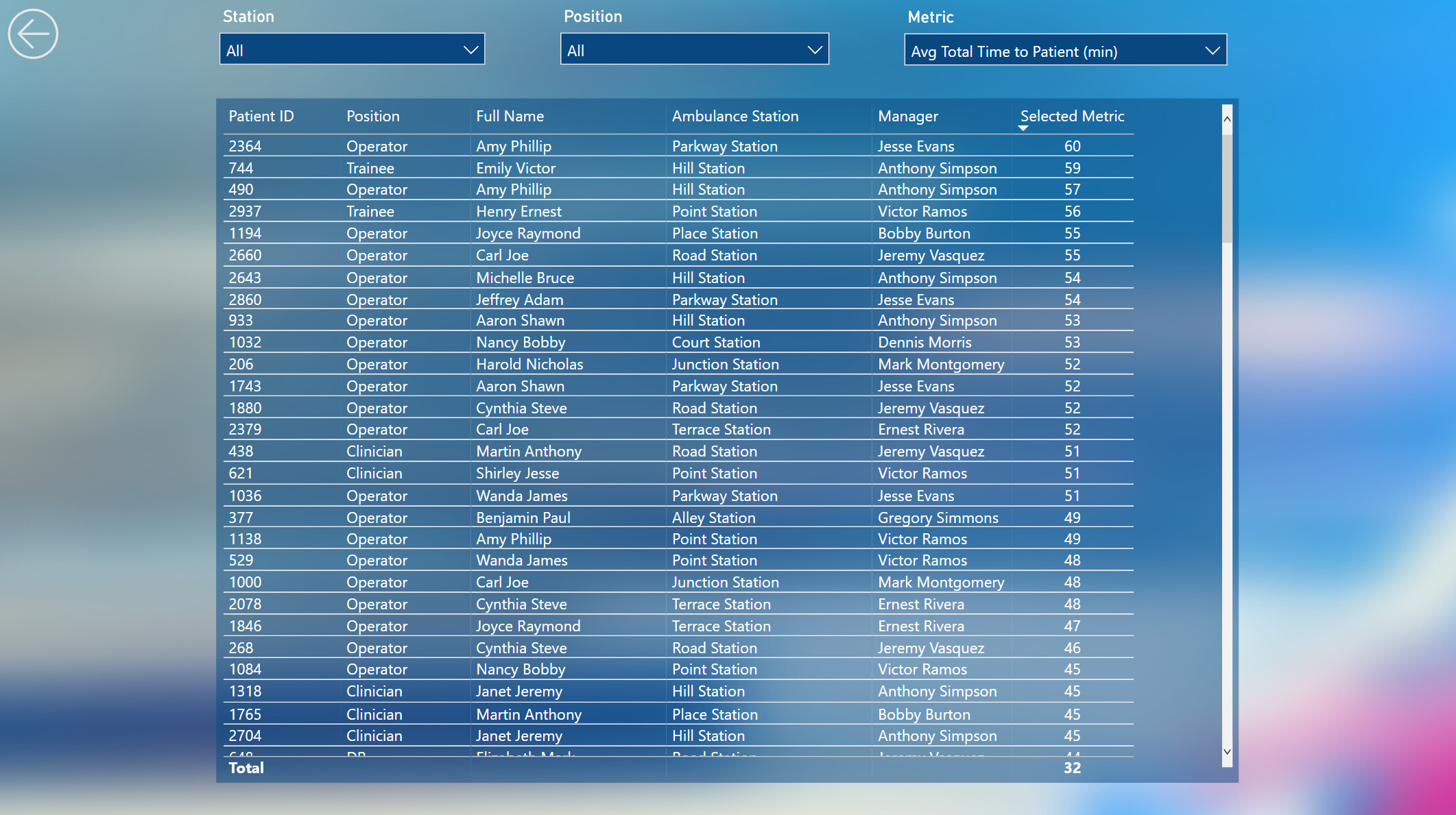
Hi all. Here’s my submission for Data Challenge 14, Emergency Services Analytics. I chose to concentrate on the technical infrastructure rather than focus on the ultimate utility of the final report, and proceeded with the following goals:
- To gain experience using two separate dataset and report PBIX files
- To evaluate all of the best practices listed in my recent Enterprise DNA YouTube series and comment on how they applied to this challenge submission
- To gain experience using JSON theme files and try to do as little formatting via the UI as possible
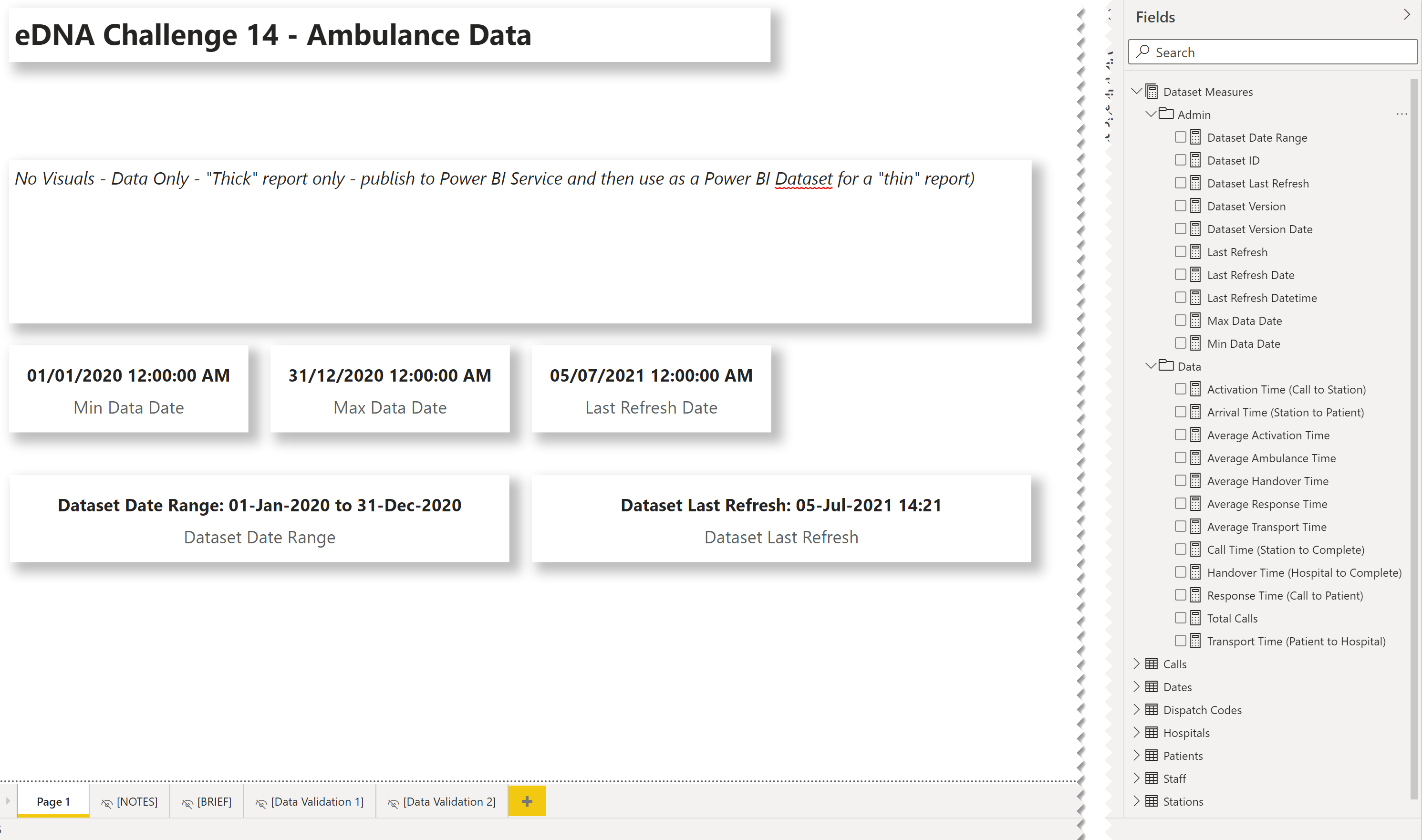
NOTE:
Unfortunately, it looks like Publish-to-Web is not supported when using shared datasets:
What I liked:
- I’m extremely happy with the use of separate PBIX files for the dataset and the report. Although their use did not serve any purpose for this challenge, I can easily see that this is an exceptional way to develop where others can make use of your dataset; I wholeheartedly recommend it for any organization that has multiple people working on a reporting project, as it both facilitates the separation of duties and the dataset endorsement process.
- I’m quite happy with the content of my YouTube series on the best practices; I was able to gain first-hand experience trying to use only those best practices and have come up with quite a satisfactory (on the surface) looking report.
- I’m quite happy with the time saved by using a custom JSON theme file, as I didn’t have to change any fonts, font sizes, font colours, or background colours during development; I plan to use this technique for future development to both save time and standardize the consistency of the output
What I didn’t like / needs more work:
- I’m not happy with the final report, and would have liked to spend much more time on creating a more insightful report, but the extra time required to flip back and forth between the separate dataset and report PBIX files consumed more than I thought, and with the technical focus of this submission, I ran out of the time I had allotted for this challenge
Findings / Notes:
- I was unable to find the correct syntax to set the custom properties I wanted for minimal shadows for visuals by JSON, so I ended-up using the UI to set the custom properties
- I was unable to find the correct syntax to set the style I wanted for matrix and table visuals by JSON, so I ended-up using the UI to set the style to “None”
- I was unable to find the correct syntax to set the default and on-hover behaviour for the “Reset Filters” button, so I ended-up using the UI to set the on-hover behaviour
- although I set the summarization to NONE in the “thick” dataset PBIX, the changes were not (not always) reflected in the “thin” report PBIX, and I needed to set the summarization again using the ribbon
Review of Best Practices:
| Pillar | ID | Best Practice | Notes |
|---|---|---|---|
| Pre-Development Setup | 1 | Auto date/time: Disable | Done |
| 2 | Auto detect relationships: Disable | Done | |
| 3 | Use cross filtering instead of cross highlighting: Enable | Done | |
| 4 | Separate dataset from report | Done | |
| Data Loading and Transformation | 5 | Use dedicated [Dates] table and mark as a date table | Done |
| 6 | Source: Use existing report/dataset before developing new | N/A | |
| 7 | Stage and reference data | Done | |
| 8 | Performance - Data Volume: Reduce as much as possible | N/A | |
| 9 | Performance - Query Folding: Enable as much as possible | N/A | |
| 10 | Performance - Data Connectivity Mode: Use Import if possible | Done | |
| 11 | Location/Shape | N/A | |
| 12 | Naming/Data Types | Done | |
| 13 | Granularity: Strive to source data at coinsistent granularity | N/A | |
| Data Modelling | 14 | Star Schema | Done |
| 15 | Waterfall Layout: Lookup tables above fact tables | Done | |
| 16 | Waterfall Layout: Measure tables at top-right (columns) | Done | |
| 17 | Waterfall Layout: Supporting tables at bottom-left (rows) | Done | |
| 18 | Use Manage Relationships dialog | Done | |
| 19 | Use Edit Relationships dialog | Done | |
| 20 | Use 1-to-many relationships/avoid bi-directional relationships | Done | |
| 21 | Use Active and Inactive Relationships | Done | |
| 22 | Use Measure Tables | Done | |
| 23 | Rename linking columns (Key) | Done | |
| 24 | Column Visibility: hide key, sort | Done | |
| DAX Calculations | 25 | Format DAX | Done |
| 26 | Comment DAX | N/A | |
| 27 | Variables: Use verbose variable names | Done | |
| 28 | Variables: Use underscore prefix | Done | |
| 29 | Variables: Use RETURN _result | Done | |
| 30 | Qualification: columns are; measures are not | Done | |
| 31 | Use CALCULATE: To change the context of a calculation | Done | |
| 32 | Use DATEADD: Most versatile / easy copy-and-paste | Done | |
| 33 | Use DIVIDE instead of arithmetic division; error handling | Done | |
| 34 | Use SWITCH TRUE instead of nested IF statements | Done | |
| 35 | Virtual Tables: Use SUMMARIZE to construct the base table | Done | |
| 36 | Virtual Tables: Use ADDCOLUMNS to construct the extended table | Done | |
| 37 | Virtual Tables: Use @ prefix on extended columns | Done | |
| 38 | Use USERELATIONSHIP: To activate inactive relationships | N/A | |
| 39 | Measures: Use Measures instead of calculated columns where possible | Done | |
| 40 | Measures: Use Measure Branching | Done | |
| 41 | Measures: Use Measure Groups (Measure Tables) | Done | |
| 42 | Context | N/A | |
| 43 | Aggregation / Iteration (e.g., SUM, SUMX, etc.) | N/A | |
| Reports and Visualizations | 44 | Use FORMAT / GENERAL to adjust X/Y/Width/Height to multiples of 10 px | Done |
| 45 | Use Model View to turn off summarization | Done | |
| 46 | Keep Selection pane and Bookmarks pane visible at all times | Done | |
| 47 | Set format of date columns to dd-mmm-yyyy | Done | |
| 48 | Set Matrix column width | N/A | |
| 49 | Think in grids / align visuals | Done | |
| 50 | Use transparent colours | N/A | |
| 51 | Use table-first development (TFD) | Done | |
| 52 | Use Reset Slicers bookmark and button | Done | |
| 53 | Use Slicer Selection echo area | N/A | |
| 54 | Use button On Hover behaviour to add interactivity | Done | |
| 55 | Use textboxes with measures to add dynamic narratives | Done | |
| 56 | Set the data category for location fields | N/A | |
| 57 | Use Edit Interactions to modify filter effect on visuals | N/A | |
| 58 | Use Selection pane to name and order all visuals | Done | |
| 59 | Identifiers: add report ID, version, version date, last refresh date | Done | |
| 60 | Performance: Minimize number of visuals per page | Done | |
| 61 | Performance: Use dropdown slicers in lieu of list slicers | N/A | |
| 62 | Performance: Collapse filter pane before saving | Done |
Here’s the notes I kept during development:
Dataset PBIX
- ensured options for “Import relationships from data sources on first load” and “Auto-detect new relationships after data is loaded” were unchecked (disabled)
- (from File \ Options and settings \ Options \ Current File\ Data Load \ Relationships)
- ensured option for “Change default visual interaction from cross highlighting to cross filtering” was checked (enabled)
- (from File \ Options and settings \ Options \ Current File\ Report Settings \ Visual Options)
- created parameters for source path name and file name
- loaded all data from source Excel workbook as staging queries, using [parameterSourcePath] and [parameterSourceFile]
- *** NOTE: while setup with a local folder only, the use of parameters for source path and file would allow the use of online files (OneDrive for Business) and, if the dataset is deployed to DEV, TEST, and PROD workspaces, the dataset in each workspace could be easily configured in the Power BI Service to use the appropriate folder and file ***
- added parameters for source path and source file
- updated staging queries to use source path and source file parameters, including check for ending ""
- renamed all “…ID” fields to use “… Key” suffix to improve clarity in linking
- created reference for each table from staging queries
- added [Dates] table from Enterprise DNA M Code Showcase (Extended Dates table):
- [Dispatch Codes]:
- replaced #(tab) with empty string
- replaced #(cr) with empty string
- replaced #(lf) with empty string
- split [Protocol] column and removed left or colon; renamed [Protocol Full]
- added new calculated column in DAX to shorten the protocol description to make visuals easier to read
Protocol =
TRIM(
    SWITCH( TRUE(),
        CONTAINSSTRING( 'Dispatch Codes'[Protocol Full], "Abdominal" ), "Abdominal",
        CONTAINSSTRING( 'Dispatch Codes'[Protocol Full], "Allergies" ), "Allergies",
        CONTAINSSTRING( 'Dispatch Codes'[Protocol Full], "Animal" ), "Animal",
        CONTAINSSTRING( 'Dispatch Codes'[Protocol Full], "Assault" ), "Assault",
        CONTAINSSTRING( 'Dispatch Codes'[Protocol Full], "Back" ), "Back",
        CONTAINSSTRING( 'Dispatch Codes'[Protocol Full], "Breathing" ), "Breathing",
        CONTAINSSTRING( 'Dispatch Codes'[Protocol Full], "Burns" ), "Burns",
        CONTAINSSTRING( 'Dispatch Codes'[Protocol Full], "Inhalation" ), "Inhalation",
        CONTAINSSTRING( 'Dispatch Codes'[Protocol Full], "Cardiac" ), "Cardiac/Respiratory",
        CONTAINSSTRING( 'Dispatch Codes'[Protocol Full], "Chest Pain" ), "Chest Pain",
        CONTAINSSTRING( 'Dispatch Codes'[Protocol Full], "Diabetic" ), "Diabetic",
        CONTAINSSTRING( 'Dispatch Codes'[Protocol Full], "Drowning" ), "Drowning",
        CONTAINSSTRING( 'Dispatch Codes'[Protocol Full], "Electrocution" ), "Electrocution",
        CONTAINSSTRING( 'Dispatch Codes'[Protocol Full], "Eye" ), "Eye",
        CONTAINSSTRING( 'Dispatch Codes'[Protocol Full], "Heart" ), "Heart",
        CONTAINSSTRING( 'Dispatch Codes'[Protocol Full], "Exposure" ), "Exposure",
        'Dispatch Codes'[Protocol Full]
    )
)
- [Dates]:
- marked as a date table
- changed date format to dd-mmm-yyyy
- [Hospitals]:
- split [Hospital] column by right-most space, renamed [Hospital.1] column to [Hospital], removed [Hospital.2] column
- [Patients]:
- renamed [Gender] to [Gender Code]
- added calculated column for [Gender] (Female, Male, Other)
- [Calls]:
- renamed columns:
- [DateTimeOfCall] to [Call DateTime]
- [Ambulance DepartureTime] to [Station DateTime]
- [Ambulance ArrivalTimePatient] to [Patient DateTime]
- [Ambulance ArrivalTimeHospital] to [Hospital DateTime]
- [Ambulance JobCompleteTime] to [Complete DateTime]
- used “Change Type \ Using Locale…” to change type of [Call DateTime] column from “Text” to “Date/Time” (used locale “English (United Kingdom)”)
- split [Call DateTime] by delimiter (space) into [Call Date] and [Call Time]
- created custom columns for durations in minutes (whole number) between:
- Call to Station
- Station to Patient
- Patient to Hospital
- Hospital to Complete
- Call to Complete
- created custom column for [Call Time Key] in HHmm format (24-hour clock) (for subsequent linking)
- renamed columns:
- added [Times] table from Enterprise DNA M Code Showcase:
- added [Last Refresh] table from Enterprise DNA M Code Showcase
- Adding a Last Refresh date to your Report
- hid [Last Refresh] table
- added [Dataset Measures] measures table
- added measures for dataset identifiers: ID, Version, Version Date
- added [Last Refresh] measure
- added measures for dataset maximum and minimum date
- added measures for [Total Calls], [Response Time (Call to Patient)], [Transport Time (Patient to Hospital)], [Ambulance Time (Station to Complete)]
- used measure branching to create measures for [Call Time]
Report PBIX
General:
- ensured options for “Import relationships from data sources on first load” and “Auto-detect new relationships after data is loaded” were unchecked (disabled)
- (from File \ Options and settings \ Options \ Current File\ Data Load \ Relationships)
- ensured option for “Change default visual interaction from cross highlighting to cross filtering” was checked (enabled)
- (from File \ Options and settings \ Options \ Current File\ Report Settings \ Visual Options)
- used theme JSON file to set all font family for all visuals to Segoe, text colour to white
- retrieved Power BI dataset (to make this a “thin” report)
- added [_Report Measures] measures table to this “thin” report
- browsed PowerPoint and chose dark red abstract slide design and exported as PNG; used exported PNG as page background for PBIX
- used the “Image to Colours” function of the Colour Theme Generator app on the Enterprise DNA Analyst Hub to extract the HEX codes from the page background image; chose #481818 (dark maroon) as a “base” colour
- used the “Colours Fan” function of the Colour Theme Generator app of the Enterprise DNA Analyst Hub with #481818 to generate an 8-colour theme
- used “Just Color Picker” to grab the HEX codes of the colour theme and saved as a text file
- used Visual Studio Code to update the “dataColors” section of the JSON theme file with the extracted HEX codes
- used Visual Studio Code to update the “visualStyles” section of the JSON theme file with visual title font colour, visual title background colour, and visual background colour
- used “View \ (Themes downarrow) \ Browse for themes” and selected the JSON theme file
- edited the JSON theme file to adjust the title font size as needed, then re-applied the JSON theme file
Visualizations:
Header:
- used textbox at left for title
- used button for “Reset Slicers”
- actions the “Reset Slicers” bookmark
- altered the on-hover behavior of the button to implement button interactivity
- used date slicer
- used rectangle for background with custom shadow (bottom, grey, minimal) [theme colour 7, 50% transparency]
Body:
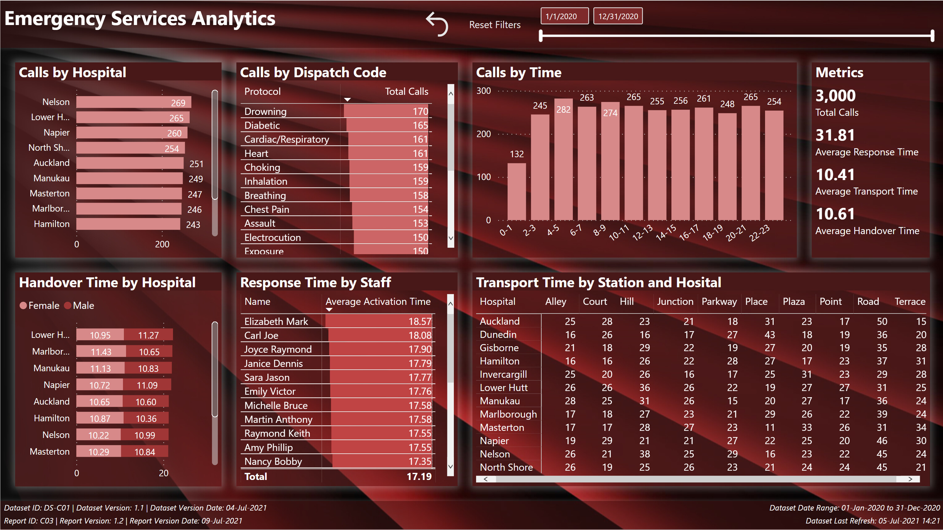
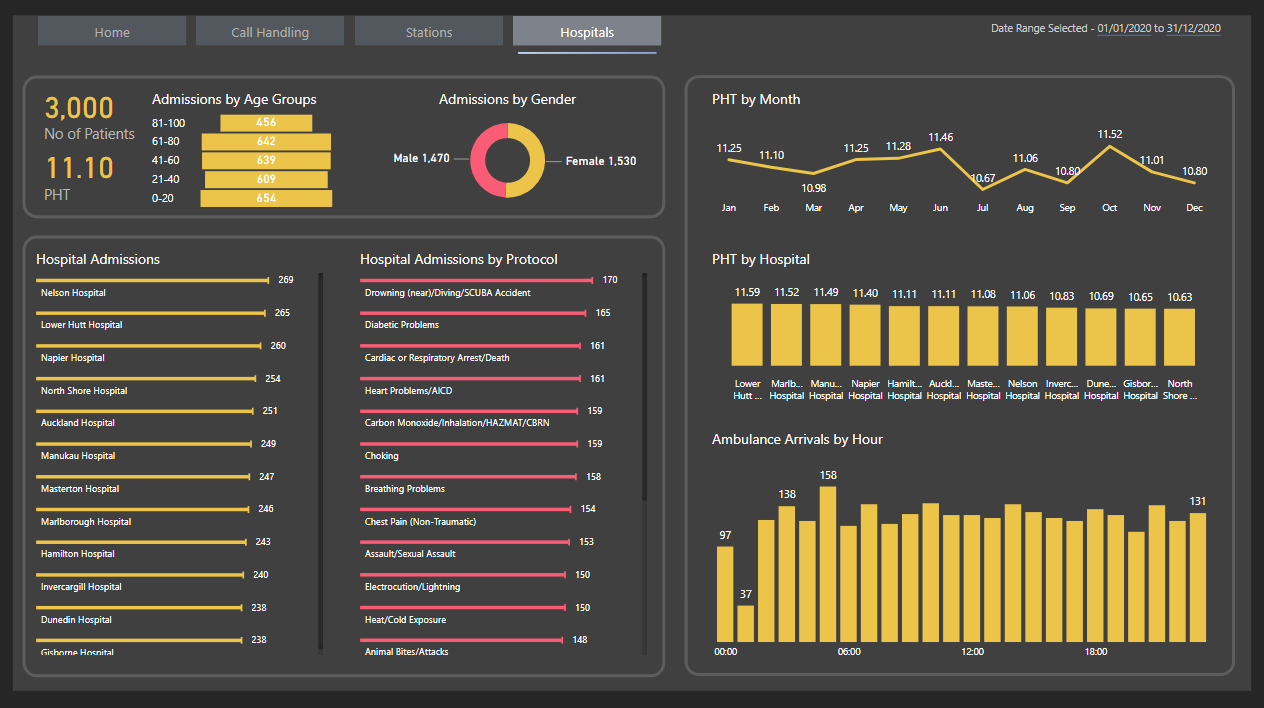
- used bar chart for “Calls by Hospital”
- used table with data bars for “Calls by Dispatch Code”
- used column chart for “Calls by Time” (2-hour intervals)
- used multi-row card for [Total Calls], [Average Response Time], [Average Ambulance Time], [Average Transport Time], and [Average Handover Time] measures
- used stacked bar chart for “Handover Times by Hospital” with gender as stacks/legend
- used table with data bars for “Response Time by Staff”
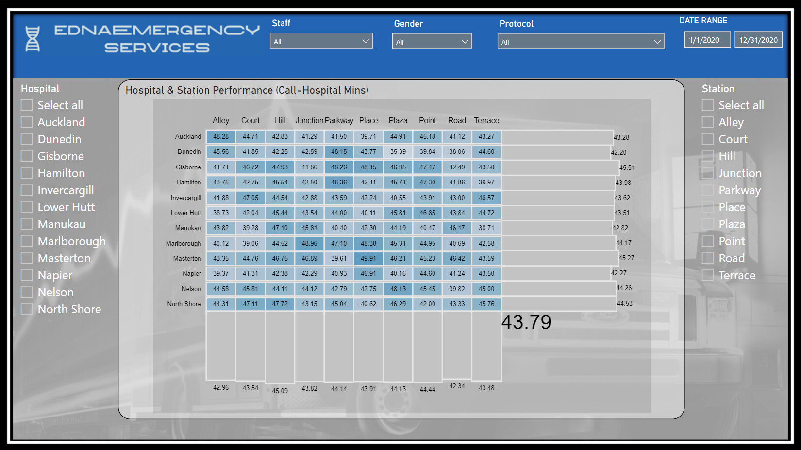
- used matrix for “Calls by Hospital and Station”; used [Matrix Spacer] measure and auto-size column width property to make matrix column with consistent
Footer:
- used textbox at left with measures for dataset admin (id, version, version date) and report admin (id, version, version date)
- used textbox at right with measures for dataset date range (to, from) and dataset last refresh date
- used rectangle for background with custom shadow (top, grey, minimal) [theme colour 7, 50% transparency]
C14 Theme.json (1.8 KB)
Contents of JSON Theme file:
{
    "name": "C14 Theme",
	"dataColors": [
		"#D78888",
		"#CC6666",
		"#C14444",
		"#A13636",
		"#7E2A2A",
		"#5C1F1F",
		"#481818",
		"#260D0D"
	],
    "visualStyles": {
        "*": {
            "*": {
                "title": [
                    {
                        "fontColor": {
                            "solid": {
                                "color": "#FFFFFF"
                            }
                        },
                        "background": {
                            "solid": {
                                "color": "#481818"
                            }
                        }
                    }
                ],
                "background": [
                    {
                        "color": {
                            "solid": {
                                "color": "#481818"
                            }
                        },
                        "transparency": 50
                    }
                ]
            }
        }
    },
    "textClasses": {
        "callout": {
            "fontSize": 30,
            "fontFace": "Segoe UI Bold",
            "color": "#FFFFFF"
        },
        "title": {
            "fontSize": 12,
            "fontFace": "Segoe UI Bold",
            "color": "#FFFFFF"
        },
        "header": {
            "fontSize": 12,
            "fontFace": "Segoe UI Semibold",
            "color": "#FFFFFF"
        },
        "label": {
            "fontSize": 10,
            "fontFace": "Segoe UI",
            "color": "#FFFFFF"
        },
        "largeLabel": {
            "fontSize": 16,
            "fontFace": "Segoe UI Bold",
            "color": "#FFFFFF"
        }
    },
    "firstLevelElements": "#FFFFFF",
    "secondLevelElements": "#FFFFFF"
}
8 Likes
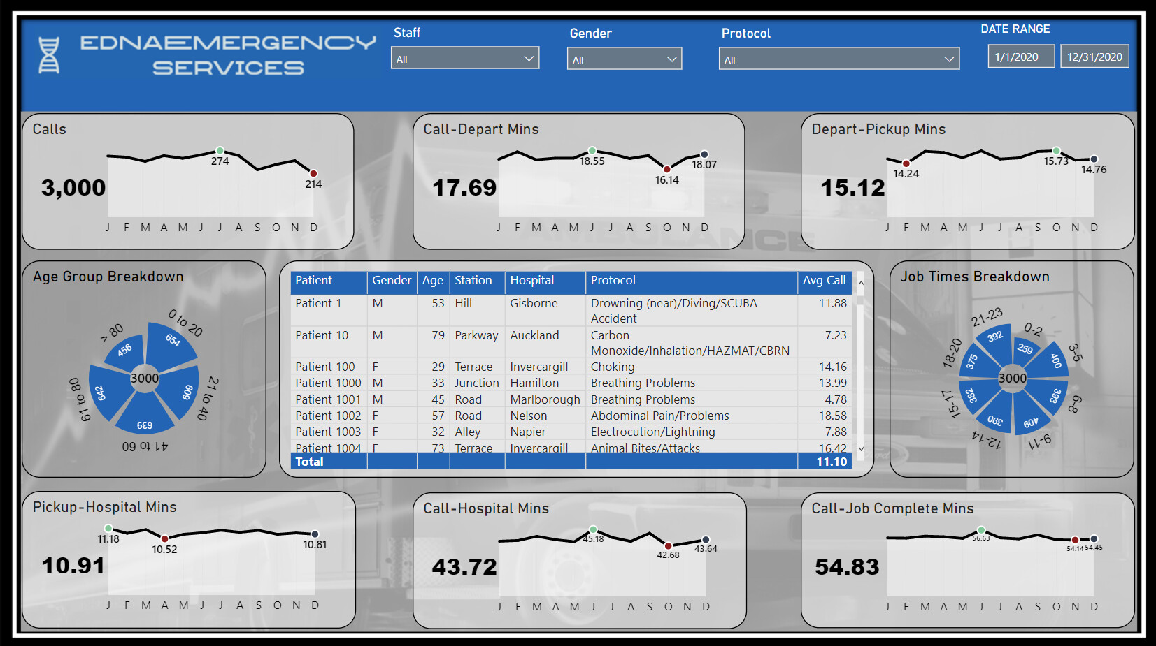
Hi,
Please see below and attached my submission for challenge 14.
Approach I have taken for this submission is to try and make the submission as flexible as possible for the end user/s for each hospital. So I added a slicer to break each page by hospital, so you can see only key figures for that hospital, but adding in text average comparisons and tooltips where you can get an idea of how other hospitals are doing in selected scenarios.
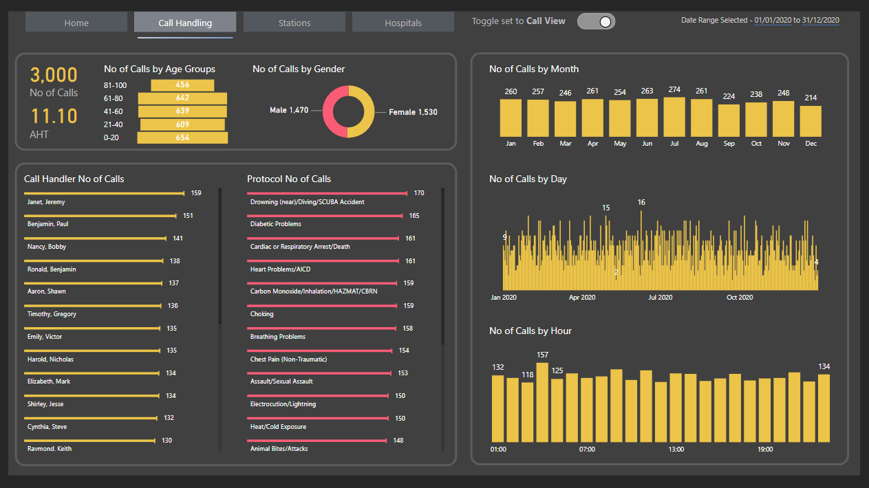
Page 1 - I focused on Call centre stats, such as volume, hours, age range, avg durations and days of the week.
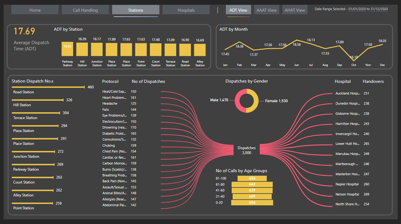
Page 2 - is focused on the ambulance service. Patients Journey from departure of the ambulance, again a breakdown in hours of the day, to identify peaks and gender and age.
Challenges I found, were coming up with relevant visuals for the measure’s created, so reverted to tables more for this challenge. Ended up using protocol numbers instead of names, but tooltips will identify the name for each P 1, P 2 etc… Time, I only saw this challenge a couple days ago, I’m sure if I had more time, I would probably take a very different approach and maybe something a bit more insightful? I think even though I don’t feel I’m reporting on much, my report feels a bit clunky, might be the fonts I decided to use, If I could redo again, I would try and make everything look a bit smoother maybe?
Hugely enjoyed the challenge, and looking forward to seeing other submissions over the weekend  Looking forward to the next!
Thanks,
Sam


Challenge14.pbix (559.9 KB)
6 Likes
Thank you @BrianJ for posting my challenge entry on PowerBI.com Here is the link: Challenge 14
As a newcomer, this is my first Challenge entry and it was a lot of fun! It is also the first time I was able to view a PBI report I created on PowerBI.com I will handle the navigation icon tool tips differently, in the future.
I tend towards a minimalistic design and stay with simple visualizations. I selected a light background with consistent colors for the three time segments in all visualizations. I hope this provides a visual clue to the end user on the segment definition to help tell the story.

I am floored by the other submissions! The quality and imaginative designs amaze me. PBI is such an amazing tool and provides so much opportunity!
4 Likes
Hey @sacrow only viewing on my mobile phone but really like your layout, theme & love the tooltip pop out. Nice submission!
David
1 Like

A very interesting best practice check list. I will keep it for record and thank you for sharing
2 Likes
All,
Here is my entry for C14. Used Charticulator for all of the visuals in this report. Tried to come up with some creative ways to show the key metrics. On vacation right now, so might be a while before I’m able to add a full writeup. Would love to hear your comments on the visuals!
Link to Report:
Thanks
Jarrett
10 Likes
Hi everyone,
here is my workout of Challenge 14 Emergency Services Analytics.
Published in Power BI Services Challenge 14 Emergency Services Analytics Delta Select , thanks to @BrianJ
and attached : Medical emergencies handling v15 DeltaSelect.pbix (502.9 KB)
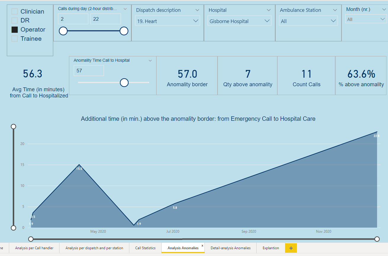
This analysis report focuses on the time it takes to bring a patient under hospital care after an emergency call, the duration is measured in minutes.
The report contains generic analytic reporting (3p) and Anomalies analysis (2p).
Anomaly is defined as all patients’ hospitalizations which takes longer as a threshold time in minutes.
As the user defined threshold time can be varied till near zero, the Anomalies analysis could be used for detailed and complete analysis.
Insights and analysis of the duration can be made through report-filters from different angles of view.
Build up of this workout:
-
Used/imported the University of Melbourne color scheme json file via Power BI View–>Themes → Browse for Themes (https://community.powerbi.com/t5/Themes-Gallery/bd-p/ThemesGallery)
-
Data is used as provided in Excel for this Challenge, the data model exists of one fakt-table CallsT of the 3.000 calls, the other data provided is used as lookup-table, I added an age group and a month lookup table (instead of the often used date table).
-
Three calculated columns are added to the fakt-table CallsT:
- “Hourgroup of call”, which calculates to which two-hour group a emergency call belongs
- “MonthNr”, which calculates to which month an emergency call belongs
- “Detail Information of the emergency call”, which concatenate eight dimensions together from lookup tables, which was needed to speed up the table in “Detail-analysis Anomalies”, as a table with information from eight dimensions becomes very slow.
-
A slicer “Anomality Call to Hospital Care” is added with a range from 15 till 80 (minutes) through Modeling → New Parameter What if in Power BI, whereby a user can determine what is seen as anomality; all anomalies can be analysed in the two anomaly report pages.
-
Three DAX measure-groups are created:
- Base Measures
- Duration Measures, for average time calculations of different stages of hospitalization, given the filtering
- Anomality measures, set up for the anomality reporting,
-
The report contains of a content page, five reporting pages, and an explanation page, see appendix.
A further development of this report might be a dashboard with required key management information. I really enjoyed this challenge.
Kind regards, JW
APPENDIX:
The five report-pages with example selections:
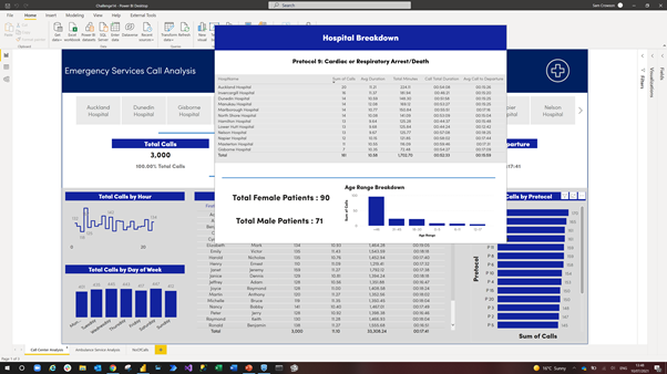
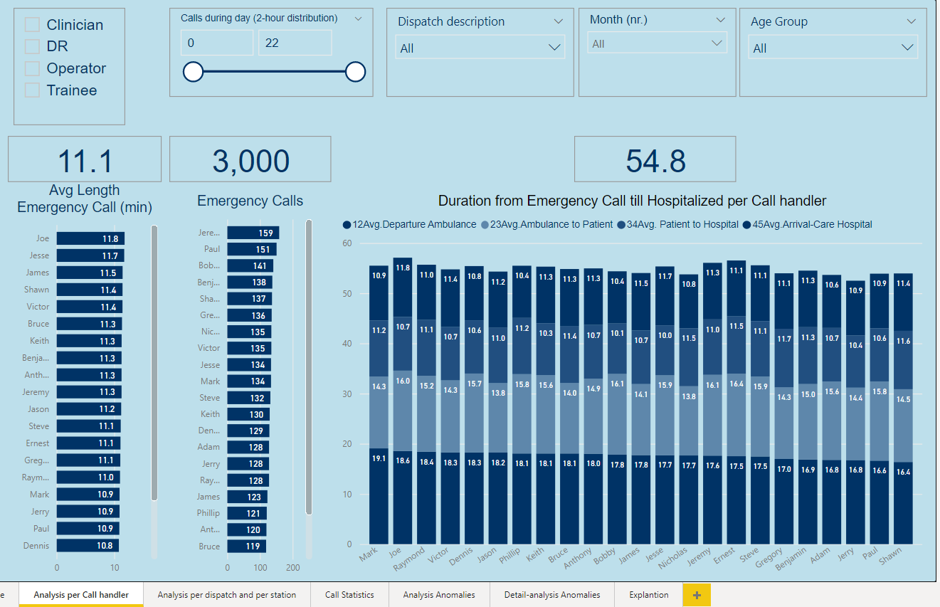
Page " Analysis per Call handler" with all calls, no selection made.
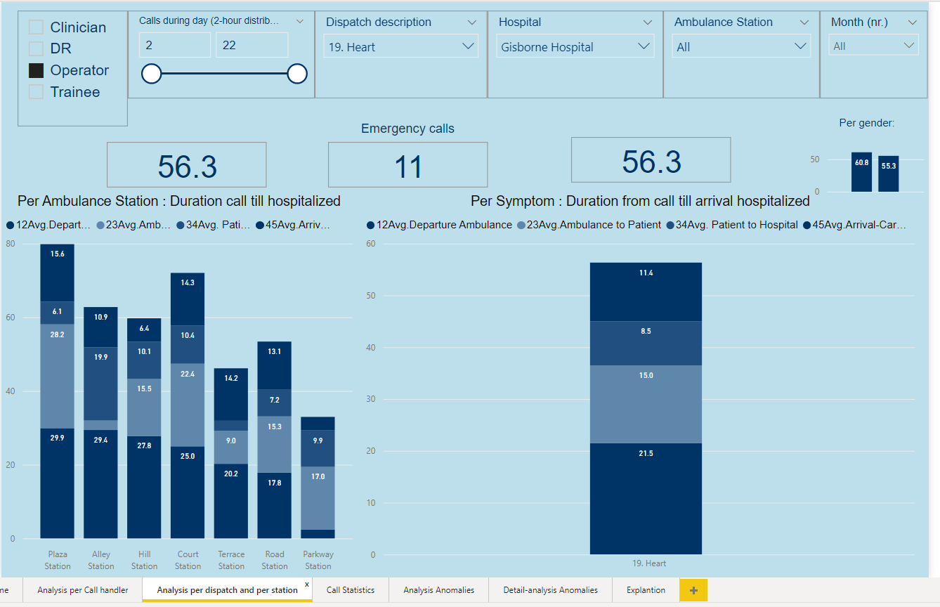
From page " Analysis per dispatch and per station" information of dispatch 19 Heart towards Gisborne Hospital
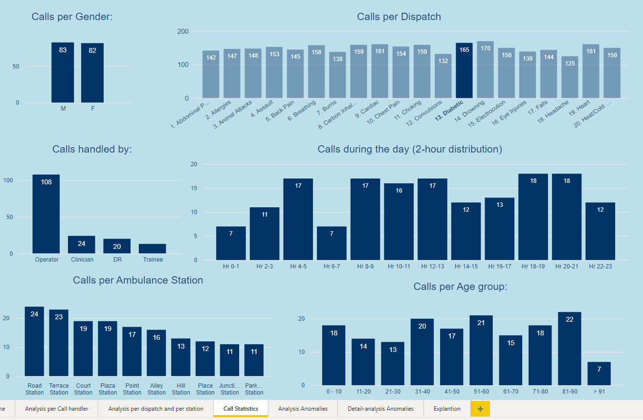
From page “Call Statistics” quantity information of dispatch 15 Diabetes
From page " Analysis Anomalies " information of dispatch 19 Heart towards Gisborne Hospital
From page " Detail-analysis Anomalies" detail information of dispatch 19 Heart towards Gisborne Hospital

7 Likes
This is my first time submitting an entry to an EDNA Challenge, also realised it was my first time creating a PBIX project that was for something other than work. I can’t say I’m fully happy with my effort, quite a few things I’d change now but ran out of time. Still really happy to have submitted an entry, thanks again to the EDNA Team for these challenges, I may not have submitted an entry for the other challenges but I’ve loved looking over & picking apart the other submissions and learning that way too.
Some obvious influences on my report design were from @MudassirAli submission for Challenge 10.
EDNA Challenge 14 DJ.pbix (3.0 MB)
David
13 Likes
I have always advocated for using these Challenges as a way to experiment, stretch yourself and try things you might not otherwise do in your real-life work reports, and I think this report embodies that approach in dramatic fashion. Of the three new elements you’ve tried, I would rate them as follows:
Custom KPI cards – stand-up triple. I think these are terrific visuals that attractively convey a lot of information at once in a relatively small space.
Selective Row/Column Heat Map – game-winning grand slam. This is truly one of the best visuals I’ve ever seen. The ability to choose the rows and columns, and have the heat map recalculate dynamically is amazing. Other than “something something Charticulator…”, I have absolutely no idea how you accomplished this. I can’t wait to see your write up and PBIX file to figure out how I can build this and incorporate it into my reports.
Deconstructed Pie Chart - foul ball that hits a spectator in the head and sends them to the hospital. Hey, we can’t win 'em all, but kudos for trying something different. However, I find this visual really distracting, hard to read and interpret, and much less effective than a simple bar chart would be.
Overall, incredibly innovative, interesting and valuable report that I think will have a lasting impact, in terms of the way I expect many of us will build our KPI cards and dynamic heat maps.
Phenomal submission! 
- Brian
2 Likes
This is an absolute knockout first entry. First, it just looks gorgeous, and has a really fluid, intuitive navigation experience. I particularly like the use of the toggle to double the amount of information on the call handling page without interfering with the great aesthetic look of the report, the multiple views available on the station page, and the bowtie visual on that same page (I think that’s a really nice variation on the decomposition tree).
Just a wonderfully conceived, designed and implemented report.
Can’t wait to see more of your work in future challenges.
- Brian
1 Like
Thank you for the kind words, much appreciated!
I will be submitting a wk 14 response, but I seriously doubt it will be in time of the deadline. My actual work takes priority, sadly :-(. With that being said I will post something as close to real-world as our company uses daily, not that it will be any better than the AMAZING ones you all have submitted.
If I post after the deadline, will it still show up here, or can I send to Brian/Sam and they will post if they want?
3 Likes