Builds 21 - "Enterprise DNA YouTube Channel Data Analysis"

Hi everyone, this is an entry submitted by Waleed Butt us via email.

Here’s how Waleed Butt described it:

I accepted the Enterprise DNA challenge. The report contains two parts.​

  1. Summary Analysis​
  2. Geographical View​
    Prepared Dynamic Video Rankings based on a user Activity.

Waleed Butt
Please feel free to give Waleed your feedback on his report.

1 Like

Hi everyone, this is an entry submitted by Grabiel Gillis via email.

Here’s how Gabriel described it:

I accepted the Enterprise DNA challenge. This is my first entry in the EDNA Challenges.
I enjoy preparing this full report

You may view the full report here
Gabriel Gillis

Please feel free to give Gabriel Gillis your feedback on his report.

1 Like

Hi everyone, this is an entry submitted by Sara Krusleski via email.

Here’s how Sara described it:

I accepted the Enterprise DNA challenge. This is my first entry in the EDNA Challenges. I enjoy preparing this full report, I hope you like

You may view the full report here
Sara Krusleski

Please feel free to give Sara Krusleskis your feedback on her report.

1 Like

Hi everyone, this is an entry submitted by @kiri00

Here’s how Kiruba described it:

I accepted the Enterprise DNA challenge. This is my second entry in the EDNA Challenges. I enjoy preparing this full report and practicing what I learned from the community

You may view the full report here
kiruba selvi

Please feel free to give kiruba your feedback on her report.

2 Likes

Hi everyone, this is an entry submitted by Amanda Nascimento via email.

Here’s how Amanda described it:

I accepted the Enterprise DNA challenge 21.​
The challenge consists in elaborate an exploratory analysis report about EDNA YouTube Channel growth.​
For the mobile view I focused just on the engagement metrics​

You may view the full report here
Amanda Nascimento

Please feel free to give Amanda your feedback on her report.

1 Like

Hi everyone, this is an entry submitted by Victor Alves via email.

Here’s how Victor described it:

I accepted the Enterprise DNA challenge 21.​
It was a great learning opportunity. May this be just the first of many times here.​
In this dashboard, you can see 3 pages: ​

Overview: Summary all KPIs​

Audience: Ctry & Gender​

Comparison: Year comparison.

You may view the full report here
Victor Alves

Please feel free to give Victor your feedback on his report.

1 Like

Hi everyone, this is an entry submitted by Lawrence Hakeem via email.

Here’s how Lawrence described it:

I accepted the Enterprise DNA challenge. This is my first entry in the EDNA Challenges. I enjoy preparing this full report, I hope you like it

You may view the full report here
Lawrence Hakeem

Please feel free to give Lawrence your feedback on his report.

1 Like

Hi everyone, this is an entry submitted by Ayse Ayaz via email.

Here’s how Ayse described it:
This is my first entry in the EDNA Challenges. I enjoy preparing this report

You may view the full report here
Ayse Ayaz

Please feel free to give Ayse your feedback on her report.

1 Like

Dear all,

Please find below my entry for following challenge.

My main idea was to push design part a little bit further and check what can we do with standard pbix possibilities in combination with standard PPT. I would call this particular report “Jarvis 1/10”.

Besides of design aspect, in this particular challenge I tried to incorporate a few dax techniques that I’ve not used before, including as follows:

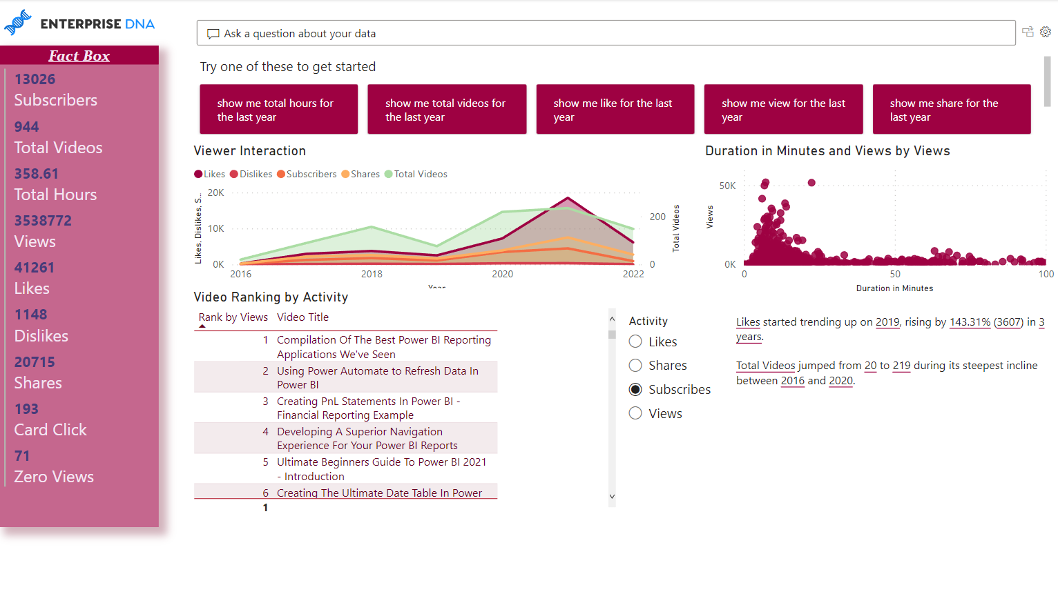
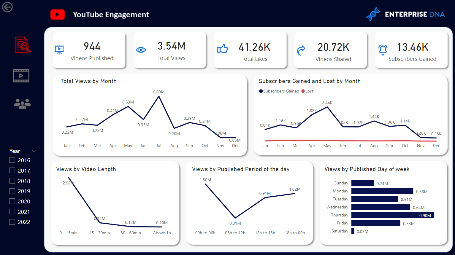
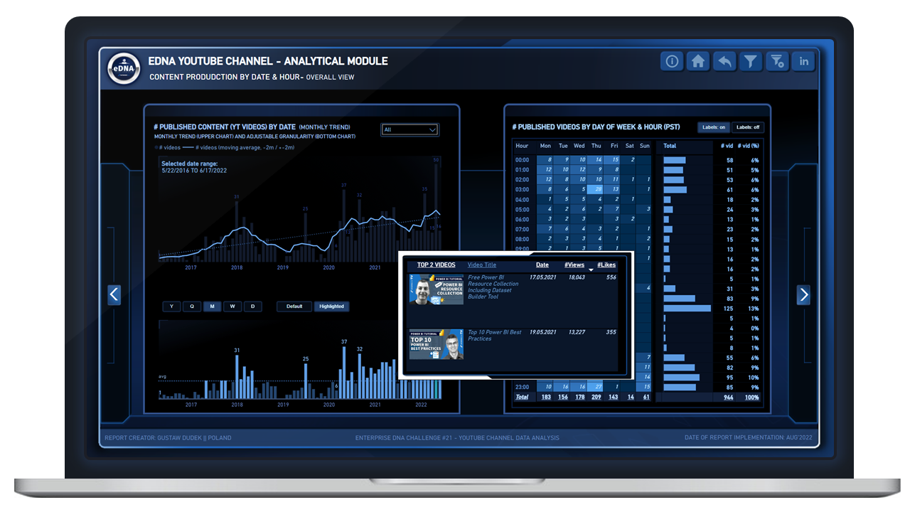
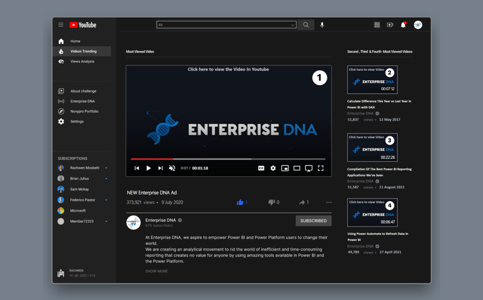
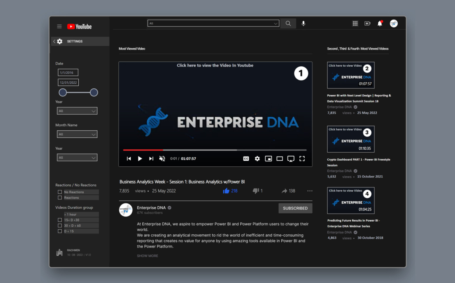
Page 1 “Content production by date & Hour”, bottom column chart:
There is applied selection for date granularity (year/quarter/month etc) and additional (and this is new) button to either show data in the standard way (“default option”) vs higlighted feature which dynamically higlight the lowest and the hightest value in the given period, as well as all periods where realization was below average. A tricky part here was to switch averages depending on current granularity selection (different averages in quarter perspective, month perspective, and so on).

Additionally, heat map is equipped with “labels off / labels on” buttons, which enable to show only conditionally formatted colors or possibly with data labels.
There is also applied custom tooltip for bottom column chart, that shows Top 2 video content published in given period (rank by by number of views)
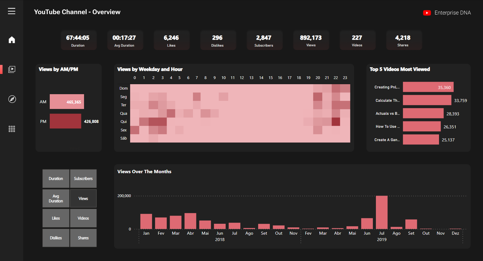
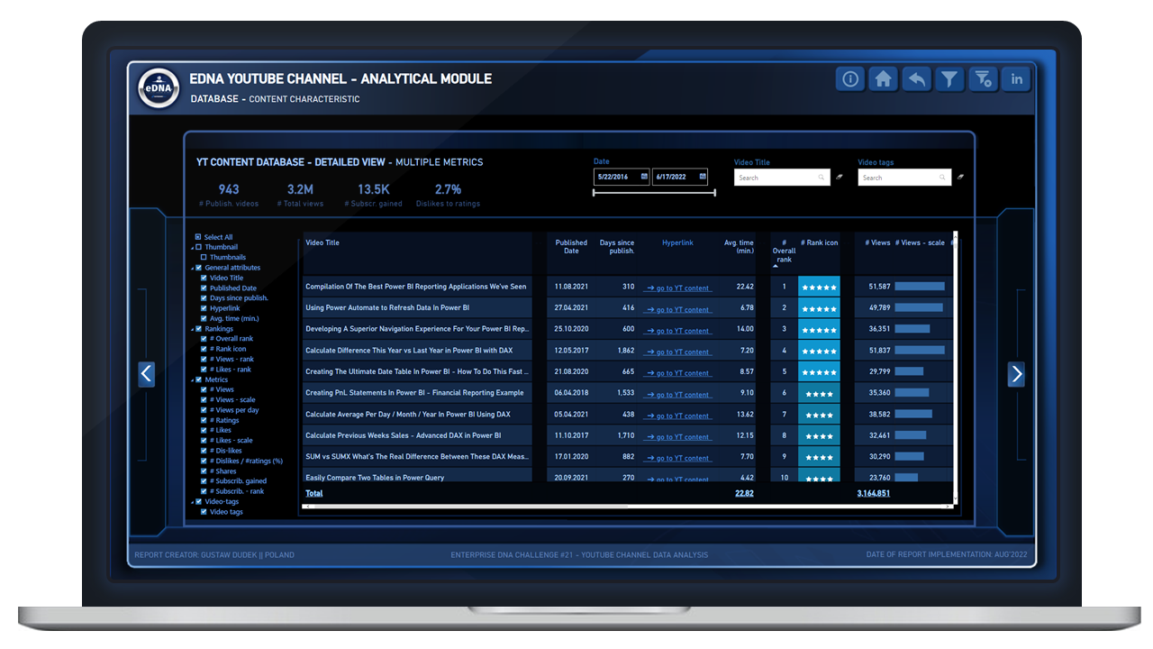
Page 2 "Database
There are two main features: the first is dynamic selection of given columns in the table (field parameter), the second one is some ranking functions. “General rank” takes into consideration separate rankings within four relevant metrics, combine them and reveal additional ranking (It’s an Idea that I have seen for the very first time 2 years ago on @sam.mckay YT video - thanks for inspiration :slight_smile: )

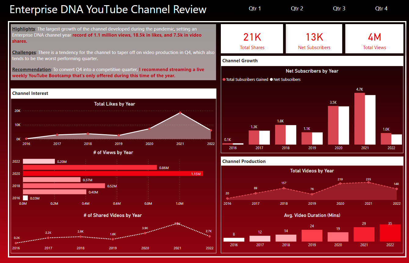
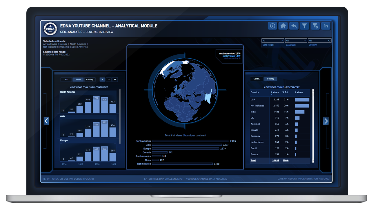
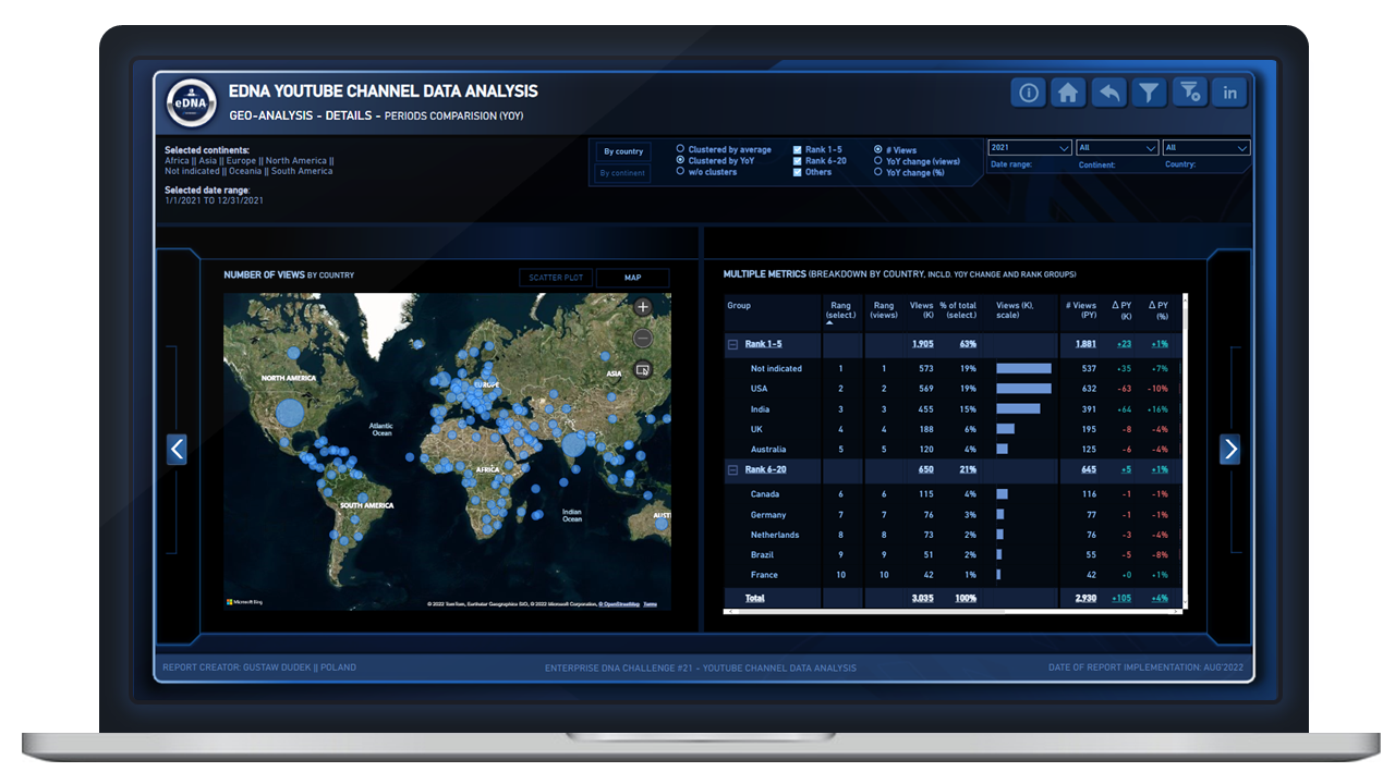
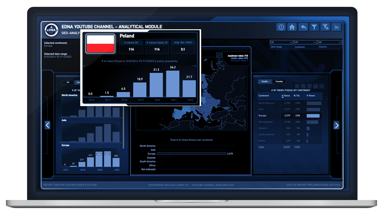
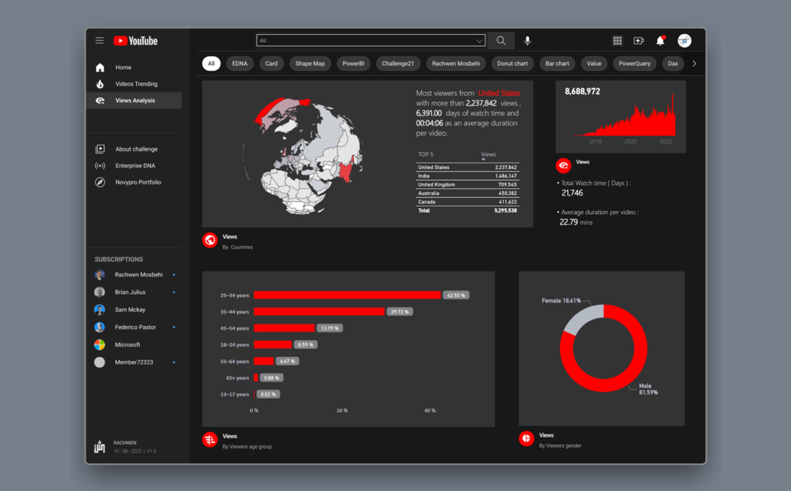
Page 3 “Geo-analysis”
This is my personal favorite report page.
First and foremost, big thank you to @FPastor for sharing txt / json file for shape map.
The most tricky part here was to handle dynamic switching of the map from round shape do rectangle (when slicing & dicing some data).
I’ve seen recently on YT that briliant people handle this rounded shapes with additional layering etc (@Paul.Gerber, I believe you also achieve that in your current entry for #21 Challenge?!!).
This time however, I decided to take different approach and try not to fight with changable shapes of the map. Instead, I was trying to leave it “round” with different shapes (like shown on the screen) when specific continents has been filtered, but when map start to change shape (e.g. when selecting “Europe”), I was trying to cover all shapes for “rounded mode” and replace with rectangle. It was done mostly by using field values / conditionall formatting and transparent “colors”.
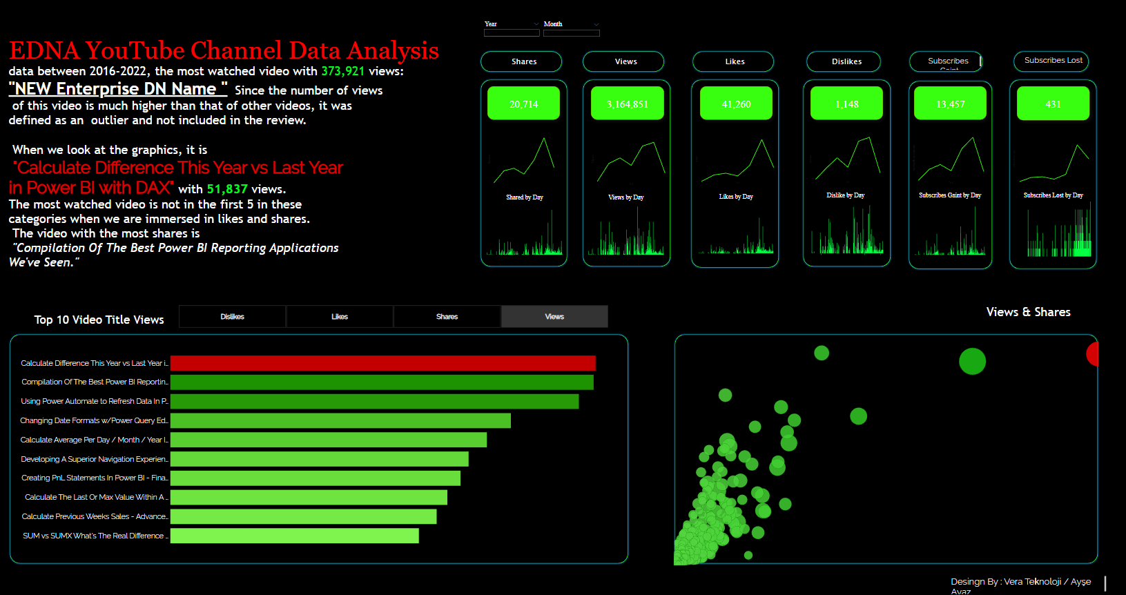
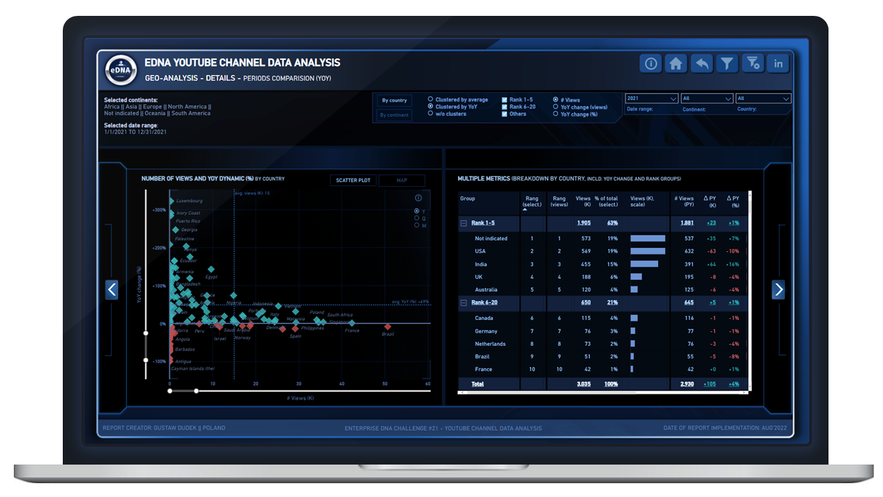
Page 4
Here are to separate dax implementations, that creates quite interesting effect when combined.
First technique distinguishes given countries depending on the rankx funtion and categorize them into three separate bins (rank 1-5, rank 6-20 and others). Once it’s in the matrix - it shows sub-totals for given rank bins and interactively filter data on the scatter chart (reducing number of data points on the chart) or on the map. This concept I’ve also see recently in one of @sam.mckay videos.

Another new feature for me was to create three scenarios (using measure, not calculated columns), that would allows for clustering data points within scatter chart. In that case we have following scenarios: 1) higlighting data points by relation to averages for given gropup (“quadrant”), 2) highlighting data points basing on YoY variation (either positive or negative change YoY), and 3) no clusters to be applied - so each data points have similar look.
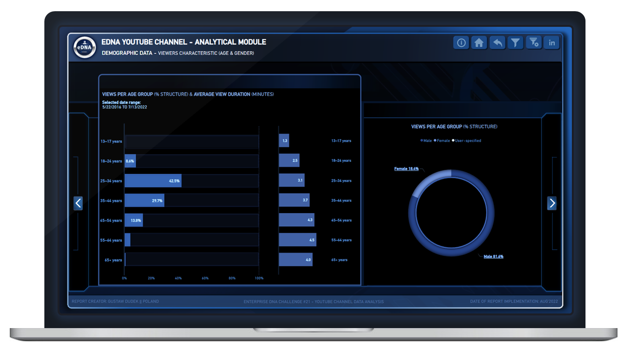
Page 5
This page adrresses demographic data (not presented on the screens).
Nothing fancy here.

Finally, I’m really happy with the look of navigation buttons in the upper right corner (made 100% within pbix using shapes and icons). Thanks especially to @MudassirAli for inspiration (latest JMAP report was amazing and really inspire to push some things forward.

Additionaly, big thanks to @BrianJ for giving me opportunity to contribute to recent Pareto Analysis.
Some work on this report gave me a few ideas of how #21 would look like.

I will definitely dive deeper into some features, so looking foward to having more discussions with you.

Published-to-web version of the reports will be shared soon.

All best!


10 Likes


11 Likes

@Gustaw Great work, like always!

2 Likes

Hi everyone, this is an entry submitted by Travis J​ Villanueva​ via email.

Here’s how Travis described it:

I thought to highlight the Animated Bar Chart which presents the views by video title over a monthly race to have an idea or picture of how the youtube video views increment over time. In addition, mobile report development is a key activity as users nowadays do their transactions or activities over the phone.

You may view the full report here
Travis J Villanueva

Please feel free to give Travis your feedback on his report.

1 Like

Hi everyone, this is an entry submitted by Steve​ Standford​​ via email.

Here’s how Steve described it:

Thank you for this challenge it was really interesting. After getting quite complex I decided to reduce it to some interesting points around the time of post, the most effective videos, and durations. ​

The longevity of many videos is awesome.

You may view the full report here
Steve​ Standford​

@Gustaw

Boom! Great report.

Excellent work.

Here is my submission for Enterprise DNA Ltd Challenge 21 - EDNA YouTube Channel Data Analysis.

PS : The full YouTube experience is guaranteed !!


12 Likes

Hi everyone, this is an entry submitted by Varshada Vengurlekar​​ via email.

Here’s how Varsha described it:

I am a first-timer for the power bi challenges on EDNA and I must say it was a great learning experience for me. It helped me practically understand the approach for any data analysis like getting familiar with data provided and what is it that we need to answer and bring out from the data that helps.

You may view the full report here
Varshada Vengulekar

1 Like

Hi everyone, this is an entry submitted by ​​ Divya Harikrishnan via email.

Here’s how Divya described it:
This is my entry into EDNA Challenges. I have given an attempt. Thanks for the wonderful opportunity. Looking forward to learn more from the upcoming challenges

You may view the full report here
Divya​ Harikrishnan​

Please feel free to give Divya your feedback on her report.

Hi everyone, this is an entry submitted by ​​ Nachiket Mehendaler via email.

Here’s how Nachiket described it:
This is my entry into EDNA Challenges. Thanks for providing the opportunity to work on the challenge.

You may view the full report here
Nachiket Mehendaler

Please feel free to give Nachiket your feedback on the report.

Hi everyone, this is an entry submitted by ​​ Matthew Braun via email.

Here’s how Matthew described it:
TI accepted the Enterprise DNA Challenge 21 - EDNA YouTube Activity Reporting. I have been a long-time follower of the Enterprise DNA platform, yet this is my first challenge submission.

You may view the full report here
Matthew Braun

Please feel free to give Matthew your feedback on his report.

Hi everyone, this is an entry submitted by ​​ Francis Folaranmi via email.

Here’s how Francis described it:
I accepted the Enterprise DNA Challenge 21 - EDNA YouTube Activity Reporting. Excellent dataset, I hope you enjoy my report.

You may view the full report here
Francis Folaranmi

Please feel free to give Francis your feedback on his report.

1 Like