This is just a generic question, when talking about Aging report, either it is Customer aging or inventory aging, or else, what is the “out of the box” visual that interest user and also help to make some offers or decision ?
Typical visual that I use are :
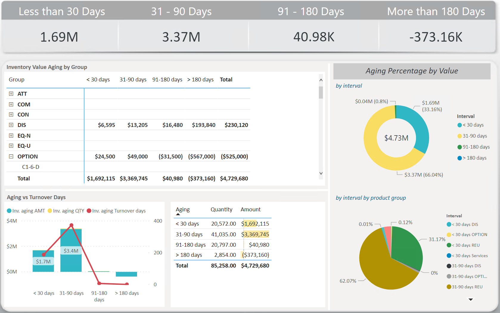
Matrix, with aging group column wise
Donut chart
Bar chart with the aging group in the blocks
This is like a common visual, which also in the end, it is just info-ing, is there anything we can improve, like more “uncommon” but related visual, also can we add something that suggesting the viewer what to do then, after they saw it.
I can recommend looking at the videos available in the Financial Reporting: Aging Trial Balance.
It has a lot of best practices and techniques to really build an outstanding Aging Balance report
In my personal experience, the best way of creating a great report is to talk with the people who will use this report to take decisions, and understand their thought process. Are they interested in using drill down for example, what dimensions do they want to see? Do they want to see an evolution? Do they want to see a different granularity? Do they want to further segment the companies by risk? What other data related to this exercise do you have? What analysis exists today ? What works well, what does not work well? What frequency of update does the end user need ?
There are many ways of building this report but the best way is to have an analysis that matches perfectly the internal processes of your company.
So, my recommendation is to start understanding the possible uses cases, build a user story after contacting the end users and asking all possible questions.
You can then build a prototype that you will iterate until the end user is happy. (If you put the end user in the center of the creation, not only he/she will be happy, but you will also work early on on change management and adoption). After all these steps, you will create the best report/analysis possible.
We can add many visuals but it depends on the fact data and dim table what you have in your model. Like you can show as aging groups ( 30 days, 60 days … ). You can also show trends of these aging wrt to date.
Best if you provide your sample pbix file then forum people can help you based on your needs.
Hi @Toni, we aim to consistently improve the topics being posted on the forum to help you in getting a strong solution faster. While waiting for a response, here are some tips so you can get the most out of the forum and other Enterprise DNA resources.
Use the forum search to discover if your query has been asked before by another member.
When posting a topic with formula make sure that it is correctly formatted to preformatted text </>.
Use the proper category that best describes your topic
Provide as much context to a question as possible.
Include the masked demo pbix file, images of the entire scenario you are dealing with, screenshot of the data model, details of how you want to visualize a result, and any other supporting links and details.
Hi @Toni, we’ve noticed that no response has been received from you since the 21st of December. We just want to check if you still need further help with this post? In case there won’t be any activity on it in the next few days, we’ll be tagging this post as Solved. If you have a follow question or concern related to this topic, please remove the Solution tag first by clicking the three dots beside Reply and then untick the checkbox. Thanks!
Hi @Toni, a response on this post has been tagged as “Solution”. If you have a follow question or concern related to this topic, please remove the Solution tag first by clicking the three dots beside Reply and then untick the check box. Also, we’ve recently launched the Enterprise DNA Forum User Experience Survey, please feel free to answer it and give your insights on how we can further improve the Support forum. Thanks!
Sorry for the late reply. Understand about the user approach, however my user are the one that asking me what can I suggest to improve their aging report. And of course as typical aging, they (and also me unfortunately) only know the “common” visual that I listed.
I did look into that Financial course which is great, been using that for a while, just probably there is more new idea. Or probably something that suggest a decision to make for the user based on visual that we created ? I’d curios about the trend however, how and what it would be like if I may ask ?
Is there a sample course for that ?
Hello @Toni,
The approach I have with users is to make a workshop and understand the personas. You have to prepare your questions in order to extract the information needed to recommend an improvement.
Focus on identifying needs, do not tackle the design aspect yet. Find out your story first
For ex, identify who is your target audience. Ask about their work. How are they thinking? What information they would like to see first? Give examples. For ex, maybe the problem comes from 31-90 days. So what? Maybe the audience will say that, in this case they would like to see if there is a major contributor, see details. You will need to ask what details they would like to know… The list of first 10 contributors, maybe understand if those clients are new, etc.
You should ask if there are credit management use cases. Try to think wider, how can you relate the data you have to other existing analysis? Your main focus should be on understanding, having feedback. Design is the last part of a report.
Ask feedback, reiterate. You report has to have a meaning. It has to serve a purpose. What problem does it solves?
P.S From the design point of view:
Ask about branding. Do you have a company logo, icons, colors? Use the brand color as the basis of your design
Be consistent with colors. Limit the number of dominant colors to 2. Color can be very powerful. Use it for attention or reinforcement.
Choice of visuals.
You cannot use Quantity and Amount in a column stacked chart
Avoid using pie charts if you have +4 slices.
Use simple charts like barcharts, linecharts. Be consistent with Title fonts & size. Give context using text.
Think about interaction between charts, about adding context with tooltips. Think about navigation: buttons/menu/drill through.
Hi @Toni, we’ve noticed that no response has been received from you since the 6th of January. We just want to check if you still need further help with this post? In case there won’t be any activity on it in the next few days, we’ll be tagging this post as Solved. If you have a follow question or concern related to this topic, please remove the Solution tag first by clicking the three dots beside Reply and then untick the checkbox. Thanks!
A response on this post has been tagged as “Solution”. If you have a follow question or concern related to this topic, please remove the Solution tag first by clicking the three dots beside Reply and then untick the check box. Thanks!